7 Expert Tips That Will Help You Increase Your Website’s Conversion Rate

As an online business owner, increasing the conversion rate of your website is one of the tasks you should be focusing on if you aren’t already doing so. If you are able to increase the number of people who convert on your site, you’ll get more sales and also reduce how much you spend on customer acquisition.
So, in today’s post, I am going to take you through seven techniques you can use if you want to improve your website conversion rate and increase sales for your business.
What is your website’s conversion rate?
To put it simply, a website’s conversion rate refers to the percentage of visitors that complete the desired action that you want them to take. And this can be anything, such as signing up for a newsletter, registering for a course, or buying a product or service.
Make sure you’re targeting the best keywords on every page
It’s important that you target the right keywords with your website copy. This will ensure your website ranks for the right queries on search engines, and it will help you reach your target audience.
To identify the most relevant keywords for each of your web pages, you’ll need to perform adequate keyword research. To do this, you can use specialist keyword research tools like Ahrefs’ keyword explorer or Ubersuggest and type in words or phrases that relate to your niche or the type of products or services you sell. You’ll then be given a list of keywords or search queries that have been entered into search engines by people in your target audience so you can work on mentioning these keywords on your web pages.
However, some people might find this process time-consuming and will want to outsource it. If you’re one of those people, I recommend using a keyword research service that will help you do the work instead.
In all of this, make sure you don’t forget to weave keywords naturally into your copy. If you keyword stuff, your readers (and Google) will know and you’ll just end up hurting your user experience and SEO rankings. Keyword stuffing refers to the practice of adding too many keywords into text on your site with the intention of manipulating search engines, and it’s something you don’t want to do.
Earn customers’ trust with positive reviews
People tend to trust word-of-mouth recommendations over marketing, so it’s a good idea to ask your customers for testimonials you can publish on your website. These will show that you’ve done a great job for customers in the past and will build a sense of trust with new clients.
Asking customers to give you testimonials doesn’t have to be a difficult task. You can simply send over an email after a purchase to ask how they liked using your product or service and if they would recommend it to their friends or colleagues.
Another way to get reviews is by creating a survey form to ask about people’s experience with your brand and including a comment box for those who would like to leave specific feedback. When you’ve created the form, you can add it to your website and then send an email that includes the link to the form, politely asking customers to fill it out.
For inspiration, let’s take a look at some companies that have done a great job of using positive reviews to build customer trust.
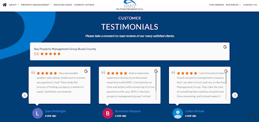
For our first example, we take a look at Bay Property Management Group. As a property management company that services various locations like Bucks County, they’ve included positive testimonials on their service page to show the experiences of past clients. It’s a pretty genius technique if you ask me because it allows prospects reading these testimonials to see reviews that are related to the specific location where they have property — in this case, Bucks County.
They also show when these testimonials were given, and this is really great because it lets people see how recent the testimonials are.
This example shows the importance of ensuring your customer reviews are going to be incredibly relevant to the people visiting a particular service page on your website. And, to show you’re still great at what you do, you might want to include the date that your customers left their testimonials so people can tell that they’re recent.
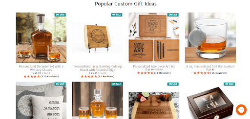
Next is A Gift Personalized, an ecommerce store that sells different gift items for various occasions. To show prospective customers how trustworthy they are, they’ve found a way to incorporate star ratings into the product descriptions that visitors can see while scrolling through their website. This allows new shoppers to see what previous customers think of different products as they try to make their decision. It also increases the chance of a visitor buying an item if they’re impressed with the ratings and reviews that it has gotten from other customers.
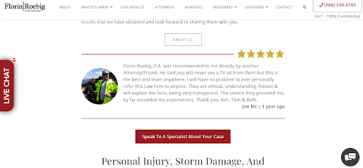
Finally, we have Florin Roebig, a law firm that specializes in various practice areas like personal injury, car accidents, and labor law.
On their homepage, they’ve included a testimonial section where they display a lengthy and very positive review from a past client. The client compliments the company very well and even mentions that they have no problem referring them to any of their friends and family. For new customers who might be skeptical about using the company’s services, a review like this will do well in influencing their decision.
To get the most out of your testimonials, try to make sure that you display your reviews in the best way possible. You could have a section on your homepage and use a sliding carousel to show several testimonials, or you could even create a separate web page for testimonials and reviews so you can display as many as you want.
Add plenty of calls to action to your site
A call to action (CTA) is a prompt that guides visitors on the steps you want them to take on your website. CTAs are a crucial part of your website’s design because they tell people what to do and they can lead to more conversions for your site.
If you want to create strong and effective CTAs, make sure you use command verbs that tell people exactly what you want them to do. Words like “get” “subscribe” and “sign up” are great examples, as they’re already letting your visitors know what they’re expected to do.
You should also be using bright colors for your CTA button so people will see them as soon as they get on your website. Plus, ideally, you should have different CTAs on various pages of your website so you can appeal to visitors in different stages of their buying journey. Some of these pages are your homepage, service page(s), blog posts, or contact page.
To give you some inspiration, here’s an example of a company that uses strong CTAs to increase the conversion rate of its website.
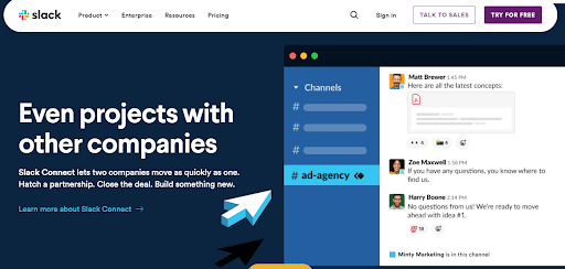
Slack is a messaging platform that allows individuals to communicate one-on-one or as teams in multiple channels. On their homepage, you’ll see two different types of CTAs — “talk to sales” and “try for free”. These CTAs are highlighted in a very noticeable color and they also appeal to different website visitors.
“Talk to sales” speaks to people who are ready to use the product, while “try for free” will attract those who just want to experience the product for the first time. So, by taking note of their customers’ buyer journey, they’ve been able to create CTAs that can help in increasing their conversion rate.
To do the same for your business, try to focus on using bright colors that will make your CTA button contrast with your background. As an added tip, you should also ensure that you have CTAs in the upper part of your web page, preferably in the center of the page so visitors don’t miss them when they get to your site.
Focus on highlighting benefits, not features
The copy on your website — and how you structure it — can have a huge impact on your conversion rate. And one of the best ways to structure your website copy is by tweaking it to highlight the benefits of your products or services before anything else, like the price or features.
Some of the benefits you should highlight about your products or services are how they help your customers save time, get great results, make more money, or save more of the money they’re already made.
For more clarity, let’s see how Evernote focuses on highlighting the benefits of their product in their website copy.
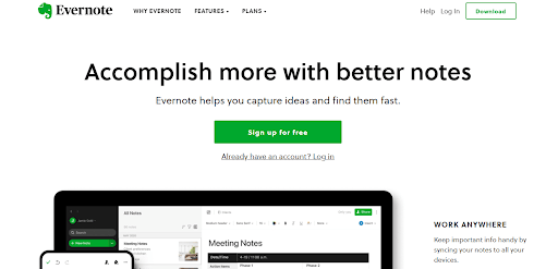
Evernote is a note-taking app. Right from when you get to their homepage, you see that they’ve highlighted the things that their product can do for you. One is to help people accomplish more things with better notes and the other is to allow customers to capture the ideas they have and find them without delay later on.
Even before getting to the features or pricing plans, they are already giving prospects an idea of the benefits they’ll get from using this product. It’s a great way to show how useful their tool is and it’s also a technique that can get them more conversions in the long run.
If you want to emulate this strategy, you can also display the benefits of your product or service front and center on your web page. But make sure you use clear and concise words so people can get the message immediately.
Make it very easy for people to take the next step
When people land on your website, you want to make it as easy as possible for them to take the next step, as this will increase your chances of making a sale. This means you should be making it easy for prospects to find more information or move forward in the buying journey.
You could make sure to give clear CTAs, or provide a sophisticated search feature that will make it easier for people to find the most relevant parts of your website. You can also provide multiple contact options that allow people to get in touch, and make sure that your checkout process is quick and simple.
Here are two examples of websites that are doing a fantastic job of moving prospects forward in their buying journey so you can get some inspiration.
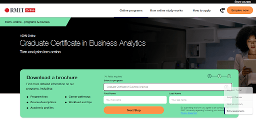
RMIT Online is a university that offers various online courses and degrees. One of the strategies they use to move people forward in their buying journey is by making brochures available for all the programs they offer. These brochures contain detailed information about program fees, course descriptions, career pathways, and other valuable information that prospective students would need to make a decision about applying to their school.
In this example, you’ll find that all prospects need to do is enter their name and email and they’ll be able to get more information on the school’s business analytics program. The fact they’ve made it so quick and easy is likely to lead to a lot more conversions for the university. And, once someone has downloaded a brochure, they’ll be far more likely to enrol in a course.
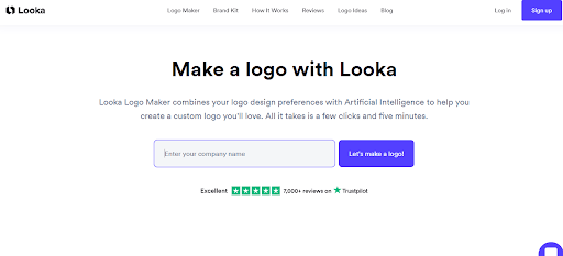
We also have an example from Looka, a company that provides an online logo maker for its customers. On getting to their site, you’re given a set of instructions that require you to input details like your company name, industry, brand colors, and slogan. At every point, they make sure there’s an obvious next step so prospects aren’t confused on what to do next.
For people who might have been stressing about how to get a new logo for their brand, this is a really simple and clear process that they would appreciate.
Just like these companies have done, there are so many ways for you to make it easier for your prospects to take the next step on your website. You could include arrows or indicators to highlight your contact options, or even create a separate section or web page where you outline the various steps that a prospect should take to buy a product or service from your website. This makes things super simple and it gives clear direction, especially to first-time website visitors.
Create helpful content your ideal customers will love
Creating helpful content can boost your SEO, drive more traffic to your website, build trust with customers, and lead to more sales. But, to create helpful content, you’ll need to come up with relevant and helpful ideas or topics.
One way to do that is through keyword research, which we’ve spoken about earlier in this article. You can also decide to join social media forums like Reddit or Quora and engage in conversations involving issues related to your niche. When you do this, you’ll be able to get some insight into the topics that are affecting people in your audience and you can create helpful content to answer some of these issues or pain points.
Let’s study the way that FreshBooks uses their helpful content to show off their expertise and also help people with solutions to their pain points.
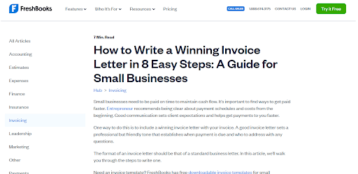
As a company that provides accounting software for small and medium-sized businesses, FreshBooks understands that there are people in its audience that do not know how to write a winning invoice letter.
So they’ve created a blog post that explains what an invoice letter is while also outlining 8 easy steps that people can use to prepare one. This type of content is going to be very useful to many of their customers and it can also get more prospects to convert after they see how much expertise the company has in their niche.
To do the same, you have to be willing to put in the time and effort to perform research and learn more about the topics that your audience will appreciate. You can even look through the comment sections on your previous blog posts and see if people have left any requests on topics they think you should cover.
Choose your website imagery carefully
Business owners need to put a lot of thought into choosing all of the imagery for their websites. You can’t just pick images on a whim because different imagery will work for different businesses.
Some of the images that can be effective are photos of staff that humanize your business or images of people using your products so that your customers can imagine themselves doing the same.
You could also create graphics that help people understand your services, or strong product imagery that displays the different features of your product(s).
When choosing these images, make sure you prioritize quality over quantity. Quality images do more for your brand’s image and they can help in getting prospects to trust you so, if you need to invest in a photographer or design tools, try to do so.
Here’s an example of a brand that does well in using quality images to show the different features of their product and generate more sales.
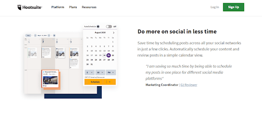
Hootsuite is a social media marketing platform and, on their homepage, you’ll find that they’ve created various high-quality images to show how their product works. These images show how people can schedule posts on a content calendar, access Hootsuite’s media assets, or keep an eye on the latest social conversations or brand mentions.
This type of imagery already gives prospects an insight into the way the tool works and this can help them in making the decision to convert. Another way to do something similar for your brand is by creating a product demonstration video. With a video, you’ll be able to give visitors a walk-through of how your product helps to solve their problems.
Summary
Increasing your website’s conversion rate isn’t as hard as you think it is. Start by targeting the best keywords, displaying customer reviews, and adding lots of strong calls to action on different pages of your website.
Once you’ve taken these steps, you can continue implementing the rest of these tips and keep monitoring your analytics to see how these techniques are working for you.
—
Author bio & headshot:
Adam Steele is the COO at Loganix, an SEO fulfillment partner for agencies and marketers. We build easy-to-use SEO services that help businesses scale. If you liked this article, please check out our SEO guides and templates on the Loganix blog.