7 Features Your B2C Clientele Wants from Your Website
Business to consumer (B2C) companies have a different perspective than business to business (B2B). While both serve other people and want to make a great impression, a B2C brand is more likely to sell a product or service directly to the target audience. Thus, the website becomes even more important than for a brand where gatherings and events might make more of an impact.
Since the COVID-19 pandemic, more people shop online than ever before. Your website becomes even more important in an economy where people feel more comfortable shopping from their armchairs. Adobe released a report showcasing how fast e-commerce grew since the pandemic and projected the first trillion dollar year in 2022.
At the same time, more people began their own businesses and the competition for online customers is fierce. How can you stand out from your competition? Ensure your website gives your visitors an amazing customer experience (CX). Here are our favorite tips for making sure you meet your B2C clientele’s expectations.
1. Product Filters
Have you ever tried to shop on a website without the advantage of product filters and searchable functionality? The user experience (UX) is negatively impacted if they can’t find what they want easily.
Think about the most common searches on your site and figure out whether you can turn those into filters. For example, if you sell clothing and people often search for “Women’s XL Tops,” you could add filters for men’s versus womens, tops versus bottoms and by size.

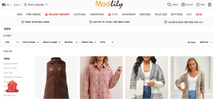
https://www.modlily.com/
Modlily breaks their clothing categories into a handful of main subjects, such as tops, dresses and swimwear. When you click on a category, you see subcategories on the left. For “Tops,” you might see “Blouses,” “Tees,” “Sweaters” and “Hoodies.”
You can even select additional filters, such as size, color, sleeve length, neckline and price. You can then sort by what’s on sale, new arrivals or price low to high or high to low.
2. Aesthetically Pleasing
A beautifully designed site helps the user see what steps to take next and doesn’t distract with garish colors or elements too clustered together. For B2C sites, it’s best to stick with a simple grid layout. Users expect to see products aligned on the page, they don’t want anything unusual on an e-commerce site.
3. Calculators
If you want to wow your customers, give them tools to make their lives easier. What calculators or other wizards you offer will depend upon your core audience and what would make their lives easier.
Think through the journey they take once they land on your site. What information do they need? How can a calculator help them gather the details needed to make an informed decision?

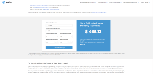
Source: https://www.refijet.com/auto-refinance-washington-dc/
RefiJet features a calculator on their website. You can see at a glance what your new payment might be and how much you’ll save over the life of your loan. Each user punches in their details, making the calculator a highly personalized feature for site users.
4. Responsive Design
More people than ever before use their mobile devices to access the internet. While the number changes constantly, more than half of all internet traffic now comes from smartphones. If your e-commerce site isn’t responsive, you risk losing all that business.
Make sure checking out is a simple process, even from a smaller screen. Limit the amount of input and how many clicks to get through checkout.
5. Search Feature
The best B2C websites have a search feature so users can find what they need quickly. All the filters in the world won’t be as fast as simply typing in what you want and having it pop up. Of course, if you have a large inventory, the filters can help further narrow the choices.

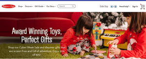
Source: https://www.melissaanddoug.com/
Melissa and Doug sell tons of different toys for all age ranges. While they also use the method of having categories, subcategories and filters, you can simply type a search term into the search box at the top of each page.
6. Optimized Shopping Cart
The majority of people bounce from a site after adding items to a shopping cart. Some of the reasons for abandoned carts include high shipping costs, too many steps to check out and people who are simply browsing.
You can encourage impulse buying by making checkout easy. If someone starts to exit out of your site, throw a pop-up in front of them and offer free shipping or a small discount if they order today. You can also increase your conversion and take advantage of sending a WooCommerce cart abandonment email.
7. Quick Solutions
Internet shoppers want a quick solution to their pain point. B2B and B2C customers often differ in this area. A B2B client tends to think through the pros and cons, weigh the cost versus profit and then make a decision. They don’t run on emotion.
On the other hand, a B2C buyer is more likely to seek a solution to a problem. They may let emotion drive them and are much more likely to make impulse purchases if they feel the solution makes sense. Your job is to show them how you’ll solve their pain point.

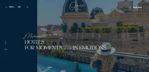
Source: https://www.once-lifetime.com
Once in a Lifetime knows they are catering to people who’ve dreamed of a vacation to one of their destinations. They tap into the emotions behind planning an exciting big trip. From the name of their brand to their tagline of “for moments rich in emotions,” they show the user they will have the finest accommodations imaginable.
Even the images shared on the site paint a rich picture of tourists seeing amazing things they’ve only dreamed about.
Ask Your Clients
Still aren’t sure what features you should adjust? Take the time to survey your current customers. Ask them what works well for them and what changes they’d like to see on your website. The more feedback you have, the better you know your customers and can serve their needs.
