10 Most Attractive Grid-based Web Designs
To make your site look professional, you’ll need to use grids. It’s a popular trend these days. It’s a kind of site that’s based on specific grid that has been placed on the design and divided into various sections, columns, and boxes. The main goal of this type of design is to have more balanced so that every element is lined up in specific places.
But you don’t just put grid to your own site. You need to follow some rules to showcase your content in aesthetic and functional manner. Keep in mind that grid can make your site clean and readable.
This post offers a great collection of grid-based designs. Most of them feature the grid but it’s not evident. By studying them all, you’ll know how to use it appropriately to your own site, thereby, increasing overall user-experience.
1. My Orange Box
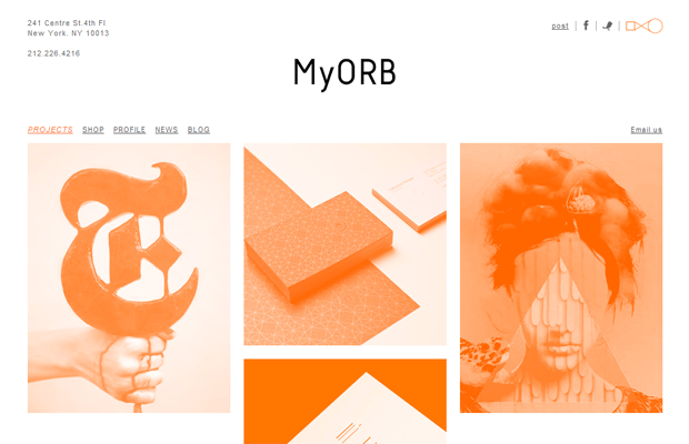
The grid here is pretty obvious. What it does is that it creates rhythm throughout the design. It makes easier to navigate the site. The entire site becomes more cohesive while it gives unity to the design.
2. Track Em Find Em Kill Em

Without the grid, the site’s visitors will surely get lost. The grid guides the visitors throughout the site, thereby, providing them better reading experience. There’s balance and harmony.
3. Bernd Kammerer

The grid here gives the necessary outline for the photos being showcased by Bernd. It helps the photos to be positioned in different elements without ruining the overall design. By combining circular and rectangular shapes, the site becomes beautiful and it just feels right.
4. Rosie Lee
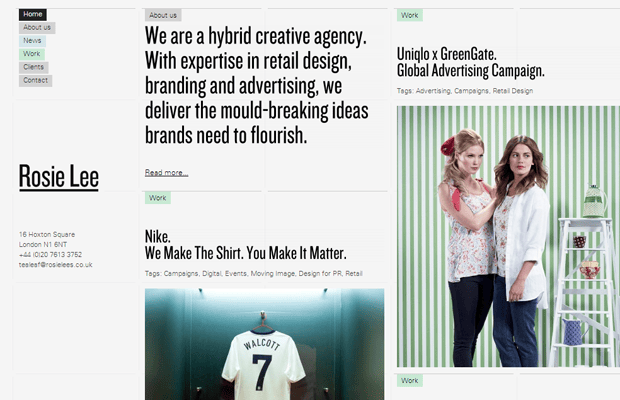
If it used red as the predominant color, you’d think that the site mimicked the style of Pinterest. Thankfully, it didn’t. This creative agency’s site has lines but they’re not visible to the visitors. Although they’re invisible, they surely create a distinct organization to the overall design.
5. Z Index
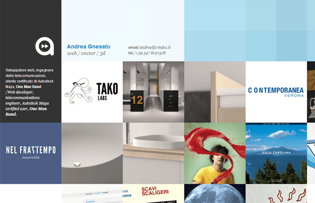
It has a flexible design with many columns and rows that have been used. The groups are broken into smaller parts to make the overall design fluid. Through the grid system, this site can be easily viewed using different browsers and devices.
6. Faces Of NYFW
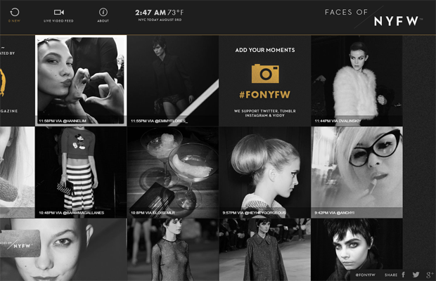
It’s made of varying numbers of columns. Even though it uses a grid system, it looks as if it doesn’t have grid at all. Thanks to its multiple grids present. Its columns may not be fixed, the site can still adapt to different browser sizes. This also means that it can be viewed using a mobile device.
7. Psych N Psych
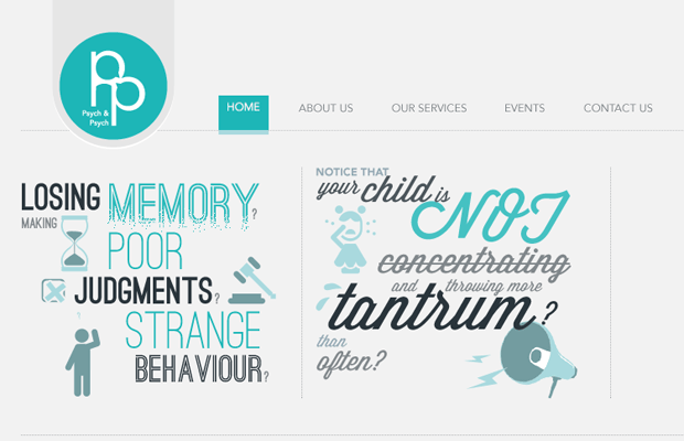
The grid structure is obvious here but it doesn’t take out the system’s beauty. The designer of this site did consider all of its elements to make sure that each element plays a part in providing the right rhythm for the entire site.
8. Reserved
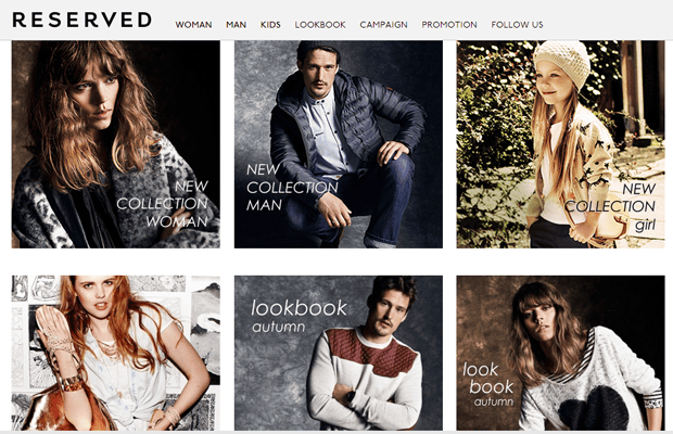
This site uses a visual grid. It takes a lot of math to use this system but the designer did pay attention to details across the different elements of the site. It shows off the photos, which are full of colors and graphics.
9. Necto

It uses unequal grid to differentiate one product/service to another. To further put emphasis on a photo/item, the cell’s sizes are different. The cells with the bigger size showcase the service. Those with smaller sizes display miscellaneous items.
10. Betel Bar And Kitchen

It’s another good example of uneven grids that showcase various foods served by such restaurant. It gives its audience strong feelings through its neatly-organized items that bring all images and text together in a harmonious manner.
There are just too many things that you can do if you use the grid system when creating a website. The examples showcased will convince you that your site needs a grid. Whether you use grids with equal widths or uneven heights, you have to consider what it can do to the overall design.

