12 Most Attractive Non Profit Websites
Creating a non-profit website is almost the same as creating other types of websites. This means that it must be user-friendly and easy to navigate.
It should also use the right fonts and colors. However, this type of site may have elements that aren’t found in a typical corporate website.
A non-profit site must make it easier for the visitors to find out the cause of the organization so they can easily donate money, in case they decide to become a donor.
The contact numbers and other important details about the organization should be prominent throughout the site. It needs to have all necessary elements that make it more inviting to targeted donors or volunteers.
When you’re designing such site, it’s best to follow those practices mentioned above.
If you’re not sure yet on what to do, then take a look at these non-profit sites. So far, they’re the most creative websites for NPO.
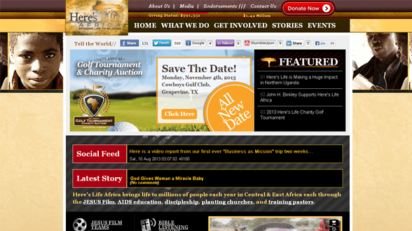
1. Here’s Life Africa
The Donate Now button is very visible on the site. It makes it simpler and more straightforward for the targeted donors to give money. This means that they don’t have to scroll up and down just to look for the button when they wish to donate. Plus, the overall design is very attractive as it features the real cause of the organization.
2. 1Love
Just like the number 1 site on this list, 1Love’s donation process is painless. It doesn’t require targeted donors to set up an account with them just to give money. Thus, it makes the donation process uncomplicated, unlike other online transactions.
3. New York City Coalition Against Hunger
This site is one of the best examples of a site that’s media-friendly. It allows other people to talk about the site, which may help in bringing in more donations or raise the organization’s profile. It includes profiles of the group’s board of founders/directors.
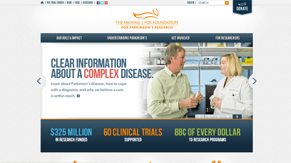
4. Michael J. Fox Organization
This site isn’t only user-friendly but it’s also volunteer-friendly. The overall theme makes it easy for potential donors or volunteers to find details on how they can get involved with the organization or the cause. Keep in mind that some people may not have money to donate but they still have the passion to help the organization.
5. Plant With Purpose
Without reading its mission and vision, you’ll know that it’s about the environment. The site uses the shades of green to emphasize the organization’s purpose. The overall design revolves around the main mission of the group.
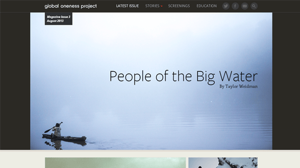
6. Global Oneness Project
In here, the main vision of the organization and the content of the site take center stage. It doesn’t only have an interesting design but the theme focuses on the content and mission of the organization. The designer of this site seriously considered the pieces of information to be highlighted.
7. Court Appointed Special Advocates
The multi-media elements of this site are used to highlight the vision and mission of the group. The width and other elements complimented the type of media being used making it more attractive. With that in mind, the site’s design doesn’t look haphazard.
8. Stop Child Labour
In here, you’ll notice the colors used in the logo are almost the same as the colors of the promotional materials. Thus, it maintains a consistent branding throughout the website. With that in mind, the visitors won’t forget their experience while they were there getting to know how to stop child labor.
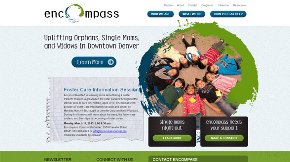
9. Encompass
The site’s purpose is clearly provided. It doesn’t have unnecessary details that may cause visitors to leave the site and forget about giving donations. In here, the organization’s goal, which is to uplift orphans, single moms and widows located in downtown Denver, is highlighted at the front page.
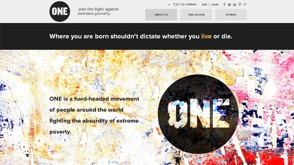
10. One
The site has the most compelling content found at the top page. It uses strong image to help in building connection with potential donors or volunteers. First-time visitors don’t have to guess about the real mission of the organization. It’s already provided in front of them.
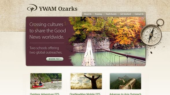
11. YMAM Ozarks
The home page describes what the organization is all about. It uses simple yet captivating words to invite more travelers to travel with them. This site’s designer did a lot of things right. All important details of the organization are prominently found at the home page.
12. Not For Sale
The multi-media content is featured in different forms, like slideshows and videos. Its overall design is simple and straightforward. It explains what the organization does and how visitors can help the group in raising awareness about child slavery and labor.
The websites listed here all followed the same useful practices of how a NPO site should have, i.e. to make it more donor/visitor-friendly. Although all of them are very attractive, they’re still simple and easy to understand.

