10 Remarkably Attractive Portfolio Website Designs
In order to make a minimalist website design, you’ll need to make it look sleek and simple. The navigation must be easy that it doesn’t confuse your visitors. Unfortunately, it’s not too easy to make your website simple. But, if you only focus on the important elements of your site, then you’ll achieve your goal. You just need to get rid of unnecessary pages and offer more content while you limit the colors and images you use.
Are you ready to simplify your website design? That’s great. But do you know where to start? You just can’t fine-tune your site to make it look simpler. You need to make a thorough plan and some inspiration, perhaps. Take a look at these minimalist portfolio designs to help you get started. They’re clean and simple. Their designs quickly show what they can offer to their visitors, thereby, helping their message get across more efficiently.
1. Swear Words
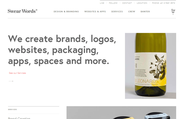
The layouts are unique and simple. It has powerful headlines. Their digital works are displayed in the middle. Essential elements of a webpage are there. The content is delivered effectively as it’s the main focus of the design.
2. Brave People

The overall design offers pictorial display of the content. It’s simple but it’s not oversimplified. It’s very intuitive allowing users to interact with the site easily. There are no distractions that make visitors leave once they’ve landed to the home page.
3. Washenry.com
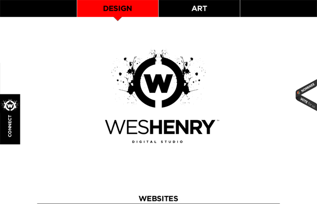
The overall design is very refined to the point that the only elements present are the essentials making it a successful minimalist page. Each element is cohesive and suits with the overall look and feel of the website. It utilizes few colors to catch the attention of its users.
4. Levi Wintering
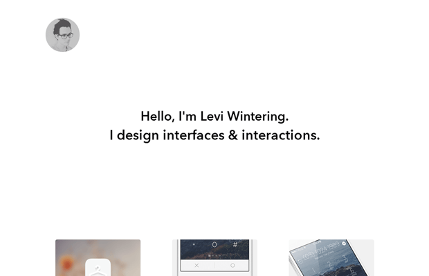
This site has trimmed down the page count making it easier for the visitors to focus on the content of the site. The navigation is simple and there’s less places that you can click around. The visitors won’t get overwhelmed.
5. Ashley Frasier
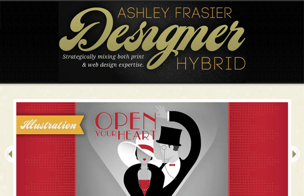
You can find too much white space in it helping the content to be the main focus of the site. In here, the important elements aren’t jumbled together. The visitors can easily navigate through the site. It’s inviting and very user-friendly.
6. The World We Live In

The main content is located above the fold, which is good. It also utilizes simple colors. The colors don’t distract the eyes. Instead, they complement the content. It uses a grid that aids its viewers in browsing through the site.
7. Risk Everything
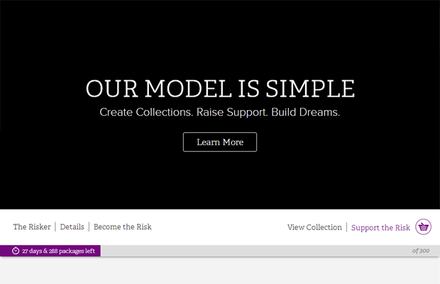
It effectively uses white space providing the site the elegance that it needs to make a lasting impression to its visitors. Its colors effectively interact with one another, thereby, highlighting the important elements of the site. The designer chooses to go with simple colors.
8. Little Lines

The About Us is briefly discussed on the first page. Type faces are clear and simple. It doesn’t use unusual colors that could distract viewers. The photos presented are accurate. They truly represent what the company is all about. Plus, it’s easy to move around.
9. Norbound Design
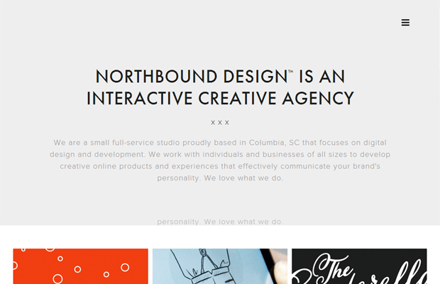
It includes proper graphics and more whitespace. The images used are eye-catching. The description of the presented work with red background as you hover is truly a nice addition to the design. It makes the overall presentation interesting.
10. Giellesse
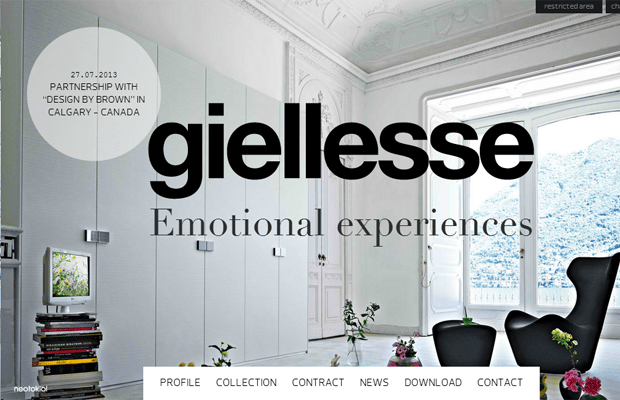
The whitespace makes the overall design straight to the point. The navigation menu is well-presented. This minimal design allows the site easy to navigate.
When it comes to creating a minimalist portfolio, you need to consider that less is more. It’s clean, which is always a great thing. These examples put their products/services against simple backgrounds/images. They offer a room for the product/service to speak for itself. The visitors will have a good feel each time they visit.