10+ Stunning B2B Website Examples & Inspirations
Closing a deal directly with an established business is much harder. Since these businesses have the cash flow to protect, offering a solution that not only resolves problems but also comes at an affordable price is another consideration. Understanding this allows you to come up with a stunning website that not only impresses but also converts. Here, we have 10+ Stunning B2B Website Examples & Inspirations you can browse and take inspiration from.
10+ Stunning B2B Website Examples & Inspirations
1. Asana
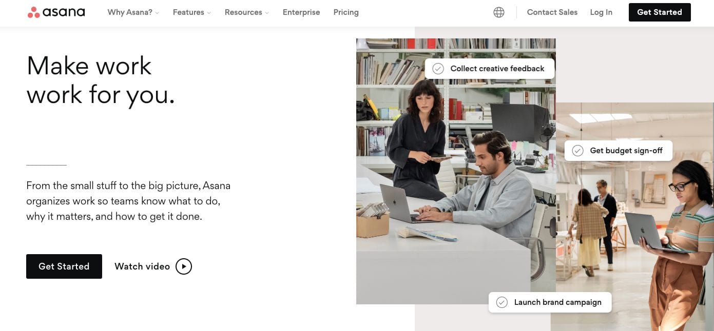
With a simple website design that’s complemented with impactful copywriting, Asana aces in communicating and connecting with their target businesses. They put importance on little things that paint the whole picture which goes well with their solution. Besides this, they also have strategic call-to-action placements that encourage the visitor to take action — whether it be in getting started with them or watching another video about what they offer.
- website: https://asana.com/
2. Grammarly
Grammarly wins as one of the best stunning B2B website examples you can explore. They have a distinctive flat design with minimalist elements and straightforward copy. With one look at their website, they are also able to express what service they offer through a live overview. Their call-to-action buttons direct the audience to check their price tier per subscription — encouraging them to close the deal.
- website: grammarly.com
3. Hire Level
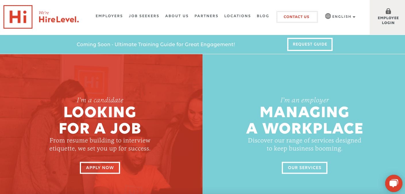
Playing around popping colours, Hire Level autopilot assorts the audience to either of their solutions offered. This helps them have a more specific approach in terms of content strategy and call-to-action buttons. Moreover, the menu bar on top is helpful for ease of navigation. They also have blog features and photos of their team for a more human approach.
- website: https://hirelevel.com/
4. Adobe CMX
Aligned with Adobe’s creative nature, Adobe CMX delivers an unconventional layout with bright colours and a playful text layout. Hand-in-hand with a well-written copy, they blended visuals and eye-catching little animations sure help to capture the attention of the readers. In between, there are also direct quotations and photos of team members which establish authority without being overbearing.
5. Packlane
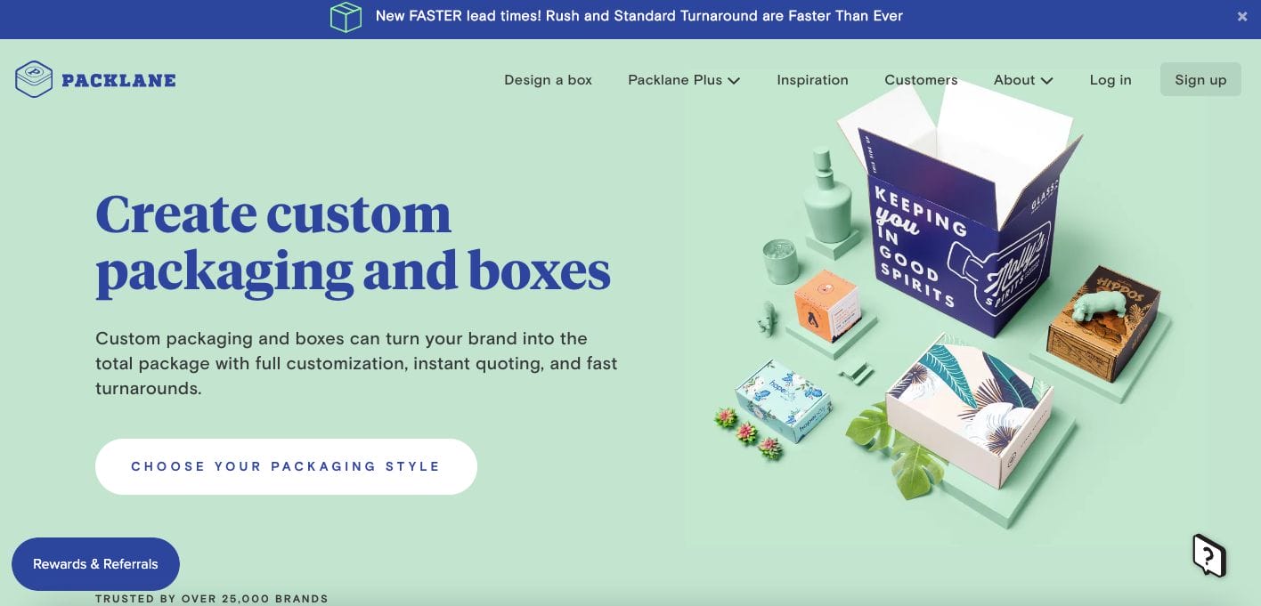
Packlane is another best B2B website example you can check out. They have a modern and youthful design which exudes creativity in their nature. Perfect in leaving an impression on potential partners, they showcase whom brands they worked with in the past and what they can bring to the table. Scroll further and you’ll also see a video material showing how their platform works.
- website: https://packlane.com/
6. Zendesk
Playing around with colours, Zendesk knows how to catch your attention and make you crave more information. They have a professional B2B website you can take inspiration from. Moreover, there is a lightbox pop out when you land on the page — catching you off guard and encouraging you to take action with a CTA button. There is also an emphasis on a free trial which subtly converts these audiences to users without much commitment.
- website: https://www.zendesk.com/
7. Plink

Non-conventional with a playful and creative website, Plink piques the interest of the audience. With their attention to detail, they may be youthful in nature but in no way novice in the industry. The use of dark elements and base colour helped their one-liner headline stand out and remain on the audience’s mind. Scrolling further, their use of moving animations also helps with those who skim.
- website: https://useplink.com/en/
8. Weblounge
Weblounge kept is neat but professional with their website. They kept it light and simple with the use of neutral colours and spaces. Furthermore, they also kept their copy short but communicates what they do with just a few words. There are also call-to-action buttons to direct clients to learn more about them. Visually driven, they have a montage of their previous projects that they can check out too.
- website: https://www.weblounge.be/en/
9. Mailchimp

Popular because of their vibrant and fun website design, Mailchimp prepared an impactful copy with a call-to-action to encourage impulse response to triggers. They also used images that appeal to creative people and also showcase their creative background to those without experience in content creation. Furthermore, they added statistics to easily communicate their success stories along with brands they previously worked with.
- website: https://mailchimp.com/
10. Yapstone
Yapstone plays around with the classic minimalist design with a touch of colour. They implemented their brand colour subtly without overpowering the clean interface. Moreover, photos are also added of people who use the system and who represent the brand which helps establish that they care. Call-to-action buttons are also peppered in each section which sure can help initiate interaction.
- website: https://www.yapstone.com/