10 Most Beautiful Landing Pages In Minimalist Style
Landing page is an important element in Internet marketing as it can help you convert leads into customers for your own business. This type of page has two categories, namely reference and transactional. The former aims to provide information that’s appealing and relevant to your customers. The former is geared towards making immediate sales.
Most landing pages meet these two categories. They inform visitors about a particular product and offer them something that’ll convert into sales. But the essential ingredient in this page is to make your message clear and express your offer in an enticing way that’ll surely convince your visitors to purchase, signup or whatever you want them to do.
There are many designs that you can follow for your own page and one of them is the minimalist style. It’s simple yet catchy.
In this post, you’ll find a collection of actual minimalist landing page examples for your inspiration.
1. Pocket
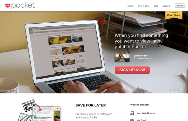
Above the fold focused on what the product is all about, rather than the information about the company. And if you need to know more about it, you can just scroll down. Its top page contains only the benefits of the site and the actionable item, i.e. Sign Up Now.
2. Simple
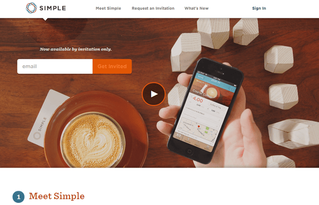
Although the site is a complex one, the concise description about its service is the only thing that’s being provided at the top. This page doesn’t pitch anything to its customers as its audience doesn’t have to know anything else but the product itself.
3. Path
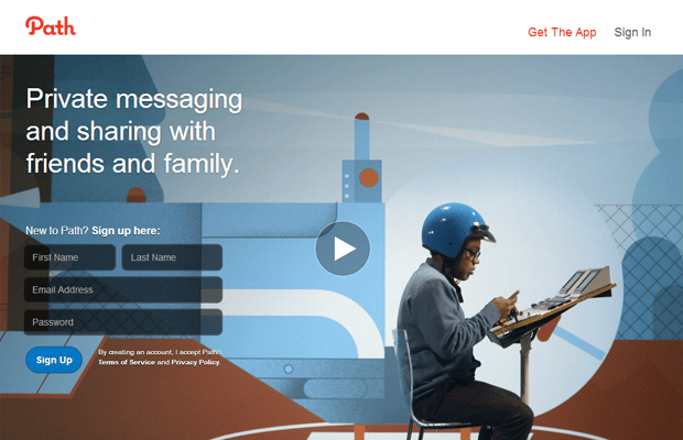
In here, the visitors don’t know that they’re being pitched to. This is important. Keep in mind that your audience doesn’t care about your company. What they’re really after is what you’re selling. And it’s clearly stated at the top of the page – “Private Messaging And Sharing With Friends And Family.”
4. Levante

It doesn’t have too many distractions making it simple yet elegant landing page. It immediately tells what makes the product different from others.
5. Square Space
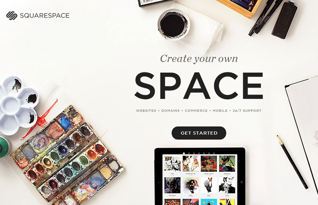
It’s a landing page geared towards people who want to have their own sites and domains. The slider may be something that you must avoid, but in this case, it’s not at all disturbing. It clearly gives explanation of what the site is all about through different photos presented.
6. Beta Takaki

In an instant, you’ve a clear understanding of what the service is all about and how you can take advantage of it. The background image, which is the snapshot of the actual working place, doesn’t cause a distraction. In fact, it’s the essence of the site.
7. Iuqo.com
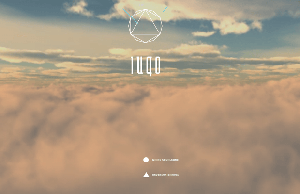
It doesn’t have a lot of information that forces you to read everything. It has navigation that can somehow reduce bouncing rates. It’s beautiful.
8. Kin

It has strong call-to-action. Its slogan is also clearly stated. The top page includes minimum amount of text. It gives you an option to play a demo video or simply try its product. A demo video is great for people who want to watch short film, rather than to read texts.
9. Gengo
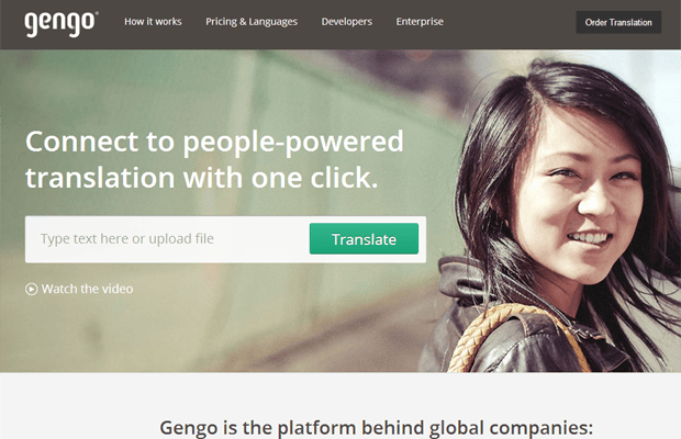
This landing page is another reason you should opt for a minimalist design as less is more. It looks very neat with one button and a prominent header. The message is clear without overcrowding its page. It doesn’t provide all features of the service but only the benefits.
10. Streak
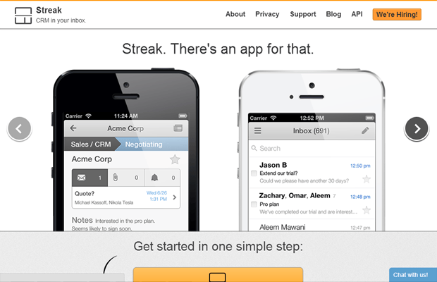
It’s easy to navigate and browse across the elements of the page. You can find the things that you’re looking for to better understand the service. It’s a good idea to place a demo video to help visitors get to know more about what the product is all about.
The importance of a landing page shouldn’t be underestimated. But you’ve to create a page that’ll make a sale, rather than overwhelming your visitors with too many information. With these examples here, you’ll realize that less is always more.

