10+ Best Professional Services Websites Examples & Inspirations
An online presence is a must-have to boost a professional service business. It can come down to color scheme, ease of use, content, and unique elements to set a well-designed website apart. This difference can result in better sales, more patrons, and exposure.
Take the step to getting better business opportunities and be creative. Here are 10+ Best Professional Services Websites Examples & Inspirations that can help you get started on your site today.
-
Seatrend Strategy Group

As a company specializing in corporate strategy development and implementation, Seatrend’s website design example is one of professionalism and experience. They use striking photographs to divide the page into five sections. The fonts used are remarkably sleek and easy on the eyes. It is a breeze to navigate with smooth transitions, helpful information, and a good combination of text and images.
- website: http://www.seatrendstrategy.com/
-
Roulston Urquhart Criminal Defense
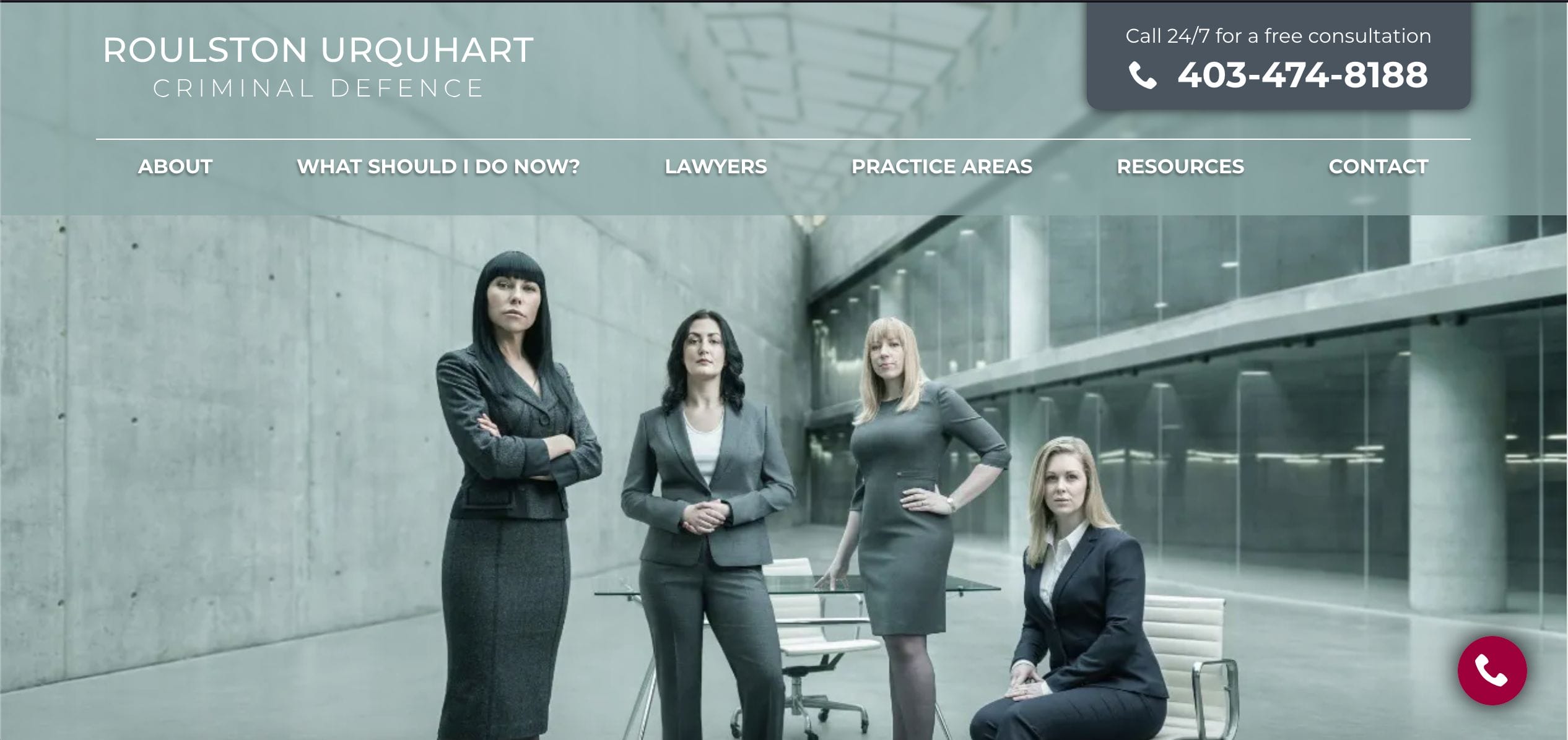
The Roulston Urquhart Criminal Defense site is one of the most impressive you’ll ever come across. The page opens to a commanding photo of four defense lawyers that will immediately grab attention. The monochrome color scheme allows the user to concentrate on its content. It focuses on testimonials, services, and proof of expertise. Intelligent use of graphics and large text puts the spotlight on data and details for effortless browsing.
- website: https://calgarydefence.com/
-
Fertility Specialists of Western Australia
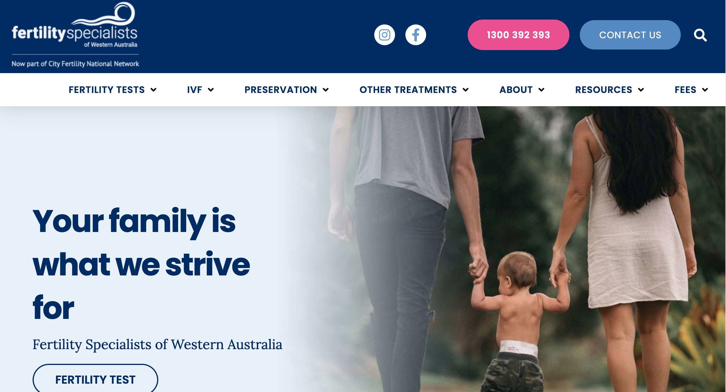
In the medical field, it is important to establish a connection with potential patients through all avenues – including your website. This page is straight to the point and very welcoming for interested parties. A slideshow of images greet you when you load the page. These photos of families and medical specialists aptly link to specific blog posts through distinct clickable buttons. You see the practice’s affiliations along with a well-planned block dedicated to their areas of specialty. They complete the website with their credentials, informative content, and relatable icons.
- website: https://www.fertilitywa.com.au/
-
Skylab Architecture
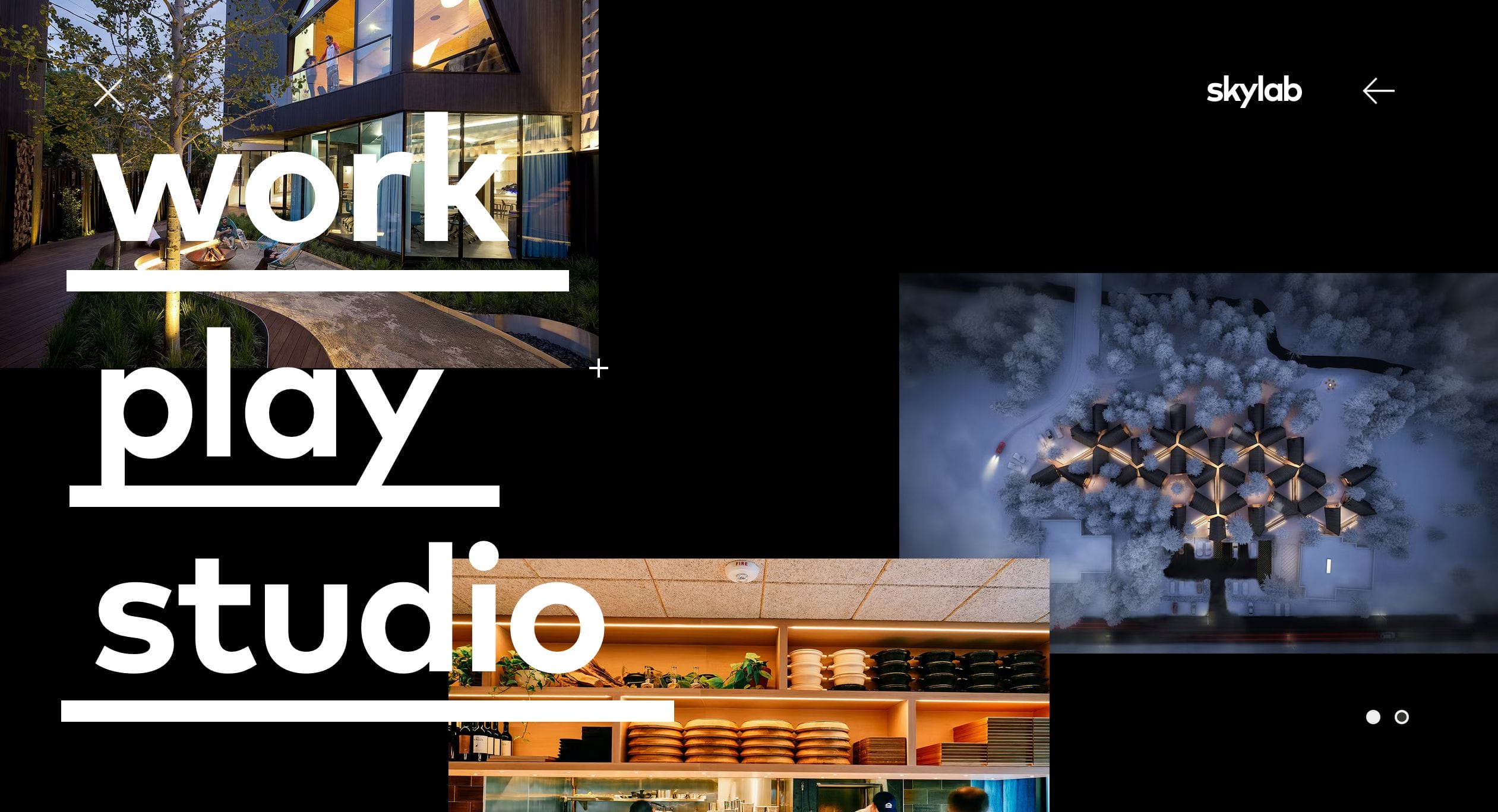
True to its expertise, Skylab Architecture brilliantly used its impressive portfolio as the backdrop of its website. The curated images of their work contrast the black background and large text. Each photo is clickable and leads to information regarding the particular project. They have a menu in the upper right to help the user screen their area of interest and go from there.
- website: https://skylabarchitecture.com
-
Sherpa Design
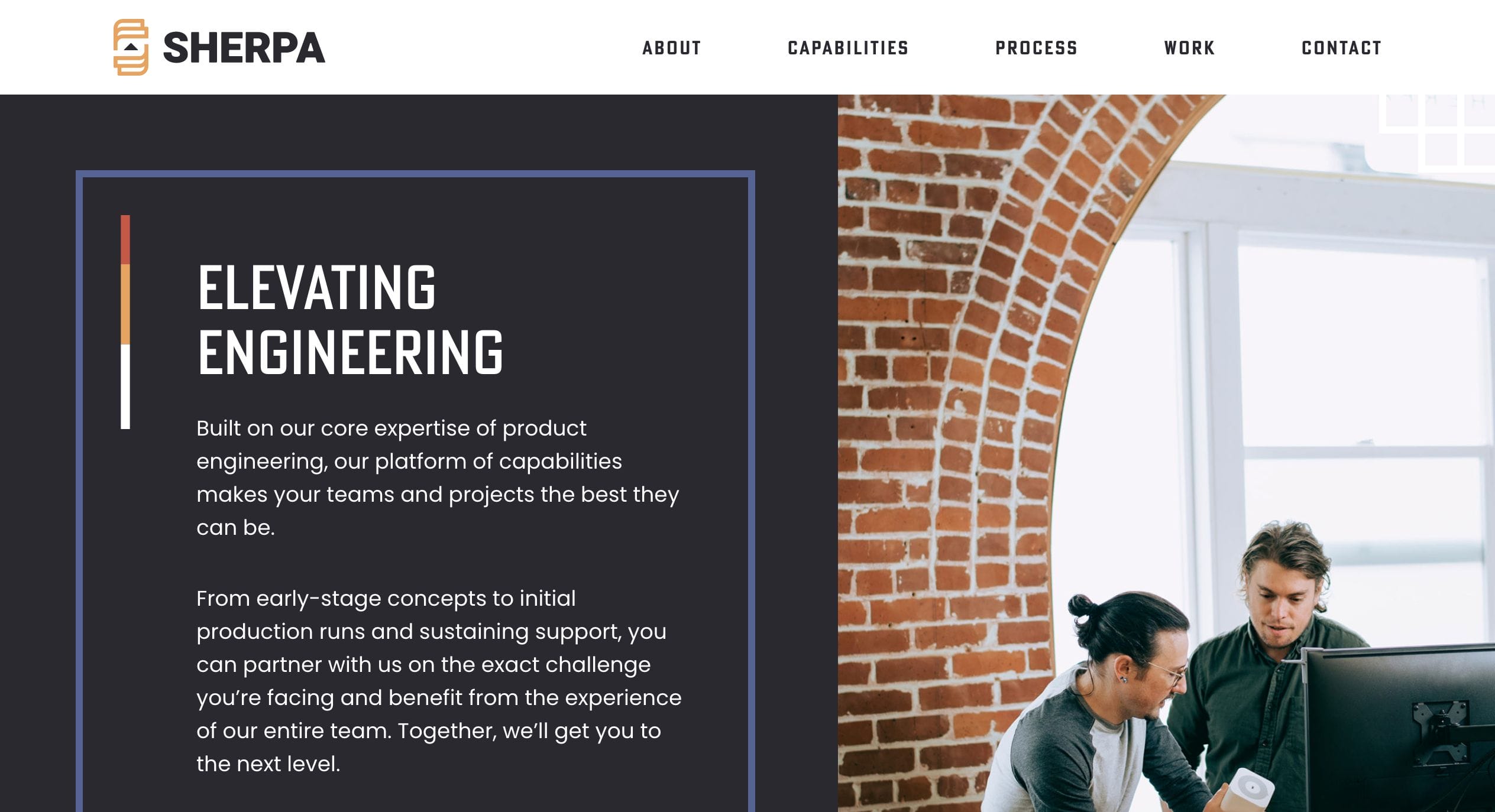
Another page to drive website design inspiration from Sherpa Design. Their page layout is simple and very easy to use. Above the fold, you see their logo and a menu that includes all the musts-knows of the company. They use boxes as elements to highlight their services and credentials. Hover over these boxes to find more information on the subject. The site uses a cohesive color scheme that ties all the elements together.
- website: https://sherpa-design.com/
-
Liebert CPA
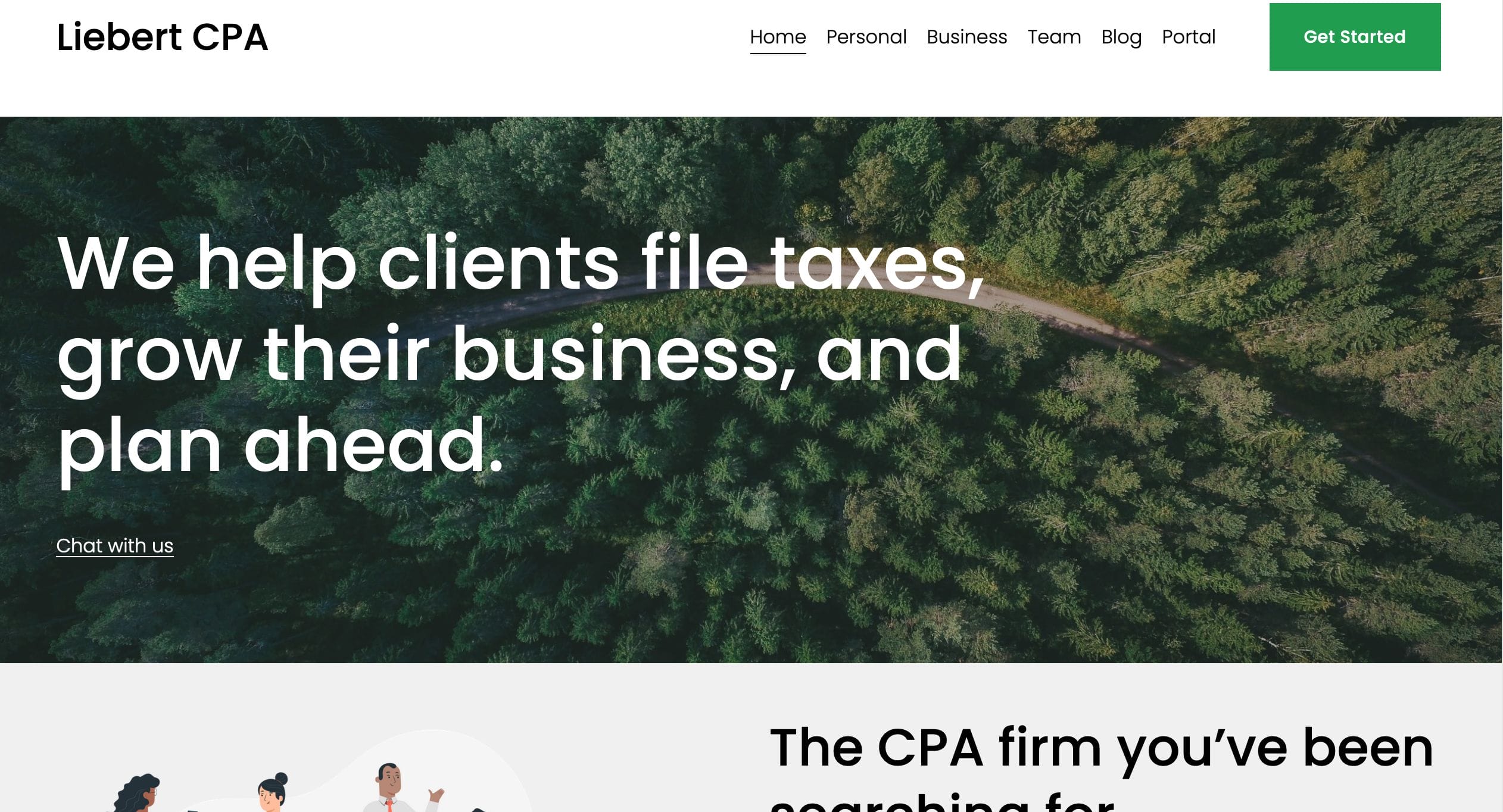
A good web design can make a tough topic like taxes more relatable to clients. Liebert CPA uses appealing graphics to demystify this topic and its services. It is simple to browse through the page and its links. Most importantly, they can establish rapport with clients through a clean and user-friendly interface.
- website: https://www.liebertassociates.com/
-
Swish Smiles
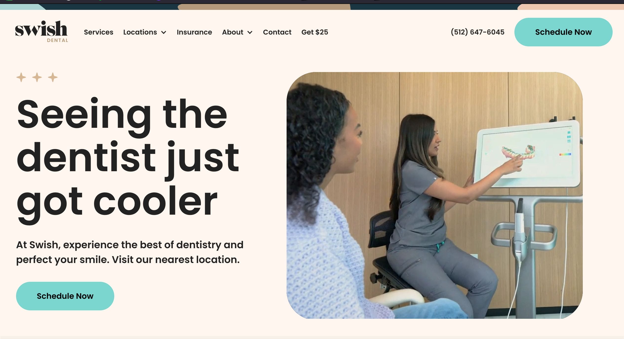
Swish Smiles’ branding is definitely on point. Their approach to making dentistry “cooler” is apparent in their website design example. The color palette, fonts, videos, and graphic elements give a youthful vibe. The featured photos come in rounded shapes to complete the youthful aesthetic. This is a friendly website from design to content. It almost makes you want to schedule an appointment with them asap.
- website: https://www.swishsmiles.com/
-
YLAW
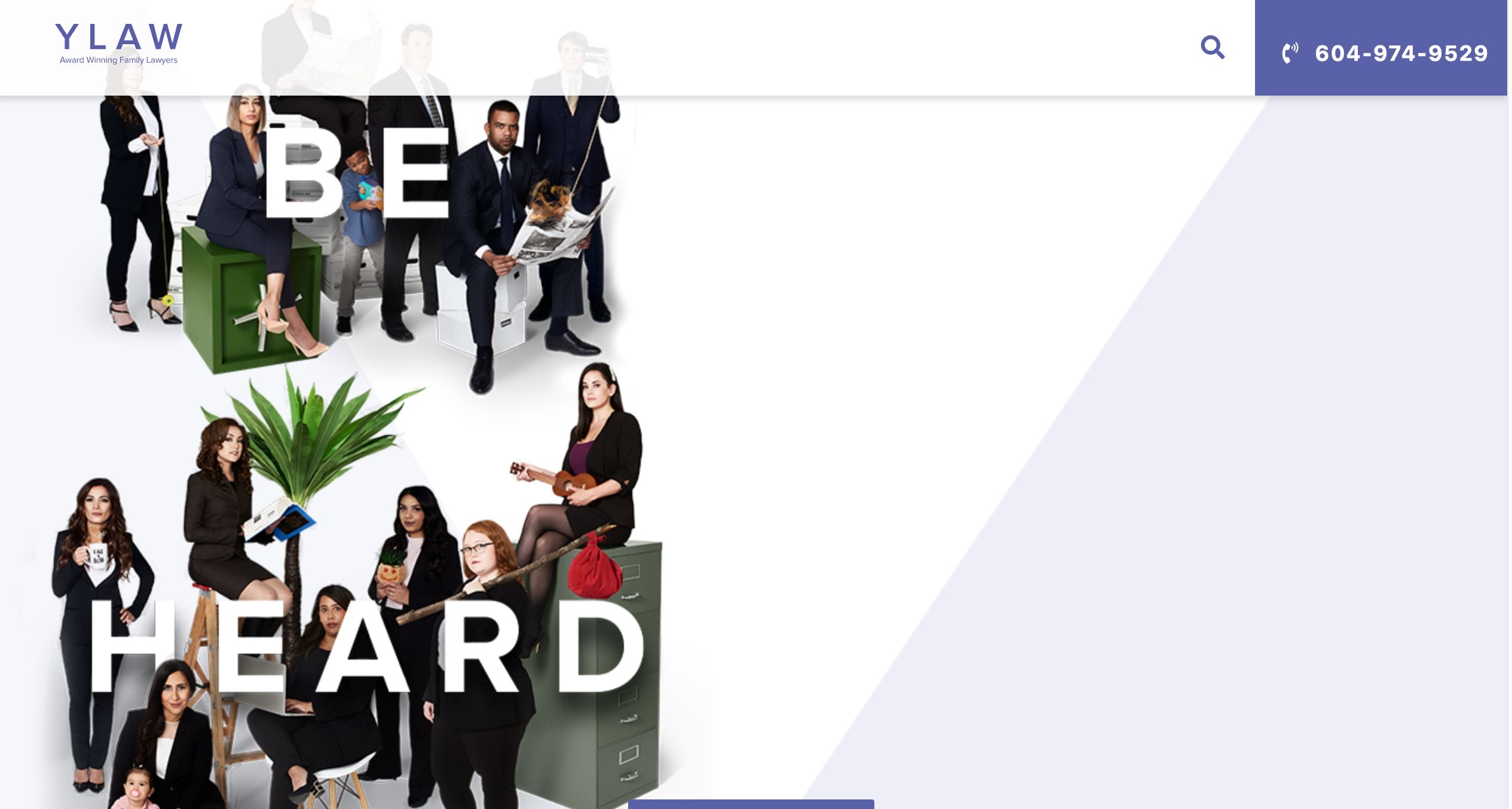
YLAW’s website is on point. They want you to know that they are a formidable practice that HEARS your concerns. This is evident upon opening their page. They immediately introduce themselves as award-winning lawyers with years of experience. They focus their layout on showing potential clients their expertise and accolades to establish credibility. They use pastel tones for relatability but contrast this with gripping photos of their lawyers.
- website: https://www.ylaw.ca/
-
Ascent Corp

Ascent Corp.’s website contains a wealth of information for interested parties. The homepage opens to a typical slideshow of high-resolution images that describe their services. They use their logo’s orange color as the same focal shade on their page. They have made a fool-proof site that is convenient to navigate. Their dropdown menu on the upper portion leads you to all you need to know about their company.
- website: https://www.ascentcorp.com
-
HBK Engineering
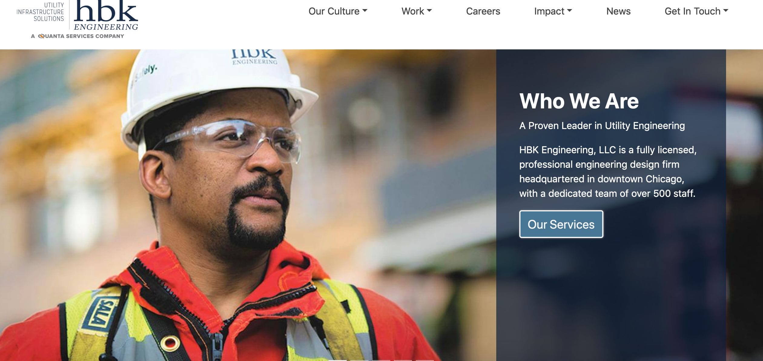
Images grab user attention, and HBK Engineering utilized this throughout their page. Aside from an accessible menu on the top, you will find photos on their website that link to different pages. You hover over these for a short description and link to the next page. They use graphics, pops of color, and content to fulfill the needs of their clients.
- website: https://www.hbkengineering.com/
