Best Single Page Website Design Inspiration
Some say it works best to have a single-page website running, while others claim that it’s just a waste of time and resources. Some would even claim that it is now an ongoing trend, while others say that it will not last long. But no matter how they look at it, it’s inevitable that there are but hundreds of single-page websites that are superbly designed. Well, guess what? They just compete very well with its multi-page rivals.
We’d love to take a look at some of these incredibly designed websites today. This might be a long journey, but the inspiration is worth all of it.
1. 2Advanced Studios, LLC
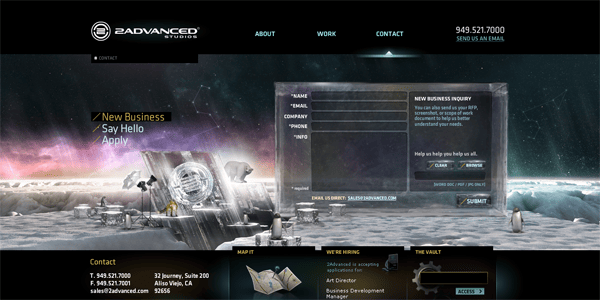
With rich stellar elements, sparkling and highly detailed graphics, 3D animations, and other flash contents, the website by 2Advanced Studios tops my list. I love the aura and the feel of this website as it really puts me in a mood for creativity. Switching between tabs also incorporates a sophisticated kind of animation. Moreover, all contents do not load that much.
2. Basil Gloo
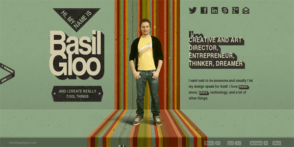
Wanted to see Basil as the stunt guy getting trapped while you scroll the page? Check out this incredible website by this creative director and entrepreneur. All elements involved—starting from the loading animation—is a showcase of creativity and professionalism. That friendly approach to presenting information and portfolio items is a plus. Beware though as you might take too much fun scrolling the page up and down.
3. The Dollar Dreadful Family Library
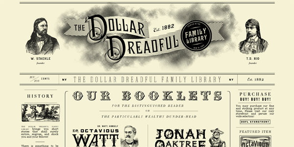
If you want a subtle taste of vintage newspapers and design styles, this should not really miss your collection. This site contains a lot of texts and a slight amount of graphics, but honestly I did not know where to start looking at. At least the design does it right.
4. 1020concepts
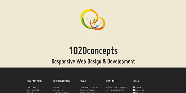
This very simply website designs wins over me for being very straightforward, and at first glance, you already know what they offer. You might also mistake the site as having a lot of other pages but in fact, they’re just outbound links. Too bad we can’t see a portfolio here.
5. Josh Minnich

Nothing beats the ‘uselessness’ of this website, at least to my perspective. There’s not any need to scroll because there’s nothing to scroll even if your restore your window and resize it. All you get is the logo(?), and the links to social sites. Anything else? No, you can’t find them here.
6. The One
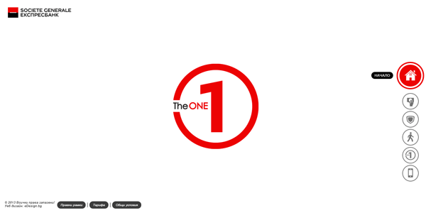
HTML5 is not really overly dominating the world of websites these days, but for some, only a few are remarkable enough to maximize its potentials. This credit card company does it very well to present how advanced their company is even though its center of attraction is the card itself. It may take a short while to load, and too bad, I don’t understand the language.
7. James Bond Cars

Avid fan of the 007 superstar? Check out Bond’s best rides since the time he was ‘born’ up to present. The website uses rich content in very strong colors, and is interactive enough using creative transitions covering the whole of the page. Just in case you’d ask, no, Mr. Bond is not here to meet you.
8. Mustasj
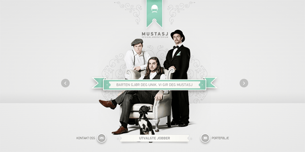
No need to use the scroll wheel of your mouse to tap in between different sections of this single-page website; use the arrow keys on your keyboard instead. The Mustasj Design Laboratorium is a very unique non-English design agency, and its website is a manifestation of what they’re good at. Animations are smooth, fast and very responsive, and all the elements contained are very consistent from top to finish.
9. Ready to Inspire
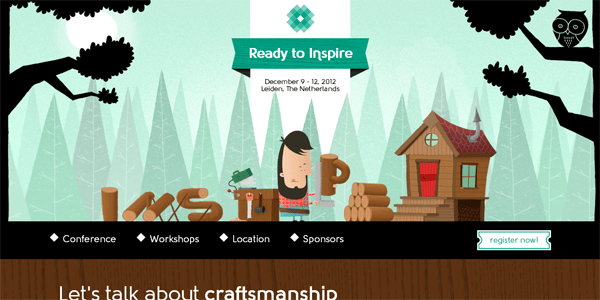
This website may just be intended as an invitation to a conference, but incredibly, this design may also be one of the most popular single-page websites ever designed. The illustration consistency is top-notch, and the fun part comes in when you did not recognize the smoking fading in and out of your attention. The set of speakers for this conference is also uniquely designed, and what’s more is that, down to the bottom, you see a very strong sense of artistry and effort going on.
10. Pixel Lab
![]()
With rich HTML content but very subtle images, Pixel Lab is among the top design company that is sought by the fortune 500 companies. The website of Pixel Lab itself is very simply, but the cool animations may be worth watching like they’re entertainment in itself. If they helped upgrade the famous game ‘Cut the Rope’ and created a billiard game to showcase the late IE9, what’s next for them?
11. I Track My Time
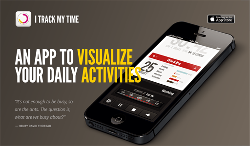
No, this isn’t a real website at all; it’s an advertisement that works more like an official website or landing page. The I Track My Time here is an iOS app that you can use to monitor your daily activities… and that’s all. If you want a preview, check the phone laid in front of you. Want a download? A link is also very visible, and I hope you won’t miss it.
12. Festa Italiana
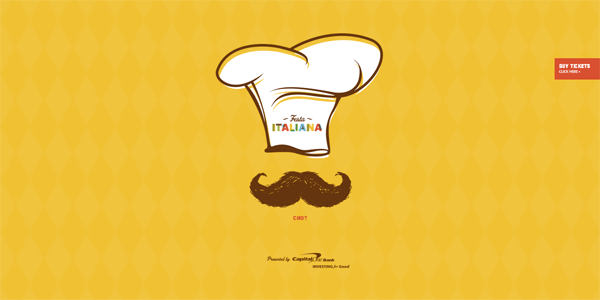
A website for food and beverages but leverages in more than simply a menu. Festa Italiana’s website involved rich colors and whole-page immersion, but with easy and smooth animations to keep the audience engaged and feel contented. I may not like the too much amount of space, but I know for sure the big elements and bigger font size do well in balancing everything in its design.
13. Barcamp Omaha 2012
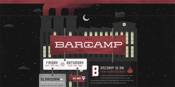
From start to finish, the website of Barcamp 2012 is much like a short movie or a short story trying to tell its own tale. Coming in a dark grey design, I thought this website was designed for like two years or more because of those amount of illustrations and animations, but the truth is what I really don’t know. All I know for sure is that, the designer is just too well for his job.
14. AppDock
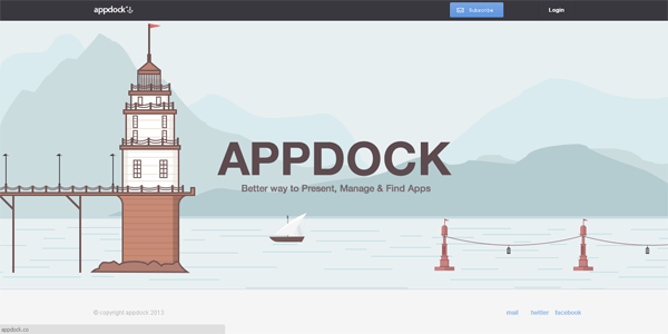
A very simple, subtle, and user-friendly website this is, AppDock really did a good job in presenting its motto: a better way to present, manage, & find Apps. Plus to the quick illustrations are some transitional animations that will greet you as you scroll, and better than this, quick links for mail, Facebook, and Twitter are always at the bottom for you to click unto.
15. My Own Corks
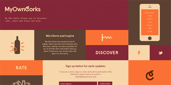
Using the unique art of using both modern and vintage schemes, the website of My Own Corks is so simple and elegant with that classic feel because of the choice of colors. Links may not be really highlighted properly, forcing visitors to hover their mouse on each tile, but the main call-to-action figure is here: just sign up for early updates. With no need to scroll and without any distracting elements, you won’t also notice that this is a directory for searching wines.
16. DayBreak 2012
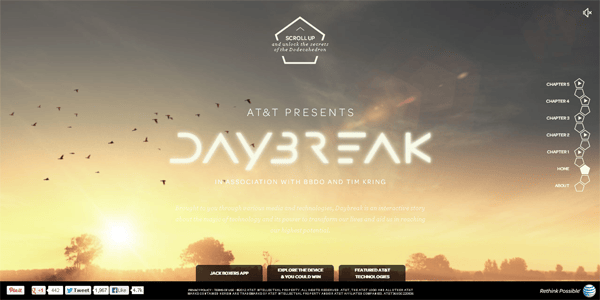
One of the most mysterious one-page websites I’ve ever encountered, this AT&T-presented interactive story features hidden gems behind interactive objects. More interestingly, instead of scrolling down which is usual, the first thing that you are requested to do is to do the otherwise: scroll up. And before I forget, yes, you may want to heighten up the volume levels of your speaker system.
17. Eone
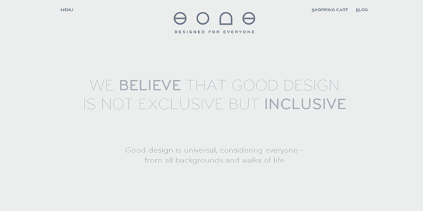
Featuring the inspiring story of Brad Snyder, this Bradley-making company has a very distinct way of presenting its line of products. The site involves a whole lot of contents to ‘scroll’ along, but what you get in the end are prisoner-like portraits of the people behind the product design. Just in case you run out of time trying to read everything you encounter on this interactive website, check out the ‘menu’ link on the top left of the screen.
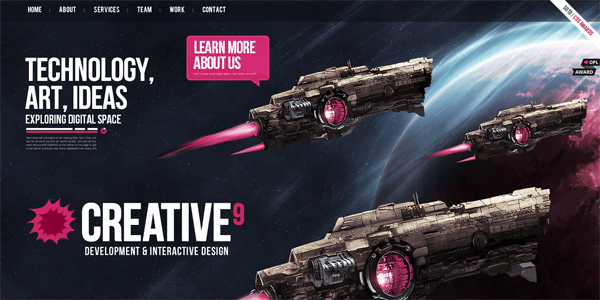
18. Creative9
And lastly, if you are looking for a more futuristic one-page website, then Creative9 does a lot for its own show. Featuring cosmic design elements from background to animating starships, you might mistake the website to be referring to the game ‘StarCraft.’ Objects move as you scroll along, and I personally love the numerical animations contained which do not represent real data at all. And as you end scrolling the page, you’ll see the spaceships all coming back to ‘say hello!’

