10+ Best Biomedical Web Design Examples & Inspirations
In the field where biology and medicine meet, building credibility is just as important as presenting the brand in the best light possible. Encouraging health establishments, professionals, and even the mass audience to put their trust in medicine, equipment, or whatever solution a brand offers relies on a good first impression and a strong track record. With this in mind, we listed 10+ Best Biomedical Web Design Examples & Inspirations that you can check out.
10+ Best Biomedical Web Design Examples & Inspirations
1. Johnson & Johnson
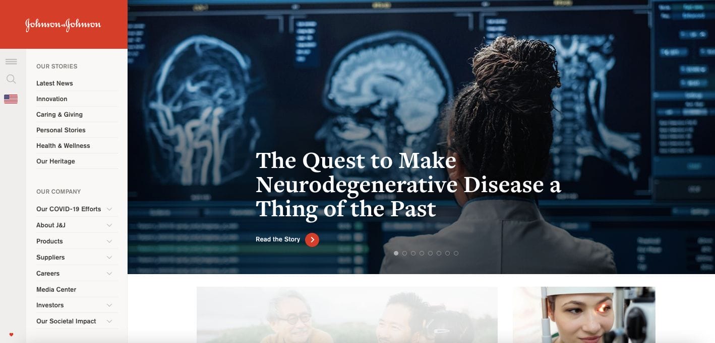
Johnson & Johnson has been a household brand for gentle products and biomedical solutions. For over 130 years, they managed to stand strong and adapted to the trends of today. They kept the menu navigation on the left, encouraging the audience to easily navigate through the web pages of offerings and stories they have. Moreover, their use of graphic art representing different people and in various colours emphasizes their intent to be inclusive and celebrate oneness.
- website: https://www.jnj.com/
2. Agfa Healthcare
Retaining a professional and modern website, Agfa Healthcare is a good biomedical website example you can check. They kept it simple with a navigational bar on top and a colourful banner that emphasizes what they do — in just one look. They also kept it straightforward with an overview section of what services they extend and a prompt that the audience can click on and see more information.
- website: https://global.agfahealthcare.com/
3. GE Healthcare
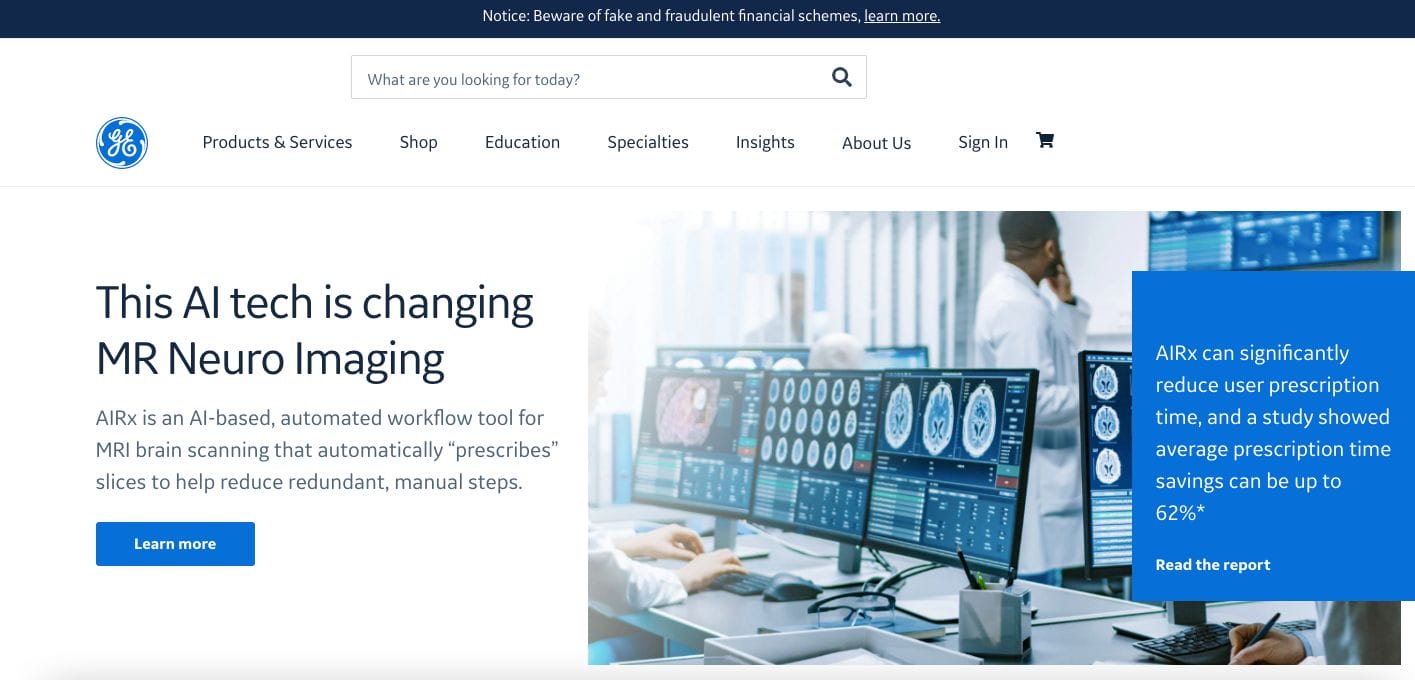
Simple and easy to navigate, GE Healthcare removes the clutter and strategically uses shorter web copy that directs the audience to click on call-to-action buttons. They also incorporated a moving media that showcases services they extend to medical institutions. Scroll a bit and you’ll also see a quick overview of their success stories in numbers — helpful in establishing credibility. Moreover, they also use keyword bubbles where one can simply select a word they’re looking for and they’ll be presented with content.
- website: https://www.gehealthcare.in/
4. Abbott
Abbott is another best pick for biomedical website inspirations to take note of. They wow us with their full-screen banner representing hope for a better tomorrow. Furthermore, they placed call-to-action buttons to trigger curiosity and encourage site visitors to read more. Keeping it short and simple, their website is easy to navigate. They also worked on grouping resources for neater layouts.
- website: https://www.ca.abbott/
5. Samsung
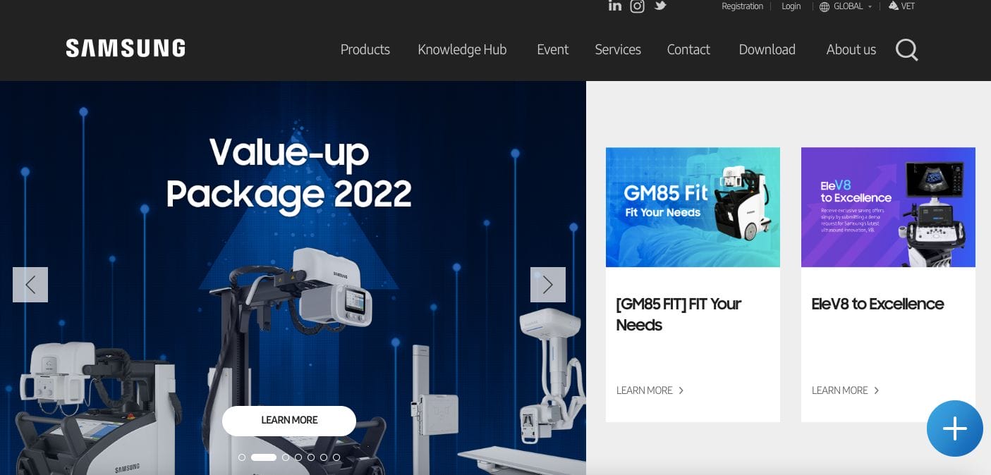
Modern and professional, Samsung uses imagery and bright colours which initially attract the full attention of the audience. With a carousel of their biomedical tech, they complemented this with a succinct web copy and a call-to-action button driving traffic to learn more. If you scroll further and still do not find what you’re looking for, they strategically placed a prompt to contact them and still handle objections should there be any.
- website: https://www.samsunghealthcare.com/en
6. Phillips
Phillips kept it aligned with their signature colours. The use of blue added a sense of security to the whole experience. Furthermore, their navigation bar has icons on top of the menu links. This makes it easy to navigate even for those who are always on the go. Their copy are also written as if directly communicating to the reader, building rapport.
- website: https://www.philips.hu/healthcare
7. Health by Habit
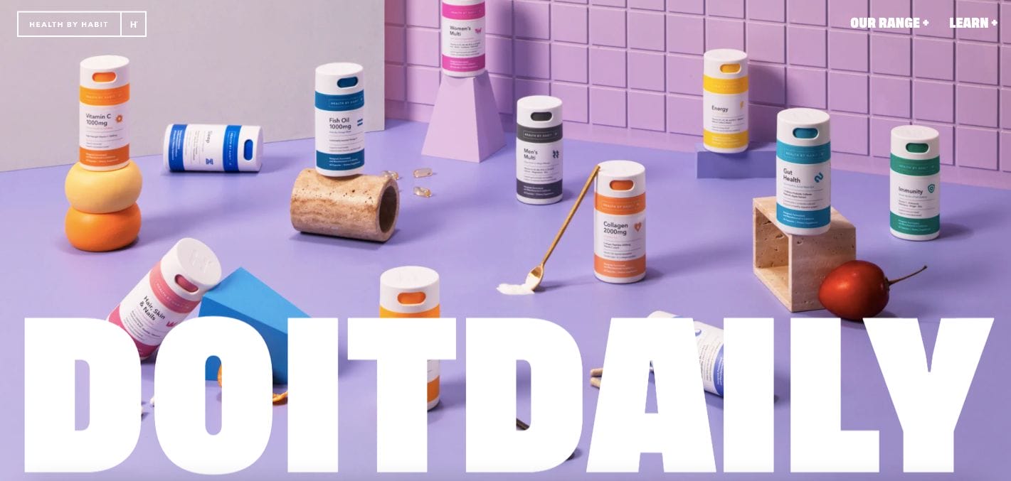
Colourful and playful, Health by Habit captivates the attention of the audience through an immersive photo and bold copy. This can be quite surprising for a brand in the biomedical industry. Like a breath of fresh air, they offer their products in simple but bright packaging that stands out. As if taken out from a comic book, you can easily add more products to your cart and check out happily.
- website: https://us.byhabit.com/
8. KLS Martin
Showing a happy family by the beach, KLS Martin is one of the best biomedical website examples you can check out. Theirs aim to inspire their audience to make the right decision (with them) to lead a healthy and better life. The headline is limited to a few words but impactfully placed to overlay the banner. Moreover, their call-to-action buttons are in red colour which encourages impulsive actions and drives them to learn more. Catering worldwide, they also have a language translation feature too.
- website: https://www.klsmartin.com/en-na/
9. Start – Genentech
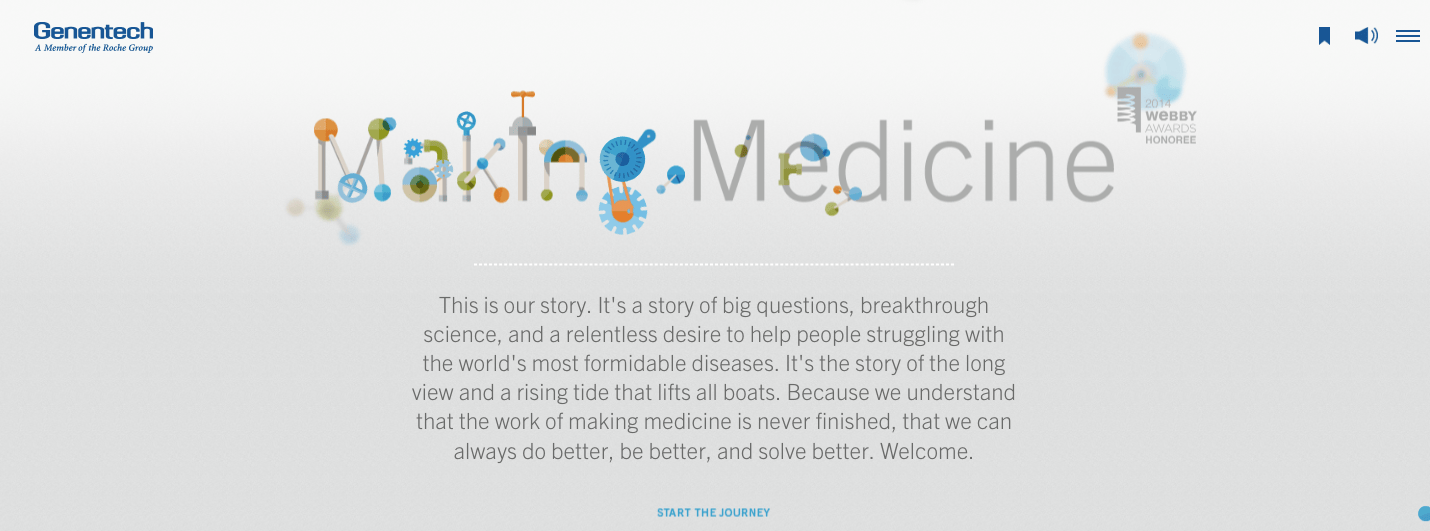
With moving media with elements of gears and mechanical pieces, Start-Genentech focuses on communicating its story to the reader. Interestingly, the website also scrolls from left to right — as if reading a book. This is perfect in how they incorporated their timeline from the conception of the business through the milestones they achieved over the years.
- website: https://making.gene.com/
10. Neuro
Neuro has a modern and professional website that is formatted to be an e-commerce platform as well for the business. They showcased media features and publications where they were seen before to leave a good impression. Furthermore, they also have call-to-action buttons depending on various triggers — from product categories, read more information, and others.
- website: https://getneuro.com/