10+ Best Biotech Website Examples & Inspirations
Establish your credibility as a biotech business with an excellent website design. Having a good website has its merit — you can showcase what you offer and also expand the business by getting more traffic. Through strategic sectioning and laying down call-to-action buttons, you can encourage action. Here, you can find 10+ Best Biotech Website Examples & Inspirations to implement to benefit the business.
10+ Best Biotech Website Examples & Inspirations
1. Mind Cure
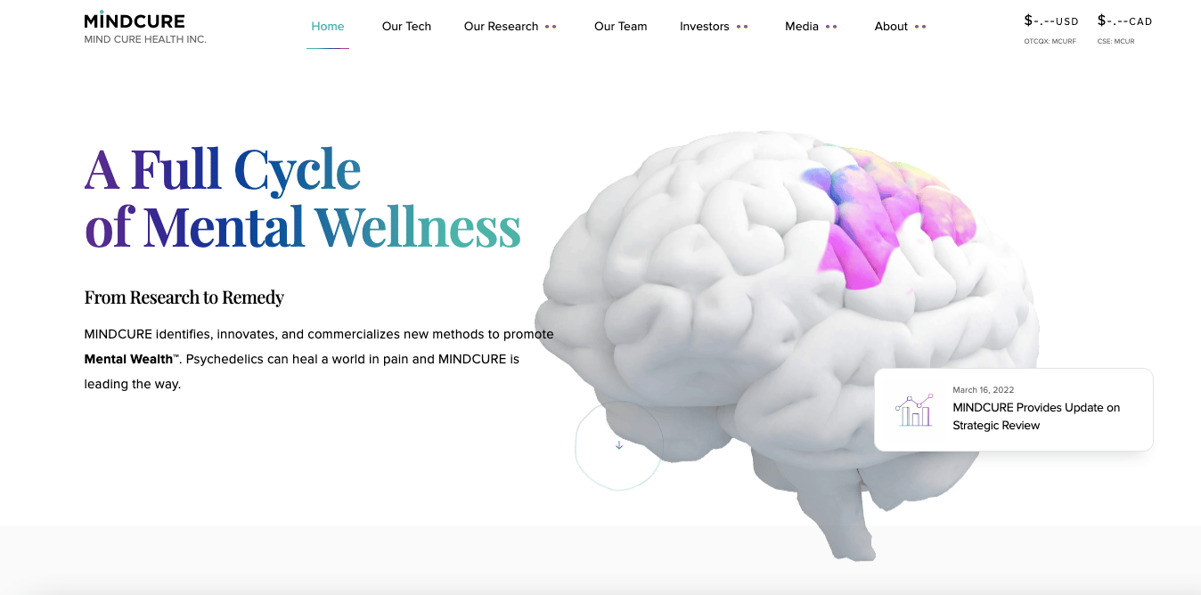
A quite neat website, Mind Cure has a minimalist website layout. More than what meets the eye, hovering the mouse over the brain graphic gives it colour. Something that catches the audience off guard in a positive way, you begin to be curious about what else they offer. Furthermore, they also have interactive sections which are informative but also immersive too.
- website: https://www.mindcure.com/
2. Qureator
Querator has a very immersive website at first sight. They used deep green colours which are bright colours of a cell-like graphic which aligns with the biotech industry. Moreover, they divided the information through easy-to-swallow sections to ensure that the message gets across. Not only that, call-to-action buttons are used strategically to encourage conversion.
- website: https://qureator.com/
3. The Lab
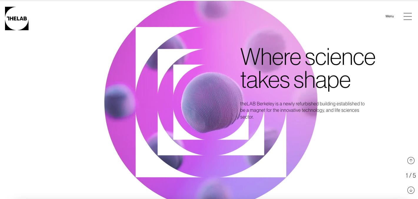
One of the best biotech website design examples, The Lab wows usa with its modern and unique website design. Professional and immersive, hovering the mouse pointer over gives us a lovely surprise. The web copy was also kept short and comes with an arrow directing the audience to read more. Selecting the menu bar also gives us a quite contrast and a list overview of few pages you might be interested in.
- website: https://thelabberkeley.com/
4. Inventia
Inventia uses moving media to represent what they do. This gives the audience an experience to easily capture the messaging and decide accordingly. Perfect for those who skim, scrolling was on point through preparing lists and succinct copy with CTAs. Furthermore, they also added a section to emphasize their achievements.
- website: https://inventia.life/
5. Aanika
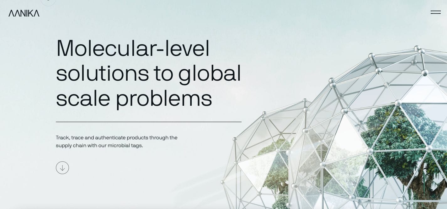
The transitioning effects in each scroll are what draw us in to get to know Aanika. They have a quite impactful website with a minimalist full-picture layout and sans serif font. Scrolling further allows you to read more copy in a short structure. This encourages ease in skimming and also leaves more impact on the audience’s mind by emphasizing what they do.
- website: https://www.aanikabio.com/
6. Bionic Sport
Bionic Sport leaves quite an impression with their full-screen media banner that gives contrast to their white headline overlay. Scrolling further, you’ll get more information about the business and what they do. At the same time, a call-to-action button directing the audience to Book Now is available on the upper right — keeping the option always open.
- website: https://www.bionic-sport.com/en/
7. Catalys Pacific
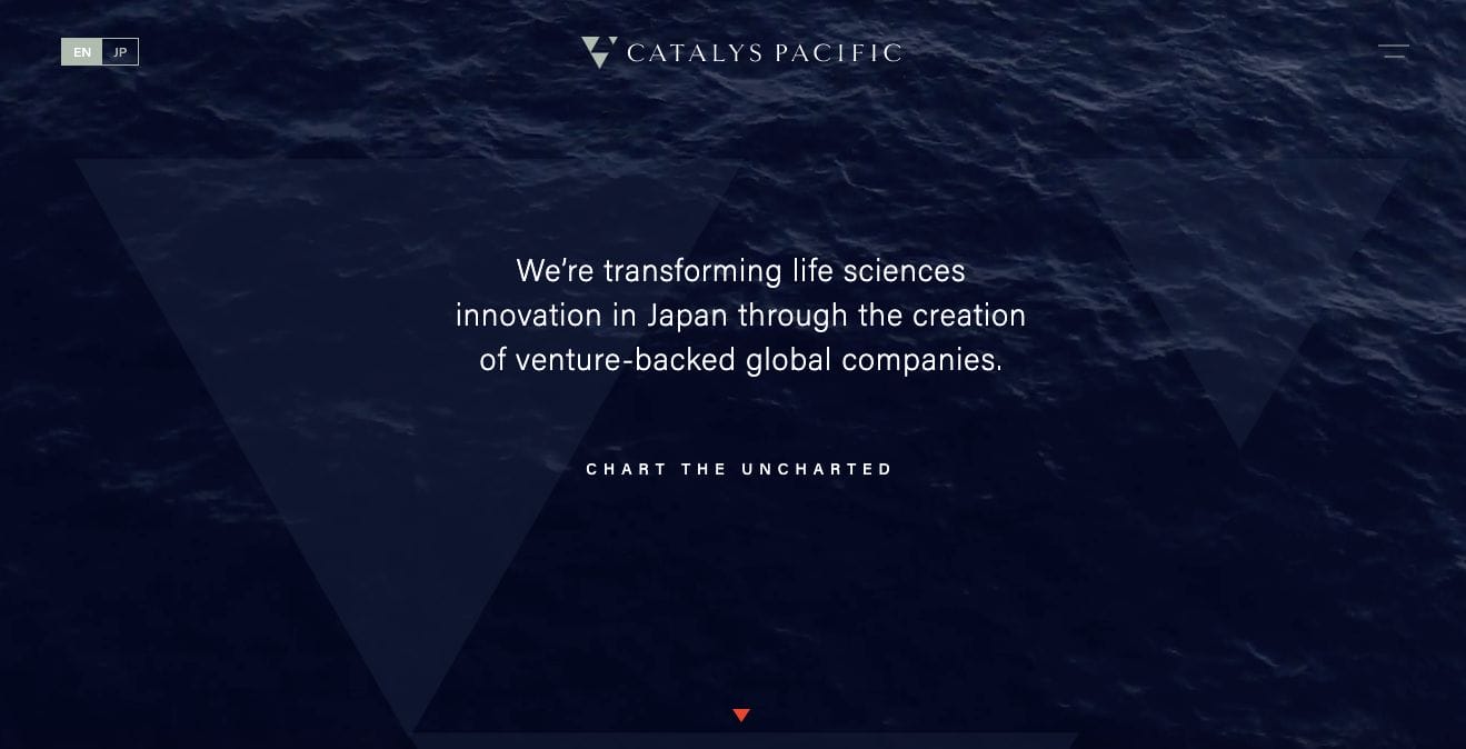
Soothing, Catalys Pacific uses moving imagery of the sea on its primary landing page. The deep blue and endless movement synchronization of the wave sure allows us to relax and focus on what their message is. Scroll a bit and they then answer the question Why Not? — debunking possible reservations about what they promise as early as possible.
- website: https://catalyspacific.com/
8. Cone Bioproducts
Cone Bioproducts keeps it straightforward by hitting one stone making them one of the best biotech website design examples to check out. They used moving media showing how things were run inside their lab which is complemented with a brief web copy that communicates the whole business module. They encourage the audience to learn more or scroll further and take action to touch base with their team.
- website: http://www.conebio.com/
9. Sprout AI
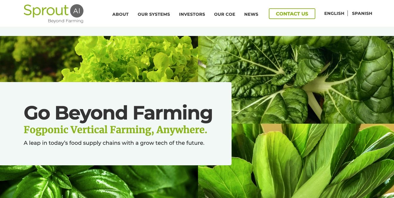
Keeping it fresh and modern, Sprout AI has a light website that showcases frames of greens. This adds a sense of life to the whole page and communicates organic or fresh solutions to modern problems. Moreover, they also choose to construct the website with narrative intent. Photos of their team and projects were also added to further emphasize what they do.
- website: https://sproutai.solutions/
10. Clic Health
Using the contrast of black and white, Clic Health was able to make their brand colour stand out and make a statement to the audience. They prepared web copy that communicates what they do and how they can help potential customers. Moreover, they also used icons to signal those who skim and easily find what they might be looking for. This also helps them remember, like bookmarks, what they read.
- website: https://clichealth.net/en/