21 Seriously Annoying Blog Design Mistakes You Need To Fix Right Now
You provide great content? Kudos! But that doesn’t count as an excuse for a terrible blog design.
Do you remember the last time you’ve been to a blog and been super frustrated because you couldn’t find the information you were looking for? Or you couldn’t do what you were supposed to do because of how it was designed?
Not very pleasant, right?
How about the last time you checked the health of your blog design?
Hmmm?
If you’re serious about blogging, you must make it a habit to review your site regularly.
Keep in mind, no matter how awesome your content is, it’s useless if the design drives people nuts.
Your visitors will simply give up and look for another website.
In this post, we’ll identify the reasons why your blog is still suffering from low traffic, poor engagement and high bounce rates despite the “awesome content” you have.
The main goal here is to make your blog functional and easy to use.
You’ll want to maximize the time visitors spend on your site and minimize the percentage of people who leave instead of continuing to view other pages within your blog.
21 Top Mistakes That Drive Your Visitors Crazy
1. Your homepage looks confusing.
No one likes landing on a site having to squint and strain to figure out what you’re all about. Attention spans are short, so make it easy for readers to see who you are and what you do – in seconds. Here’s how to fix it:
- Eliminate the jargon. Use terms that people can understand.
- Keep the design clean and the content clear. You don’t have to fill every blank space on your site.
- Keep your navigation uniform throughout the site.
- Don’t put too many calls to action (or too many options).
- Put a link to your “about” page somewhere visible in the header area or a little “about” section on the sidebar..
- Or perhaps, create a “Start Here” page or section.
Every element on your site should have a reason for where it is and why it’s there. Remember, you don’t need to show your users everything at once. Using cloud also saves time such as opting for Toptal alternatives.
2. Your main navigation bar is overcrowded with links. If you load your navigation bar with countless and irrelevant page links or drop-down menus, your visitors will get lost. Take this for example:
How to fix it: Group related links together and create a separate navigation bar for each. For example, include the most updated categories that are important to your target audience on the main navigation (usually located at the header) while the less important ones on the footer or maybe on the sidebar.
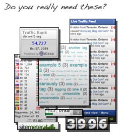
3. Your sidebar is overloaded with random widgets.
This section is usually the most abused one – usually jam-packed with unnecessary widgets or third party add-ons such as blinking glittery banners, page counters, polls, long list of tags (uh!), login links and so on. Not only they add clutter to your blog, but they can slow down your site as well.
How to fix it: Cut down the unnecessary and add only the essentials or include some of the widgets on the footer or “About” page instead. Use Google Analytics for tracking instead. Keep them balanced.
4. Your theme doesn’t speak to your target audience. If you have a beauty blog and your target audience is teens but your site design looks too corporate, chances are you’ll bore your teen users. Not to mention your first-time visitors may not recognize that you even run a beauty blog. Remember how I’ve said in my previous posts, “Always create content relevant to your target audience”? The same rules apply for designing a theme, you must always choose a theme that speaks to your target audience.
How to fix it: Define who your target audience is and use a theme that appeals to them. Go check your competitors and take a look at how they do theirs, what kind of style, and colors they use.
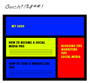
5. Your color scheme hurts your audience’s eyes. White text or hot pink text on a black background. Combining red and blue text together. Red text on pink background. Rainbow colors… a big NO NO!
Using colors that clash terribly together will definitely strain your readers’ eyes. This is a great way to discourage your visitors from browsing further, plus it can have a real bad impact on your branding. Some colors are just not meant to be together.
Look at the example on the right, how would you feel reading a blog with colors like that?
How to fix it: Read Wpmudev’s tutorial on how choose a great color scheme for your site here or Tutsplus’ tutorial on selecting color scheme here and use 3-4 colors that are appropriate to your target audience and be consistent with them.
6. Your content is difficult to scan. Having a big block of uninterrupted text will scare off your readers. Most people don’t read unless absolutely necessary (they scan). We all want information quick and to the point so if you make it hard for them to read your content, expect them not to return again.
How to fix it: Break up your darn novel with some visuals or subtitles, and use short paragraphs to make your content easy on eyes. Take this for example:
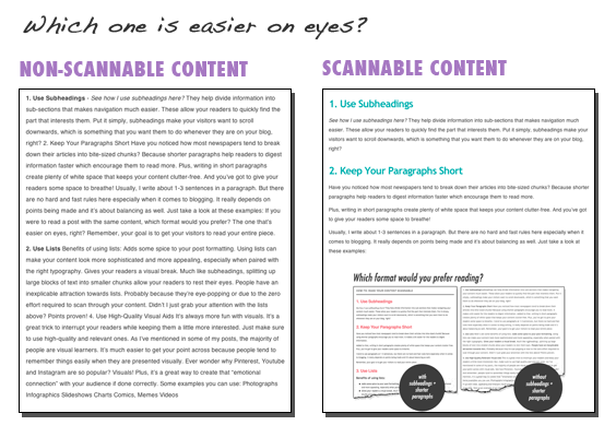
Of course, you will want to read the second one right? Here are some more ways to make your content easily readable:
- Avoid the use of fancy unreadable text. Use web safe fonts instead.
- Use lists.
- Use bold or italic font faces to highlight important points.
- Don’t use small fonts. I would recommend using at least 14px.
- Be consistent with your font sizing, spacing and styling.
7. You use about 15 different types of fonts. Using too many types of fonts can make your site look gaudy and confusing. Look at this example:
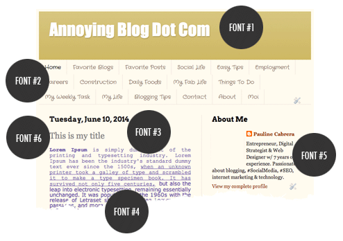
Why complicate things?
How to fix it: Limit the font types you use to 2 or 3 and be consistent with them. One for the main text. One for headings. Perhaps, another type of font for “quotes”. You don’t want to use an Arial font on one paragraph then a Comic Sans on the next paragraph, right? Keep it simple.
8. Your links don’t look like links. Your visitors should easily be able to tell that your link is a link. In other words, make your links appear “clickable”.
How to fix it: Use contrasting colors and consider keeping your links underlined or bolded.
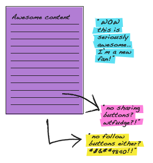
9. Your social sharing buttons are nowhere to be found. I get a bit irritated when people say, “if they like your content, they will find a way to share it.” Really folks, we are now in the social sharing era! If making easier for people to spread your content is not one of your goals then that’s OK.
How to fix it: If you’re a serious player in your industry, make sure to include easy sharing buttons in visible places. These are typically located at the top and bottom of each page. Or put them on a sticky floating bar at the side of your posts.
And one more thing, don’t forget to include your Twitter @handle on your “Tweet” sharing button. Some people will want you to know how much they appreciate your posts (including me), and it’s a great way to start a conversation with people who engage with your content.
10. Your social follow buttons are missing. I’m a new fan of your blog, how can I express how much I love your site?!?! Make it easy for me to find you!
How to fix it: Add social follow buttons somewhere obvious or where people would expect them. Place it in the header or sidebar.
11. You make it impossible to contact you.
Don’t you find it annoying when you have to search for ways to contact the author or the website owner? What if someone is interested in doing business with you? People don’t like to jump through hoops.
How to fix it: Make sure your contact information is easily found on every page of your site. Make it obvious. Use a big font or a button that stands out. Most people expect a link to your “Contact Us” page, a phone number or an address in the top right-hand corner and the footer area.
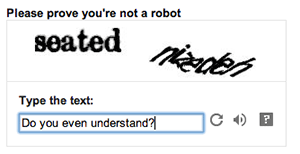
12. You’re still using CAPTCHA or word verifications, A.K.A those jumbled words you have to enter correctly before your comment gets through. This has got to be one of the most annoying features that most bloggers can’t stand. It’s time consuming and frustrating.
Imagine when you have to spend your precious time typing a comment and then a hard-to-read CAPTCHA comes up – feeling quite scared because you’re not sure if it’s going to work properly? I can relate! I understand that you’re against bots and spam, but it’s not worth it if it’s damaging your user experience.
How to fix it: Use user-friendly alternatives like simple math questions or a checkmark option like “check to prove you’re not a spammer”. If you’re using WordPress, use plugins like GrowMap, Askimet or another comment system like Disqus.
13. Your search box is hiding. One of the first things your users look for is the search bar, especially your first-time visitors. And those people that cannot find what they’re looking for usually turn to the search box.
How to fix it: Place the search box somewhere visible or where users would usually expect to see them – could be in the top sidebar or in the header.
14. You don’t care about the broken or outdated links on your site. Dead links don’t only annoy visitors, but the search engines as well so make sure all your links lead to where they should.
How to fix it: Regularly check the header, sidebar, footer and your content area and review all links on each area. Review and click the links within your content before hitting the publish button. Here are some useful tools that will help you find broken links using these tools: Broken Link Check / W3C Link Checker / Google Webmaster Tools.
15. You use low-quality images. If you have nothing nice to show, then don’t show it at all. Stretched, blurry and low-quality images make your site look amateur and cheap. Look at these examples:  How do you feel about the second image?
How to fix it: Always download or use high-resolution images. When editing, make sure to save them in their highest quality. Don’t resize a small image to a larger size, it will result in a blurred image.
16. You use super large and uncompressed images. Filling your site with large and uncompressed images will not only cost you extra dollars for bandwidth but it can also slow down your site. And search engines don’t like slow websites.
How to fix it: Use resizing tools such as Adobe Photoshop or Pic Resize. And make sure to reduce the size of your images before uploading them to your website. Here are some of my favorite tools you can use to optimize your images: TinyPNG / JPEG Mini / ImageOptim (for Mac users only). Using WordPress? Find optimization plugins here.

17. You throw pop-ups all over the place. Pop-ups distracts and can frustrate the user especially those horrible ads. Use sparingly or get rid of them.
18. You’re using flash. Yup it’s fancy, but it’s not useful. Remember, your visitors are not coming to your blog for a show. They want information – fast and quick. What’s more, they take forever to load and don’t display properly on other devices.
Similarly, avoid flash “intros”. Don’t force the user to watch or read something before he can access to the real content. This is just annoying and shows little confidence in the quality of the website’s content.
How to fix it: Remove them. Use video instead. Or if you want to create a presentation, use Slideshare.
19. You auto-play music/video. Have video and music content that visitors can control but avoid playing music or video on your site the moment your visitors arrive. That is unless you want them to leave your site. There’s no surer way to offend the senses and upset new visitors than have interactive media that plays without warning.
20. Your blog can only be viewed in Internet Explorer.
Mozilla Firefox and Google Chrome have gained considerable popularity. Then of course there are Mac users and smart phone browsers.
How to fix it: Make sure your website is cross-browser compatible. Use Screenfly (free) to test how your website look on other browsers. OR get a responsive theme. Hire a web developer or purchase a theme that’s responsive, which means your site can be easily viewed regardless of the screen size of the device. You can buy responsive themes from Themeforest or Elegant Themes.
21. Your page is broken. We usually tend to break something when we edit or add something new to our site so make it a habit to validate your page every time you post a new content or whenever you edit something on your blog.
How to fix it: Use free service like The W3C Markup Validation to catch the errors and fix them.
User-friendly Blog Design Examples + Inspirations
Here are some great blog design examples you can use for inspiration:
Final Words
Plenty to think about but you’d be surprised just how many websites make these mistakes regardless of their size.
It’s okay to be creative, but don’t overdo it. Keep the structure and the design of your layout straightforward, relevant and organized.
Remember, your main goal is to be useful, so avoid anything that wastes your readers’ precious time.
Forget about fancy technologies because they do more harm than good. Always consider what’s best for your readers – it’s the best way to make them stay longer on your blog and much more likely to engage with you.
In other words, K.I.S.S. (Keep It Simple, Stupid!).
Your Turn: What are your biggest pet peeves when it comes to blog design? Pop them in the comments below!