10 Bridal Boutiques Website to Inspire You in 2025
One of the most exciting parts of wedding planning is dress shopping. Unfortunately, it is also one of the most stressful tasks to accomplish. It’s no surprise why plenty of brides now prefer to purchase their bridal gowns from online shops for a more straightforward experience.
Because of this, there are now more bridal shops investing in their website. As a result, many wedding dress shop bridal boutique web design has significantly improved across all boards. To see what we are talking about, let’s take a look at the top bridal boutique website in 2025.
Top Bridal Boutique Websites of 2025
Here are the top bridal boutique website design examples in 2025 that you can use as inspiration:
Bromely Brides

Bromely Brides has a video banner that is something that you won’t see on many other similar websites. It creates a feeling like you are really in a bridal boutique. Moreover, the website also uses a neutral color palette. This creates an elegant look suitable for a bridal boutique website.
Pros
- Video banner
- Neutral pallet
- Elegant design
Blush and Ivory

Blush and Ivory have done well integrating their brick-and-mortar store into their website by using it as their homepage background. It creates a true-to-life experience but, at the same time, evokes class and luxury, which are the main essence of high street bridal boutiques.
Pros
- Luxurious vibe
- Realistic
- Easy to navigate
Boho Bride Boutique
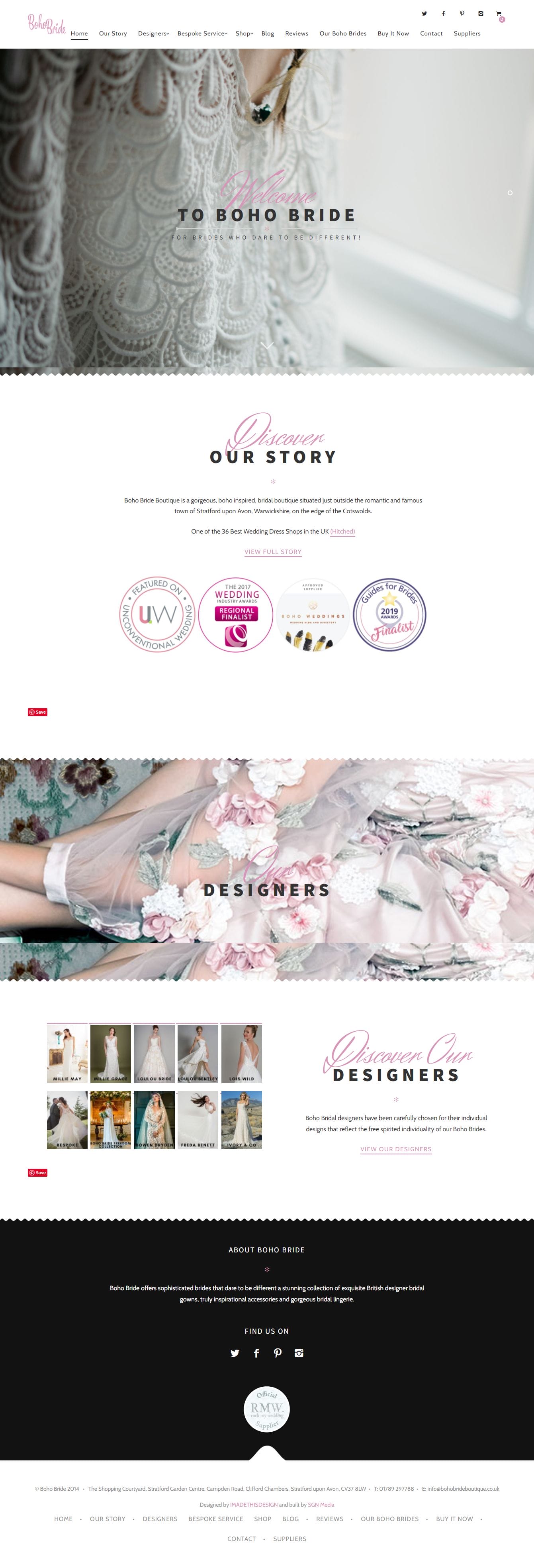
This web design has a solid and consistent brand all throughout, allowing it to stand out and attract the attention of more brides. Upon first glance, you will immediately notice that it is unlike any other online bridal boutique because your eyes will be captivated by the beautiful background.
However, although this website makes use of an interesting background, the clever use of pink color, which contrasts well with black and white, does not take away from the branding and messaging.
Pros
- Clever choice of color
- Consistent branding
- Appealing aesthetics
Sassi Halford

Sassi Halford has a well-executed minimalist design. Along with their bold but classy choice of typography, the overall appeal of the website showcases their high-end brand message very well. This website is also very easy to navigate. Everything is pretty self-explanatory, which is a huge plus in terms of user experience.
Pros
- Minimalist design
- Easy to navigate
- Classy Typography
Maria Modes
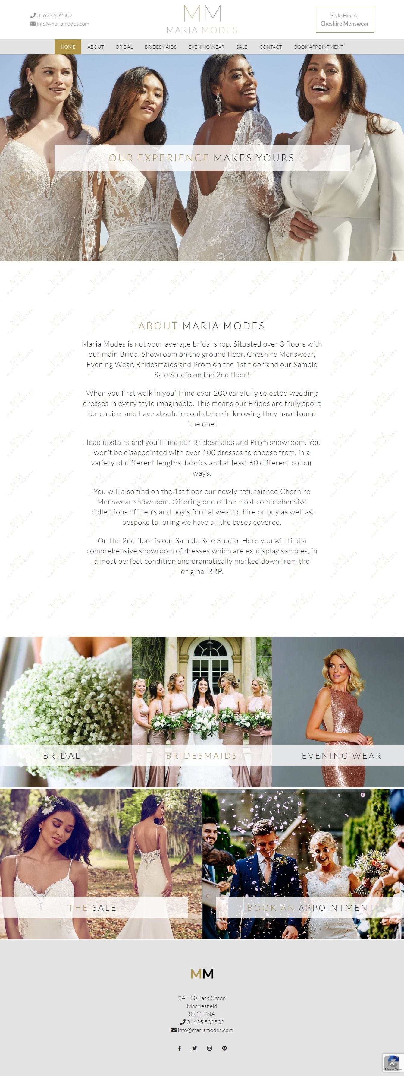
Compared to the other designs on this list, the Maria Modes website has more pops of colors. It’s not just plain white because there are a lot of greens and pinks in the color palette making the overall appearance of the website look more natural.
It also cleverly integrates photos from previous clients, creating a sense of relatability from visitors. But, it has done so in a way that is organized. You can easily click on the wedding dress collection that you want from the tiles found on the homepage.
Pros
- Easy to navigate
- Excellent color choices
- Nice choice of photos
Catherine Blades Couture

The Catherine Blades Couture is a no-fuss, clean-cut website. The choice of going for a simple design also captures the brand of the company. In terms of navigation, it’s also very easy to figure out. The call to action is also clear and concise.
Pros
- Clear message
- Excellent branding
- Minimalist
Wedding Atelier
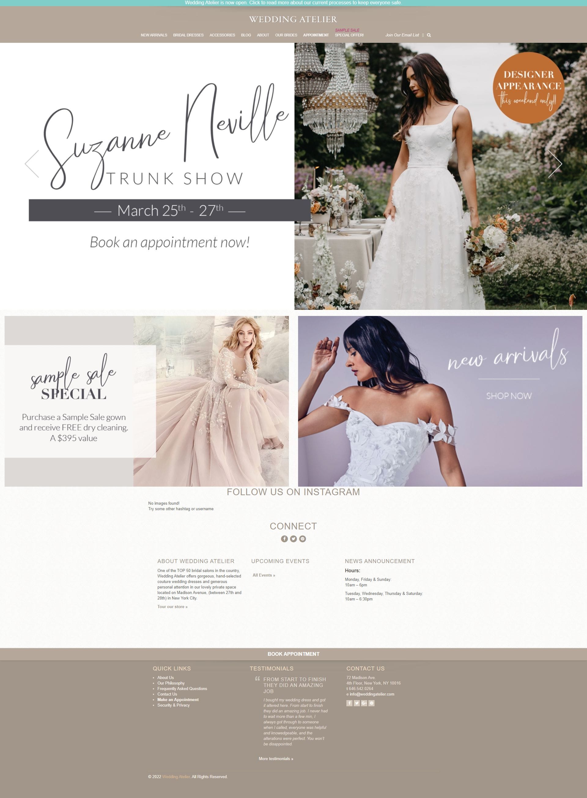
Wedding Atelier is the epitome of a seamlessly designed online bridal boutique shop. The choice of colors showcases the brand’s elegance. This is even made better by the logo and typography that adds more sophistication to the website’s overall look. The call to action here is also very straightforward. The same thing with the navigation as well; very easy to move from one page to another.
Pros:
- Clear call-to-action
- Seamless navigation
- Elegant design
Joyce Young

Joyce Young is a brand that evokes youthful style and luxury, and they were able to capture that in the design of their website. They also make use of unique imagery that highlights their amazing bridal clothes.
Pros
- Unique image
- Simple typography
- Modern design
Elizabeth Louise Bridal
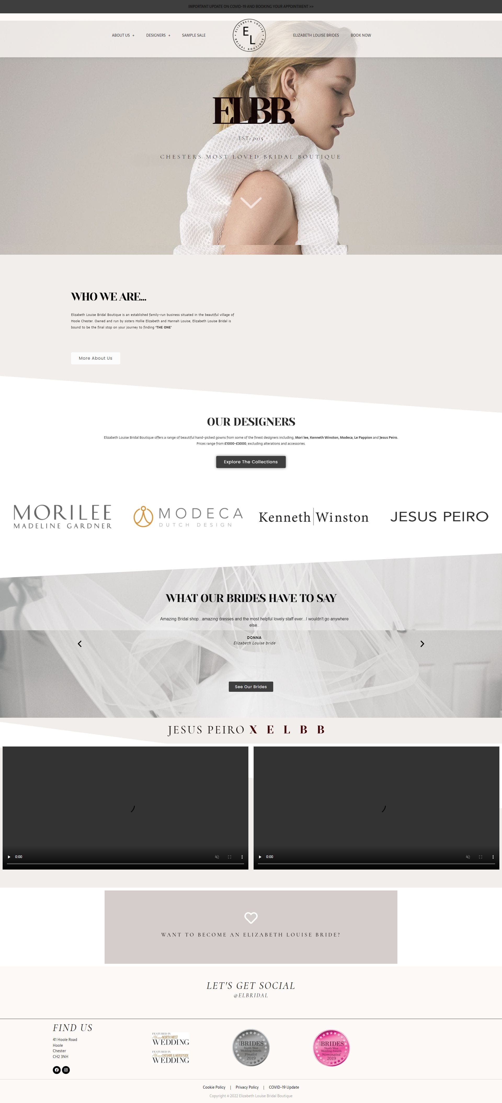
The Elizabeth Louise Bridal was able to highlight its individual style and imagery on its website. This brings out their elegant style, attracting the attention of their audience. Taking a look at what they offer is also very easy to do, thanks to the simple navigation menu. Their choice of typography also compliments their overall aesthetic, making it look pleasing to the eyes.
Pros
- Complimentary typography
- Easy to navigate
- Minimalist color palette
Raishma

Like many of the websites on this list, Raishma has a clean and elegant look. But, what makes it a well-designed website is its clear and easy-to-use navigation menu. They have also displayed their social media accounts, allowing customers to easily reach out to them. Doing this is also an excellent way of increasing engagement with clients.
Pros
- Easy to use navigation bar
- Social media display
- Clean design
Elements that Should be in A Good Bridal Boutique Website
Based on the list of bridal boutique web design inspiration mentioned above, a good one must have the following elements:
Clear Intent
A good bridal boutique website must have clear intentions from the get-go. Without much effort, you must be able to immediately see whether they want to do either of the following:
- Inform
- Entertain
- Sell
The intent is mostly reflected in the content of the website. The choice of words used must be easy to understand. There should also be a call-to-action that guides visitors on what to do next when looking around the website’s different pages.
Easy Navigation
Your website is like your online storefront. Suppose it’s difficult for the visitor to look around the store because of obstacles. In that case, there’s a high chance that they will be discouraged from continuing to look for what they want to buy. In some cases, they might even leave immediately since they don’t want to be wasting their time. This is why easy navigation is crucial in bridal dress web design.
Simple User Experience
One of the reasons why many brides choose to shop for bridal dresses online is because they want straightforward shopping. This is why it’s vital to make your user experience as simple as possible. If you can, your visitors must not need to use their brain cells to figure out how to browse from one page to another on your website.
Appealing Color Choice
The choice of color used in the website design is also a powerful communication tool. At the same time, it can also evoke an emotional response from the visitor. For bridal boutique websites, using colors that are closely associated with weddings can be very effective. This is mostly why many of the websites mentioned above are full of white, ivory, and blush color.
However, this does not mean that you should not use other pops of color. In fact, doing so is an excellent way of making your website look more unique, just like how Maria Modes’ website did it. Just make sure that it’s not too over the top that it loses its “bridal boutique” look.
Expressive Imagery
The imagery of a web design refers to the visual aspects used in communication. This includes the illustration, video, photography, and all graphics featured on the website.
For a bridal boutique website, it is crucial for the imagery to be expressive. Unlike other retail shops, there’s a lot of sentimental value associated with bridal dresses. Taking advantage of this fact and integrating it into the web design will allow you to appeal to the emotion of the visitors.
At the same time, the imagery must also reflect the brand’s personality and voice. This is very important because visitors take in their initial information from the website’s imagery. It would help if you made a good first impression. By doing so, you create a sense of credibility and professionalism in the visitor’s minds.
Complimentary Typography
Typography plays an important role in web design. It can command attention and serve as a visual interpretation of your branding.
Bridal boutique web design ideas that have excellent typography must be considered readability. This is because there are some who use very whimsical fonts. Although it looks good, it might not be as effective in conveying the message you want since it is not readable.
Also, it’s okay for you to have multiple fonts in your web design. However, they must be coherent with each other. The rule of the thumb is not to exceed 3 types of fonts to avoid making the design look messy.
Final Words
Suppose you are also a bridal boutique owner looking to improve your shop’s website. In that case, the websites mentioned above will surely inspire you. You don’t necessarily have to copy the exact strategies of each of these web designs.
However, you can take the good aspects of each design and apply them to yours. By doing this, you will be able to make a better and more desirable website that will help you achieve your business goals.
