10+ Best Consulting Website Design Examples & Inspirations
Catering to businesses, consulting agencies attend to internal issues and propose solutions to resolve and propel the client towards their goals. What best way to showcase credibility is by deliberately coming up with an amazing website that’s professional and effective in delivering results. Here, we rounded up 10+ Best Consulting Website Design Examples & Inspirations that you can visit to learn more and take best practices from.
10+ Best Consulting Website Design Examples & Inspirations
1. Bain
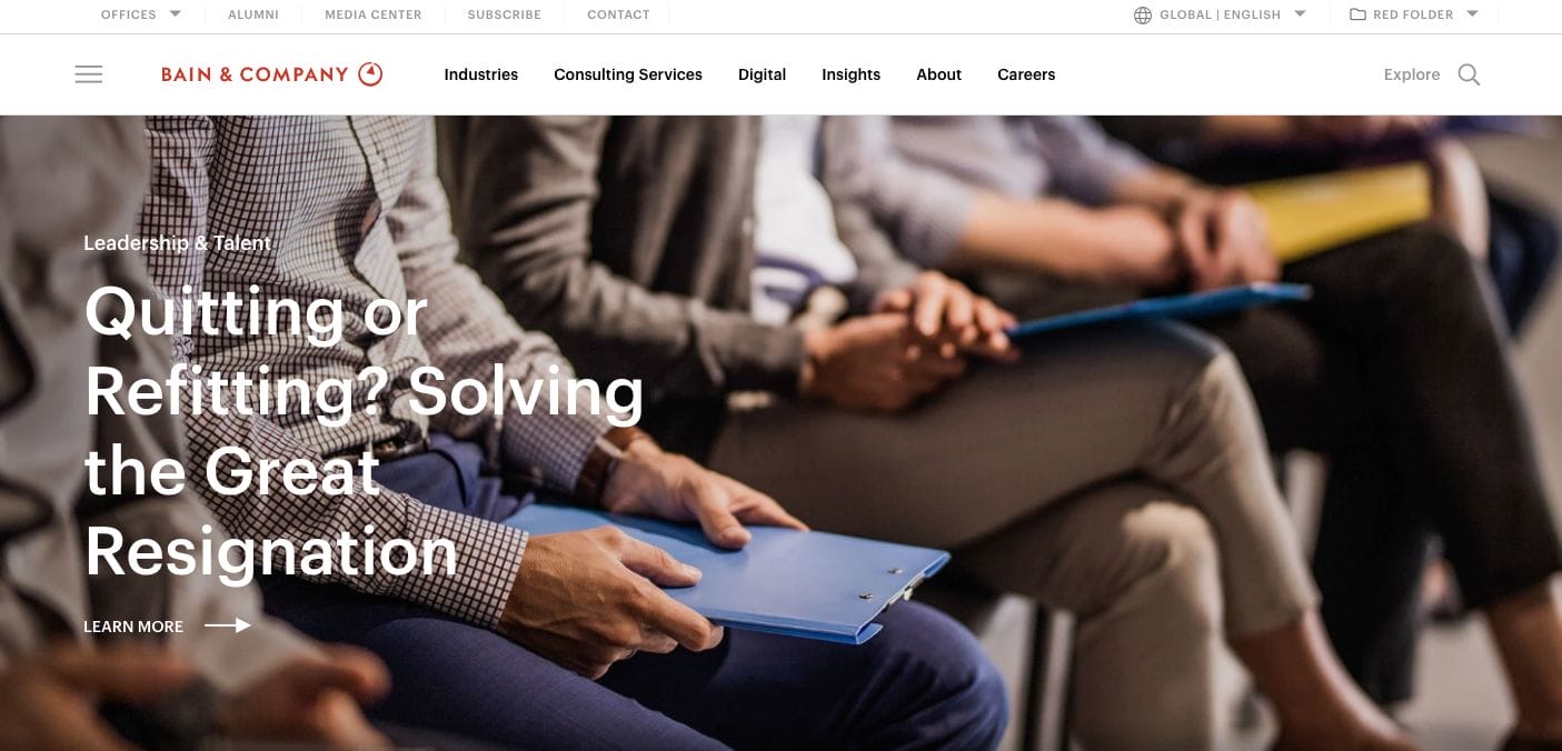
With a carousel banner that showcases user experience, Bain highlights what the business does with a few phrases that speak directly to the target market. This allows them to instantly connect with the audience — letting the viewer know that they understand and they can help. Further to the landing page, they also came up with questionnaires to better know the visitor and provide suitable content based on their inputs. Besides this, they also embedded a video introduction of the agency for those who do not have time to read through the whole page.
- website: https://www.bain.com/
2. Motivated Mornings
Motivated Mornings has a bright bubbly design with yellow as the main colour together with black and white. This encourages clients to have a more positive attitude towards the agency — after all, their business is all about sparking motivation. Furthermore, they used simple linear graphics along with short copies that kept the layout clutter-free and easy for the eyes. There are also call-to-action buttons on each section which direct the visitor to read more and take action.
- website: https://www.motivatedmornings.work/
3. One North
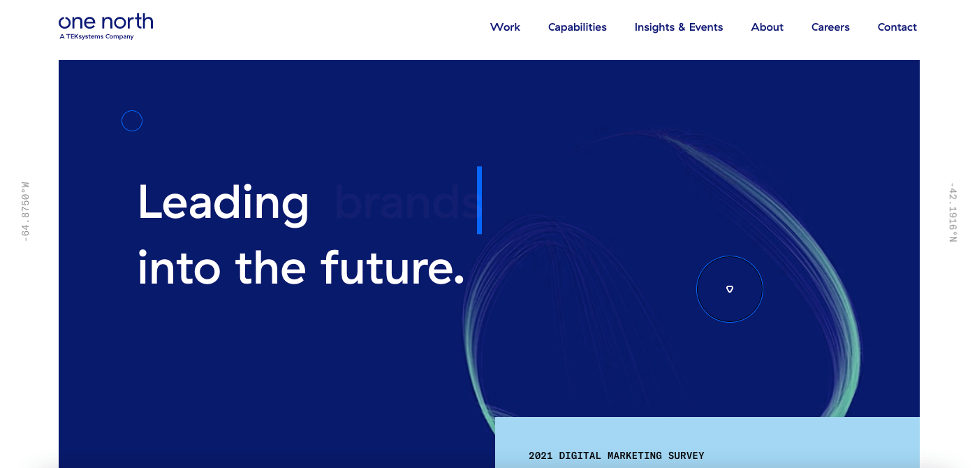
Modern and professional, One North boasts of its amazing track record by adding sections with quantifiable results and previous clientele projects. This association helps further establish their credibility. Moreover, the minimalist and colour-blocking layout they have adds a premium appeal that high-paying clients may be looking for. The clutter-free layout allows the visitor to absorb messaging and take positive action toward the brand.
- website: https://www.onenorth.com/
4. Frog
Frog is another consulting website design that you can explore. They have a neat layout that is immersive because of the video banner embedding. With this in mind, it gives visitors a glimpse of what to expect and instantly encourages rapport with the consulting agency. Furthermore, the use of human elements also helps with storytelling and adds warmth to the general business. Surely, one would be more encouraged to get in touch with a business they feel more connected to.
- website: https://www.frog.co/
5. Laurie Ruettimann

With an impactful website, Laurie Ruettiman used colours to her advantage. Her use of dark monotonous colours helped her accent colours pop out more. With this, she used the pop of colour on the important copy which helps direct the attention of the visitor to focus on these more. Besides this, she added sections that establish her credibility — a showcase of her previous clients, accolades, and testimonials were also readily-available.
- website: https://laurieruettimann.com/
6. Landor & Fitch
Landor & Fitch has a bright and modern consulting website design example to get ideas from. They used bright contrasts that quite surprise the visitors and pique their interest. Moreover, the incorporation of moving pictures also adds a sense of flow that helps tell the narrative of the agency. For further information, they have a montage of previous articles and posts that one can check to get to know the business more.
- website: https://landorandfitch.com/en
7. Navigate Corp
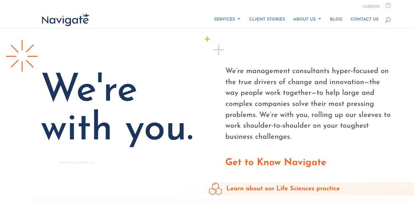
Neat layout, Navigate Corp focuses on their content that’s why its layout has a white background. The copy is paired with graphics which adds a little colour. Furthermore, call-to-action buttons are placed every after each section. At the bottom of the page, they have a quick links menu, newsletter subscription form, and contact details readily available.
- website: https://www.navigatecorp.com/
8. Pontoon
Pontoon is another great consulting web design example you can take inspiration from. They used patterns in two-tone which adds a playfulness feel but also directs the eye to the important sections of the website. Moreover, they added sections that divide content into categories for ease of navigation. Call-to-action buttons are also in bright blue which stands out from the monotonous template.
- website: https://www.pontoonsolutions.com/en/
9. Harpar Grace

A true expert in luxury, Harpar Grace has a premium-looking website that leans towards the use of space and limited colours to have a neat design. The use of slight transitions also helps with the overall client experience as one navigates through the website. In case you’re looking for something specific, they have a top menu bar with links to important pages. To get in touch with the team, there is also a built-in chat to use.
- website: https://www.harpargrace.com/
10. Kurt Elster
Kurt Elster has a quirk website that depicts elements of how the user interface of the past looked like. Quite nostalgic in a way, this helped resonate with people who find tech as fast-paced and need someone who gets the past but also experienced on current trends in website design. Furthermore, menu icons are available on the right side of the screen which directs to his other socials and services.
- website: https://kurtelster.com/
