how to create a blog your readers will love: 6 user experience tips you can use today

Have you ever wondered how to create a blog that will keep your readers coming back?
Well here’s the good news:
With a number of fairly straight forward tweaks you can radically improve the user experience on your blog.
This means your blog will grow faster than ever before. Sounds good right?
In this post I’ll talk you through some straight forward tips that will improve your blog’s reader experience – starting today.
Ready? Let’s dive in!
How To Create A Blog Your Readers Will Love
1. Be clear who your blog is for
When a visitor lands on your blog, it needs to be easy for them to get an idea of exactly how your blog can help them.
You need to be able to answer these two questions:
- Who is your blog for?
- How will your blog help them?
Once you are clear on these two questions it’s time to ensure that this is conveyed throughout your blog.
1a: Optimize your home page
Your home page is likely one of your most popular pages, especially for those who are new to your blog.
A great example of this is Steve Kamb’s Nerd Fitness:

Right from the start its extremely clear how Nerd Fitness can help you.
1b: Optimize your “start here” page
If you have a “start here” page, it’s important to bring this in line with the message you’re conveying on your home page.
If you haven’t got a “start here” page yet, the idea is to provide new readers with everything they need to know in one location. Just setting up this page will be a big help to your readers.
On ProjectLifeMastery.com, Stefan Pylarinos clearly highlights the purpose of his blog:
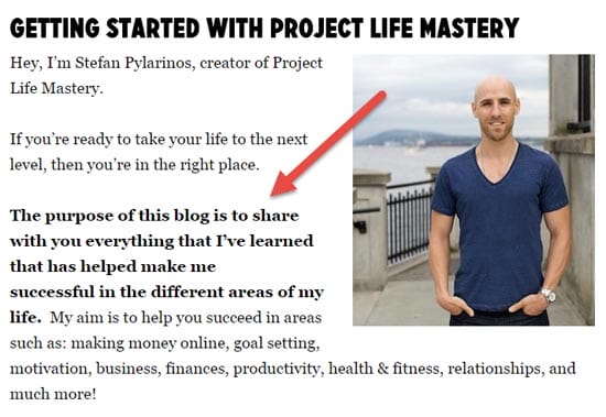
Immediately anyone checking out this page knows who he is and exactly why they should be following his blog.
1c: Tweak your about page
Sticking with an example from Stefan Pylarinos, his about page highlights the purpose of his blog in a similar way to the “start here” page.
The main difference being that instead of the page being more about readers, the about page goes into more detail about his personal story.
1d: Leverage your sidebar
On Backlinko, Brian Dean does a great job of showing who his blog is for using a widget in his sidebar:
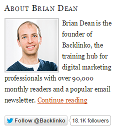
This widget goes beyond just letting people know who the blog is for and how it can help them, it also includes two great social proof elements.
If you haven’t come across the term social proof before, this quote probably says it best:
“People see an action as more appropriate when others are doing it.”- Robert Cialdini
So when people see a social widget with a high number of followers, they’ll be more likely to follow along just because others are.
The mention of how many monthly readers Brian works great and is followed up by a Twitter follow button which displays his follower count.
2. Simplify your main navigation
Have you ever visited a blog, checked out the navigation menu and been so overwhelmed with how many options there are that you haven’t used it at all?
It’s similar to how in a restaurant, when faced with too many choices you may find it more difficult to decide, and then end up second guessing your choice later on.
When you simplify your main navigation it does two things:
- Makes it easier for your readers
- Allows you to highlight the important pages you want your readers to check out
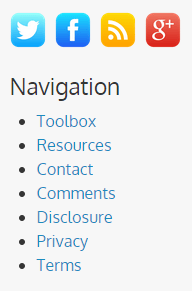
On Blogging Wizard, I display a very simple navigation menu:

While these are usually the main pages that people need to find and those which I’d like my readers to check out, there will always be pages people will need. They won’t be the most popular but they still need to have some level of visibility.
These usually include policy pages such as your privacy policy and disclosure etc. These entirely depend on what your blog requires but they need to be visible.
I keep these pages in my footer which tends to be the 2nd place people will look for other key pages (or at least, that’s where I’d look):
3. Remove unnecessary clutter
Every element on your blog should have a purpose and it should help you get closer to your goals (whatever they may be).
One of the main examples tends to be badges, although there are some badges that are worth keeping.
The best badges to include will be those that convey social proof but in order to do that they need to be difficult to obtain for others.
Francisco Rosales has a great example of this on Socialmouths.com:

Why do these work so well?
It’s extremely difficult to get these awards from Social Media Examiner and all the details of the winners can be found with a quick Google search.
Other elements you’ll likely want to keep
Aside from badges that do a good job of conveying social proof, there are definitely other elements worth including on your blog.
Below are some examples:
- Opt-in forms – Building an email list is one of the best ways to grow your blog. This post covers plenty of the main tips and tools to help you.
- Related posts – If you want to drive traffic to other posts on your blog, displaying related posts widgets below your content can be a great way to do this. If you use WordPress, Contextual Related Posts is a free and effective plugin to use.
- Popular posts – Displaying your most popular posts in your sidebar can be a great way to inform new readers about your older content.
- Recent posts – Similar to displaying your popular posts in your sidebar, it’s helpful to display your most recent posts.
- Testimonials – We have already mentioned how the right badges can be a great way to convey social proof. If you have a testimonial from a reader, client or influencer – show it off!
There are plenty of other elements that could be worth including but the bottom line here is that whatever elements (widgets etc) you include should have a purpose.
A big part of this is figuring out what you want to achieve and optimizing your blog to help make it happen.
Elements to consider removing
Ok, so now we’ve talked about what badges can work, what about the ones that are worth removing?
A good example (or bad, depending on how you look at it) would be badges for blog directories or article directories. Chances are that these are only helping those directories.
From a social proof perspective, these don’t work either. Displaying a “featured on” badge for a directory that anyone can get “featured on” won’t work all that well.
A lot of people probably get that it’s easy to display these sorts of badges and those that don’t may end up leaving your blog.
It’s worth taking a closer look at any widget or element that has the potential to convey negative social proof.
Negative proof works a lot like social proof, but instead of people being more likely to follow you, they’ll be less likely to follow you if you have a low follower count being displayed.
For example, if you have a Facebook Like box that is showing around 10 likes or an RSS subscription counter showing 100 or so subscribers – these will have the potential of causing issues.
Tweet widgets are worth reconsidering too – I’m a huge fan of Twitter and it refers plenty of visitors to my blog. But, all tweet widgets do is send traffic back to Twitter when I’d prefer people to be more focused on what they’re reading on my blog (whatever that may be).
4. Tailor your sidebar to specific categories
The thinking behind this tip is that your readers are much more likely to interact with an element of your sidebar if it’s relevant to the content they’re reading.
There are plenty of ways you could use this. Two good examples include:
- Displaying different calls to action (CTA’s)
- Displaying popular posts from the current category
If you use WordPress, this is extremely straight forward to do.
Jetpack is a free plugin which has a module called “widget visibility” – this allows you to choose exactly when certain widgets are displayed (or not displayed). For more detailed instructions, check out this tutorial.
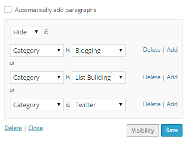
What I like about this is that there isn’t any need to worry about creating multiple sidebars, you simply choose different visibility rules.
You’re not limited to categories either, there are plenty of other ways to tailor your sidebar widgets including; tags, authors, role, date, page and more.
Jetpack does have a lot of other modules but you can choose to disable all of the ones you don’t need.
5. Improve page load times
The time it takes for your blog to load is incredibly important and there are numerous case studies on the web to prove it.
As mobile browsing continues to rise, this becomes even more important.
So what can you do to improve your blog’s page load times?
5a: Benchmark your current load times
There are lots of tools to help you but I personally prefer to use LoadImpact.com.
The reason why I use it is because it simulates how your page load times hold up against simultaneous visitors. A lot of blogs tend to be ok with a few visitors, but as soon as traffic increases page load times skyrocket.
Below is an example run on my blog:
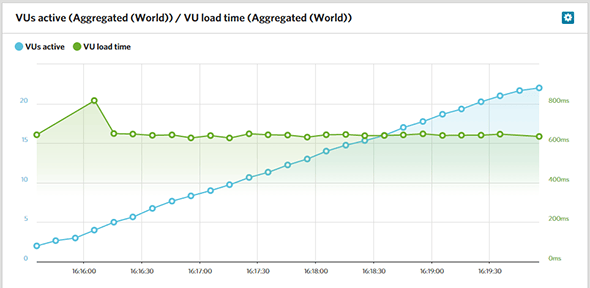
So here your aim should be to keep the load times consistent despite an increase in visitors.
Any page load times below 2 seconds are really good.
5b: Optimize your blog’s page load times
There are a few big quick wins that will seriously help you here.
In the above LoadImpact test, it shows my blog loading in just under 700ms for the most part which is great. But the truth is that under the hood, it isn’t all that well optimized.
Further optimization is on my to-do list but I’ve focused on making simple changes that produce massive improvements.
Whatever platform you use, these two changes will improve massively:
- Upgrade to a faster web host – budget web hosts have their place, but the unfortunate reality is that they quickly cave in when faced with traffic spikes.
- Setup a CDN – CDN stands for “content delivery network”. They use servers strategically placed all over the world to ensure that your content (e.g. HTML/images etc) load from a location much closer to your visitors. For example, if your web host is in the USA, visitors from Europe would likely experience slower load times than someone from the USA. I use MaxCDN personally but there are plenty of others.
If you use WordPress, there are plenty of helpful guides you can use to optimize your blog – WP Curve’s post on WordPress speed is a great place to start.
Alternatively, using a tool like PageSpeed Insights by Google can give you a good idea of exactly what changes you need to implement to improve load times further. If you aren’t a developer, you could hire one to help you from sites like PeoplePerHour.com or Elance.com.
6. Always be testing
Data is a bloggers best friend.
It tells us when something is wrong with our site, how well our posts have been received, where our conversions are coming from and more.
At a basic level, it’s essential to ensure you have a decent analytics tool setup – something like Google Analytics will do the job.
If you want to take your blog’s user experience to the next level, there are a few more options which you can use.
6a: Get user feedback from Usability Hub
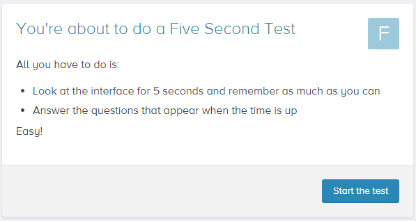
Nothing beats getting feedback from real people and that’s what Usability Hub helps you with.
Users on the site are given a short test where they’re shown a design or website element – they can then answer questions afterwards or perform another action.
There are a number of different tests which include:
- 5 second test
- Click test
- Preference test
- Nav flow test
All of which allowing you to approach tests in a slightly different way and get all sorts of qualitative data.
The basic plan for Usability Hub is free although you will have to do tests for other users in order to earn credits. Credits allow you to get your own designs tested. You can choose to buy tests if you like (its $1 on the free plan or half price on the paid plan).
6b:
Use heat maps to find what works (and what doesn’t)
Knowing where your visitors are clicking on your site can be very helpful when it comes to validating design changes.
There are a bunch of tools that can help us with this. One of the most popular is Crazy Egg with pricing plans starting at $9/month. The set of features you get access to are incredible the number of visitors and active users are limited.
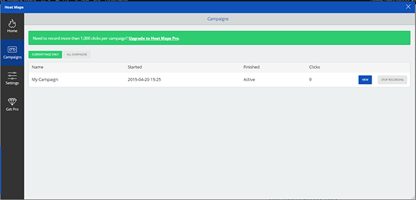
Another great tool is the Heat Maps app from SumoMe.
It’s free to use but if you want to track more than 1000 clicks per campaign, you can upgrade to the $20/month plan.
All you need to do to get started is to add a snippet of code to your blog (or install the plugin if you use WordPress).
Within minutes of setting up my new campaign, clicks are already being tracked.
The bottom line here is that the more data you have at your fingertips, the easier you’ll be able to narrow down user experience issues as well as validating any design changes.
Over to you
This quote says it all:
“The ability to simplify means to eliminate the unnecessary so that the necessary may speak.” – Hans Hofmann
Now you’ve got a bunch of tips you can take away and implement but there are so many more ways to improve user experience for your blog.
Which user experience improvement tips would you add to the list?
Let us know in the comments!