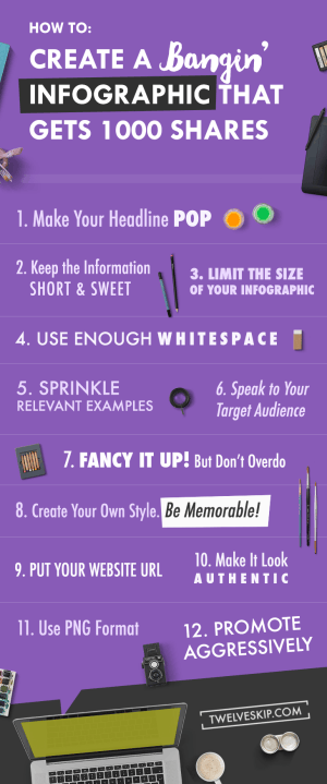
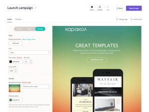
how i create a bangin’ infographic that gets 1000 shares
As you’ve probably noticed, almost every content I publish has an infographic in it.
Just like this post.
Want to know why?
To get noticed, of course. Heck, it’s my favorite marketing strategy.
Infographics are like teasers for my content.
It’s my way to grab people’s attention, make them curious and get them to click the link to my website.
Why are infographics so hot these days?
Simple, because they invite engagement (when done right).
You get noticed = potential to go viral = spread the buzz about your brand.
Ever since I started creating infographics, the engagement rate on my blog has been pretty incredible.
A lot of people in my industry started linking out to my content, sharing my posts, and not to mention one of my infographics got published in a best-selling social media book, The Art of Social Media by Guy Kawasaki and Peg Fitzpatrick. Sounds amazing, right?
Truth be told, most people are naturally visual learners.
Studies show that you can convey more information faster with visuals than you can with words. Approximately, 65% of us are visual learners, which proves that most of us learn best through what we see.
So infographic is definitely a hot way to spread your message.
However, you don’t just create infographics for the sake of having an infographic on your content.
You need to make sure that they don’t suck.
In this post, I will share some fun tips and resources I usually use to create an infographic.
First off, I will share the typical steps of how I create my infographics:
- Step 1: Gather your information + data together
- Step 2: Look for inspiration
- Step 3: Plan the concept
- Step 4: Look for add-ons (icons, elements, photos, stock photos, fonts)
- Step 5: Add the information and start designing. I mainly use Photoshop for creating infographics (which you can rent for $10/month) but here are some other tools that can help you create stunning infographics: Canva // Piktochart // Infogr.am // Visme.co // Visual.ly
- Step 6: Promote!
Tips + Resources For Creating Infographics
1. Make Your Headline Pop
Of course, your first goal is to grab attention. And to capture people’s attention, you must craft an interesting, strong and compelling headline for your infographic.
Remember when the pros say “If you want to attract more clicks and views to your content, you need a catchy title that evokes emotion”.
The same principle applies to infographics.
Create that headline that makes people curious. You know, that headline that makes them tick.
But how do you do that?
Here are some general guidelines I follow myself (they work for me):
- Keep it short and focused
- Make it benefit driven
- Use numbers or use how-to
- Use interesting adjectives
- Use the language your target audience use
Here’s what I do:
I write up to 3-5 headlines and compare them. I mix up words and see what I come up with. I use thesaurus.com to search up for interesting adjectives or go to my favourite websites that are savvy with creating catchy titles. If I like to sound like a badass, I go to urbandictionary.com or buzzfeed.com for more ideas.
Let’s take a look at these examples:
- Boring title: How to Create An Infographic
- Juicy title: How To Create A Bangin’ Infographic That Gets 1000 Shares or 10 Juicy Ways To Creating A Bangin’ Infographic That Gets Shared
You see, the second one is more specific, benefit-driven and more exciting, right?
Here are the questions I ask that help me better create an interesting headline: “Does this make me excited? Does it sound juicy enough?” If I can’t decide, I ask my sisters or friends for a feedback or even post a poll on social media. Here’s an example:

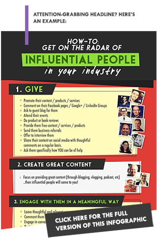
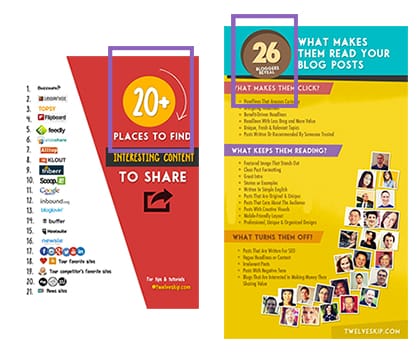
Once you’re done cooking up a killer headline, make sure to use a big and readable font and make it prominent when you put it on your infographic. Here are some good examples with easy-to-read headlines: example 1 // example 2. See screenshots below.
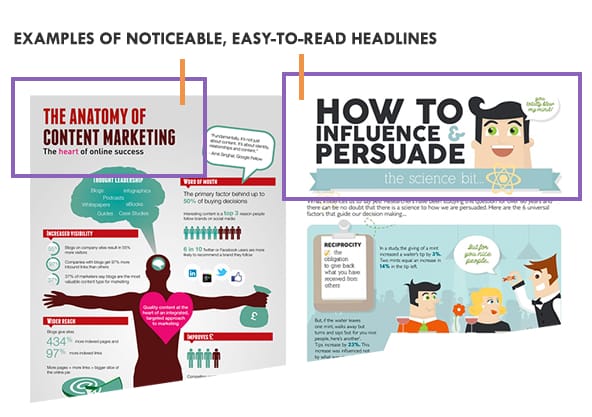
Resources that will help you generate headlines: HubSpot, Portent or check out my post 100+ Blog Post Title Templates That Grabs Attention
2. Keep the information short & sweet
Your next goal: KEEP your audience reading.
For the sake of brevity, keep your message to the point. Short and punchy are key.
Look, you’re not creating a book, or a blog post so you wouldn’t want to put a large chunk of hard-to-read information into your graphic.
Remember? We live in a world of short attention spans!
Some tips:
- Limit your paragraphs to 1-2 short sentences for better digestions (1 sentence is better).
- Use lists.
- Keep your message as simple as possible. Remove unnecessary information.
- Choose fonts that are easy to read, and make sure they are big enough to be read. Do a test to make sure – upload your infographic on one social media network, E.g. on Google+ (some page you don’t really use), and see if you can read the font when it’s uploaded.
Here are some examples of easy-to-read infographics: example #1 // example #2 // example #3
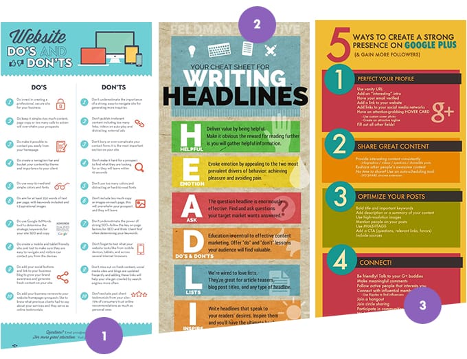
Some of my favorite fonts: Tw Cen Mt // Futura // Sanchez
3. Limit the size of your infographic
Note: This tip is not one size fits all.
You may not agree with this tip but I personally won’t read an infographic that is super long unless I’m really interested in a topic.
Why am I not so fond of super long infographics?
When I share a super large image on social media especially on Google+ and Facebook, it automatically gets resized into a smaller one, which makes it hard for you people to read. So super long ones are not really “shareable” especially on social media networks.
I used to upload long infographics and some of my friends didn’t like it. I remember that someone told me… “Do you think I can even read this?” His message did make sense… why bother sharing if I can’t even read the information right? So from then on I try my best to keep my infographics NOT super long. Plus, some long ones tend to make me sleepy (hey I have a short attention span).
Here are some examples of successful infographics that are not super long: example #1 // example #2 [mini infographic] // example #3 // example #4 [mini infographic].
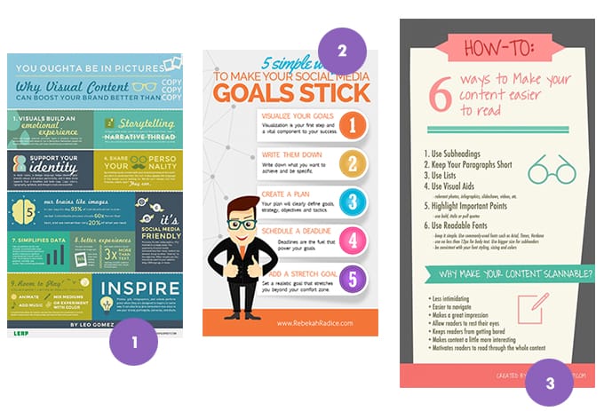
Here are the sizes I usually use, feel free to use ’em:
- 600px width x 1000px height (example)
- 730px width X 1360px height (example)
- 730px width X 1620px height (example)
- 730px width X 1700px height (example)
Feel free to experiment and test your own sizes until you find your sweet spot. If you have the time, you can make shorter infographics for some social media networks and longer ones for others.
Vertical images perform better than horizontal images (based on my experience plus statistics).
4. Use enough whitespace
What is whitespace? In web design, whitespace refers to the “space” between elements in your design.
You need whitespace to improve the readability of your graphic and to give your text and other elements room to breathe. In other words, whitespace helps you eliminate clutter.
Here’s an example (when blogging):
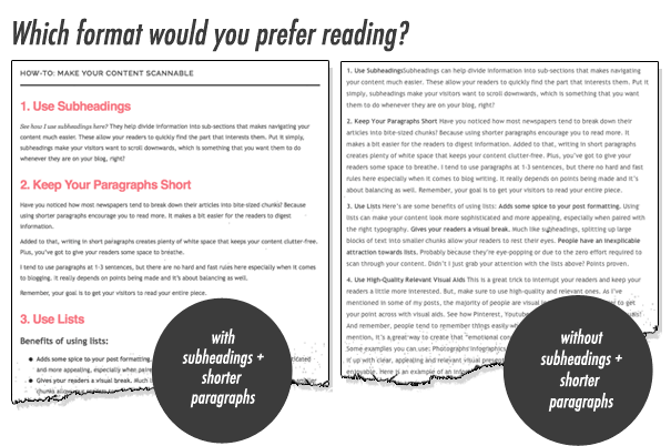
Which one would you prefer to read? Of course, the first one. So when you create your infographic, make sure to use enough whitespace in between the paragraphs or elements for a cleaner and easier to read layout.
BUT do not use too much whitespace. Remember, your goal is to make your infographic “easy” on the eyes.
5. Sprinkle Relevant Examples
As they always say, “Show, don’t tell”. Depending on your industry or depending on how long your content is, it’s always better to use actual examples rather than just adding pure text.
You can either add relevant photos, before and after examples, icons or any other extra elements to demonstrate what you’re trying to teach. Take a look at these fun infographics:
example #1 // example #2 // example #3.

Where do I get my resources?
- For stock photos: PicJumbo //
Picography //
Getrefe // Foodies Feed //
Unsplash - For icons and mini elements: I go to Icon Finder // Creative Market / / Graphic River // Pixeden // Graphic Burger // Freebies Bug
6. Keep your target audience in mind
Of course, you wouldn’t want to design a girly infographic if your target market is a guy, right? If you want to grab the attention of the “right” people, you need to design according to your target audience’s taste.
Also, you must speak your target audience’s language. You need to tailor your writing to a specific person so your target market can easily grasp what you mean.
In other words, produce an infographic that appeals to your target audience’s needs and desires.
7. Fancy it up! But don’t overdo
Okay, so now you know the general rules of creating a concept or a layout for an infographic.
Now here’s the fun part – prettify your infographic to achieve that “wow factor”. You want to stand out. You want to create a strong impact. So sprinkle some drama into your infographic.
Some ideas for snazzyfying your infographic:
There are no hard and fast rules here. Be creative!
- Use shapes to highlight numbers or place numbers inside shapes (example).

- Layer icons creatively (example #1 // example #2)
- Use shapes creatively (example #1 // example #2 // example #3 // example #4)
- Use lively colors but be consistent with it.
- Brighten up your graphics with attention grabbing graphics (example #1 // example #2).
- Befriend patterns and textures. I love Deviantart.com.
- Use gradients
- Use numbers / lists (example).
- Use charts (example).
- Use that “fade out” effect (example #1 // example #2).
- Use that “drawing” effect (example).
- Use photography as your background and use white typography (example #1 // example #2).
- Keep it simple (example).
- Use blurred backgrounds.
- Be fearless. Break the rules! (example).
Some tips:
- Limit your fonts typefaces to 1 or 2 to keep things simple. Use easy to read fonts for simple and effective graphic design. The eye finds it hard to scan multiple typefaces, so stick to a simple collection of fonts.
- Restrict the use of your colours. Stick to 3-4 colour pallet that complements to each other. Here are some color pickers: Adobe // Colour Lovers // Pictaculous
Need design ideas and inspirations to get your creative juices flowing? Find them here:
8. Create your own style. Be memorable.
I remember when I went a little cray cray when I recognized my favourite blogger’s mini infographic (Rebekah Radice) on Pinterest. So I clicked on the graphic and yup, it was hers! I went to read the content right away and shared it with my followers.
See? I knew it was Rebekah Radice’s infographic because that “style” or “BRAND” was hers. I clicked on it without thinking twice because I knew her – I knew that all of her content are useful.
That’s what you want to do as well – brand your infographic. Make it YOU. Create your own style, and be consistent with it. So when your fans see your infographics shared elsewhere, they can easily recognize that they’re yours.
You can create your own signature by using the same fonts on every infographic, same shapes or elements, same colors, or by adding a unique style that makes “YOU”. Take a look at the example infographics I’ve created below, see how the fonts are always the same? The style? The elements I’m using?
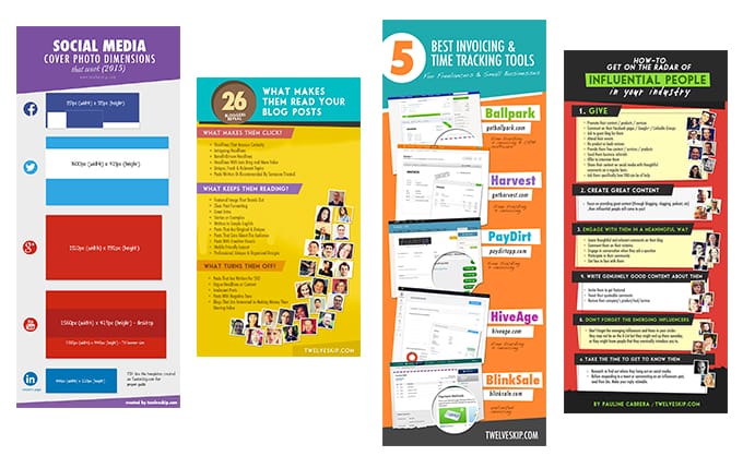
Techniques I use to create branded infographics:
- Keep the fonts consistent. It’s okay to mix it up with other fonts but keep using the same font you’re using with your brand if possible.
- Use consistent elements. For example, I use the same “highlight” black element on every graphic I make.
- Use the same layout or concept.
- Inject your brand colors. Again, it’s okay to mix it up a bit with other colors. As you can see, I don’t really use the same colors in my infographics because I’m afraid that people will easily get tired. As long as you use the same style, you will be ok.
- Add your logo. I put my logo at the bottom of the graphic.
Check out my friend’s (Andrea) post on how to create branded watermarks.
9. Add your website URL
No need for long explanation here! Add your website URL at the bottom of your infographic so people know where to find you.
10. Make it look authentic
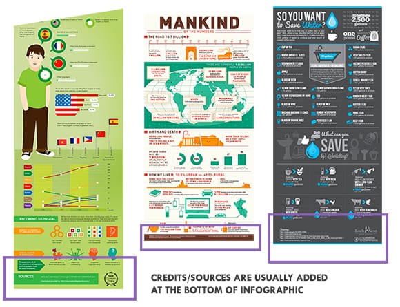
Now you’re almost done. Time to give credit where credit is due. Plus, when you add reputable sources, it makes your infographic look “trustworthy”.
If you borrow some information or graphics to decorate your infographic, always put them in the sources/credits section. I put mine at the very bottom of my graphics. Some examples: example #1 // example #2 // example #3.
11. Use PNG format
You can use either PNG or JPG but I usually stick to PNG format because it generates a higher quality output. If you use the JPG format, make sure to save it to its highest quality.
File size too big? Here are my favorite tools for reducing the size of my infographics:
- TinyPNG: Online image compressor for JPG and PNG formatted images
- ImageOptim: For Mac users only
12. Promote Aggressively
You spent hours of researching, writing and beautifying that infographic, of course you would want the world to see your infographic, right?
I like using the “aggressive” word because I want you to REALLY promote your infographic. Not just post it across your social media channels and consider it done. You want 1000s of shares right? So promote it as much as you can.
Here are some ideas to get your content seen:
- Make it easy to share. Integrate the infographic on your blog post and make sure you have social sharing buttons to make it easy for people to share. Be sure to have Facebook share, Google+ share, Tweet button, Pin button etc. You get it. Don’t forget to put an ON-HOVER pin button on your posts (Do you see the Pin button when you put your mouse over the images in this post? That’s what you want to do!). Here are some WordPress plugins you can use: Filament // Social Warfare // Pin It Hover Buttons
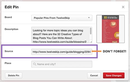
- Promote it on Pinterest. Upload your pin with descriptive and enticing text. Don’t ever forget to add the link to your infographic in the source link part (most people forget this). Inject some keywords to make it search friendly. According to Dan, pins with descriptions around 200 characters long are the most repinnable.

- Pin it on relevant group boards in Pinterest. Trust me, you need to join some group boards on Pinterest. It’s one of the best ways to promote your infographic on Pinterest especially when you collaborate with Popular boards. To find relevant group boards for you, here’s a nifty tool for you: Pin Groupie.
- Promote it on Twitter. Play around with different headlines and tweet your infographic repeatedly throughout the week or month. Need creative headlines that grabs attention? Here’s a list for you.
- Promote it on your Facebook page. If your infographic is too long, I wouldn’t really recommend uploading it on your Facebook page as it will get resized into a really small size. But here’s an alternative solution: cut your infographic into 2 or 3 parts and put the link to your infographic on the caption. Don’t forget to add a personalized message that will excite people and click your link.
- Promote it on relevant Facebook groups. Make sure to add a personalized message along with your infographic and make sure to share it with those people who you think will be interested in your infographic. Warning: DO NOT SPAM. And what I mean by that is, do not randomly post your graphic in any Facebook groups. Do not post a lot at the same time. Try to schedule your message and at least tailor your message for each group so you won’t look like a spammer. There’s a big chance that you will be marked as a spam. See the screenshot below? You wouldn’t want your link to be redirected to a warning every time people click your link on Facebook:

- Use Facebook ads. If you think you should use Facebook ads, make sure to tweak your ad settings to make sure it’s targeted. Here’s a great post about the 4-step approach to effective Facebook Ad targeting, click here.
- Optimize and promote it on Google+. Make sure to include a killer headline, personalized description, use 2-3 hashtags and your link. Here’s an example of a perfect Google+ post.
- Make your infographic embeddable. Add a textarea form with the infographic code so people can go grab your infographic Check out’s QuickSprout’s post for example. Scroll to the bottom of the post and you should see a text area where you can get the code for the infographic.

- Don’t forget Tumblr. Yup, don’t underestimate the power of Tumblr. It’s a pretty big site so if you think your audience hangs out on Tumblr, use it!
- Outreach to other people in your industry. This technique should be used carefully. Do not just randomly email people asking to promote you. That’s annoying. Feel free to ask your friends in your industry who already trusts you to share your infographic. If you asked those you don’t really know, it’s better if you do something nice at first before asking a favor.
- Use your newsletter. Another way to spread the word about your infographic! Make sure to sprinkle your message with personal touch.
- Submit on StumbleUpon.
- Submit to Reddit’s Infographic Subreddit.
- Submit to infographics directory. Here are some links: Infograhic Journal // Visual.ly // Daily Infographic // Cool Infographics // Infographics Archive // Infographics Showcase // More 20 Infographic Directories
And again, you don’t have to follow everything in this list. These are just some tips and ideas. It’s always better to experiment to see what works for you and what doesn’t. Don’t forget to add tracking to your links so you’ll be able to track your performance.
Keep it simple. Be useful. Be entertaining = Bangin’ Infographic
Over to you: Have you tried creating an infographic? If so, have you noticed an increase in engagement? I’d love to know your thoughts in the comments below!

