how to create visual content your audience will love
There’s a reason why infographics are enjoying their moment in the sun, and it isn’t only because more and more businesses are recognizing their worth and potential.

When it comes right down it, audiences are attracted to visuals they can connect with.
The task then, is to convey engaging information that is relevant, accurate and shareable.
Achieving this task begins with an understanding of the role design plays in making the content both appealing and accessible.
Fortunately, there are a number of ways you can go about doing this, whether you’re presenting an infographic, video, image, or other form of visual content.
Here are a few considerations you should make when creating visuals tailored to the interests of your fans and followers.
Creating Effective Visual Content
1. Find a Balance between Words and Images
According to a recent article from HubSpot, 90 percent of the information the brain receives is visual. This means it helps if text is presented in a more visual form, such as stylized font choices and bold, encompassing graphics.
But this alone is not what makes graphics more or less successful.
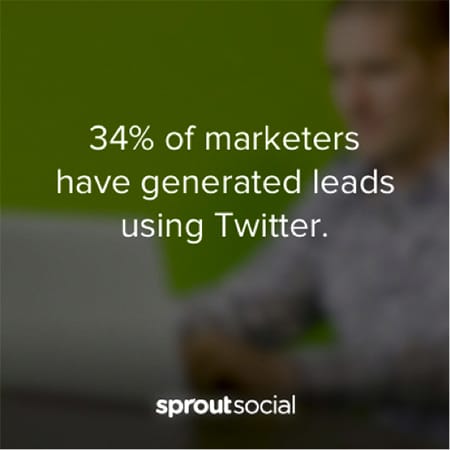
People are wired to respond to visual communication. And today’s social media platforms have created an infrastructure for this type of content to flourish. Keep it in mind that what you say is just as important as how you choose to present it. Don’t let your important information get lost in the content – make it stick out by putting it on an image like Sprout Social does.
Just like in the example, the main point of an article is often really quite simple and can be summed up and made into a graphic that is easily shareable and transformed into multiple posts.
2. Pay Close Attention to Visual Hierarchy
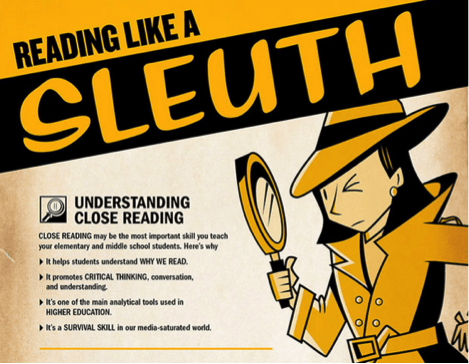
Understand that infographics follow specific rules with regards to visual language. The best examples make good use of spatial relationships when communicating ideas. This makes them an educational art form of sorts, designed to make statistical information palatable in a way that encourages views, likes and shares.
Source: https://blog.kissmetrics.com/12-infographic-tips/
Think about how the information is arranged and include negative or white space where necessary to lead the eye. Notice that in the above graphic, the reader is persuaded to engage in ‘close reading’ to view the text after navigating the material in a clockwise motion.
Besides using positioning and size variation to draw attention to certain things, color and color psychology can be used to great effect if the infographic flows and is scannable.
3. Simplicity Promotes Shareability
The advantage a visual has over more conventional delivery methods is its potential to go viral. For this to be achieved, a simplistic approach is required.
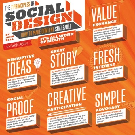
Content only becomes shareable when it incorporates aspects of social design and is easily understood at a glance. If you drag out the point you’re trying to make or provide unnecessary details that confuse the viewer, you will be setting yourself up for failure.
Source: http://www.adweek.com/socialtimes/shareable-social-content/485050
Most people won’t keep reading after they’ve got what they needed. Visuals that go viral do so because they work well within social media settings and account for shorter – and often fleeting – attention spans.
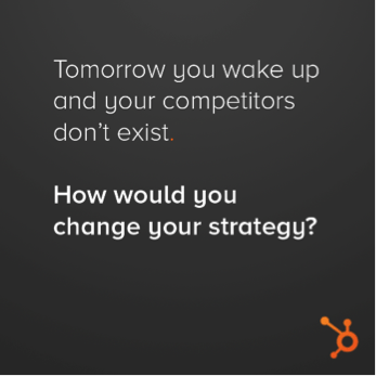
Hubspot often uses visualized text as conversation starters. The image is as simple as it gets – not providing any unnecessary design elements – and encourages the audience to engage in conversation and exchange ideas.
4. Attempt to Solve a Problem
In an excellent real-world example, CJ Pony Parts has created an infographic designed to help readers beat the dealer. Not only does it provide the company’s audience with actionable advice on how to do this, it addresses a contemporary issue within society.

Source: https://blog.cjponyparts.com/2014/10/beat-dealer-infographic/
The infographic, also available as a motion graphic, comes across as authoritative and goes to great lengths to establish credibility. One way you can incorporate this into your own visuals is to talk about any pain points that relate to your target audience, then offer solutions.
You also see this a lot on Pinterest or Reddit via “life hacks.” The images, like the one below, solve a problem. But, rather than describing it alone, it is paired with a visual demonstrating the trick which makes it much more compelling and likely to be shared.
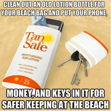
Source: http://www.lifehack.org/articles/lifestyle/100-life-hacks-that-make-life-easier.html
5. Tell a Story with Your Unique POV
If you really want to connect with your audience, understand that visuals are about more than presenting statistics and bite-sized factoids in a vacuum. A picture is worth a thousand words, so find a way to tell your story visually and the audience will be much more interested. The following infographic takes the topic of drug abuse – a problem many Americans are aware of – and makes it a more approachable subject for modern audiences.
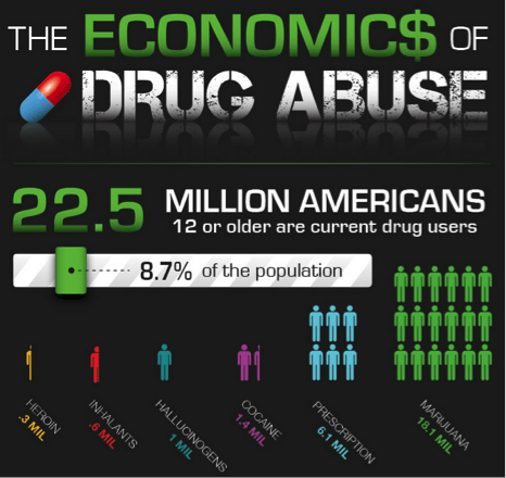
Source: http://www.12keysrehab.com/blog/the-economics-of-drug-abuse-infographic
The material appeals to the reader’s sense of morality and proposes alternative methods for dealing with the situation such as sending drug abusers to rehab instead of jail. These methods are hard to argue with when you see the economic impact it could have.
The reason it works so well is because a particular stance on a controversial topic is taken and a story is told. This particular approach encourages the audience and general public to weigh in with their own opinions.
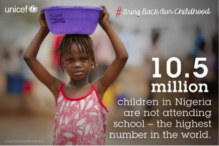
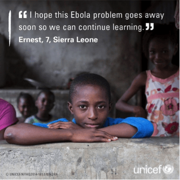
This tactic is also used quite often by charities like UNICEF that tell the story of someone in need that supports the issue they’re working to combat. The visual compels people to help support the cause because they can identify with the person in need, feel the desperation of their situation, and imagine that their donation is helping the person in the picture.
6. Design with Your Target Audience in Mind
If your visual is more concerned with creating a debate, odds are the internet will have a lot to say about it – especially if you hit a hot topic.
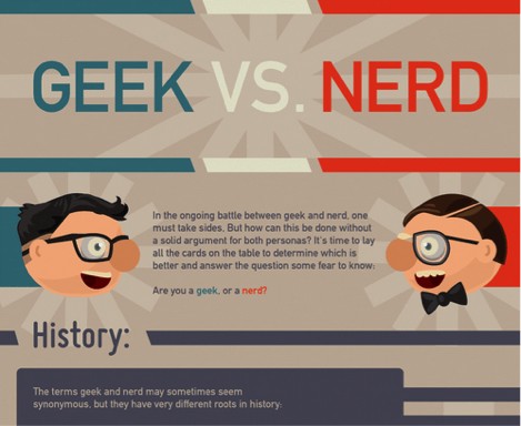
In some cases and for some businesses, it may even make sense to include your target audience within the content, or even make it about them. Such was the case with the following Geek vs. Nerd infographic that circulated a few years ago. Don’t forget about the ever-popular GIFs, either.
Source: http://www.coolinfographics.com/blog/2012/1/20/geek-vs-nerd-which-are-you.html
How you promote your graphic is hugely important. Tailor it to the social platforms they’re most engaged in. Use their language and incorporate their style into the design; a style blog will have elaborate design and a tech blog would be clean and simple.
Create an avenue for your followers to be heard and encourage engagement by asking your readers to share their own stories. This will develop a community around the piece.
7. Check Your Facts and Cite Your Resources
It’s one thing to create a visual containing scientific facts about things most people aren’t familiar with, but it’s another matter to communicate ideas about popular topics. Either way, citation is important if the message is to be taken seriously. The following is an example of a SlideShare presentation, a newer form of visual content that is gaining popularity.
If you focus on being accurate, your graphic or presentation may be linked to or endorsed by an industry expert or influencer. This situation is ideal because it should increase the content’s longevity, helping it to reach a much wider audience than it otherwise would have.
Keep in mind that what’s popular on the internet can change as quickly as the weather. And new information may create the need for revisions.
When this happens, it can be easy to fixate on what is wrong or not quite right. But at some point you just need to get it out there and let your fans decide. Make sure you’re able to trial, test and repeat any successful elements so you can replicate the process when creating your next piece of visual content.

