10 Most Creative Dark Website Designs
There’s no doubt that dark web designs can offer elegant and creative look. They can work for many types of clients. Unfortunately, they aren’t always appropriate for every website. Thus, they must only be used if you think it’s appropriate.
However, many web designers don’t know how to use darker designs effectively. As a result, they scare away their visitors. This is because darker design means less readability. It also doesn’t appeal to most readers.
Then again, you can still have a dark design that will appeal to general audience. As a web designer, you need to learn how to pull an effective dark designs without losing the interest of your audience.
In this post, you’ll learn how to convince your visitors that your site is still readable and user-friendly, in spite of its light text against dark background, by looking at the top 10 examples of creative and appealing dark website designs.
With the ideas from these sites, you can still be creative without straining your visitors’ eyes.
These websites here offer clear and readable content against dark backgrounds.
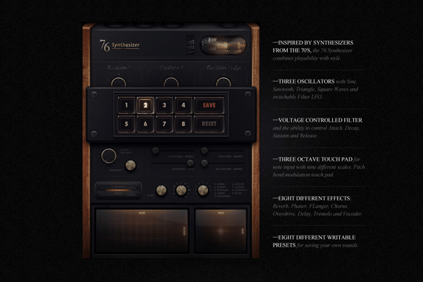
1. Synthesizer
This site showcases darker design. But it’s a beautiful site and it catches one’s attention. The trick here is that the designer used a large white space to outline the site’s important elements. The images presented have a lot of white space around highlighting the content. In here, the white space is used appropriately to emphasize not the design but the text and the main content of Synthesizer.
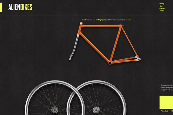
2. Alien Bikes
The content and image are placed together with most white space. The role of white space here is to guide the visitor in reading the content allowing you to pay attention to the products being shown. It would be a boring site if it didn’t use the dark background. This is because the site relies heavily on the black (white) space.
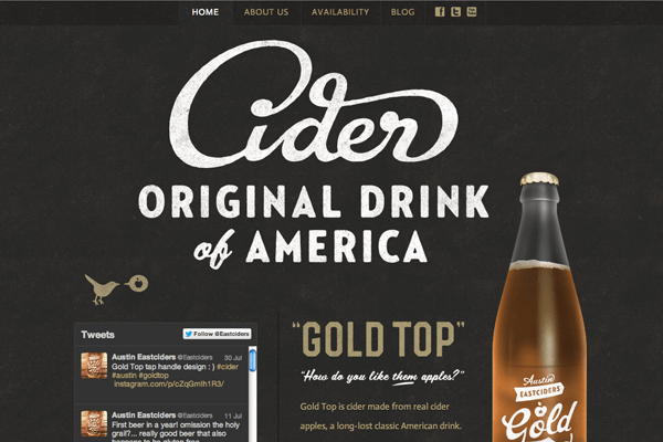
3. Cider
This site also utilizes white space in providing breathing room for the content. The visitors can use the space as the resting point before they move to the next pieces of information. With the help of white space, the website becomes properly laid out providing only the important elements. Plus, the dark background offers the elegance it needs for the overall look.
4. Champion Boxing Fitness
The designer opted to use images to make the darker site more effective. With the help of the dark background, the user will have a clear look at those images and text. The information becomes readable through the white space and paragraph size.
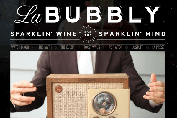
5. La Bubbly
One of the biggest problems of web designers in choosing dark website is readability. But the designer of LA Bubbly made sure that the site would still be readable by increasing the font size. With larger font size, it can have more white space so each letter appears round. The text becomes easier to read.
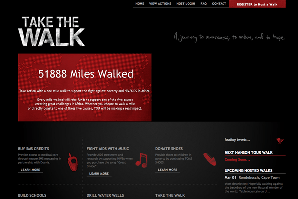
6. Take The Walk
Although it opts for a darker background, the text is still readable and appealing. Thanks to its choice of colors. The color scheme definitely complement with the site’s overall theme. The primary color, red, works well to emphasize the key points of the site.
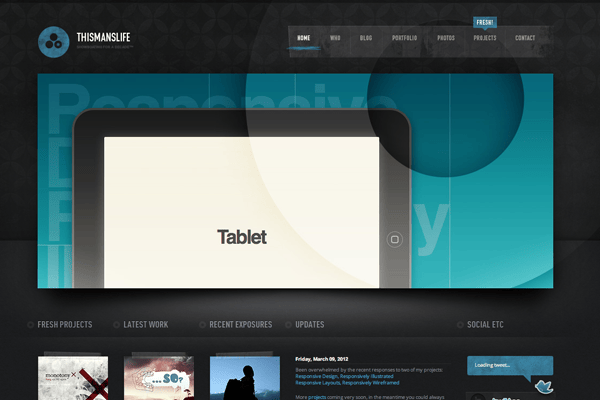
7. This Man’s Life
Notice how this site utilizes reflections? They’re fascinating. They provide a good effect to the overall theme. Reflections always look best with a dark background. Although the font size is a bit smaller, the usage of gray and white color makes the design looks attractive.
8. Etch
The site has a clean with uncluttered appearance because of the minimal color schemes. It uses two to three colors against dark-colored background. The texts are also readable as the fonts are easy to read. It uses the right color for the font making the text visible even if the background is dark.
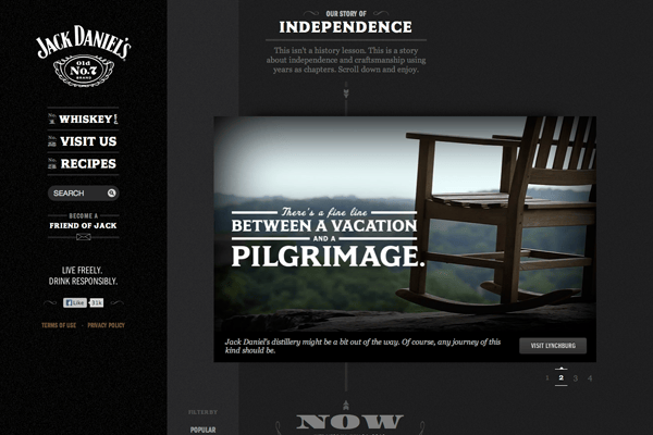
9. Jack Daniel’s
It uses the right contrast to the background making a pleasing site. The contrast includes light and dark colors combined. The textures allow the site to look elegant. It’s clean and readable.
10. Holler
This site has little content. But look at its unique layout. The dark colors chosen are also appealing. It doesn’t use fancy fonts making the text worth reading.
These are just some of the examples that you can use to give you ideas on how to make a darker website design. There many elements that you must consider to make it more appealing. As you can see from these examples, dark designs are great. But they always depend on how you make it.

