15 Captivating Examples Of Contact Form Designs
Especially with the entrance of the new web design trend known as single page websites, contact forms are now going present on the landing page rather than the usual way of putting it in a separate page. This is to save time and hassle for visitors, and this in turn will also induce more traffic to the main page rather than on a separate page.
Contact forms are critical especially to modern websites. With contact forms ready on the site itself, visitors will save themselves the time and effort to go into their main mail client just to send a message. Being essential to propagate communication with prospected clients, contact forms must be designed as much as the rest of the pages. With a good contact form, visitors may even be visually tempted to fill in the necessary information even if they are unsure yet!
Check out these cool contact forms and pages that you’d love to peek as inspirations!
1. Denise Chandler
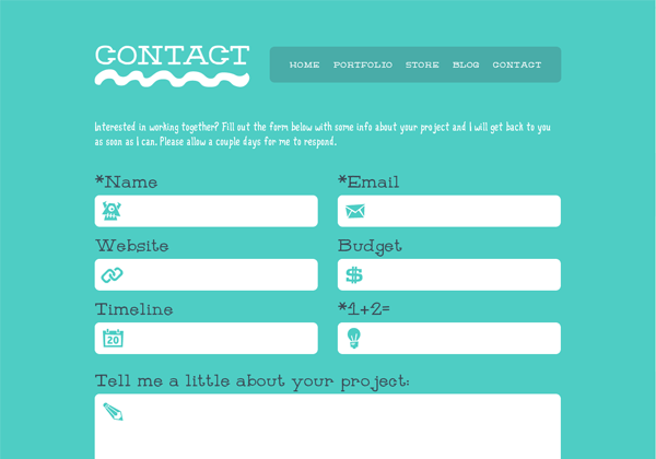
With a very lovely font face, creative and youthful icons and shapes, and a subtle ocean blue background, this contact form stands out as a contact form serving as a page. The fields are also big and wide enough like a black hole hungry for a fill-up. Moreover, looking into the labels, instead of the usual field for ‘message,’ the big box says ‘tell me a little about your project.’ I think this is a lot more straightforward.
2. Baptiste Cochard | Atelier Detour
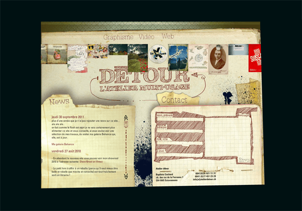
A sample of a single-page website filled with interactivity and flash contents, the highly-creative contact form found on the bottom of the page (though you may have to click a button for it to show) is a perfect design element to blend to the overall website design. The form fields are also irregularly shaped to make it look more like a random draft. Lastly, other contact details are found on the bottom, making it easy to access without looking anywhere else within the same page.
3. Little Lines

The contact page starts with a full-sized banner saying how the company is excited to hear from visitors. Scrolling below, a vertically-oriented fill-out form is ready for all the necessary information. Making this contact form more unique is a choice for visitors to opt between a simple message or if they want to ‘kickstart’ a project at once. This can be a great idea: adding another call-to-action element to the contact form to make it more productive.
4. Mario Petrone
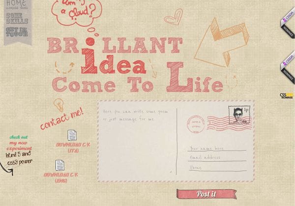
Anchored right on the main page, the contact form found on this well-designed website is of a subtle but less formal tone. With a real mail-like look plus a ‘demon’ stamp right on the upper right, the contact form can also be mistaken as a postcard. Nevertheless, this contact form is very unique, and hence, tops on my list very well.
5. Vismaad
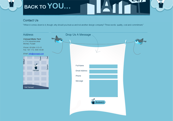
The contact form found on this website by Vismaad is of no surprise in look, but what made it a little standout and hence unique is the way it is blended with the background image which is a couple of birds trying to keep the string on air. And yes, we must not miss the other contact information found on the left, together with an unusual map design that will tempt you to click on it.
6. PaperLux
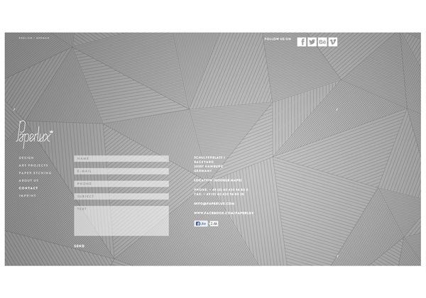
The main asset of this contact page is the unusual way of layout. Giving more emphasis on the patterned background, the contact form is rather situated on the left side of the page, slightly lower than the horizontal center. The form itself is very common, and at least, we can communicate with the site directly using the Facebook ‘Like’ button.
7. Falko Seidel
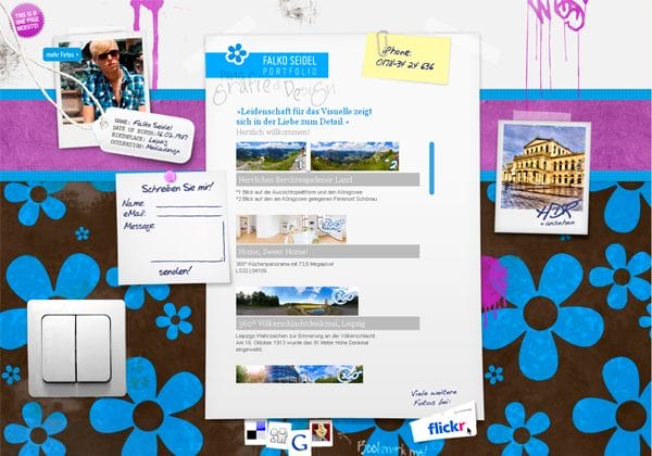
Though the contact form can be slightly misleading in position and size, this small ‘pinned’ contact area is of a unique feature. Moreover, with a whole lot of other elements and background design, the contact form here is unusually irregularly practiced as a trend as well. Input text can hence be smaller in size as well, so you better not have any trouble reading them.
8. Code Quest
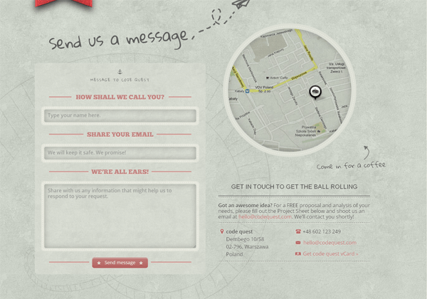
With a well-designed website itself and a very creative background, the contact form of Code Quest is a very attractive form to fill on. Each detail of the contact form looked meticulously designed, and the way labels are addressed is of a creative nature as well. Looking on the right side, a clipped map is ready to guide visitors ‘for a cup of coffee,’ and other information like e-mail address are all hot links for easy reference.
9. Sormenpills
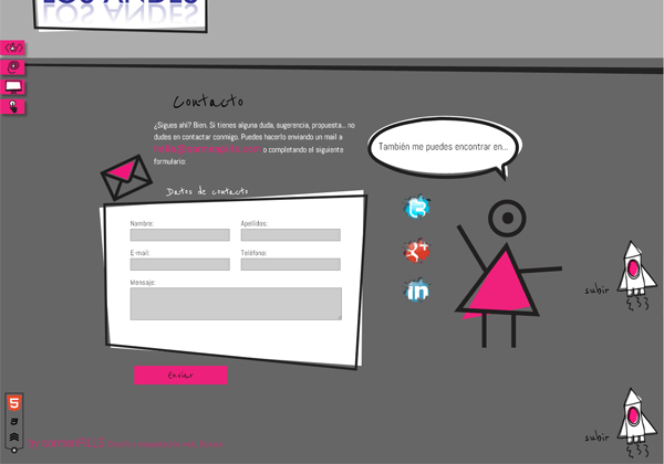
Better not put any prejudice on this site because of the load of line arts in the design as a whole. With a lot of irregular but simple shapes, the artist behind the site is capable of making the usual things unique and appealing. Too bad we don’t really have a lot of other contact methods here, but the three social icons punched on the little right of the form can be helpful at least.
10. Xbition-Art
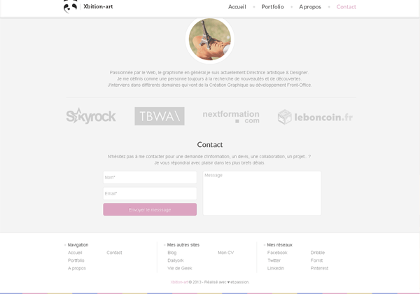
The contact form in this site which is found at the bottom of the page is not really emphasized and, in fact, not designed exceptionally. However, what makes this contact form different as a good inspiration as well is the layout itself. This could be a great idea if you are running out of spaces, or if you do not want to waste much space on your overall design. Unfortunately, that’s all you got for this contact section: no map, no contact numbers, no e-mails.
11. Sick Designer
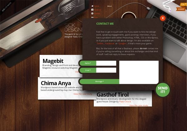
You won’t really find the contact form here at once, but when you clicked on the ‘contact’ link on the top of the page, you will be surprised with the contact form that drops down out of nowhere. The contact form itself is a stand-alone art that you can be really proud of. You’ve got a personal message here, fields for you message, and the ‘send it’ button that gets falling on the bottom right of the pop-up design. Impressive, isn’t it?
12. Pearman
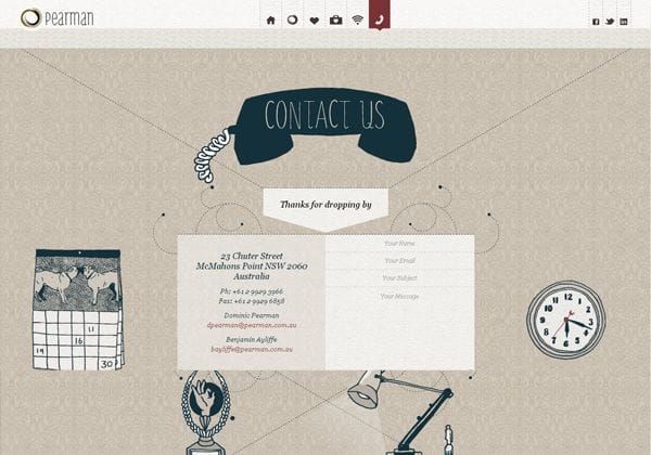
Another great design for a contact form, Pearman offers a contact section that is easily navigated using the animated anchor link found on the top of the page. The contact section includes a lot of illustration arts, and better, aside from the usual form fields, you are also given other contact details including direct e-mails to the artists. And just in case you didn’t notice at all, this contact section of the page knows how to say ‘thanks for dropping by.’
13. Online Department
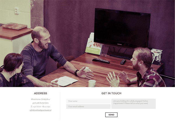
This highly interactive website design is one of a kind for being elegant and real professional in look and feel. Going for the contact page, a very smooth transition greets you to what you are about to get, not to mention the big banner image that shows how good they are at collaborating with people. The contact form itself is not amply spaced for a message of a good length, but the main way to communicate with the department, as the design speaks for itself, is via the social links found on the cover photo itself.
14. Always Creative
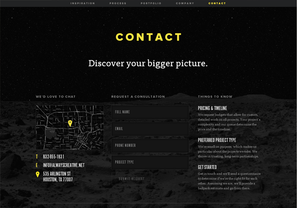
The website design itself is comprised of several ‘scrollable’ sections that look like independent pages. Going for the contact section itself, the black theme of the section is what makes this contact form a standout. On top of this, there are some ‘things to know’ scribed on the right side of the form, and on the other side, a ‘black map’ with a yellow cursor is ready to guide visitors as well. Too bad we didn’t get a navigation here for quickly scrolling down to this area, but I think this has a good purpose.
15. Try Triangle
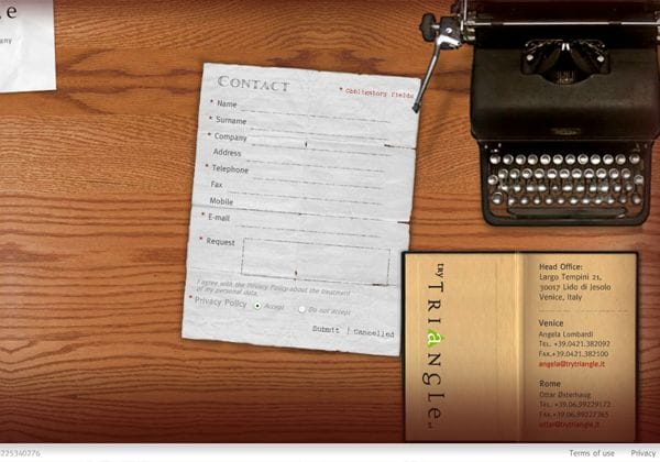
Another highly-animated website that loads very quickly, you’ll immediately know where to click to get to the contact area of the website. The contact form itself takes the form of a real paper-like form with a lot of fields to fill in to. Uniquely, aside from the obligatory fields, there’s also an option wherein visitors can choose if they have read the privacy policy of the company. If you want to go to the contact details directly, check out the journal sitting atop the contact form.