10 Great Examples Of Single-colored Background Sites
Web designing has evolved immensely. When you compare websites 10 years ago, you’ll realize that their differences are enormous. From fonts to layout, most elements of a website have changed.
The background of a modern website has also been modified by designers. It’s one of the features that can make an impact to the visitors.
When you’re designing your site’s background, one of the things you’ll have to consider is its color. Single-colored background is one of the popular trends being followed by many designers.
In this post, you’ll find examples of sites that utilize a predominant single background color. Take note of how they’re used and complemented the overall appeal of the site. You should also keep in mind that they’re not that bold but they’re powerful enough to instill elegance and unity.
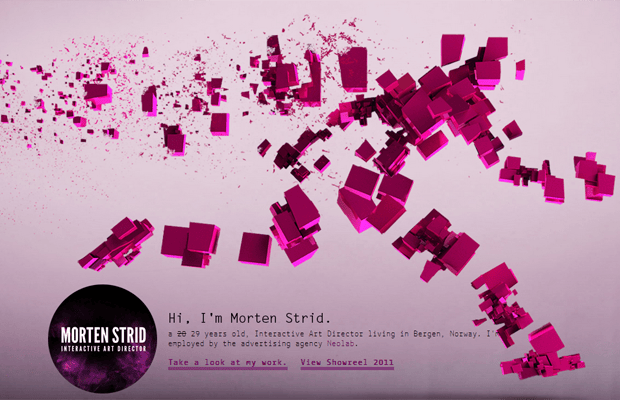
1. Morten Strid
This site chooses shades of pink as the dominant color. This kind of color reflects the creativity of the owner. Pink conveys confidence and emotional strength, as well as optimism.
2. Lipton Mint Green Tea
Green is the color chosen by most eco-warriors and Lipton’s Green Tea used it here. The designer of this site has a firm grasp about the brand and the audience. Generally, it’s a smart color choice as it doesn’t induce eye strain.
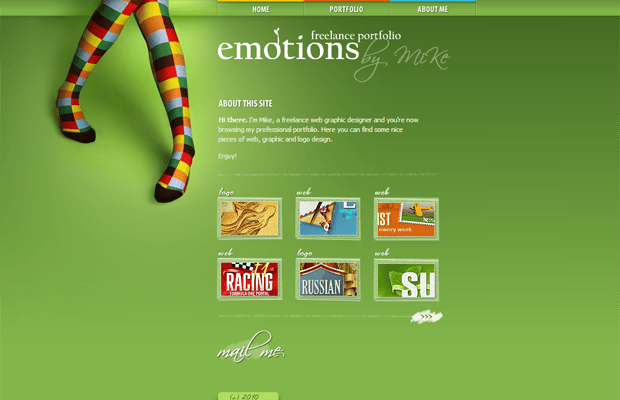
3. Emotions
The white text on green background ensures legibility. Essentially, it’s very persuasive and attractive. The main goal of this site is to showcase the owner’s work of art. And Mike did a great job there.
4. Warface
It’s definitely orange. Although it’s not every day you see a site that uses this shade of color, the designer made sure that the visitors won’t have blood running from their eyes while they read the text.
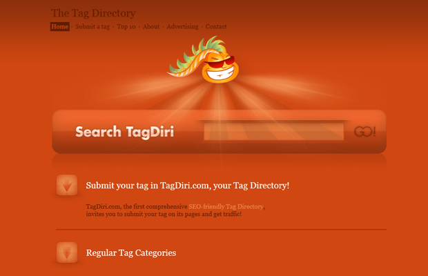
5. The Tag Directory
Red isn’t a favorite background color. But this site changes that perception. It looks professional and it’s not at all irritating. However, you need to be cautious when using shades of red. Make sure that the outcome can surely get the emotional response you’re aiming from your visitors.
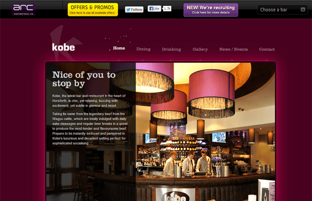
6. Arc
The purplish background color creates a pleasant experience for the site’s visitors. Although purple is a female color, it still manages to market the brand in the male department.
7. 42Angels
The site is geared towards entrepreneurs in Czech and Slovak who want to make a profitable business. Both young and old will appreciate the vivid black color utilized by this site.
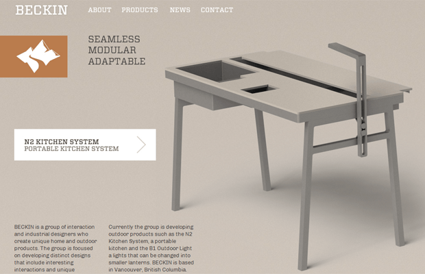
8. Beckin
It uses a unisex color. So, you can’t say that it’s only for male or female audience. But the site’s owners made the right choice considering the products/services they’re offering. Grayish isn’t a popular choice but this site shows that it can be a good option while making your site more attractive and professional.
9. Book Of Beards
It’s a site about a book – Book of Beards. The book is about power and mystery of cancer. Hence, the color black.
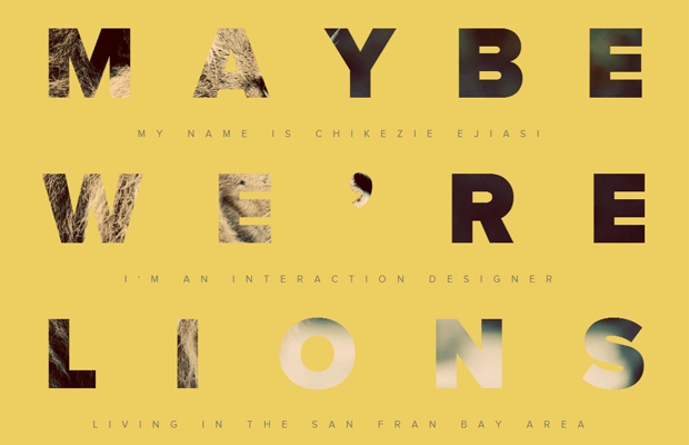
10. Nine Lion Design
The site is full of warmth, energy, and friendliness. This is probably the reason the site’s owner chose to have shades of orange. The photos add a lot of depth to the entire website.
Choosing a solid single color for your background is tricky. You need to pick a color that makes your text readable. To reduce eyestrain, you have to choose one that highlights the text to grab the user’s attention. Don’t forget to use contrast between text and background. This is to avoid your users going insane. It’ll only strain their eyes. Depending on the goal of your site, you should choose a color that reflects its mission.
