10+ Best Financial Services Website Design Examples
The finance industry is one of the most intimidating industries since most people are already sceptic of anything related to money and investments. Now, designing a good financial service website should not only look good but also appeal to their emotions and encourage them to trust you. Here, we rounded up 10+ Best Financial Services Website Design Examples & Inspirations we can visit and learn a few things to implement on yours.
10+ Best Financial Services Website Design Examples & Inspirations
1. Brightwood
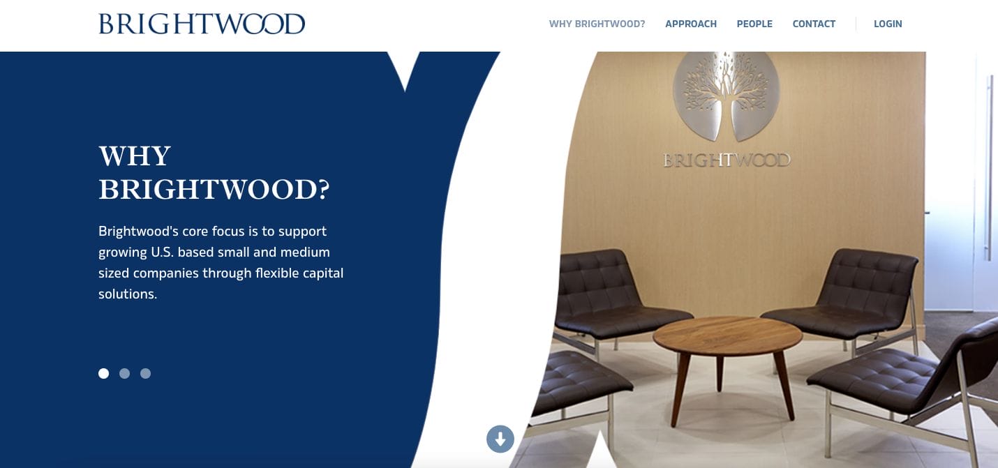
Modern and professional, Brightwood curated its website to somewhat showcase its tenure in the industry without being too stiff. They added visual elements such as curves and transitions which modernized the experience while browsing their landing page. Besides this, they added snapshots of their office and their wide network of specialists. With brief copies in between, they also implemented call-to-action buttons to encourage the audience to take action.
- website: https://brightwoodlp.com/
2. Nerd Wallet
With a fresher concept that shines best through its choice of colours, Nerd Wallet is one of the best financial service website design examples you can take inspiration from. Their menu bar includes links directed if you want to learn more about the company and their service. They also added testimonials and statistics to promote the reliability of the platform they offer.
- website: https://www.nerdwallet.com/
3. Pearl Capital
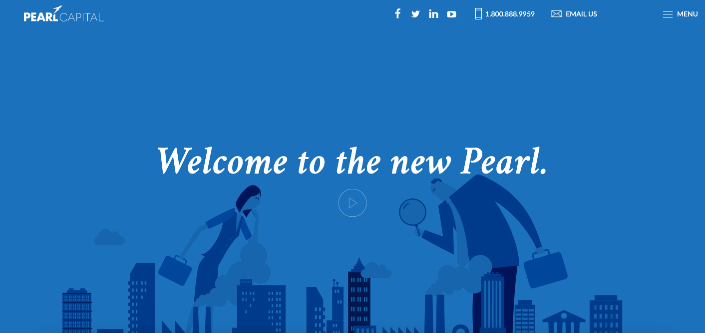
Pearl Capital has modern and youthful energy on its website. Though minimalist in general, they used graphic elements and illustrations to add life to the website. Scrolling further down, we get an introduction to the business and what services they offer. Pay close attention because they actually embedded a video overview of the business that one can watch if not into reading.
- website: https://pearlcapital.com/
4. BNY Mellon
Professional and tenured in the industry, BNY Mellon showcases different articles and write-ups directed to educate potential clients. They use these resources to also attract more traffic through search engine optimization. Additionally, these also increase their credibility and expertise in topics relating to the business.
- website: https://www.bnymellon.com/
5. Runway Growth
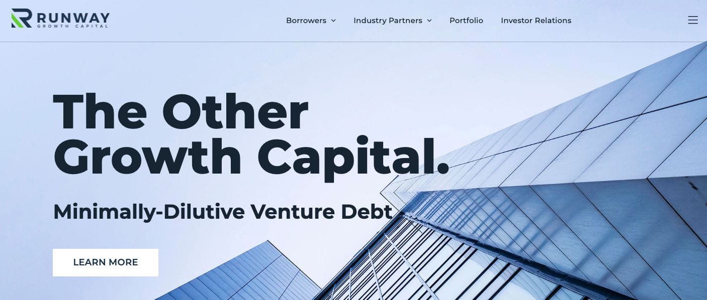
Runway Growth is another of the best financial service website design examples you can spend time in. Their website is quite simplistic but sophisticated in many ways. They have strategic call-to-action buttons that push site visitors to take action immediately. Besides this, their website is also optimized for mobile. Partners in the past were also showcased in a section to help them with establishing their credibility.
- website: https://runwaygrowth.com/
6. Pangea
Since Pangea is a money transfer platform, adding a quick version form to the landing page is a good strategy. This adds a more immersive experience for potential clients who wants to send or convert currencies. Moreover, they included sections to showcase the platform along with testimonials and feedback from other users. Listing countries supported along with adding their flags also helped make it scannable.
- website: https://pangeamoneytransfer.com/
7. Morgan Stanley
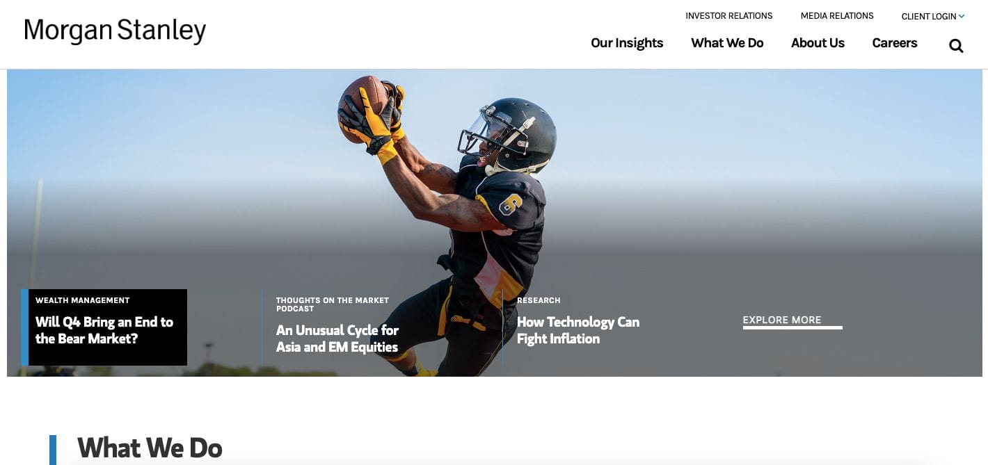
A neat and premium website, Morgan Stanley sure is one of the most reliable companies in the financial service industry. With this in mind, their content matters and people would definitely listen to what they have to say. They listed down the services they offer with a quick overview and photo to make it easier to absorb for readers. Insights and company achievements are also showcased if you want to know more about them.
- website: https://www.morganstanley.com/
8. Keybank
Though mainly simple, Keybank strategically mapped its website to be skimmable. They added icons that can serve as cues and trigger the attention of clients. Furthermore, the use of red as an accent colour may help psychologically attract attention and encourage impulsive actions. Awards are also added in a section along with a list of services they offer.
9. Goldman Sachs

Sleek website, Goldman Sachs put their platform in the centre stage. They added well-written copy along with call-to-action buttons that trigger action favourably for the company. Scrolling further, they showcased a few of their top blogs that not only help with optimization on search engines but also in establishing their expertise in the business.
- website: https://www.goldmansachs.com/
10. Adison partners
Adison Partners is unique and unconventional — they used bright contrasting colours which can easily pique the interest of site visitors. With a one-liner headline and a neat design, they direct potential clients to check their social media accounts or click on their menu icon to learn more about them. With neat transitions, it’s not hard to fall in love with the website and stay interested to read more and navigate further.
- website: https://www.adisonpartners.com/
