10+ Best Fintech Website Design Examples & Inspirations
Trust and reliability are a few of the things important in the Fintech industry. To gain traction and encourage customers to try, covering all possible bases and handling potential objections with realistic solutions is your best bet. Now without further ado, we rounded up the 10+ Best Fintech Website Design Examples & Inspirations so you can get ideas and work on revamping your website.
10+ Best Fintech Website Design Examples & Inspirations
1. Stripe
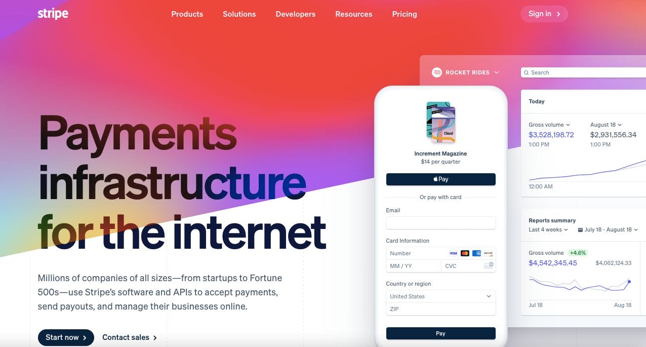
Revolutionary, Stripe wows us with their colourful and youthful website that showcases vibrant colours. They also implemented a soft and slow transition on the colours, adding life to the website layout. Headings and copy are well-written and paired with a graphic representation of the in-app platform. Besides this, they showcase their brand partners and highlighted their features along with data statistics to support each. Call-to-action buttons directed to the application or contacting their sales team are available too.
- website: https://stripe.com/
2. Betterment
Consistent with their promise of providing better solutions, Betterment has a good fintech website design to check as an example. Bright and cheery with their choice of yellow and black, the top menu bar also allows easy navigation through the website. Furthermore, they also added a segment that allows site visitors to check their money on hand and toggle it accordingly to see potential investment profit.
- website: https://www.betterment.com/
3. Robinhood
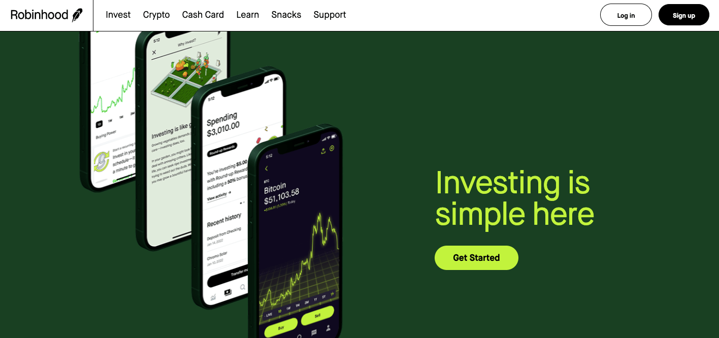
Using primarily green and close tones of this, Robinhood employs a quite minimalist website with sleek transitions. Each phone graphic gives an overview of the different features of the platform. Scrolling further, they added sections giving more information about each and added call-to-action buttons to nudge the use of the app. Hip and modern — Robinhood is definitely future-oriented. In the end, disclaimers and necessary notices are added to manage expectations and establish that they follow set regulations.
- website: https://robinhood.com/us/en/
4. Mint Intuit
Mint Intuit is a personal finance app and their website just communicates that best. They crafted their copy well and their call-to-action button directs site visitors to try and download the app. Furthermore, testimonials and ratings are also showcased to establish reliability in mass usage. Options for their other fintech solutions are also available in the menu bar on top of the screen as well to promote them as a credible developer.
- website: https://mint.intuit.com/
5. Albert
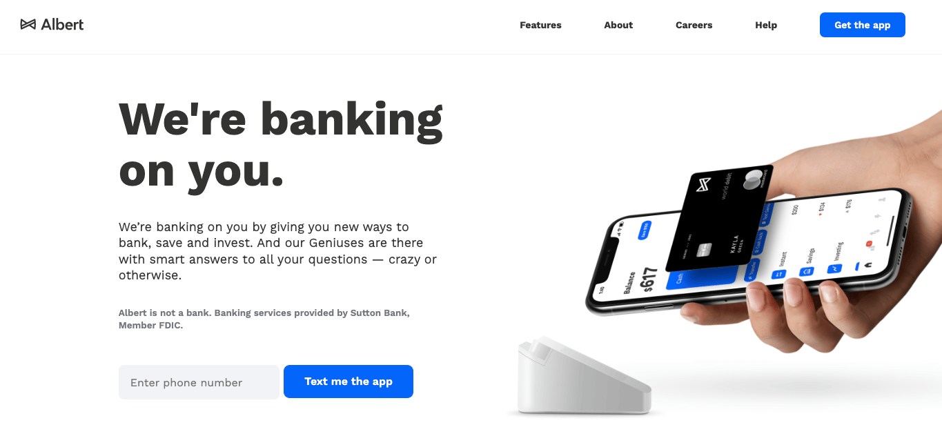
With a witty headline, Albert showcases a minimalist professional fintech website example to get inspiration from. They focused on well-written copy that was just right to keep the audience engaged. Graphics are added accordingly to express thoughts better and make content more skimmable. Call-to-action buttons are strategically placed in sections to encourage the site visitors to join the team’s database.
- website: https://albert.com/
6. Cash App
Very techy, Cash App has an iconic website design with digital elements and colours that reminds us of The Matrix. Moreover, there are subtle transitions as you scroll which directs the attention toward the important details on the website. There is even a QR code for ease of downloading the app on your phone. Moreover, the website looks hip and youthful. Screenshots from the app are also incorporated to further showcase the functionality of the app.
- website: https://cash.app/
7. Western union
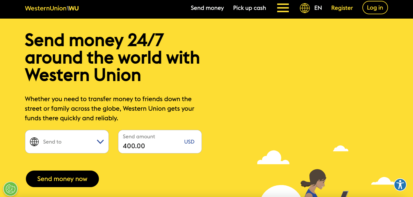
A true pioneer in the fintech industry, Western Union picked yellow and black which is quite remarkable. This promotes brand retention and also captivates the mind to pay attention to the website’s content. Furthermore, there is a quick form you can use to tag your location and the amount you potentially want to send. This triggers and records the date adding it to their database. Additionally, there is also an accessibility and cookie setting.
8. Binance
Minimalist and neat, Binance is another good fintech website to get inspiration from. Since the platform is about a userbase, its call-to-action buttons are directed to encourage site visitors to register or sign in. Besides this, they also ensured security through various measures which assure users that their investments are safe. To further encourage new people to bask in their solutions, they added statistics and a few previews they can read to gauge if they’re a good fit for what the person needs.
- website: https://www.binance.com/en
9. Wealthfront
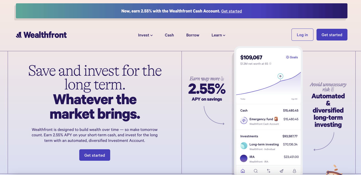
Wealthfront has a good website design with a modern touch. The use of light colours and serif fonts merge modern and professional concepts into one. They incorporated digital paintings with muted colours to add a pop of colour along with a few screenshots from the platform too. For further information, an FAQ section was added as a dropdown transition to show answers. Guidelines and regulations are added in the end to set expectations of their users.
- website: https://www.wealthfront.com/
10. Credit Karma
Neat website, Credit Karma is straightforward and communicates the services they offer without much fuss. They kept it easy to chew and incorporated a few icons to trigger association when scanning. Furthermore, they also used images of people immersed in tech to further support the benefits they promise and at the same time, build a real-life connection with the audience.
- website: https://www.creditkarma.com/