10 Awe-inspiring Landscape-themed Website Designs
Most website owners would like to have a very creative web design. As a website owner, your priority must be content and substance. However, in order to retain readership, you’ll need to add great design. Compared before, it’s more possible to combine great content and creative web design.
As the time passes, the Internet is filled with colorful and exciting sites that anyone can surf. Right now, you can browse hundreds to thousands of great designs. And one of the hottest trends is the use of landscapes as a theme. If you’re going to use it, too, in your own design, then you’ll be able to come up with clean site without those flashing buttons. It’s still creative sans loud backgrounds.
Listed below are 10 of the great looking designs based on a landscape theme that you shouldn’t miss. Each has its own beautiful landscape image in a large photograph.
1. Clem
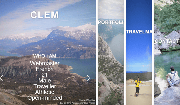
For one, it’s a very polished site with beautiful nature view. Instead of deploying a horizontal bar for its navigation options, it uses landscape photo for each menu. Although it’s different from the typical site you’ve seen, the navigation layouts aren’t at all confusing. You don’t need to figure how it works. The most important links are already plastered on its home page.
2. MacAllandRidge
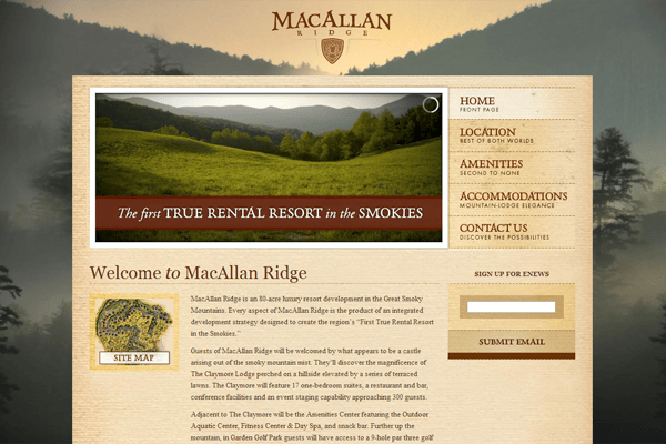
Its landscape background image isn’t the highlight of the site but it still attracts attention. The designer of this site knows how to get rid of the clutter to make it easier for the home page to load. It is void of visual clutter that’ll surely take the visitors’ eyes away from the most important elements of the page.
3. Creative Simplicity
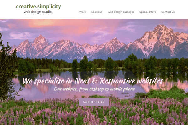
This is another excellent example on how to capture your visitor’s attention. It showcases beautiful scenery without the oversized photo. It’s perfectly done. It also contains a lot of breathing rooms for the visitors to absorb the features of the site or the product.
4. AlexArts
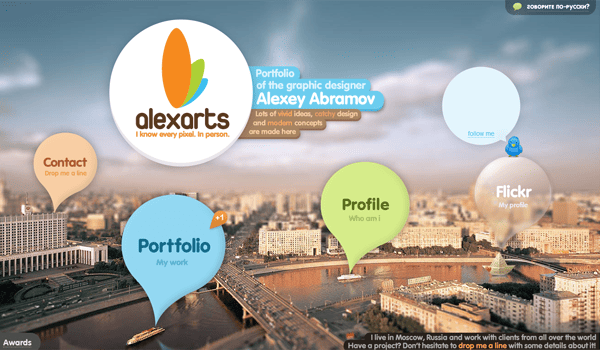
The big photo of a city in Russia is very pleasing to the eyes. Combined with a beautiful layout, the design technique used by this owner gives him a major edge in marketing. He uses that one photo to produce an elegant with modern appearance site.
5. August
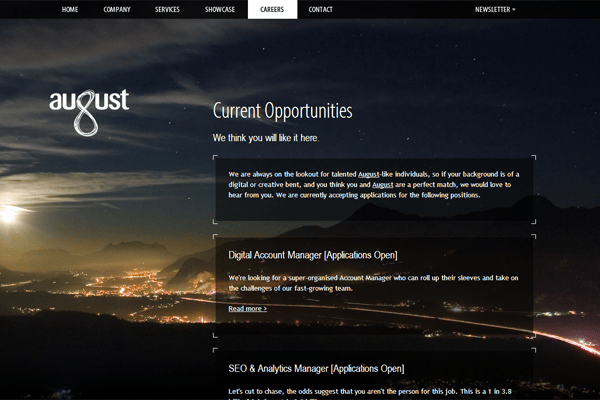
Just look at how the “g” in August is formed. It’s very creative, isn’t it? This, too, follows the idea of minimalism. It keeps everything simple yet it’s focused on the core product of the site. The photo isn’t generic. It’s unique and very attractive.
6. Thomas Marine
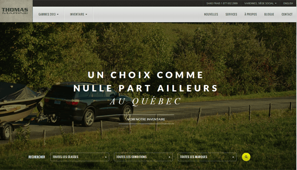
The owner chose a photo that’s related to the site, i.e. yacht. The site has an easy-to-read typeface. It uses darkened background and white-colored text to emphasize its tagline.
7. Kyle Thacker
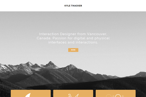
Yes, it has a beautiful background but the owner manages to keep the site simple. It’s more memorable and adaptable. It focuses on important key elements. The navigation system, which is inspired by Windows 8 interface, is another attractive thing about the site. It complements the overall design.
8. Thankful Registry
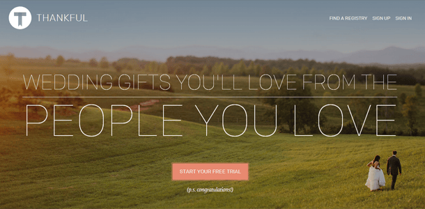
The landscape photo plays the role of being the center of attention. The layout is also very clean and simple. Above fold is straight to the point. And when you scroll down, it has clearer details about the site. It uses vibrant photo that truly stands out and is related to the site.
9. 4Lex
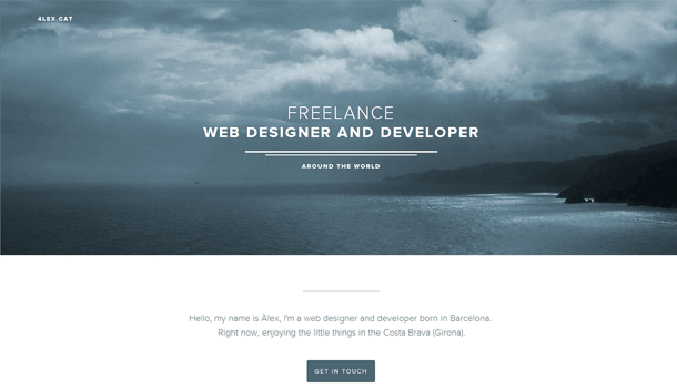
It provides the best experience possible. The photo is simply mesmerizing and captivating. It offers such an impeccable appeal to the overall site.
10. UX UI Designer
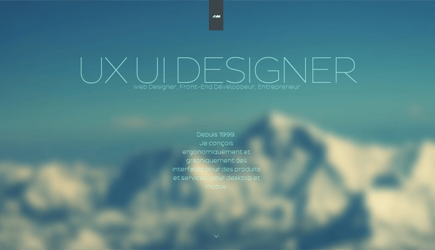
It uses blurred background of a mountain that makes the site clean and neat. The chosen typeface offers readable text. It’s very appealing to the visitors to the point that they have no choice but to click on the buttons or scroll down to get to know more about the site.
One important thing that you should remember when you create a landscape theme is to use high-quality background image. Don’t just hunt for free stock images online. Go with quality, instead of settling with generic photos. The reason these sites stand out is that each of them used beautiful landscape image.