12 Inspiring Minimal Logo Designs That Say Less Is More
A logo is a reminder of what the company or product is all about. Clients recognize a company through its logo. Behind that beautiful image is the mind of a designer who incorporates the mission and vision of a company in a single graphic.
It’s a constant reminder of what a product or company can offer to its clients. It’s no wonder that graphic logo design projects are very popular amongst graphic designers. As it affects branding, the demand of creating a top-class logo becomes higher and higher each day.
With such high demand, graphic designers are left with a difficult challenge – how to create a logo that’s original and that can stand out in the crowd. It’s also a challenge for them on how to make it quickly while maintaining its quality.
If you’re a graphic designer, then you know that designing a logo isn’t just about creating a beautiful visual for your clients. Rather, you must concentrate on how to develop a brand that can stand out while still communicating with an audience.
When finding the best design for your clients, you’ll need to conduct a thorough research and allow your client to get involved with it. Keep in mind that your interpretation may be different from his/her. Thus, before you make an actual design, you need to make sure that your client is there to see it.
One of the most popular designs that you see is of minimalistic approach. But this style isn’t as easy as you think it is. It’s not just about putting a company’s mission into a subtle and compact design. It’s more than that.
You’ve to be creative every step of the way.
If you’re still trying to figure out how to design a minimalistic logo, then here’s a collection of highly clever designs that might tickle your artistic side.
Don’t create the same design as these logos, however.
Rather, you just have to follow how the designers came up with such clever designs without taking away the quality.
1. High Contrast Photography
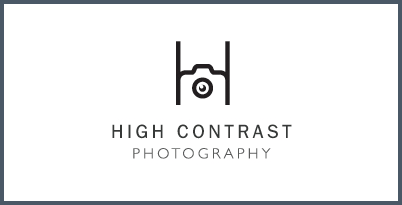
The negative space in this graphic offers an interactive approach. It carves out the edges and makes the subject unique.
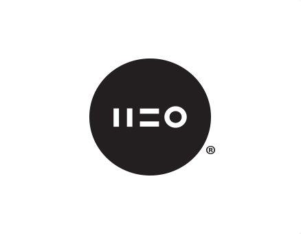
2. Med Equal
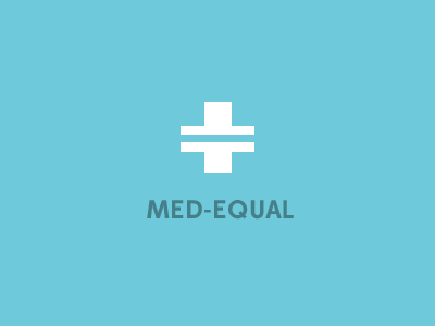
The white and blue combination offers a very creative composition. The color balances out the entire design without detracting the overall message. Surely, the designer, Curt Rice, knew how to find balance within the logo.
3. Resrkibe
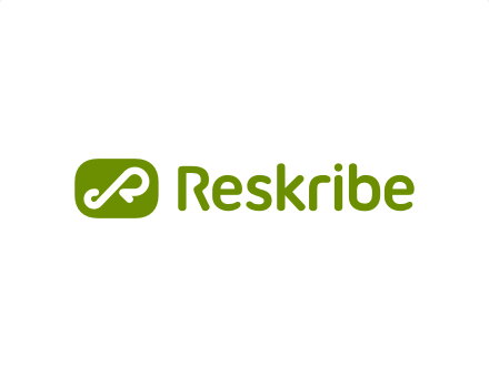
It’s designed for a company that offers billing services. Although the company seems to have a dozen of features and services, its logo is elegant and very trimmed down without too many distractions.
4. Steps
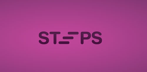
Jason Sanzone did know how to incorporate the “steps” into the actual design. This type of design is especially great if you’re just starting out as a logo designer. There are fewer elements you need to involve. Jason succeeded in showing off his design skills in a very tasteful manner.
5. Wrkshp

It’s the new identity of the company called WRKSHP Architecture Bureau. As one of its fans said about this logo, the entire design is very sharp and super clean. The designer did know how to save unneeded pain during the design process.
6. CoolFish
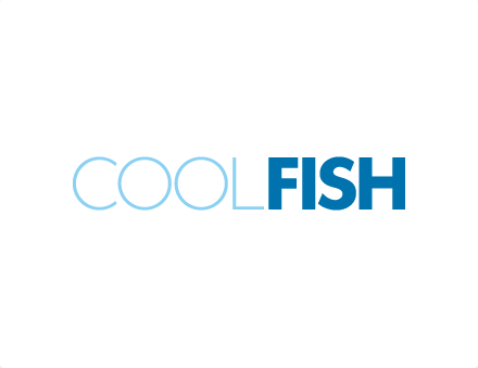
It’s very easy to read. It also offers a better view of the logo. The color choice unifies what the visual experience the company is trying to convey.
7. Unleashed Ideas
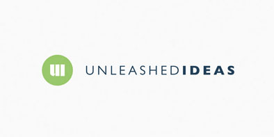
Designed by Stuart L. Crawford, the design allows a single color to provide a better impact to the overall concept. It surely generates dynamic expression.
8. 220
For the designer, Kostadin Kostadinov, this logo was created with a “pattern in mind.” Yes, a Two-Twenty logo.
9. 27
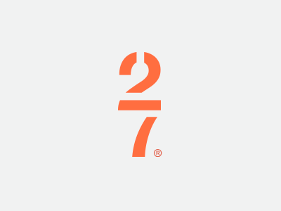
This is a brilliant logo designed by Petrov. In here, you’ll find that, in designing, less is always more.
10. Swings
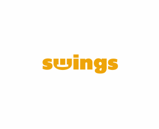
Notice how the “swing” was incorporated in this design? Clever, isn’t it?
11. GoodScout

The “scout” sign is perfectly inserted in this design. Good job, Raoul Camion.
12. Love Letters
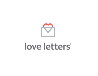
This is another nice and smart idea of logo designing. Its audience loved how the heart was made – elegant and simple.
No matter what logo you’re creating, you must make sure that it’s a symbol that truly represents the company. It must reflect the brand and the mission. It should speak with fluent notes to a client.
