5 Most Inspiring Vintage Ads
It’s sometimes mesmerizing to find vintage advertisements. Most of them are truly impressive and amazing. The old designs will keep you wondering how designers used their talents with the absence of software editing tool. Those old ads didn’t use Photoshop to enhance the images. They were done because of talent and dedication of designers. They may not be that impressive to some, but the concept will always be there.
Retro poster designs are always in style, even though there are plenty of new styles existing constantly. They utilized appropriate typography and layout that could truly attract the attention of everyone. The appealing concept has come back because of its value. These days, many artists are now using vintage items as a way to advertise a certain product. You’ll also see ads that were last seen since post civil war and are now popping up.
To find inspiration for your print ad design project, take a look at these remarkable vintage ads. They’re still effective and creative to boost how you promote your own product.
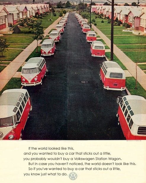
1. Volkswagen
This ad is clearly geared toward fanatics of Volkswagen. This isn’t a generic ad. Rather, it’s an ad that speaks the language of the brand and grabs the attention of the customers – past, present, and future. It may not be as attractive as the present ads of Volkswagen but it did speak to its clients to a personal level. They know just what to do.
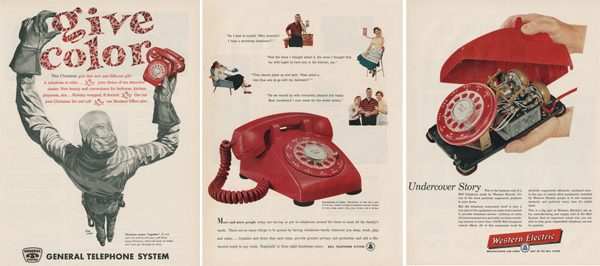
2. Western Electric
It came out in the 1950s when cell phones weren’t discovered yet. The designer showed the “inside” of the telephone system of Western Electric. As you can see here, it’s not as attractive as its “outside” appearance. This highlights the system’s competitive advantage. Its telephone was “skillfully engineered and efficiently produced.” These factors gave them an advantage over their competitors. The overall design provides value to potential customers who know how telephone system works. If iPhone were advertised this way, would you still buy it?
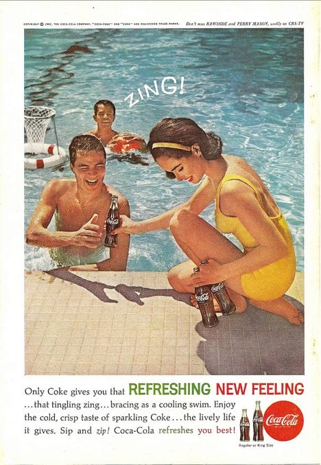
3. Coke
Its tagline “Only Coke gives you that REFRESHING NEW FEELING” is simply a hit. When you compare the present ads of a beverage company that involves women, this one doesn’t show women in two-piece or clothes that are too revealing. It’s just refreshing to see it. Instead, it depicted how men and a woman could hang out and have a sparking taste of Coke. The scene was just appropriate as it describes how Coke can add a zing to your life as you go for a cooling swim.
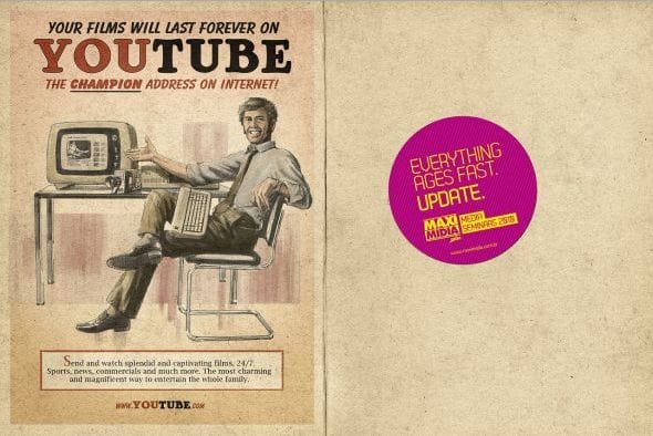
4. YouTube
This is one perfect example of how a vintage ad can be applied to a modern product. It highlights what makes YouTube unique. It provides consumers about the benefits of using this tool. It also tells what you can do, i.e. “send and watch films, 24/7.” It has relevant phrases that catch the attention of the people.
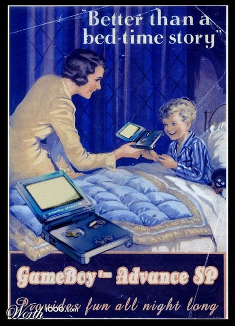
5. GameBoy Advance SP
This is another modern product that utilizes vintage ad style. Its headline “Better than a bed-time story” attracts your and other people’s attention to what the designer is trying to show. As soon as you’re attracted to it, the rest will come down on its own. The designer avoided to use an image that look like an advertisement. This is a good strategy as people don’t want to look at ads that only want to sell things. You, too, can follow this technique and avoid your ad to look like an “ad.”
When creating a vintage ad, you must still consider using effective text, image and color schemes. Your ad must have content. And always keep it professional. This means that you need to polish it by triple checking the spelling and grammar. To further draw attention to your ad, you’ll need to capitalize the first letter of each word in your headline. Follow these tips and your ad will be a standout.

