10+ Best Interior Design Website Examples & Inspirations
A good gauge for a fantastic interior design website is aesthetic. Clearly expressing your style and expertise can help you score clients without much fuss. Here, we take a look at 10+ Best Interior Design Website Examples & Inspirations so you can revamp your website for further business growth. Since these are established businesses in the industry, you may mix and match their best practices to make them work for you.
10+ Best Interior Design Website Examples & Inspirations
1. Welly Lai

Welly Lai has a gallery-style website layout. They put together different photos from their previous projects. With this, it’s straightforward and allows the potential client to take a look around and see if they’re a good fit. Since the size of the images is a bit small, this adds more room for additional photos showcasing various styles. By the side, there is also a menu to help them navigate and take the next steps.
- website: http://www.wellylai.com/
2. Neotecture
Moody yet sophisticated, Neotecture has a dark moody website palette. This appeals to those who are into this aesthetic and mature clients. Furthermore, their website has a couple of sections that introduce what the business promise to deliver — all copy are short but sweet. Testimonials are also added along with social media links.
3. WCArchitect

WCArchitect has a minimalist and gallery-style interior design website example that allows clients to get a feel of their style and expertise. Their menu is kept on the upper left for ease of navigation. Moreover, you can click on each and be directed to more photos of the project. On the bottom right, they added their company details for easier follow-through of the site visitor.
- website: https://www.wcarchitect.com/
4. Sean Michael Design
Another interior web design example to take inspiration from, Sean Michael Design kept it simple. Without much fuss, they added a photo that best showcases their style and what services they offer. On top, there is also a menu to navigate the website and learn more about the business. On their contact page, they also incorporated an easy-to-fill-out form to touch base with the team.
5. Interiors by Sabrina
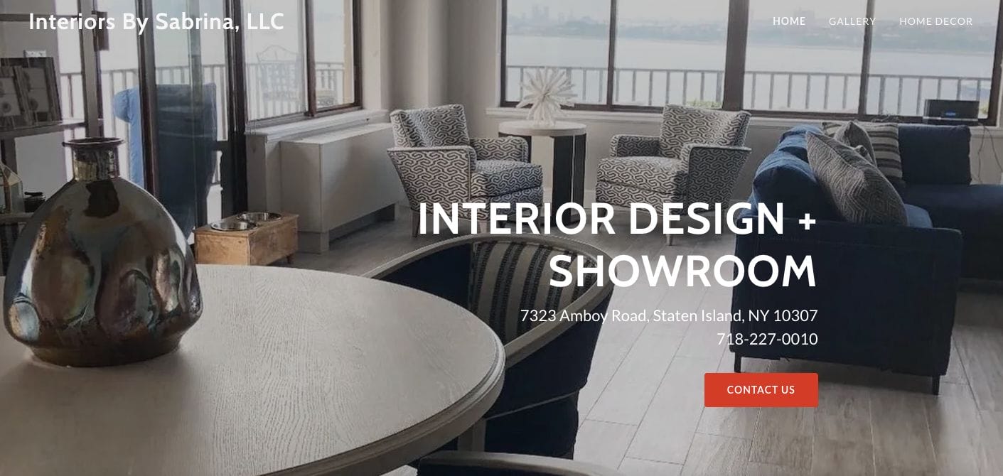
Interior by Sabrina has a full-screen photo showcase of an interior project they worked on in the past. Showcasing their style and services offered, they added an overlay text with their contact details with a call-to-action button to nudge potential clients to get in touch with their team. Next, they also added a section with their achievements and another with an online appointment booking plug-in.
- website: https://interiorsbysabrina.com/
6. Love Decor
Warm and cosy, Love Decor added elements with warm tones that contrast with their plain white background. This allows site visitors to zone in on their photos and important details without much distraction. Furthermore, there are also call-to-action buttons to download their brochure or directly talk to their team.
- website: https://lovedecor.com/
7. Avery Cox

Avery Cox wows us with their rustic yet sophisticated style. This image added life to their minimalist website — adding colours that match the aesthetic they’re going for. Their copy is written in a second voice and has a conversational tone that resonates with the audience. Besides this, they added a section with more information and project collection to introduce themselves more to the potential client.
- website: https://www.averycoxdesign.com/
8. Heal’s
An interior design website example dedicated to aesthetic furniture, Heal’s assorted their categories for ease of search. You can browse through each in their navigational bar and save time. Their use of images with copy attracts attention and promotes skimmability. Besides this, they also have call-to-action buttons directed to their shop.
- website: https://www.heals.com/
9. Shawn Henderson
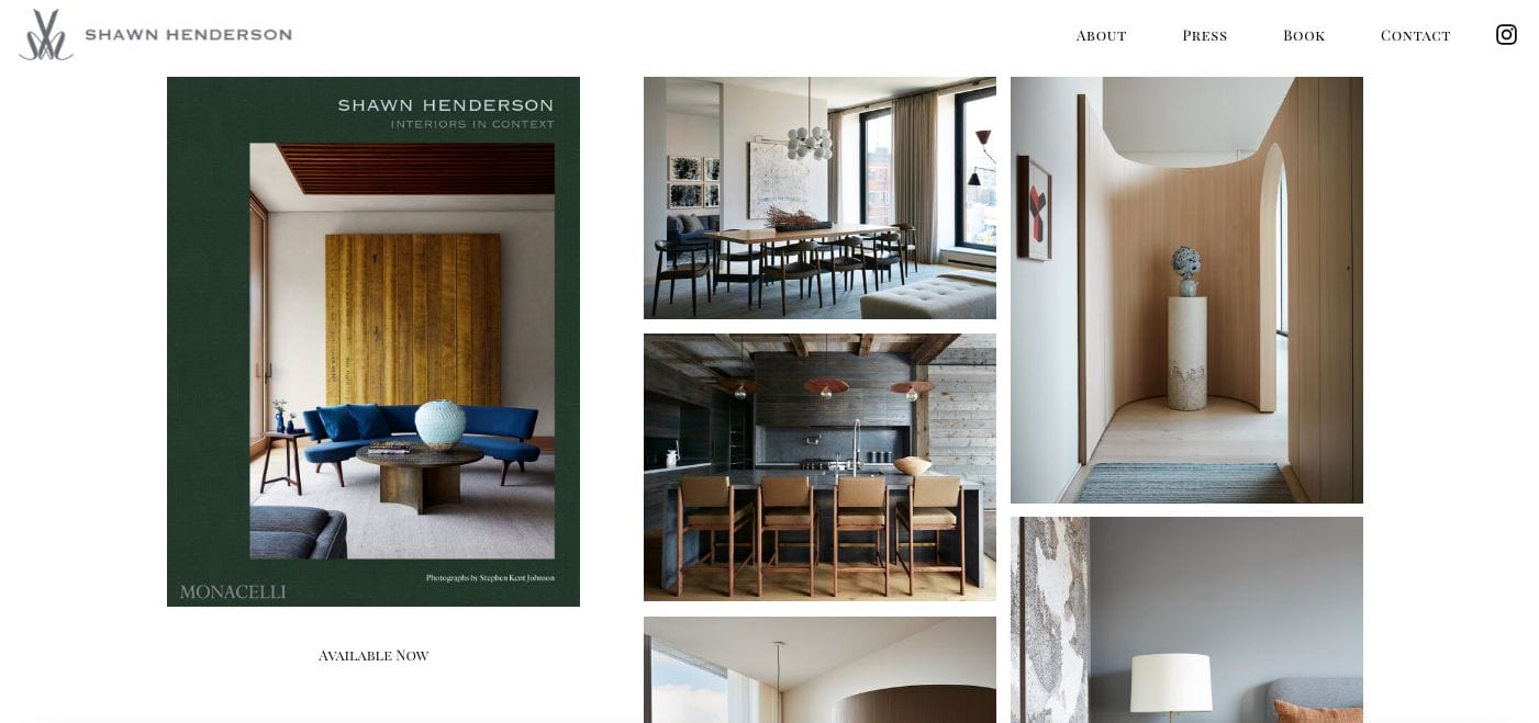
Shawn Henderson has a minimalist website dedicated as a showcase of their previous projects. Besides this, there is also a pop-up invite to join their email list. Call-to-action button promoting the download of their brochure is also helpful for clients who want to get to know the company more before working with them.
- website: https://www.shawnhenderson.com/
10. Juan Rotger
With a slideshow carousel that showcases their projects, Juan Rotger understands how to express their style. Once the attention is captured, they then introduce their company background and build rapport with the site visitor. For further browsing, they can also explore the navigational bar on top. At the end of the page, they added contact details to communicate with the team without fuss.
- website: http://rotger-arquitectos.com/

