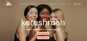
25+ Kajabi Landing Pages Inspirations
Landing pages are often one-pager sales communication material. This is to encourage the closing of an agreement — in most cases a sale. Besides this, you can also use this for various purposes such as building your email list or driving attention towards a new item. As a business owner, implementing this on your website can help you save a lot of time in negotiating and answering questions. You can first talk about their pain points and bridge how what you’re offering can help them be better (or be in a better place). Here, we rounded up 25+ Kajabi Landing Pages Inspiration you can check out.
25+ Kajabi Landing Pages Inspirations
1. All of Billy Jene

A landing page that instantly communicates the pain points of their target audience — hitting close to home — then directs them on the promise of a better tomorrow for a lesser investment. All of Billy Jene choose a black background allowing the bright colours to pop out.
2. Sales Page by Design
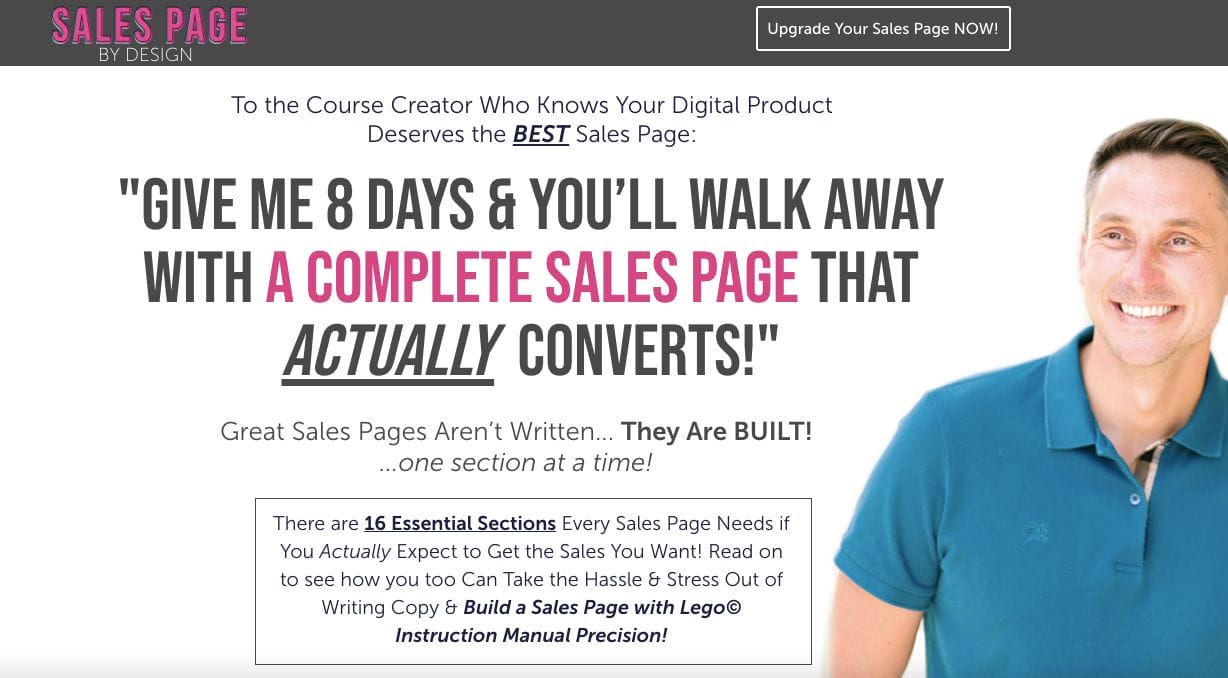
Offering sales pages to potential clients, Sales Page by Design sure knows how best to close a sale. They utilized the best practices they learned and crafted a sales page that takes about the clients — their pain points and how the page can help them overcome these struggles.
3. Ted Mcgrath
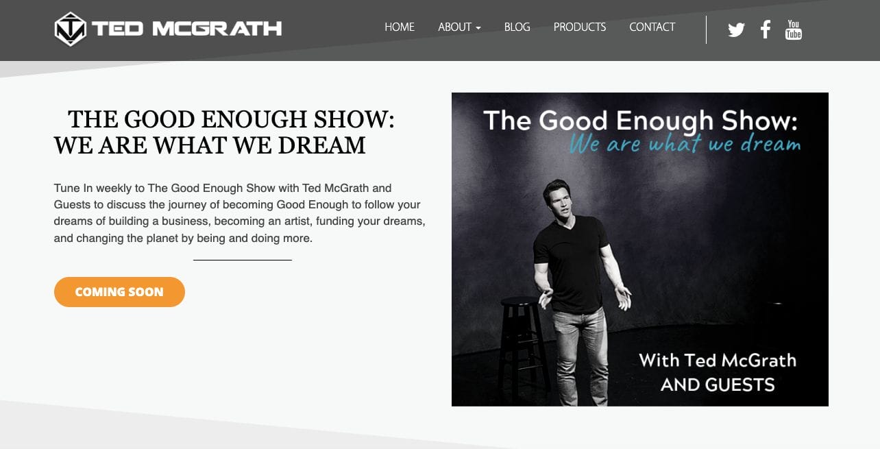
The landing page set on his about me, Ted Mcgrath establishes his credibility. He tells a quick background story about himself and his motivation for why he does what he does.
4. Anne Helmstadter
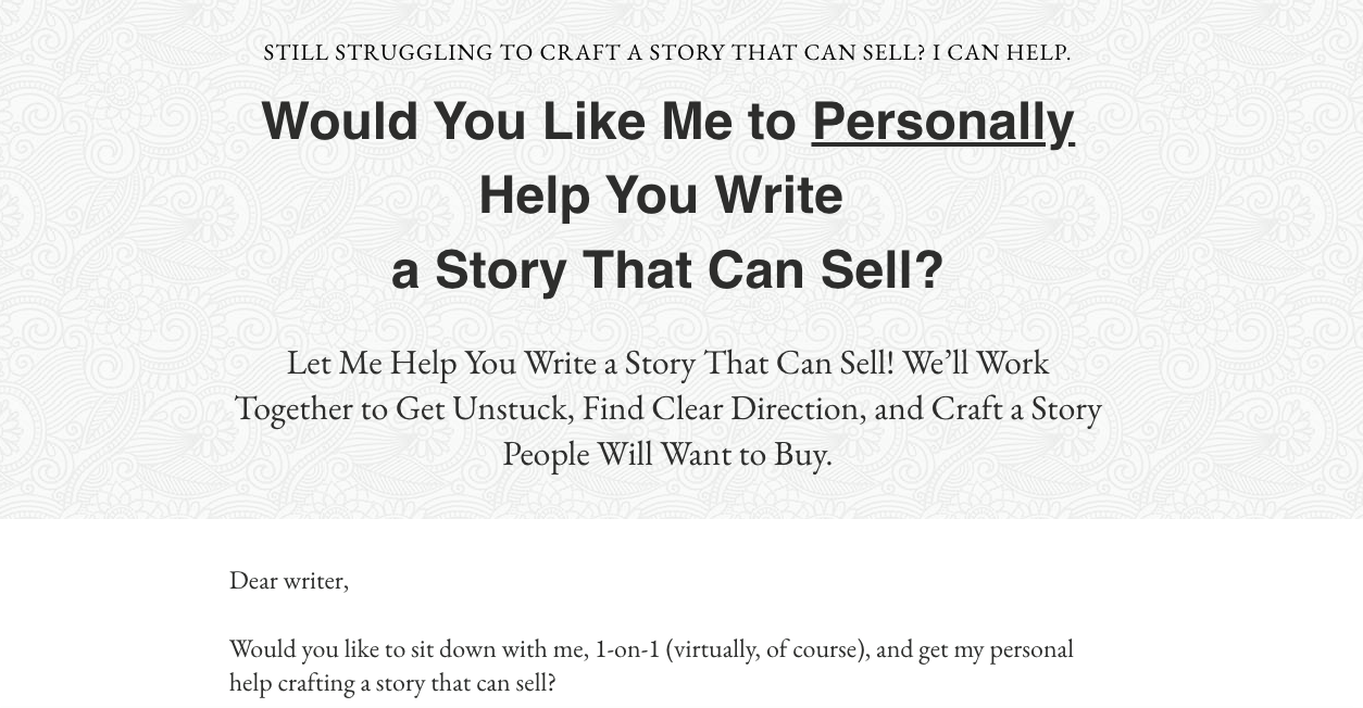
It might look too simple but Anne Helmstadter aced her web copy. She touched on pain points and how she can help the audience regarding their writing.
5. RTY Art
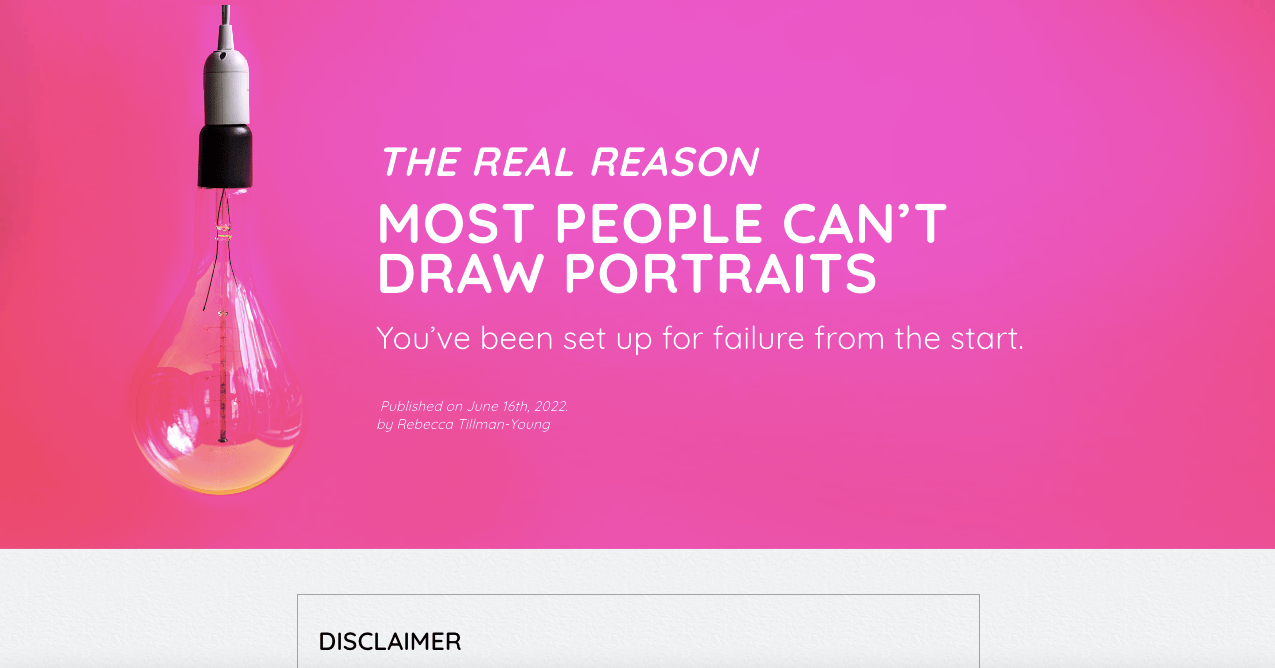
With a captivating hot-pink banner, RTY Art sure catches the attention of visitors in one second. They also used this to communicate the pain point of their target market and how she knows how to help them.
6. Be On TV

Emphasizing on stats of the people they’ve touched, Be On TV emphasizes the promise they deliver. There are forms on the landing page to encourage the visitor to take charge and resolve these pain points together.
7. Perry Marshall
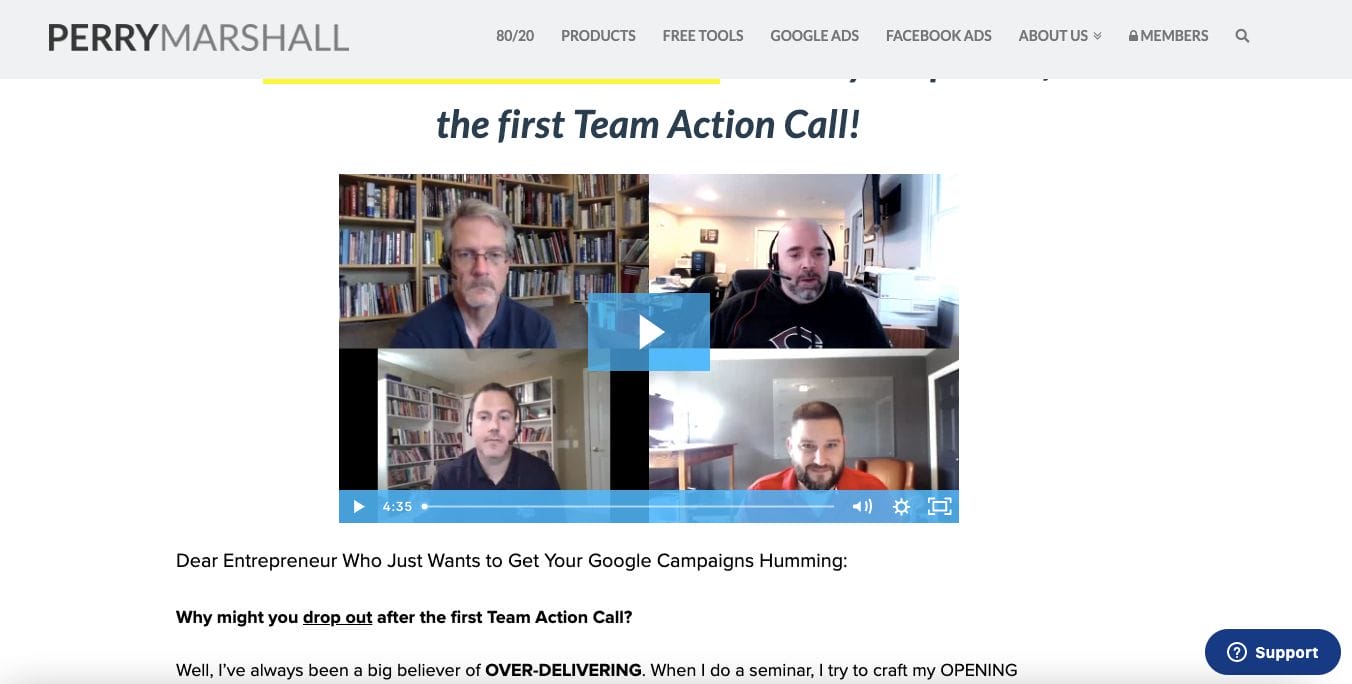
Another great Kajabi landing page inspiration, Perry Marshall prepared not only a deliberate web copy but also a video to further communicate his services. He also established his credibility through showcasing certification and testimonials.
8. EDgandia
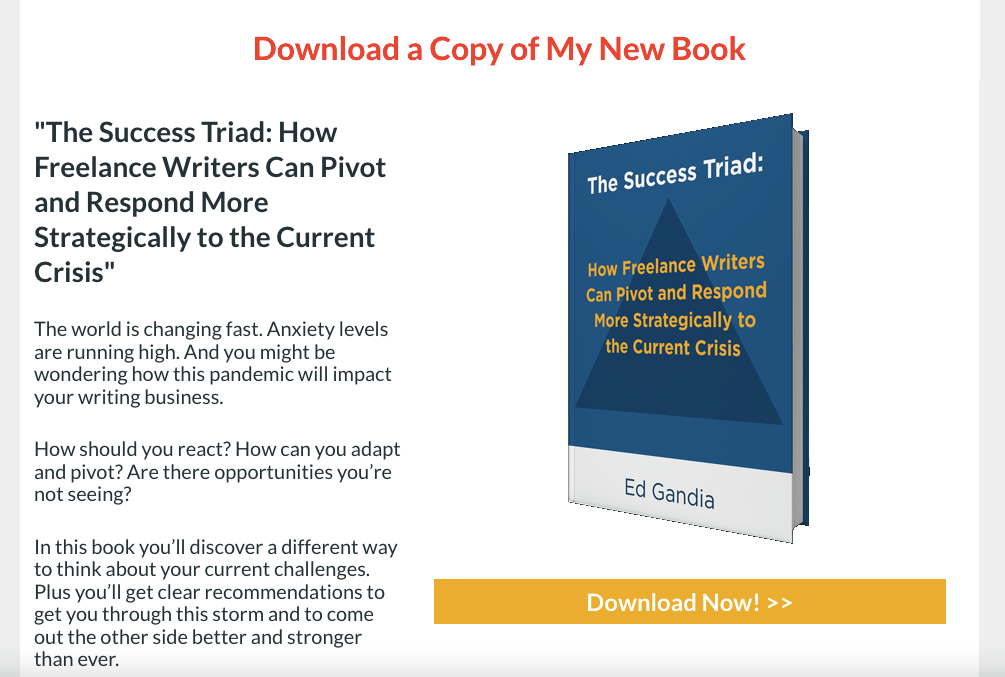
Edgandia kept it short and simple, they added a quick preview of the book they offer and what benefits it has in store. Then, there is also a call-to-action directing to another page to get the book.
- website: https://edgandia.lpages.co/crisis/?leadpages-fn=~Contact.FirstName~&leadpages-e=~Contact.Email~
9. Pure Barre

With a stunning layout and sectioning, Pure Barre utilizes these to introduce the business and showcase what it can deliver to clients. They also added photos and videos to keep it personal and encourage engagement from the audience.
10. The Maximizer Program
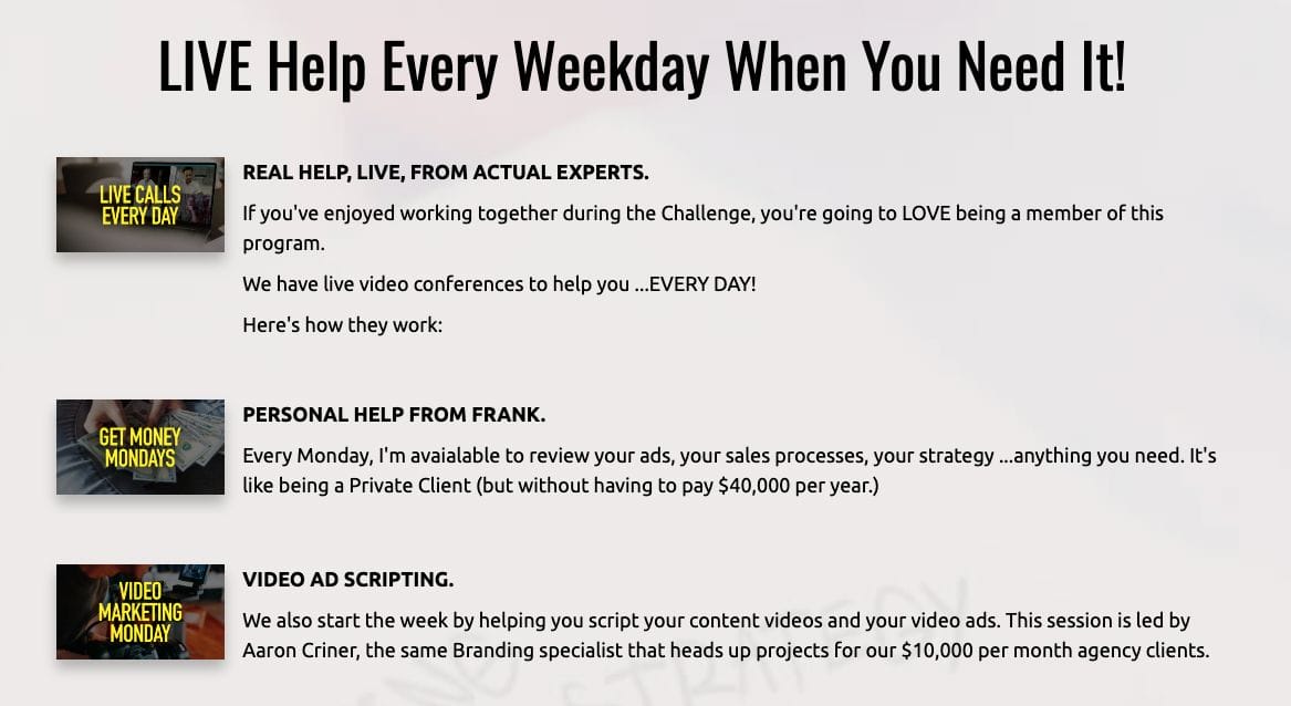
The Maximizer Program kept its web copy short to cater for people who skim content. This also helped them communicate the important points easily and direct the audience to take action.
11. Obe Fitness

The use of various colours helped Obe Fitness put emphasis on certain points and communicate the message even for those who just skim. Program and other information are also readily available within the navigational buttons.
- website: https://obefitness.com/
12. Dean and Tony Live

Dean and Tony Live implemented a timer which communicates scarcity. Moreover, there is a ready form on the side that one can easily fill out and check out. Perfect in closing impulsive sales.
13. Brian Kurtz
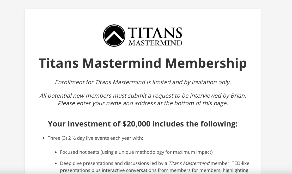
Brian Kurtz focused on emphasizing the benefits of the service and inserted call-to-action buttons that intend to encourage the visitor to close the sale. Furthermore, there are even testimonials, inclusions, and more to nudge action from the reader.
14. Moms Into Fitness

Mom into Fitness added a free 1-week subscription which is great, especially for reluctant clients. Not only that, they intend to empower through their choice of words and message.
- website: https://www.momsintofitness.com/
15. Consulting

Consulting also added a section for their previous partners and successful projects. There are also call-to-action in each section which directs the audience to navigate or engage with them.
- website: https://www.consulting.com/
16. Tony Robbins
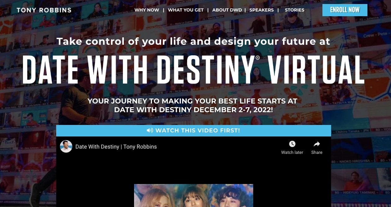
With a darker scheme, Tony Robbins sports a dark theme which helped make the bright colours and photos pop out more. This is ideal especially if you’re highlighting media more than the copy. Moreover, they also added videos to engage visitors who don’t consume content through reading.
17. Brainathon
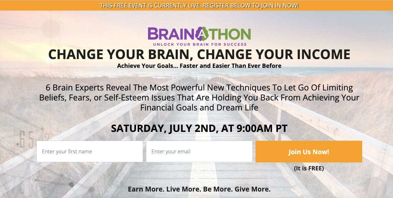
Quite straightforward, this landing page intends to invite people and build an email list. Brainathon also emphasized what their objectives are and that joining is free.
18. Your Guitar Sage
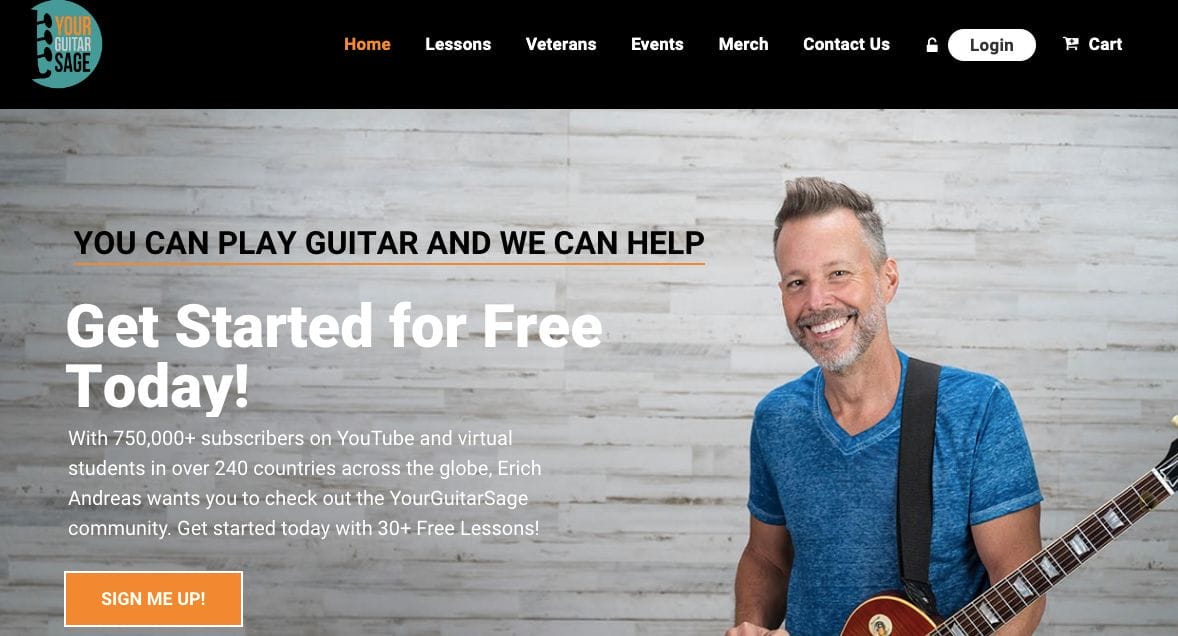
Adding a photo for a professional service business can help establish a human connection and build rapport. Besides this, Guitar Sage also prepared a copy that empathizes their stats with a call-to-action button to encourage conversion.
- website: https://yourguitarsage.com/
19. The Fight Back Challenge
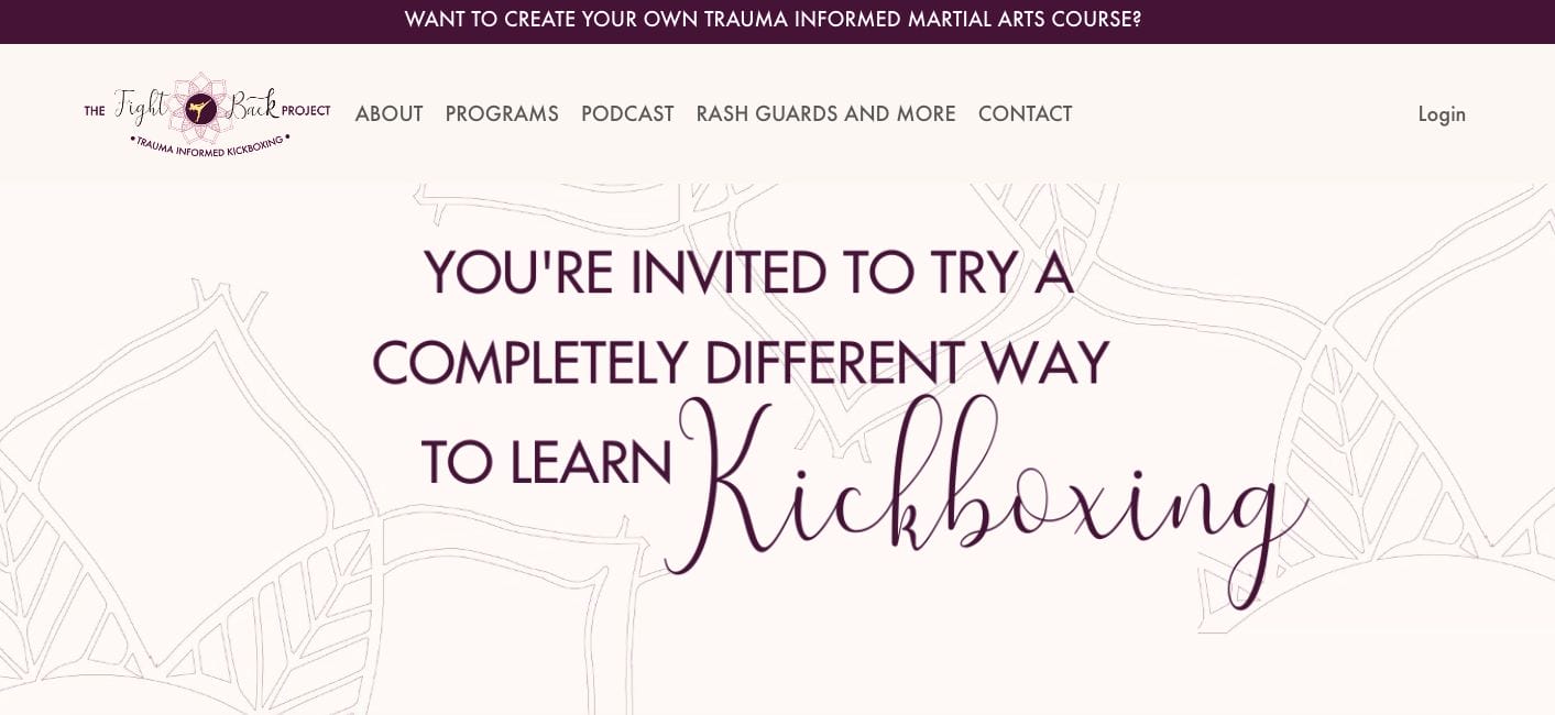
Fight Back Project selected its colour palette according to its intent to promote feminity with strength. Serving as an invitation, the landing page tells about the project’s mission and encourages women to participate.
- website: https://www.fightbackproject.com/
20. Grant Cardone

With a text overlay is simple yet striking, its combination with the collage of previous projects and content regarding financial topics helps boost Grant Cardone‘s credibility in the industry. Sure enough, a form is also available for those who intend to engage.
- website: https://training.grantcardone.com/
21. Floret

As a floral business, Floret sure communicated it easily through a stunning field of flowers. Furthermore, there are short sections with information about the business and what they offer that customers can avail themselves of.
- website: https://workshop.floretflowers.com/
22. Earn That Body

Touching on the pain points of their target audience, Earn that Body prepared the copy to be impactful and direct action in either watching the live stream or joining the challenge they set.
- website: https://www.earnthatbody.com/
23. Going Square
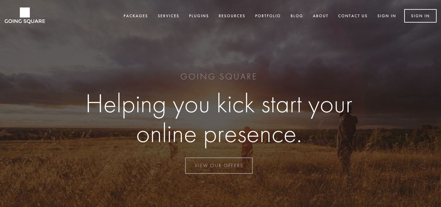
Going Square tells us about the background of the brand and how they too overcame the same struggles as their clients. Furthermore, there are other pages you can explore to continue reading about the content.
- website: https://www.goingsquare.com/
24. Yoga with Adriene

Simple yet impactful, Yoga with Adriene played around with font sizes and formatting to easily emphasize important points. She also implemented bullet points for skimmability regarding the benefits of easy understanding.
- website: https://yogawithadriene.com/
25. Icy Productions
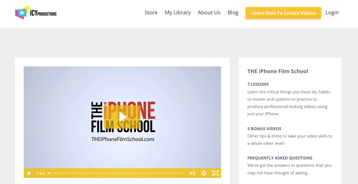
Simple and modern, Icy Productions embedded a video to showcase what they bring to the table. Besides this, the reader can also explore the other content they have and frequently asked questions to best communicate their services.
