10+ Best Lab Website Design Examples & Inspirations
Steering away from the traditional websites for labs, many have adapted innovative designs that impress clients and potential investors. Here, we rounded up 10+ Best Lab Website Design Examples & Inspirations to get an overview of how they use the online platform to introduce and grow the business. Remember to take note of your own objectives and look at each with an objective eye.
10+ Best Lab Website Design Examples & Inspirations
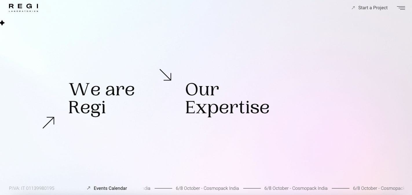
1. Regi Laboratories
- website: https://regi.it/
2. Biomesense
Biomesense welcomes its site visitors with an overview of what services they offer. Besides the impactful landing page, they also added detailed elaborations for their projects and encourage the audience to read further. With smooth transitions and diagram representation of their concepts, they ensure that their clients are well-aware of how good business partners they may be.
- website: https://www.biomesense.com/
3. Ulrick & Short
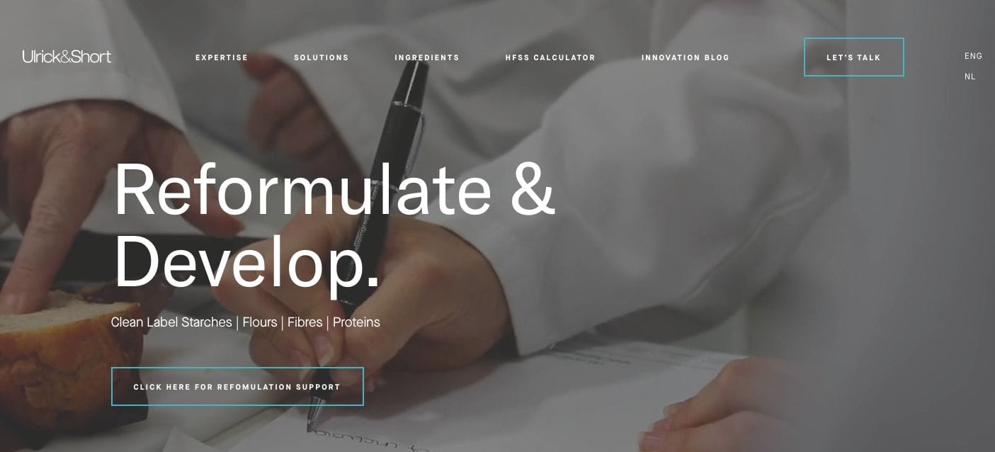
With a video clip compilation on the landing page showcasing the behind the scene team of their lab, Clean Label Ingredients clearly promote transparency and expertise in their endeavour. Furthermore, they added call-to-action buttons that encourage the audience to read more or touch base with the team. They also incorporated an overview of the areas they cater to worldwide through an interactive map. Should you be interested to learn more about their products, they also created a dedicated section for this.
4. BCN Research
BCN Research is one of the best lab website examples you can learn from. Their website’s intent is to show what they can deliver and how they can help potential partners in their endeavours. With this in mind, they added different sections to give an overview of the business. They also added statistics and statements to support their communication strategy.
- website: https://www.bcnlabs.com/
5. Medwest
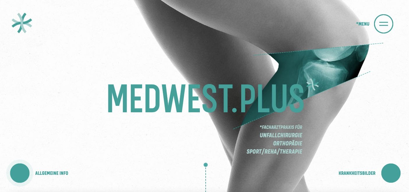
An impactful website design, Medwest wows us with its unconventional design and how they were able to communicate its services without much words. Keeping the website short with no fuss, you can navigate their other web pages through the menu drawer they have on the side. The smooth transition per section and iconic art style can sure leave a mark in the visitor’s mind. Other business partners are also showcased on the site which encourages a trusted network for new clients.
- website: https://medwest.plus/
6. CRB Group
CRB Group kept is their website layout modern and professional. They mapped the website with the target client in mind and ensured that all potential call-to-action buttons are placed accordingly. Besides this, they dedicated their landing page to insights and write-ups which can help them establish their expertise in the business. At the same time, they also have a search option available for easy information to look up.
- website: https://www.crbgroup.com/
7. Lucid Reality Labs

Touching on the dream concept, Lucid Reality Labs maintained that their website has this surreal and unconventional vibe to it. They added sections which elaborate on the projects they pursue and also share a quick overview of the company. Besides these, their choice of photos in each section maintains the contrasting vivid colours that stand out from the black plain background.
- website: https://lucidrealitylabs.com/
8. Living Lab
Living Lab is a must-see website because of its modern design. They kept the website as fuss-free as possible, allowing the audience to focus on their content and learn more about them. Furthermore, colourful diagrams were also used to communicate concepts and ensure understanding for each point they deliver.
- website: https://living-lab.e-cancer.fr/
9. Enveda Biosciences
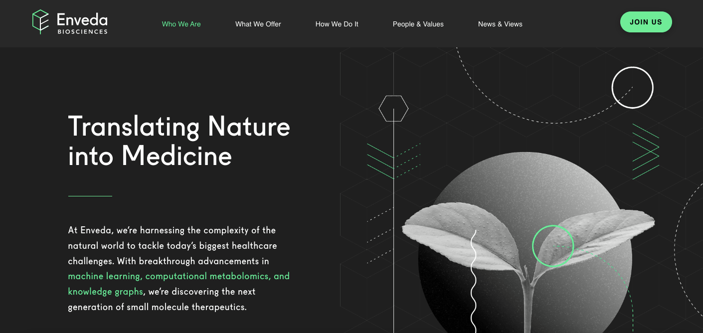
With a modern website design, Enveda Biosciences kept its colour plate limited to black and white with occasional green accents. The choice of green aligns with their branding — which taps into nature and science. Besides this, there are sections dedicated to more information about their projects which is of big help for partners who are not well-versed in the technicalities of the industry.
- website: https://www.envedabio.com/
10. Biocad
Biocad has a minimalist website that showcases a moving picture banner depicting DNA. This element, along with their web copy, communicates well what the lab is all about. Moreover, their call-to-cation button is directed to encourage the site visitor to learn more about the business. This is ideal for filtering out leads and nurturing them from hereon.
- website: https://biocadglobal.com/


