New Trend: Long Shadow Flat Designs For Ui
I still remember when I myself would design something and use a lot of bevelling, effects, shadows, and textures on my art, but hilariously, it’s a bit of a shame if I still apply the same techniques for the modern UIs today.
The regency of design especially for the web is pervasively changing faster than we’d expected, and designers would admit to this fact by letting themselves join communities to learn about these what’s-hot’s and what’s-not’s.
These days’ ongoing trend: long shadow designs.
The Long Shadow Designs is actually the next response to the late flat design trends majorly inspired with the release of the latest iOS 7 interface.
Simple shapes and contours, lesser gradients, more subtle if not pale colors, less effects, soft shadows—these are the marks of the new flat design trends. However, the newest trend which is the long shadow design adds what it says: a long shadow cast on the main object presented especially on an icon.
It can hardly be stated that there are rules for using this new trend. However, it’s not simply putting a shadow cast from an object; the light is said to be casting the shadow from a 45-degree angle or at least to its equivalent.
The shadow size (or length) is also reported to must have the size no smaller or shorter than the actual object it is being cast about.
The long shadow trend aims to make flat designs appear to have a subtle depth, creating an illusion that the main focal point pops up from a source of light.
Pencil Scoop
We’d like to take a look at a few samples from PencilScoop.
The designs presented in this blog show the few basic principles being followed to perform the illusions. The logo of the Superman, taking as an example, may not appear anything different, but instead of adding a metallic texture plus a 3D effect, the sense of depth is simply being given by the shadow in contrast to the background it sits.

Flat Designs at Dribbble
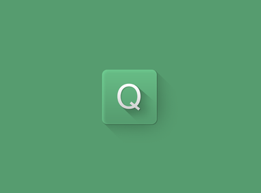
Going to Dribble, you can also find yourself in a big hall of modern long-shadow-design samples. The Flat Thing by Tji Sousa is probably one of the simplest I have encountered to belong to this new trend.
The Flat Thing is an icon probably for an e-mail client or something similar, and there’re hardly any other distracting elements to portray the very apparent message. The shadow may be quite long, if you’d argue, but we’d love to say that at least, it fits well to its faint blue background.

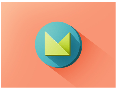
Another from Dribble is the “M” – WIP by Sarah Sugarman. The icon is actually confusing that it is following the flat design trend, but by adding an extra piece of layer to the lower right side of the icon and its main element, a new sense of depth is being produced that sits side by side with a 3D effect.
Doing this kind of art, though, may need a real amount of accuracy especially when setting the angle of the depth in accordance with the angle of the shadow it tries to project.
And if you want to deviate a little without losing from the chain of trend, you may want to look at how Lasse Eriksen of Dribble did his Longshadow. By simply using an inner glow to the tile, the icons boasts of the illusion making it appear more like a button if not an embossed plastic art. Following this design may also take an amount of cautiousness as taking a longer look might reveal some inconsistencies within the elements especially from the perspective of light.
The Personal Logo of Eldin Heric uses a different style of shadowing without really deviating for the long shadow design trend. Eldin used two different shadows: one is a thicker but shorter one, and the other makes the long shadow effect. The illusion created in this art is almost perfect, but since one would use two different shadow styles, the argument about the cast colors in and out of the elements can be raised.

Behance
The Long Shadow Flat Icons by Hector Ooi in Behance is another great example for the long shadow design trend. However, I would love to point that this set of icons is actually containing in itself a modern vintage fashion. Several layer-like elements are also added to make the icons look more abstract and iconic, and besides, all icons are boxed in a square frame. This is I think one of the most fantastic ideas in using the long shadow design.
Entyce-Creative
An entry from Entyce-Creative also follows almost the same attempt, though the 3D effect sits just below the tile rather than occurring on the main object. You may also want to direct your attention to the Rubee design shown on. The diamond icon, aside from the long shadow, uses the same color but in different shade amounts or contrast to make it look popped and floating.
It makes a lot of designers question ‘what’s next?’ after the release of this new design trend. Indeed, the growth of aesthetic consciousness has gone a way lot far now, and we’d believe that in one way or another, simplicity or subtlety would still be one of the strongest factors to make an incoming design popular and efficient.