6 Effective Ways To Make Your Content Easier To Read
If having a catchy title makes people click your link and draw them to your precious content, how do you keep them from getting bored?
What’s a better way to motivate them to read through your entire post? You can also start your own content marketing agency by getting an LLC in Georgia.
Scannable content.
That means you need to organize your content in a clear and easy-to-read format to keep your readers engaged, regardless of its length. Of course, you can think about how to get help with college papers while studying and making content but the tips mentioned in this article will help you organize your content to get the best result.
Why exactly do you need to make your content scannable?

Pin For Later: click for the infographic version
1) Make a good impression. Having a scannable content can help you make a great impression especially to your new readers. You don’t want to scare them off with extremely lengthy, uninterrupted text.
2) Easy to navigate. According to a 2008 study by Jakob Nielsen, only about 20% of the text on the average page is read. Meaning, most people don’t read. They scan. People want to quickly find information they’re looking for without reading through the whole thing.
3) Less intimidating. Posts without breaks in the content are visually unappealing. Your visitors may quickly click away if your content looks complicated and painful to read.
Frankly speaking, I’m one of those people who don’t really read unless I need to or trust the site. I usually scan first to see if there’s anything that will interest me.
If I land into a content with large chunks of text without allowing me to rest my eyes, I’ll leave immediately.
So it’s always important to tailor your posts to make them “scanner-friendly”. Here are some fantastic ways to “trick” your readers into thinking that your content is not as lengthy as it seems.
HOW-TO: Make your Content Scannable
1. Use Subheadings
See how I use subheadings here? They help divide information into sub-sections that makes navigation much easier. These allow your readers to quickly find the part that interests them. Put it simply, subheadings make your visitors want to scroll downwards, which is something that you want them to do whenever they are on your blog, right?
2. Keep Your Paragraphs Short
Have you noticed how most newspapers tend to break down their articles into bite-sized chunks? Because shorter paragraphs help readers to digest information faster which encourage them to read more.
Plus, writing in short paragraphs create plenty of white space that keeps your content clutter-free. And you’ve got to give your readers some space to breathe!
Usually, I write about 1-3 sentences in a paragraph. But there are no hard and fast rules here especially when it comes to blogging. It really depends on points being made and it’s about balancing as well. Just take a look at these examples:
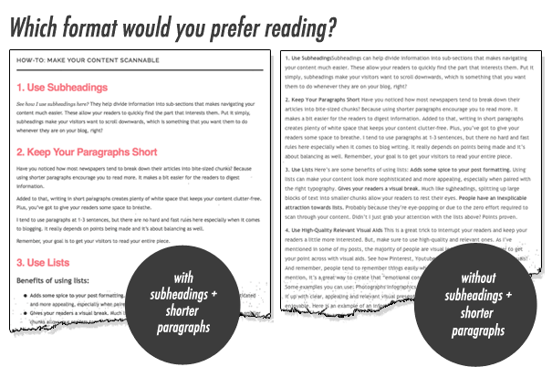
If you were to read a post with the same content, which format would you prefer? The one that’s easier on eyes, right?
Remember, your goal is to get your visitors to read your entire piece.
3. Use Lists
Benefits of using lists:
- Adds some spice to your post formatting. Using lists can make your content look more sophisticated and more appealing, especially when paired with the right typography.
- Gives your readers a visual break. Much like subheadings, splitting up large blocks of text into smaller chunks allow your readers to rest their eyes.
- People have an inexplicable attraction towards lists. Probably because they’re eye-popping or due to the zero effort required to scan through your content.
Didn’t I just grab your attention with the lists above? Points proven!
4. Use High-Quality Visual Aids
It’s always more fun with visuals. It’s a great trick to interrupt your readers while keeping them a little more interested. Just make sure to use high-quality and relevant ones.
As I’ve mentioned in some of my posts, the majority of people are visual learners. It’s much easier to get your point across because people tend to remember things easily when they are presented visually. Ever wonder why Pinterest, Youtube and Instagram are so popular? Visuals!
Plus, it’s a great way to create that “emotional connection” with your audience if done correctly.
Some examples you can use:
- Photographs
- Infographics
- Slideshows
- Charts
- Comics, Memes
- Videos
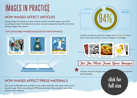
So mix it up with clear, appealing and relevant visual presentations to make reading a lot more enjoyable. Here’s an infographic that tells you just how important images and/or in general, visual aids are in writing content (click for full size):
Useful read: Learn how to use visual aids properly.
5. Highlight Important Points
When speaking, we usually stress certain words, phrases and points by raising the tone of our voice or changing it.
Using pull quotes can also be useful to emphasize key points.
This is because the change in tone lets your listeners know that you’re trying to make a point.
The same thing applies when writing.
Whenever you want to let your readers know about a few important points, don’t be afraid to highlight those by using bold and italic font faces. This way, they can take note of the words that you highlighted.
Useful read: How to Use Pull-Quotes the Right Way
6. Use Readable Fonts
Yes, fonts do matter. They can affect the “look and feel” of your posts. The type of fonts you’re using, colors, size and the consistency of your fonts can make or break your content.
To make your fonts readable, make sure to:
- Use readable fonts. I recommend using commonly-used fonts such as Arial, Verdana, Georgia, Times New Roman or Trebuchet MS. No
Comic Sans MSplease. - Avoid using too much decorative font types.
- Do not set your font size in point unit (PT) unless you’re setting it up for print stylesheet. Point units are inconsistent across browsers and platforms. Use pixel (px), ems (em) or percent (%) instead. Useful read: CSS Font-Size: em vs. px vs. pt vs. percent.
- For the body text, use no less than 12px. Use larger size fonts if you have older audience.
- For the headings, use larger than your body text.
- Avoid using too much CAPS in every word (capital letters).
- Set line-height property larger than your current font size. Text that are very tight together can be hard to read.
- Be consistent with your font style, sizing and spacing.
- Avoid using more than 2 types of fonts.
Bonus! Use a reading grade level tool
Here’s a tool I recently discovered to help you calculate the readability of your posts – read-able.com. Just add the URL in and click “Calculate Readability”.
Remember, most people are scanners so it’s important to make your content easier to read to keep their attention (especially for first-time readers) .