10+ Best Manufacturing Web Design Examples & Inspirations
Attract potential business partners and grow your clientele without much effort on your end through a good website. You may design your landing page to also work as a sales page — handling objections and pushing your offerings to potential clients on autopilot. To do this, we took 10+ Best Manufacturing Web Design Examples & Inspirations so you can take their best practices and apply it in yours.
10+ Best Manufacturing Web Design Examples & Inspirations
1. PLEX
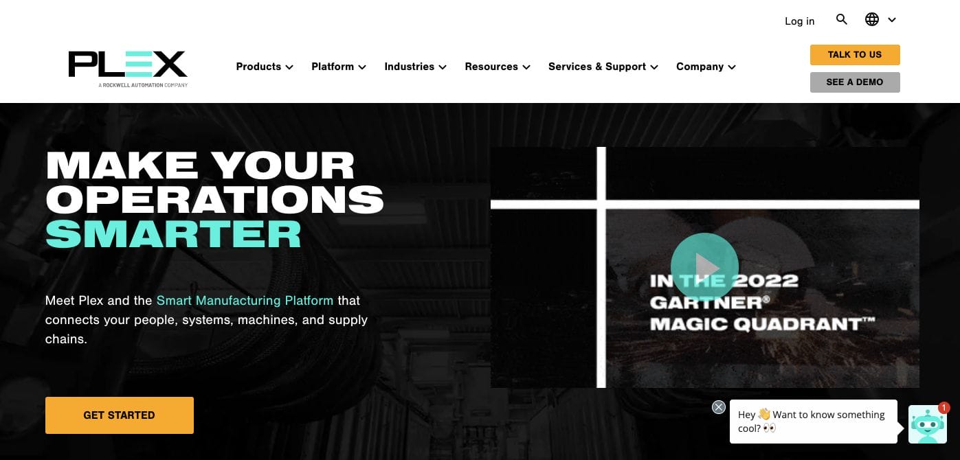
With everything essential right in front of the target audience, PLEX‘s landing page features a top navigational menu bar with quick links to their different pages. Furthermore, they also added a headline in white and blue which stands out from their black image overlay. A video clip to further communicate the brand’s vision was also added. At the same time, they ensured to attend to all queries by adding a chat plug-in.
- website: https://www.plex.com/
2. Cisco
Cisco is another manufacturing web design example you can take inspiration from. They have a simple and clean design which gives a centre stage for their valuable content to get across to the target audience. Besides this, they used lineart design and icons to trigger the concept association and pique the interest of specific specialists that their offerings can help. Additionally, photos of their offerings are added with vibrant colours which can also attract the attention of the user.
3. Anduril
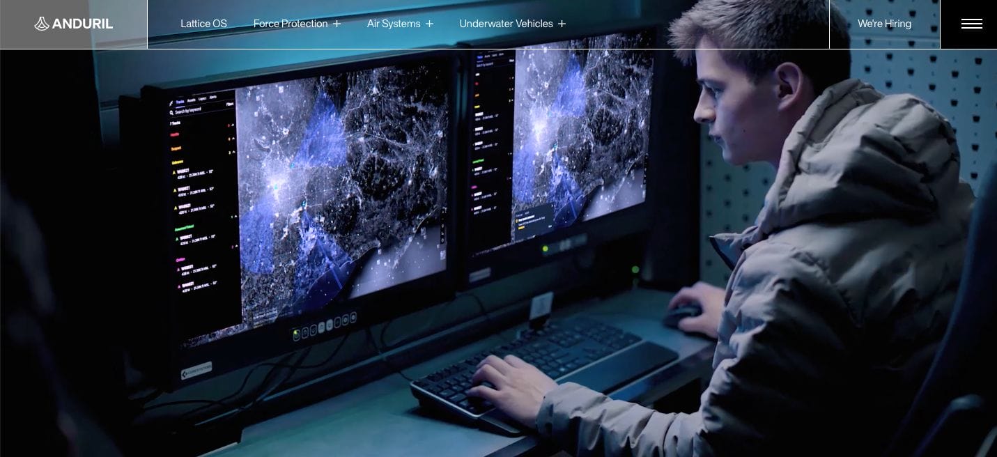
One of the best manufacturing web design examples you can check out, Anduril offers an immersive experience through a full-screen video compilation of behind-the-scenes. Moreover, their top navigational bar allows site visitors to explore freely and read more information depending on what they need. For more information, they have a menu drawer for another overview of the company.
- website: https://www.anduril.com/
4. Rockwell Automation
Quite bright and modern compared to the websites earlier, Rockwell Automation used white and red colours for their website. This allowed them to seamlessly create captivating information that taps into the impulsive triggers of the audience. Besides this, their mapping of sections to discuss the business further along with its vision can benefit the lead generation objective of the brand.
5. Weima
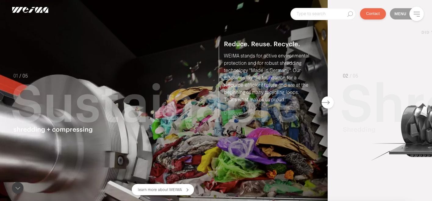
Weima is a good manufacturing web design example to take the time to visit. Their website features full-screen snippets of what goes on inside the business model to support their well-written copy. Moreover, the sections on the website highlight statistics and important details for an easier understanding of their communication strategy. Call-to-action buttons and insights crafted by their team are also added along with trade fair appearance schedules.
- website: https://weima.com/en/
6. John Deere
Featuring the offers they extend, John Deere added a section with categories to allow ease of navigation for their potential clients. Besides this, they incorporated real-life application shots of their products which can help get the message across. They also ensured to catalogue their website and add a search plug-in that can help clients get more information with just a few taps.
- website: https://www.deere.com/en/
7. Dyson
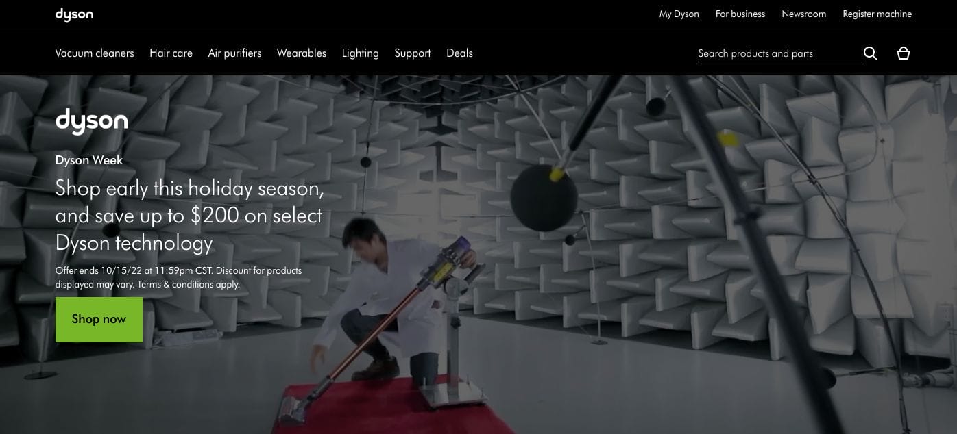
Dyson has an impressive website that showcases their product and how they were conceptualized into reality. Moreover, they added a succinct copy as an overlay along with call-to-action buttons to encourage favourable action. Scrolling further, they added their feature products with each’s feature. Also, there is a language function which allows the audience to change depending on the language they’re more comfortable with.
- website: https://www.dyson.com/en
8. Lear
With a scenic future forward image, Lear chooses an image that’s aligned with the company’s expertise — vehicles. They also added a short but impactful copy that not just pushes their products but also encourages the audience to envision a better further with them. Each section has subtle transitions which allow comfortable navigation throughout and keeps the audience attentive as they go further along the page. In case you also have further queries, they incorporated a form one can simply fill out and wait for their responsive team to send a swift reply.
- website: https://www.lear.com/
9. Markforged
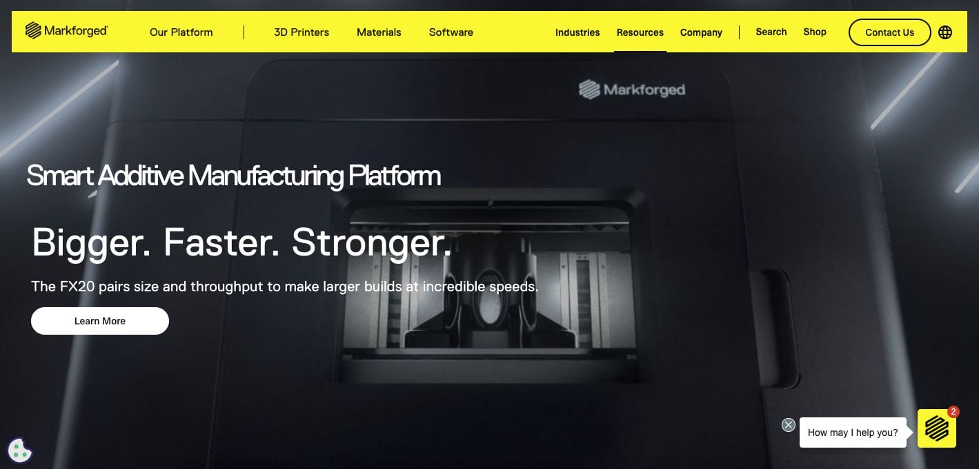
The combination of yellow and black sure captures the attention of the site visitor — encouraging them to get curious and learn more about Markforged. With this in mind, it also helps that the website uses sleek black imagery with white font for quite the contrast to make the emphasis on design. Besides this, they also added sections to feature brands they worked with along with call-to-action buttons depending on the desired next action of the audience.
- website: https://markforged.com/
10. Dupont
With an image carousel on its landing page, DuPont wows us with a lot of good information about the brand. This easily maximizes the holding of the audience’s attention and seeing to it that they get to absorb who they are and what they offer. The sections further the website discuss the vision of the company and what they aim to achieve. There are call-to-action buttons available for them to click and touch base with the brand.
- website: https://www.dupont.com/