10+ Best Medical Website Design Examples & Inspirations
Medical companies need to come up with a good website that helps them get more clients. One can do so by paying attention to details that help a company build credibility along with what helps convert them to paying clients. Without further ado, we rounded up 10+ Best Medical Website Design Examples & Inspirations that you can visit to get ideas on how you can improve your website.
10+ Best Medical Website Design Examples & Inspirations
1. Northwestern Medicine
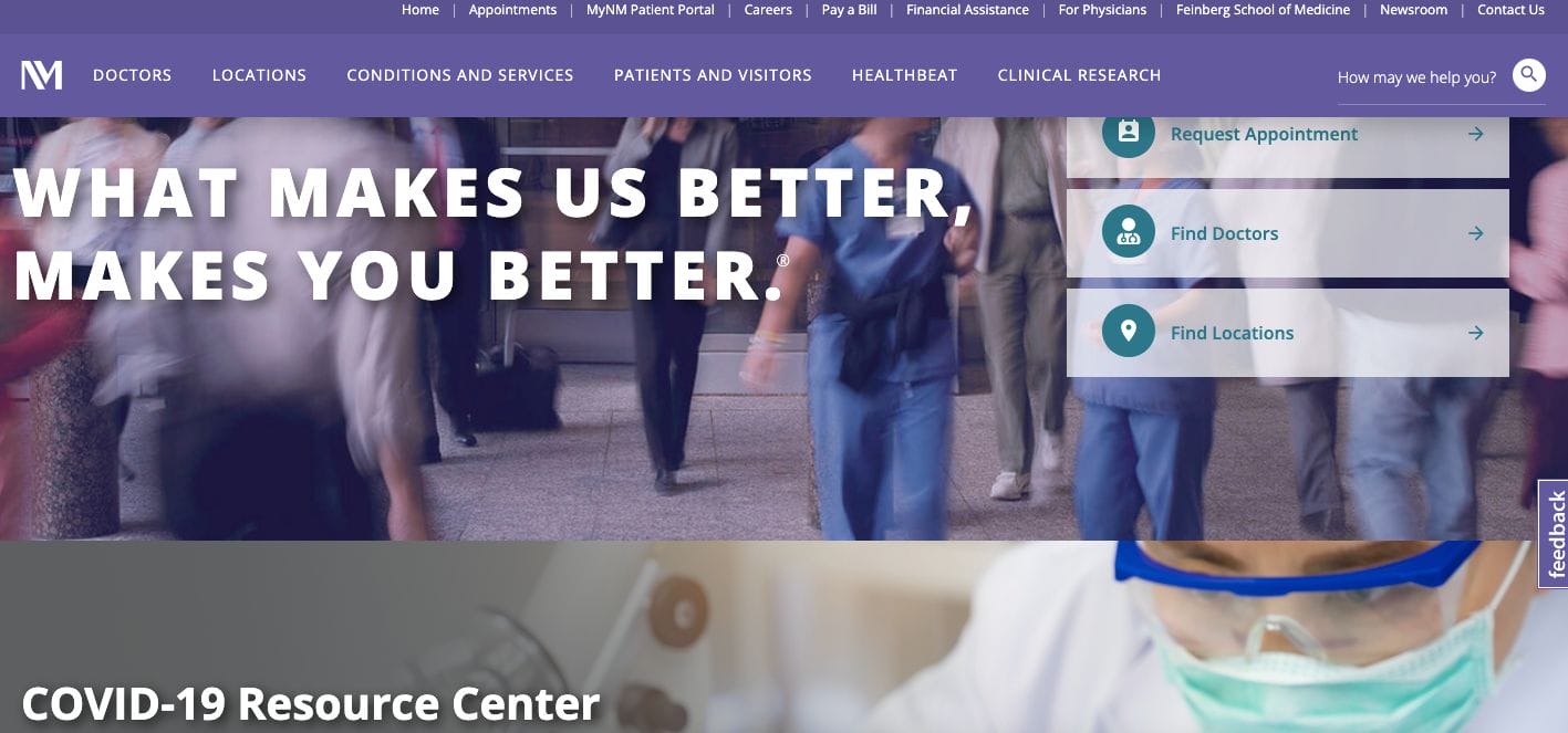
With a structured website, Northwestern Medicine understands what its clients need and decided to build its website to deliver an impressive experience. They have call-to-action buttons that are intended to segregate their clients depending on their intent — be it to find a doctor near them, request an appointment, or find a nearby location. Besides this, they also added a section which showcases their statistics of physicians in their network, number of employees, and other figures to help establish their credibility.
- website: https://www.nm.org/
2. Split Rock Rehab
Split Rock Rehab is a good medical website design example that you can take inspiration from. Their website uses a narrative form in their copy which appeals to the emotions and experiences of the potential client. Since they are a rehab, it’s important to bridge a connection between their attending physicians and potential clients. Their website is also good for skimming since they kept the copy concise and some points in bullets. Also, they added call-to-action buttons to easily translate clients into long-term patients.
- website: https://splitrockrehab.com/
3. Adventist Health Care
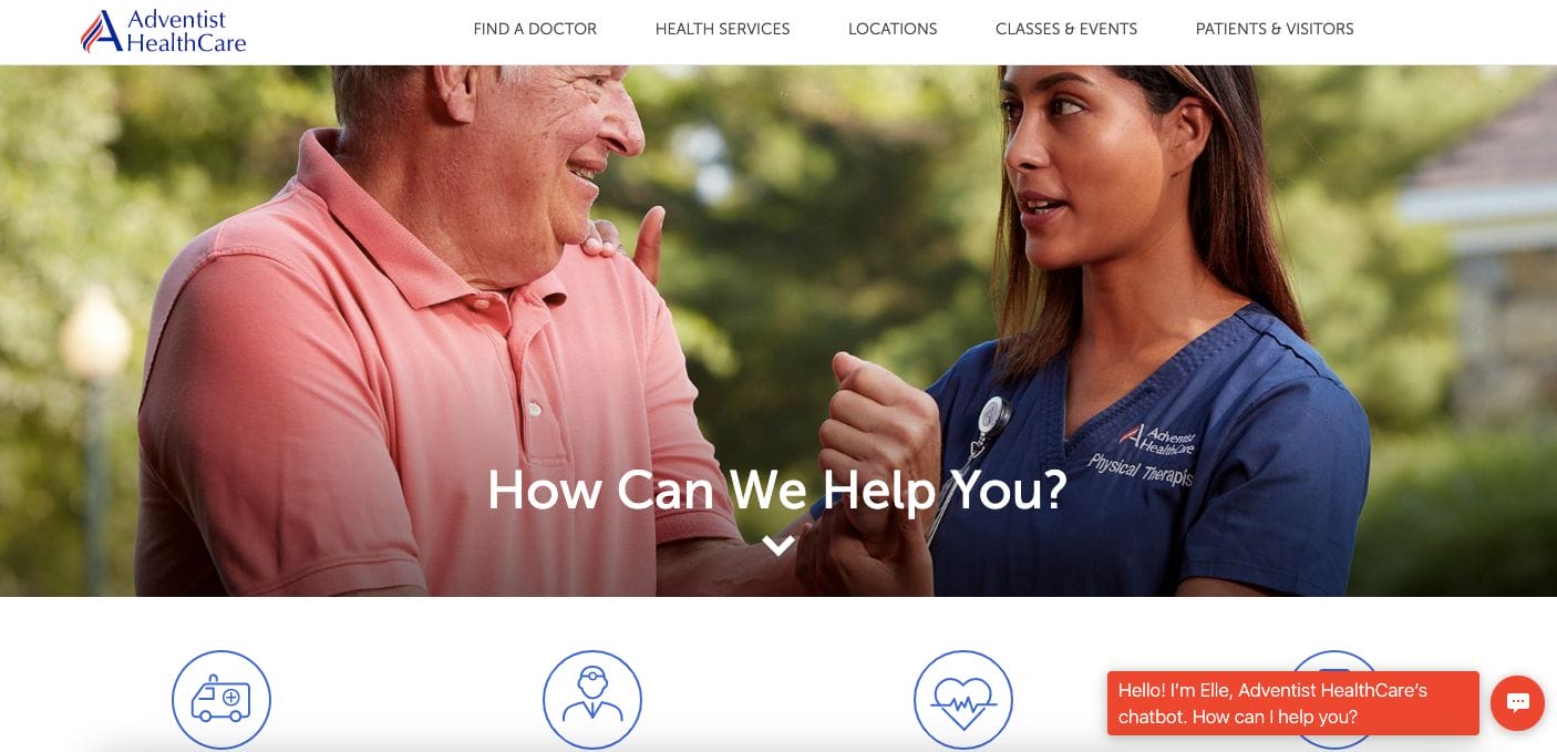
With the use of photos highlighting humans, Adventist Health Care stays true to its commitment to showing genuine care to its clients. Their website is neatly designed with intuitive buttons to get immediate help with each query. Furthermore, they also incorporated a real-time chat plug-in that one can use to get urgent help. Classes and events are also listed for easy reference for interested clients. Additionally, they incorporated a video overview of their facilities and services offered which is ideally helpful for new clients.
- website: https://www.adventisthealthcare.com/
4. Concord Hospital
With a modern and professional website design, Concord Hospital paid attention to elements for a smooth website visitor experience. They have a header menu bar which allows easy navigation from one page to another. Moreover, their landing page includes sections that focus on giving an overview of the platform as a patient hub. Call-to-action button on top encouraging members to log in is available as well.
- website: https://www.concordhospital.org/
5. Altru Care
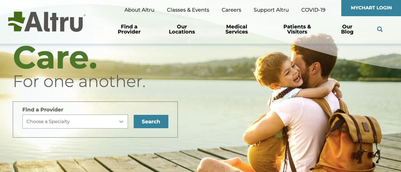
Showing care in little moments, Altru Care taps into our needs and emotions by adding images that relate to their values. Besides this, they maintain a warm and cosy design which encourages people to get comfortable with their team. A search bar option is also available for those who are looking for specific specialists local to the area. They also have a blog section which can help with boosting their credibility and showing their expertise in the subject. At the same time, this helps with optimizing their search engine visibility too.
- website: https://www.altru.org/
6. Office of Mental Health
Office of Mental Health has a neat design that’s also optimized for mobile. They kept their website with dark and serious tones which resonates with the anxiety and desire to bring hope to their patients. Moreover, several writeups are also available in case you need to read more and get a gauge of their activities. Also, they added call-to-action buttons which communicate the hotline for patients who are going through distress.
- website: https://omh.ny.gov/
7. Mount Sinai
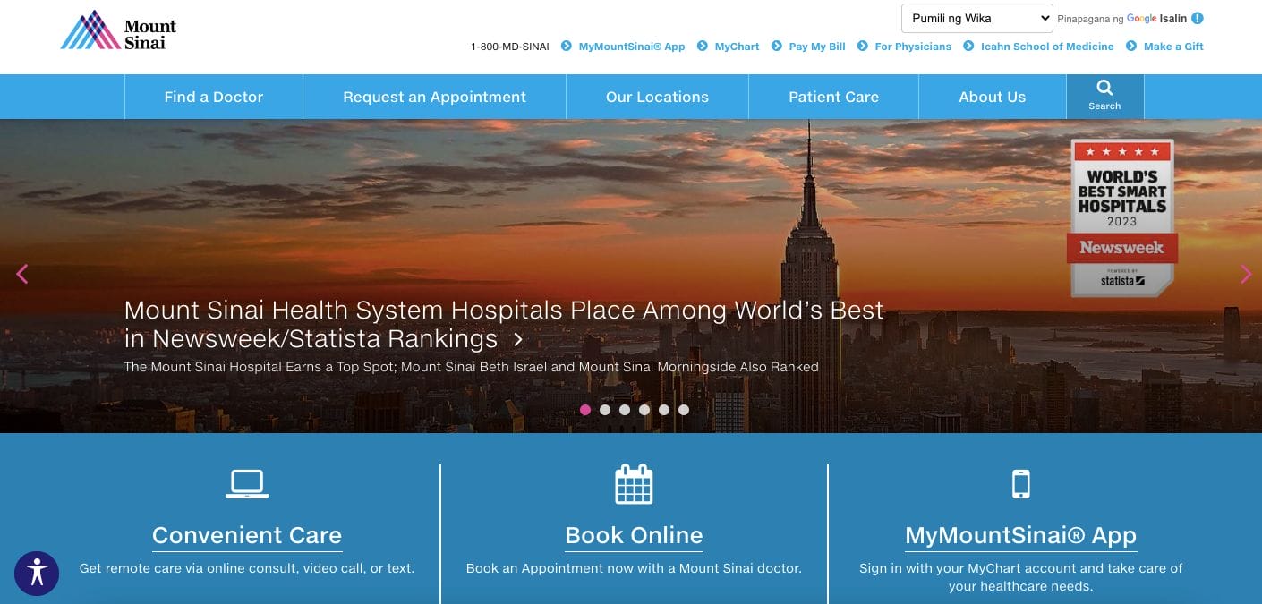
Mount Sinai is another of the best medical website design examples you can check. Their website is professional and straightforward, only incorporating functions with the intent to deliver immediate help to patients. Furthermore, the services they offer are also skimmable since they implemented it in bullet form with links directed to the site with more information.
- website: https://www.mountsinai.org/
8. Spartanburg
With a modern and professional website design, Spartanburg leaves an impact through a well-written headline and drop-down option to classify the client depending on what they need. This allows more curated content that can attend to what they need and secure the lead conversion right away. Besides this, they also use bullets to ensure easy-to-absorb content.
- website: https://www.spartanburgregional.com/
9. Freudenburg Medical
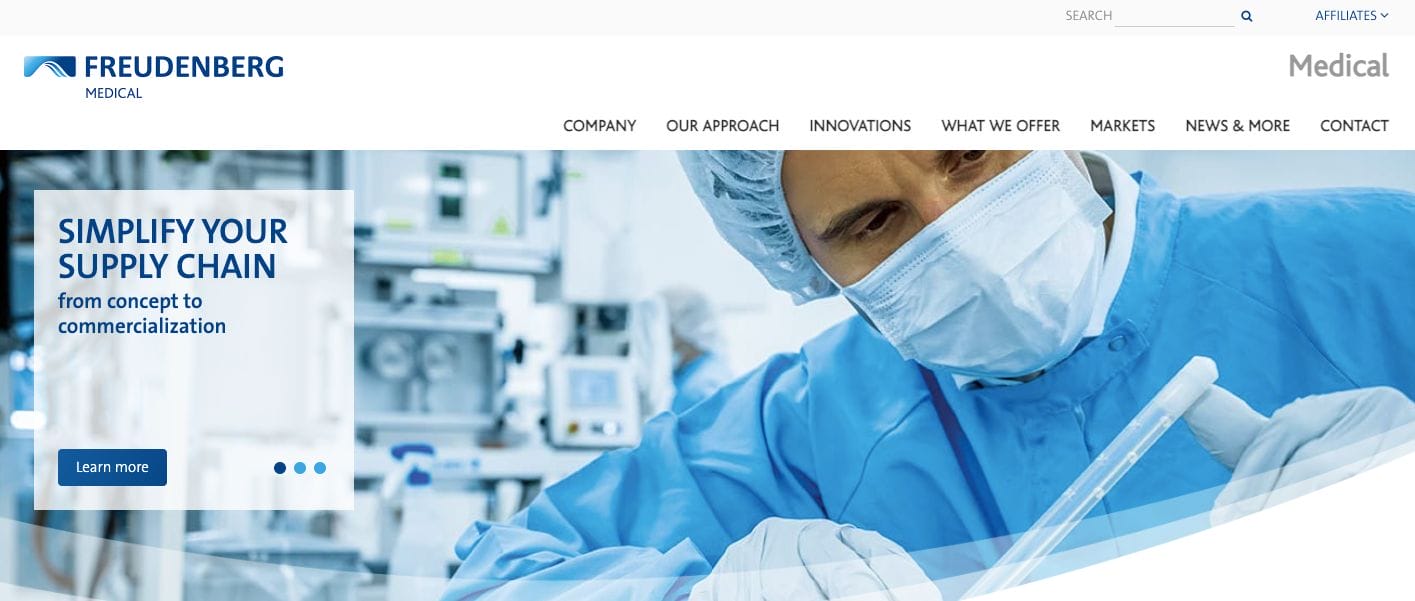
Showcasing its team of medical professionals, Freudenburg Medical easily establish its expertise in the business. Their website is well organized with different sections dedicated to specific services or products offered. Furthermore, there are call-to-action buttons incorporated to encourage potential clients to touch base.
10. Cigna
Focusing on their clients, Cigna‘s communication strategy is to connect with their potential clients and bring the solutions they need to lead a better life. They were able to do this through well-written copy that follows their narrative. The choice of photos also helps with the overall feel and allows clients to get comfortable with the company.
- website: https://www.cigna.com/