10 Best Online Course Platforms You’ll Love (2023)
Whether you’re a course creator yourself or offering a platform to help facilitate crafting the perfect course, we got you! Here, we put together the 10 best online course builders you’ll surely love. You can take inspiration from what they did on their own website to keep the planning shorter but more focused and efficient. Take notes and impress your potential clients to work with you!
10 Best Apps to Create Online Training Courses
1. Course Studio

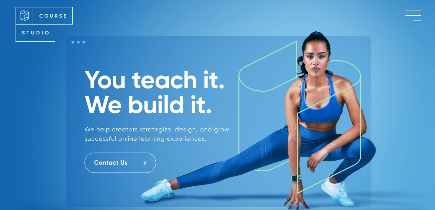
Impressively modern and professional, Course Studio focuses on delivering a stunning website that appeals to their target market outright: fitness instructors. With the use of a human photo, they establish a sense of connection to readers who may find themselves relating. Moreover, they also have well-separated sections with different colours diving into the content, encouraging scrolling further in a seamless but bite-sized content. They are also able to add what they can deliver and emphasize their value to the audience.
- website: https://course.studio/
2. Spring Solutions
Spring Solutions has a simple website that leaves an impact. They played around with different font sizes and the contrast between black font on white, making the copy easier to read. Furthermore, they also added media content such as videos and photos to support what they are communicating to the audience. With a few scrolls, they also showcase their awards and recognitions which lets the audience know what they can expect.
- website: https://www.ispringsolutions.com/
3. THinkific

Playing around with professionalism and modern design, Thinkific brought a stunning website for us to check out. They have a sleek navigation panel on top and the choice of sans serif fonts add a neat aesthetic to the overall look. Moreover, different sections go through the service and previous client experience. They also maintained a cohesive look by sticking with bluish tones complemented with white.
- website: https://www.thinkific.com/
4. Learn Dash
Learn Dash is one of the best course creator websites to check out. They played around with different layouts with sudden splashes of colours. Furthermore, they used this to direct attention to different areas and encourage retention in the audience’s mind. With different layouts per section, they also took advantage of charts and graphics to better express their points as well.
- website: https://www.thinkific.com/
5. Digital Course Hive

A women-led course creator platform, Digital Course Hive has a sleek and modern website. They used colour-blocking techniques with soft muted colours to add a bit of depth to the design. There are also photos in between that celebrate the journey of the team behind the website and how happy their clients are. With this, clients can build rapport and encourage other visitors to explore their service too.
- website: https://digitalcoursehive.com/
6. Mastera
Mastera is another fantastic website that you can explore. They used minimal colours and elements in their website which are complemented with bright colours in the photos. There are also photos of people that shows each step in the journey of course creation which can help establish credibility and encourage connection with the audience. More than this, there are also call-to-action buttons strategically placed throughout the landing page. This can encourage action from the site visitor’s end.
- website: https://mastera.io/
7. Zenler

There is something charming with Zenler‘s website despite its simplicity and occasional bursts of colours. They focus on adding more spaces and encouraging the site audience to keep browsing and understand what they are trying to say through illustrations. Not only this, but they also have interactive graphics and elaborative copy that gives a more detailed take on what value they bring to the table. Truly shows how perfect examples of course creator websites are.
- website: https://www.newzenler.com/
8. Teachable
Teachable is another platform for course creation but more than this, they sport a modern and trendy look that sure impresses younger audiences. Moreover, other features are optimized to give out more information and encourage conversion. They used a combination of sans serif and serif font to add more attention and emphasis to the headings. This improves readability and navigation too.
- website: https://teachable.com/
9. Maven

With one look at their website, it’s not hard to remember Maven. They incorporated green impactful full-screen background that is complemented with the white font to stand out. With further scrolls, the layout switches to a cleaner design that is easier on the eyes. The graphics they also used are playful and attractive to the eyes. This no doubt gets the attention of the audience more to focus on the important stuff.
- website: https://maven.com/
10. Flow Online
Flow Online has a stunning pink landing page with white detailing. The choice of bright colour helps make an impression and encourages the audience to stay and browse more about the website. Moreover, their layout is also directed to touch on the experiences of the audience. This is to tap into what they need and zone in to whom they are targeting as a lead to nurture as a customer.
- website: https://flow-online.co.uk/


