10+ Best Private Equity Website Design Examples & Inspirations
A private equity firm website is crucial in maintaining a presence in the financial services industry. It is where potential partners learn about your firm and its services, allowing them to evaluate whether they are a good match for your company. A well-designed web presence helps build trust and generate new business opportunities.
And with that, here are the 10 best website design examples and inspirations for private equity firms:
-
Vista Equity Partners
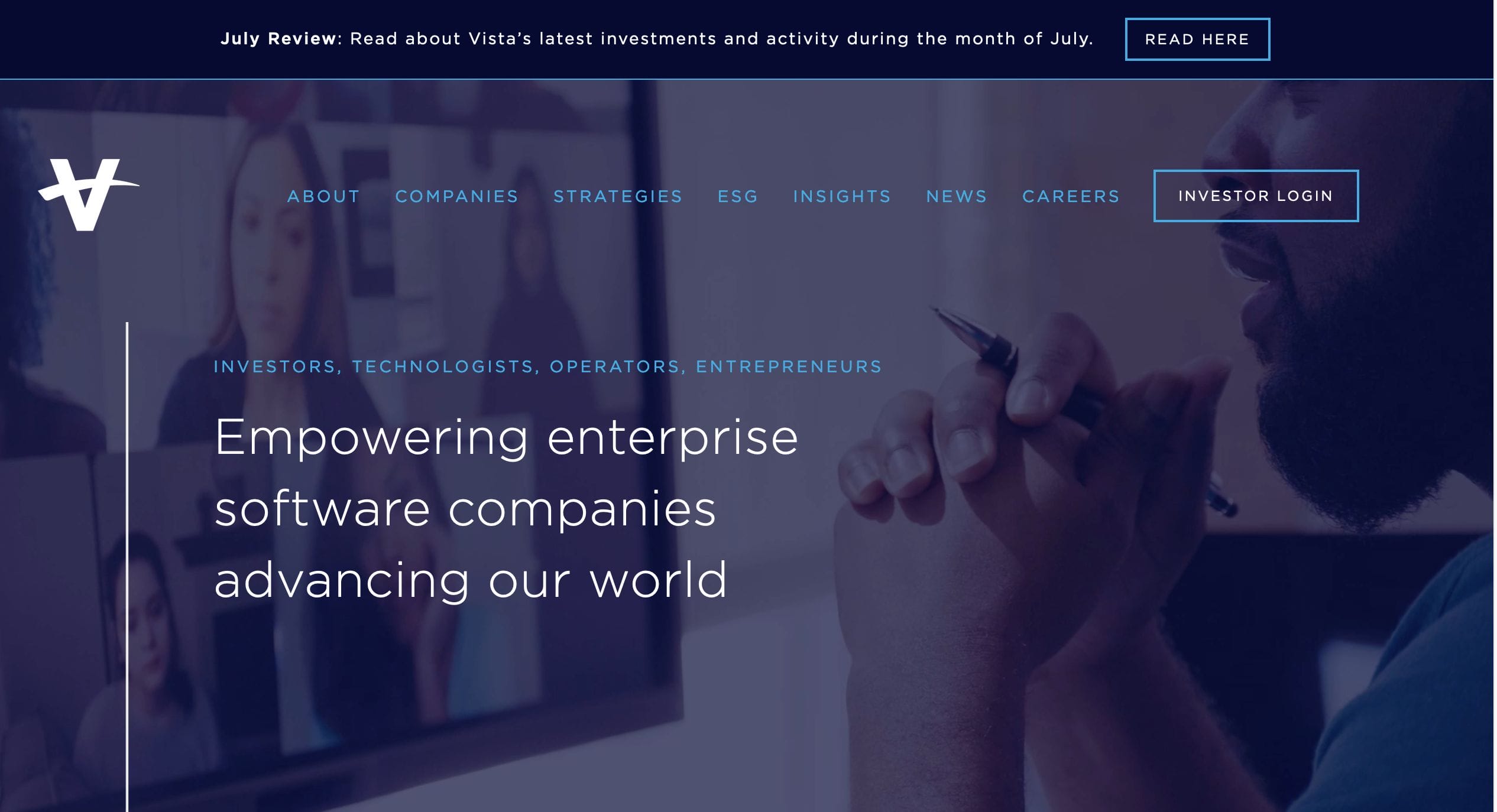
Vista Equity Partners’ web design example makes it easy to learn about the firm. The site is bright and colorful, with an energetic vibe that makes it appealing to potential clients. It presents information that is convenient and easy to use. The page establishes credibility through videos and testimonials that detail the company’s accomplishments well.
- website: https://www.vistaequitypartners.com/
-
Emergence

The use of illustrations on Emergence’s page makes for a unique web design inspiration. It makes an impression on clients as it immediately places its focus on “people.” They place the spotlight on some clients with their stories front and center on the page. Through large photos of their clients and founders, they can introduce the company and the expertise they offer to the industry. The site has a slightly retro feel with its warm color scheme and fonts that add to its charm and appeal.
- website: https://www.emcap.com/
-
Graham Partners
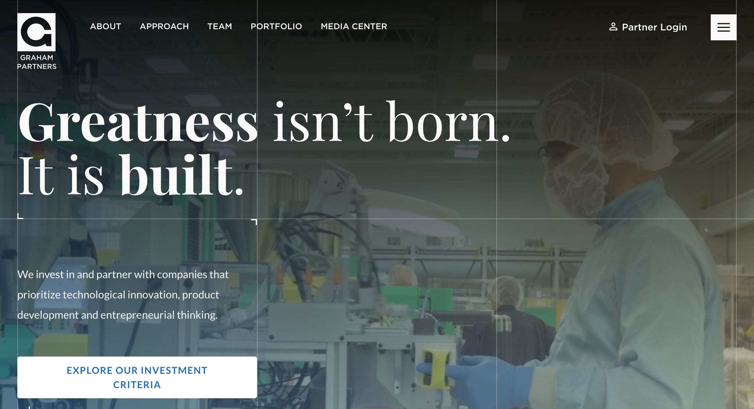
Graham Partners’ website encourages visitors to take a deeper dive into the company’s offerings. Its distinctive web design is directed toward its clientele. A powerful image and a commanding headline communicate their distinction in the business sector. The site’s layout is clean and simple to navigate. The menu tab includes pertinent information and details regarding their company and services.
- website: https://www.grahampartners.net/
-
Alpine
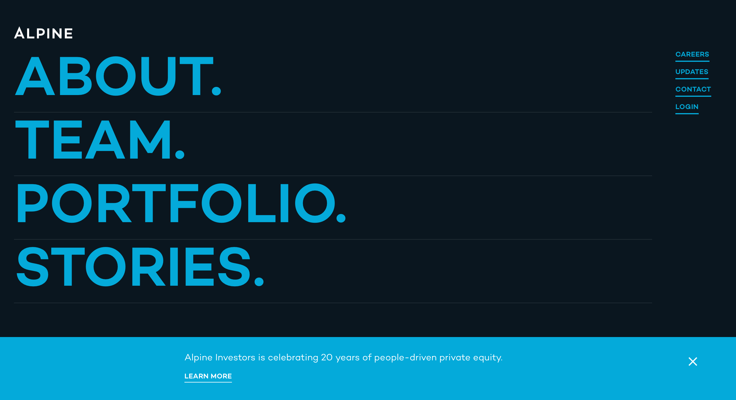
While most website design inspiration comes from using images to grab the user’s attention, Alpine has opted to use large text instead. The page is simple to navigate with its understated and clean layout. The use of different hues of blue and a singular tone for the images make for a very cohesive look. This choice allows users to get an easier grasp on what they’re looking at as soon as they land on the site.
- website: https://www.alpineinvestors.com/
-
Long Ridge Equity Partners

More than flashy and complicated, more users prefer simple yet easy-to-navigate websites. Long Ridge’s page is a great example of professional branding using relaxing blue tones and a fun composition using different elements. A pop of yellow is used to highlight sections and links for effortless browsing.
- website: https://long-ridge.com/
-
Light bay Capital
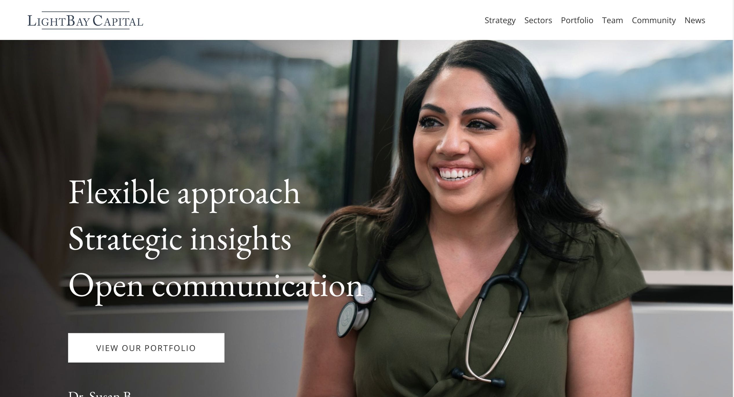
Light bay Capital’s page is the perfect web design example for a functional and direct-to-the-point format. It features a two-tone page with striking images that bring interested clients to the meat of their website – the content. The upper tab has their logo and a menu that includes their strategy, portfolio, and other information. The site is professional and gives you all you need in one scroll.
- website: https://www.lightbay.com/
-
Lightspeed Venture Partners
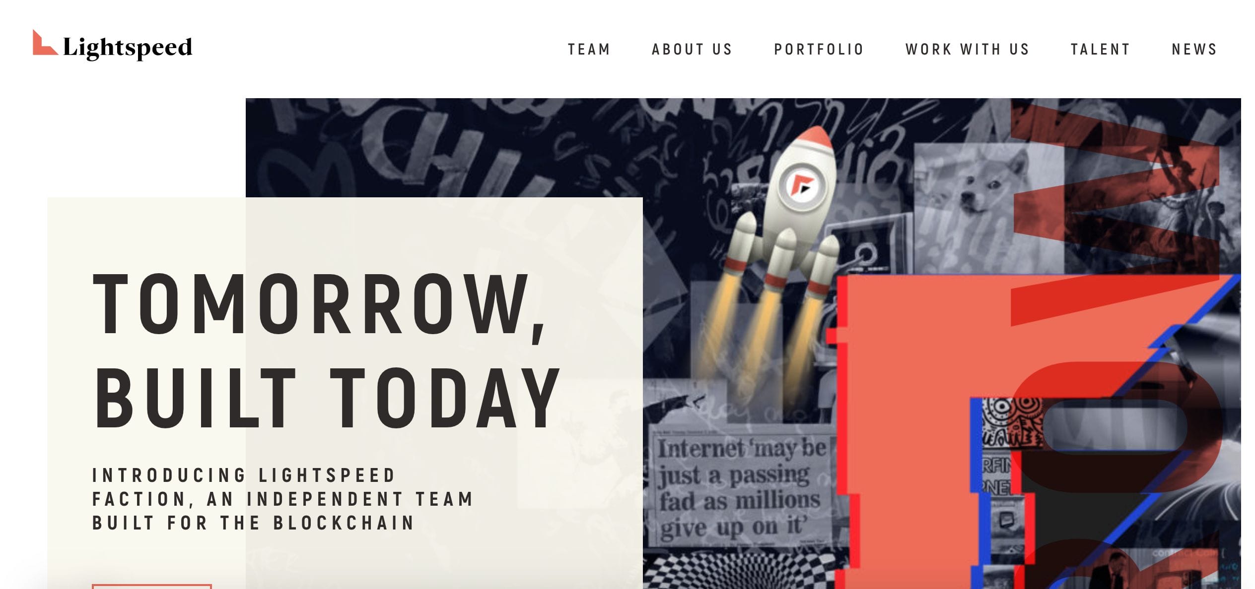
Lightspeed Venture Partners has a very “in the now” and modern theme for their website. They used large, vibrant images coupled with animation and oversized text. It is a breeze to use and a refreshing sight in the world of private equity. The whole structure draws clients in from the elements used in the color scheme.
- website: https://lsvp.com/
-
Sterling Partners
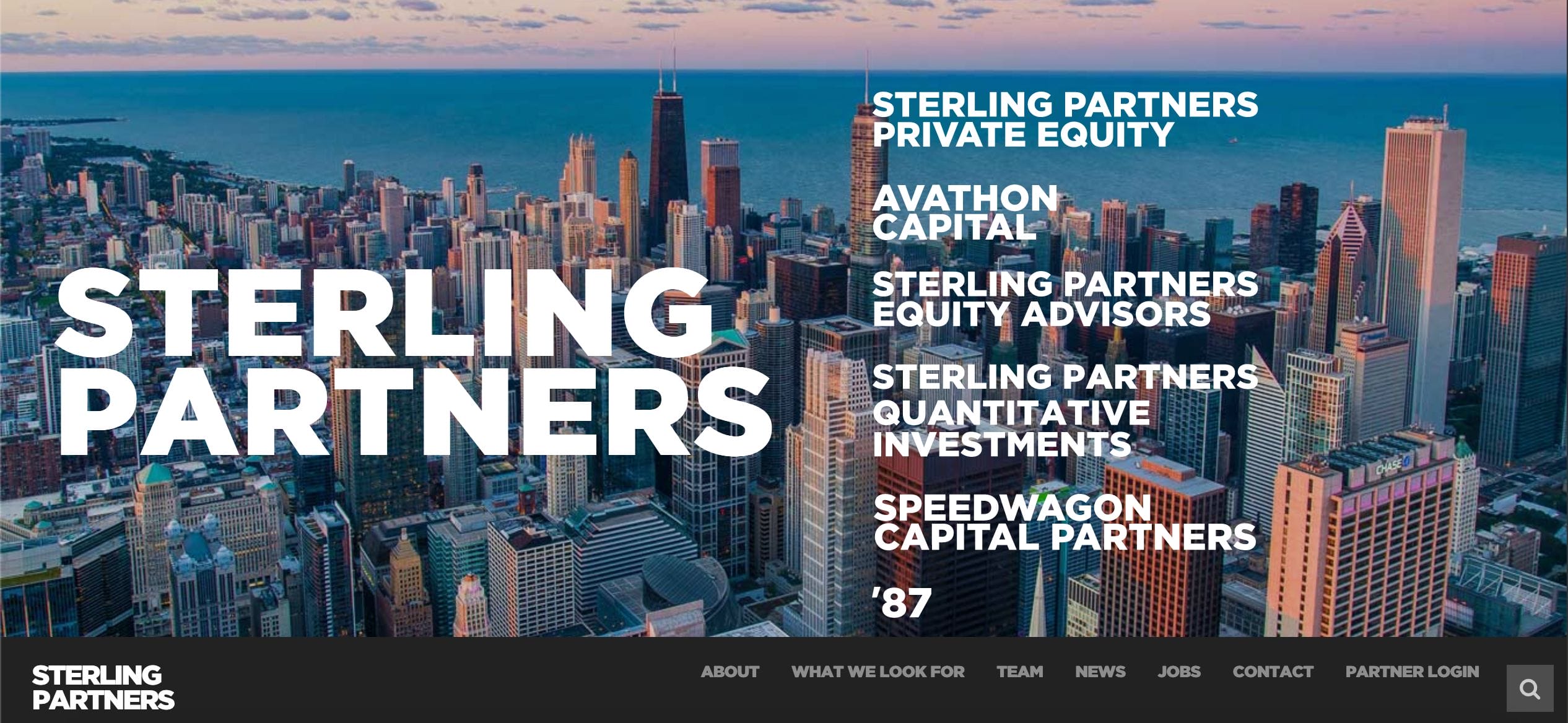
Sterling Partners mean business and they’re here to show you what they can do. Once you open their website, you are greeted with a bustling photo of the city as the backdrop of what they do best – specializing in small-capitalization investment strategies. The page is straightforward and practical as clients are served with their must-knows immediately upon clicking on their unmistakable tabs and links.
- website: https://www.sterlingpartners.com/
-
Brightwood Capital

Brightwood Capital’s site aims to inform why they are the best company for their market. Scrolling through their website feels like browsing through lively pages of a book. Using photos, color, and intelligent animation, they can convey the company’s approach, experience, and assets. It is unique in its own simple yet very effective way.
- website: https://brightwoodlp.com/
-
Artemis
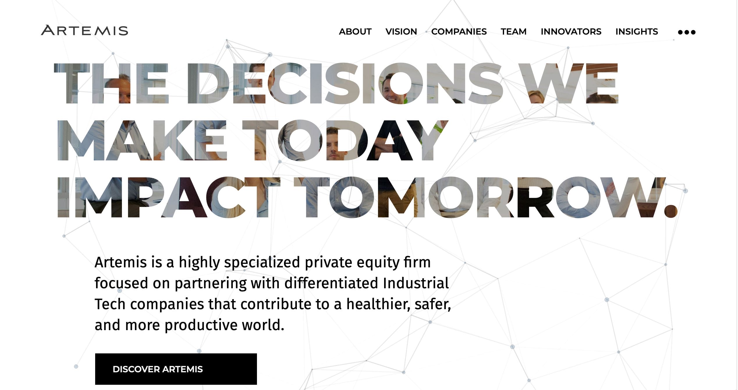
Artemis has made an uncomplicated website that feels brand new and fresh. There is no need to scroll through its homepage anymore. You simply need to click on the tabs they’ve made readily available on their upper screen. The design is very clean with a focus on giving their prospective clientele the information they need as easily as possible.
- website: https://www.artemislp.com/
