10+ Beautiful Private Equity Website Design Examples
Just like any business, private equity companies put much emphasis on their credibility and reputation. They set a high standard not only in their service and client relations but also in how they present the brand to the public. With this in mind, we rounded up the 10+ Beautiful Private Equity Website Design Examples you can check out and take inspiration from before building the best website for the business.
10+ Beautiful Private Equity Website Design Examples
1. HGCC
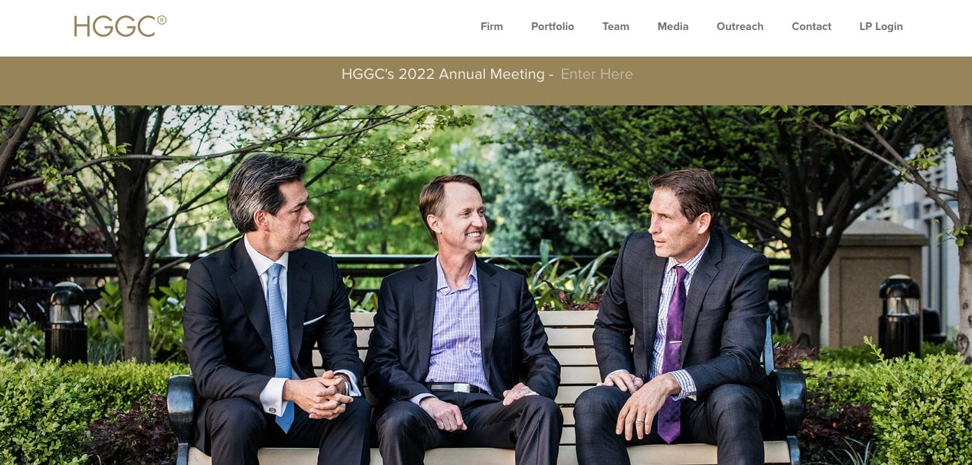
Establishing credibility within the private equity industry is one of the main challenges you need to overcome. HGCC understands this best and crafted a modern and professional website showcasing the people behind the company and those lives they touched. Scrolling further, they introduce the company and what services they deliver. There is a call to action button which encourages interested partners to view our partnership model.
- website: https://www.hggc.com/
2. Alpine
Alpine Investors kept it cool and straightforward with a monotonous blue tone and a montage of photos of people they’ve helped — to further promote the mission and vision of the brand. Moreover, the landing page listed page titles directed to give the customer more information and stories shared by successful partners and employees.
- website: https://www.alpineinvestors.com/
3. AQR
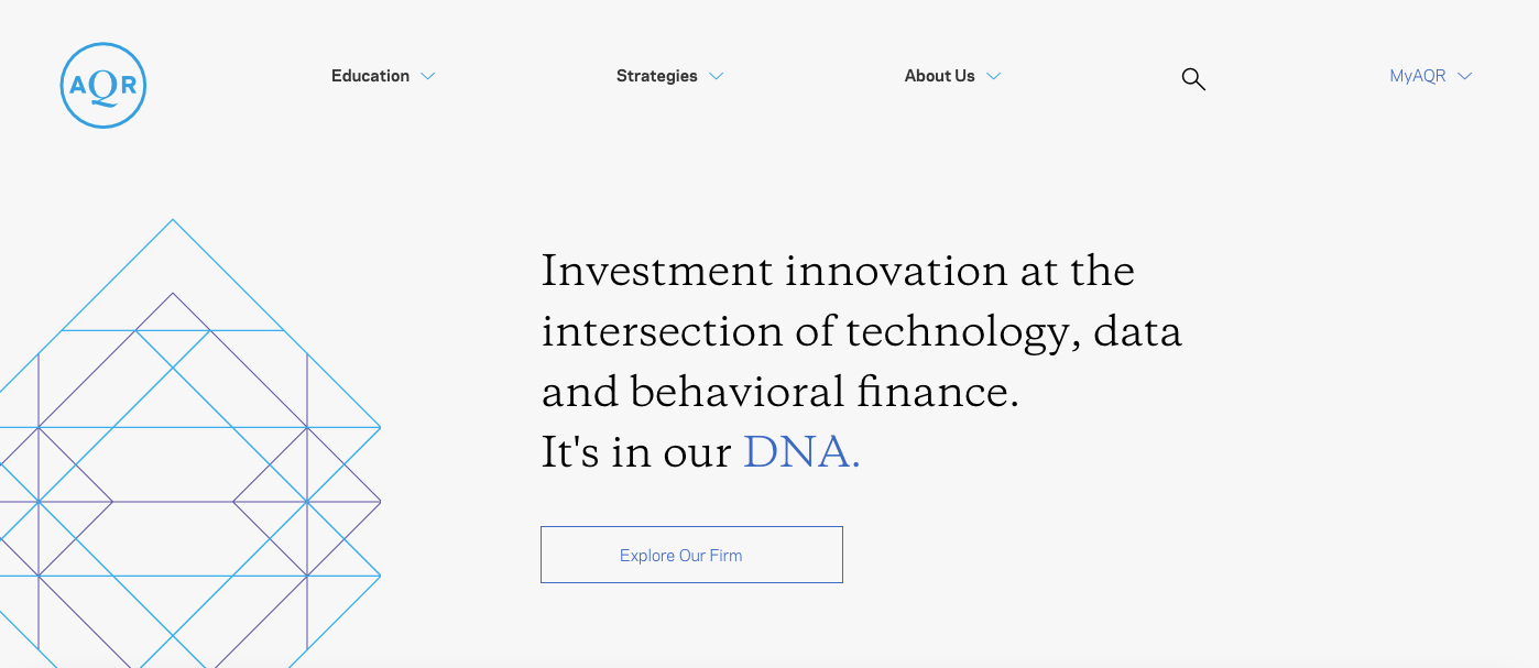
Clean and minimalist, AQR has a navigational bar that’s assorted depending on the intention the visitor has in mind. Be it to educate, strategize, and even storytelling — they sure encourage conversion of leads without much effort from the customer end. There is also a call-to-action that encourages the audience to learn more about the company.
- website: https://www.aqr.com/
4. Insight Partners
Insight Partners has a stunning website that showcases scenic photos that inspire partners to take action toward a better future. Since they have a slideshow, it has a well-written copy with assigned call-to-action buttons engaging customers to read more. Quite neat, they also added their success rates and previous clients they work with. Surely, this help with leaving an impressive impression.
- website: https://www.insightpartners.com/
5. Artemis
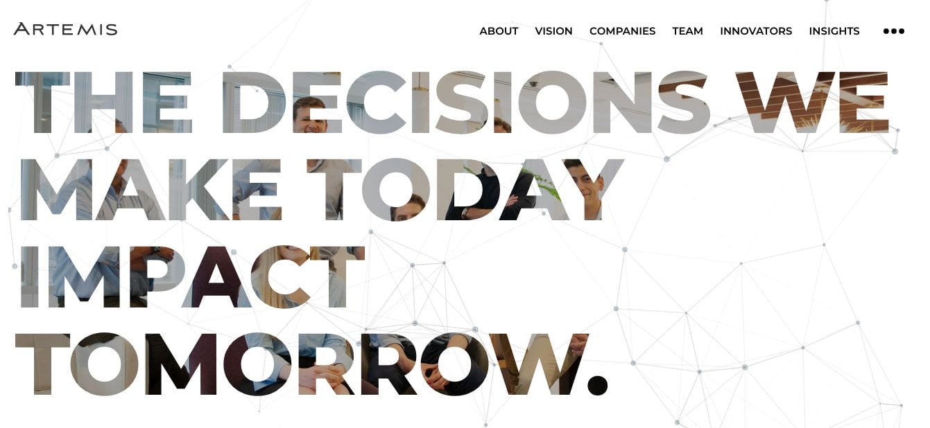
Modern and sophisticated, Artemis boasts a stunning website worth checking out. It features geometrical patterns with their heading copy overlaying a warm photo of the team. Furthermore, they kept the landing page short without boring them with too much text. They also have a page introducing the team along with several insights behind each undertaking of the company.
- website: https://www.artemislp.com/
6. Sterling Partners
Sterling Partners wow us with an unconventional website landing page. As one of the best private equity website design example to explore, they started with an impactful headline with a bullet of services they offered. These are linked to pages where their audience can read more. Scrolling the page further, they establish their expertise by introducing themselves and the team behind them.
- website: https://www.sterlingpartners.com/
7. lightBay Capital
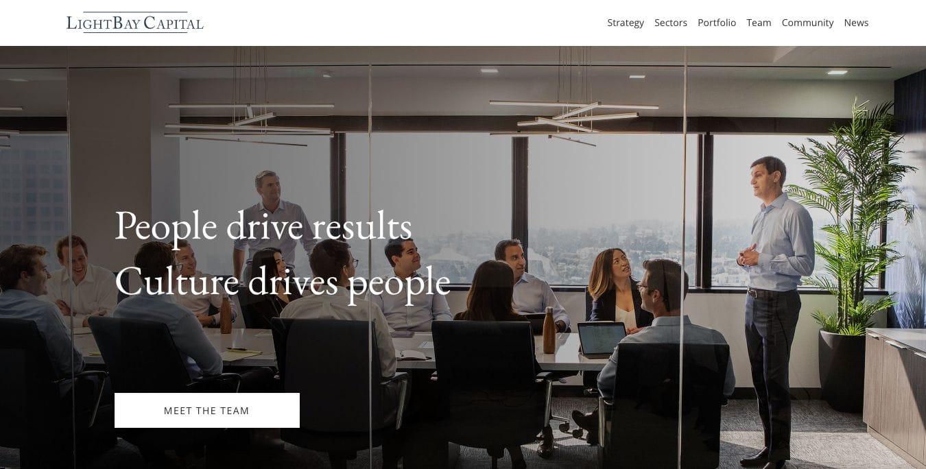
Definitely people-oriented, LightBay Captial showcases photos of people who seem to be happy and successful. This helps them communicate how the services they offer help their clients lead better life. Moreover, they added skimmable and easy-to-remember features they offer. Everything to capture the attention of impatient audiences who jump from one place to another.
- website: https://www.lightbay.com/
8. Blackstone
Classy and impactful, Blackstone has a minimalist website that relies solely on website copy and choice of font. Leaving quite a mysterious impression, this generally piques the interest of the visitor and encourages them to browse further to get to know the business. The use of serif fonts also establishes authority that they know best in the industry. Furthermore, this is paired with an arrow directed to the right which signals that there is something to check out next.
- website: https://www.blackstone.com/
9. Carlyle
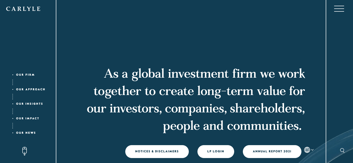
Carlyle is another of the best private equity website design examples to explore, they picked blue as their main brand colour. This means trustworthiness and security in colour psychology which fits their business well. Also, the use of serif fonts helps communicate how seasoned their people are in the business. With a few scrolls, they take you on a journey to get to know the brand more.
- website: https://www.carlyle.com/
10. Varagon
With a simple yet stunning interactive website, Varagon paid attention to small details. Through scrolling, there are transition effects they implemented which allow smooth movement. Not only that, this easily captures the attention of the audience without even hard-selling them to read more. At the same time, they also used numbers to establish credibility.
- website: https://www.carlyle.com/
