10+ Best Recruitment Web Design Examples & Inspirations
Recruitment is all about believable persuasion. Therefore, a recruitment website must be as impressive as possible in terms of visuals, content, and navigation to convince people to apply. Introduce a company properly through its page and get conversions through trust.
Stand out from the rest and be inspired by our list of 10+ Best Recruitment Web Design Examples & Inspirations below!
-
Medely

Medely caters to professionals in the nursing and allied health sectors. In this regard, it is a web design example of clean, simple, and direct to the point. The color scheme is neutral with pops of blue hues which is typical in medical fields. Menu options are available throughout the homepage for effortless scrolling. The layout is straightforward and its content makes it very accommodating for its potential clients.
- website: https://medely.com/
-
The Recruitment Crowd
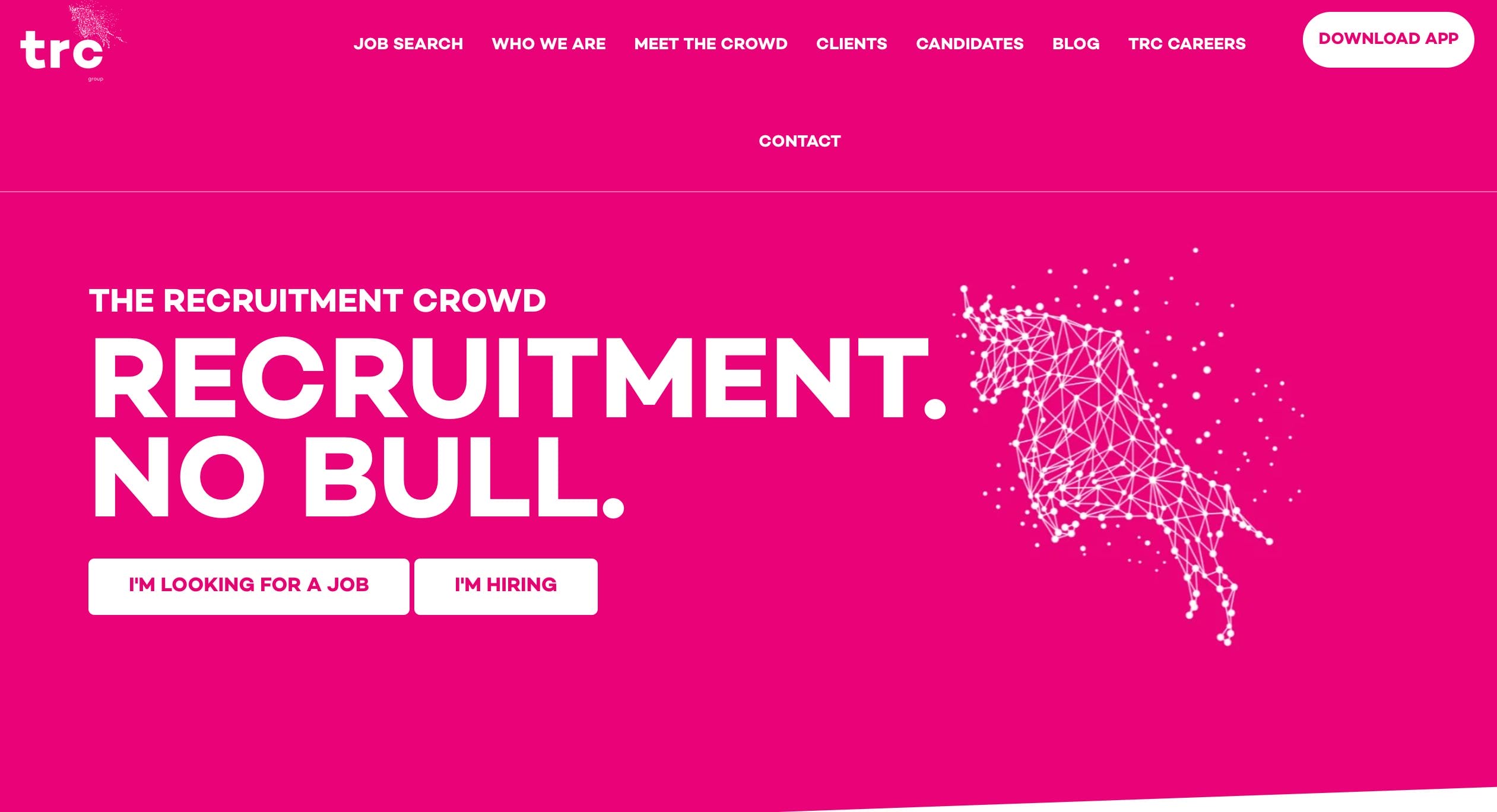
A vivid pink layout with thoughtful transitions and a striking welcome statement makes the TRC website an engaging web design inspiration. Above the fold, you’ll find a menu for everything you need to look for on the website. They have a spinning wheel for different job sectors. This is an interesting take on how they intelligently divided their page into different sections – call to action, testimonials, about us, and many job availabilities.
- website: https://therecruitmentcrowd.com/
-
Salt
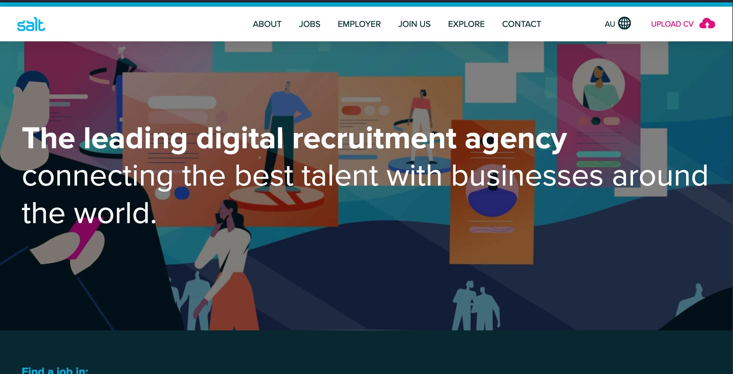
A digital recruitment agency, Salt provides different job opportunities in the creative, HR, sales, marketing, and technology fields. This web design example is innovative and user-friendly. It displays quick and easy navigation through a large search bar and a convenient “Upload CV” button. The company highlights transparency as a significant part of the homepage is dedicated to available jobs and salary offers. Lastly, the video at the end of the site is a great way to introduce the company to potential clients.
- website: https://www.welovesalt.com/
-
JDM Talent
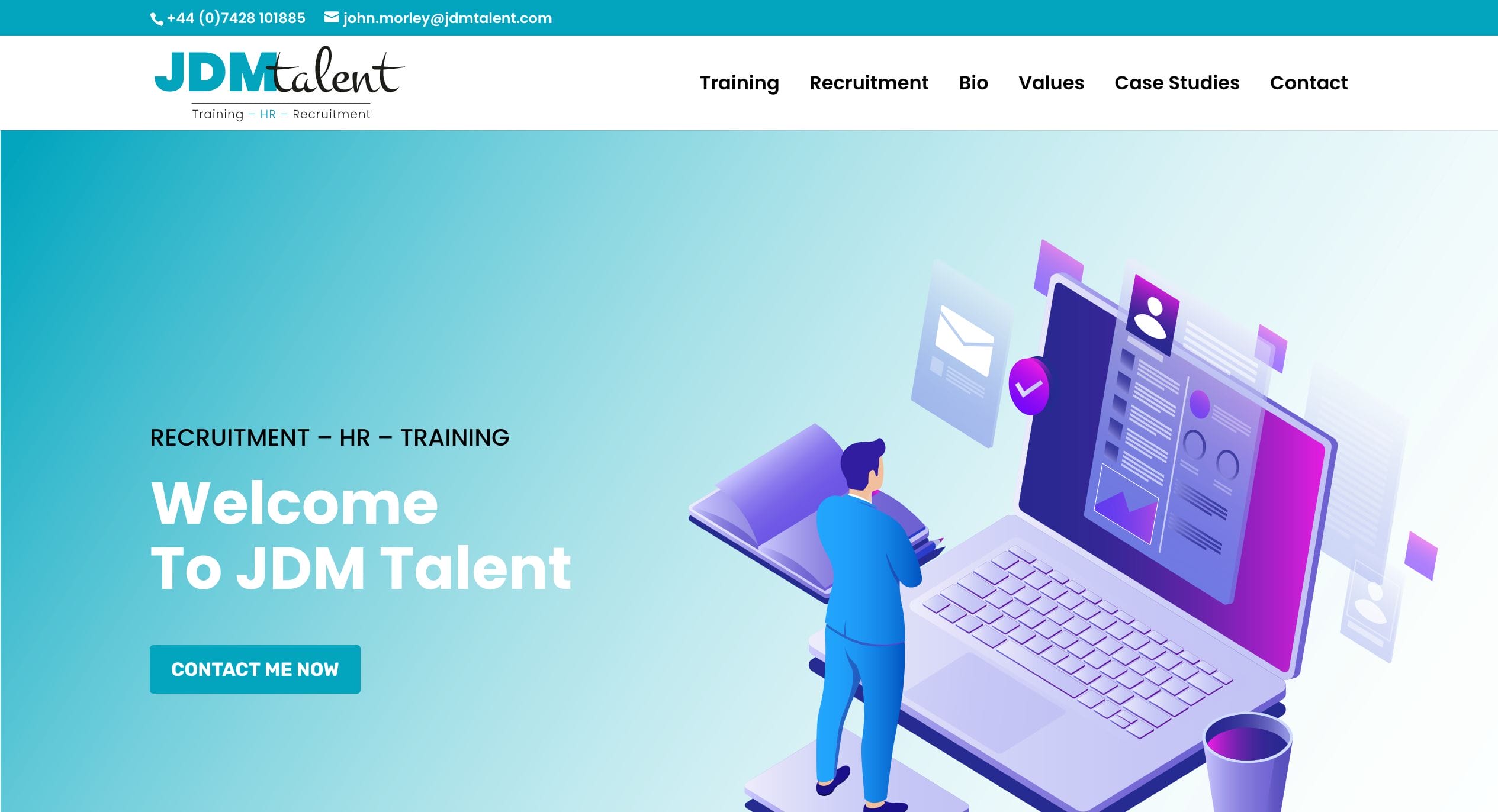
JDM Talent opted for a minimalistic and uncluttered design. They utilized graphics to drive their selling point with a dynamic color palette contrasted with white space. They streamline the content to give the user a good grasp of the company profile, services, and the person behind the firm. Testimonials and case studies are available to further build trust with their clientele.
- website: https://www.jdmtalent.com/
-
Mayday
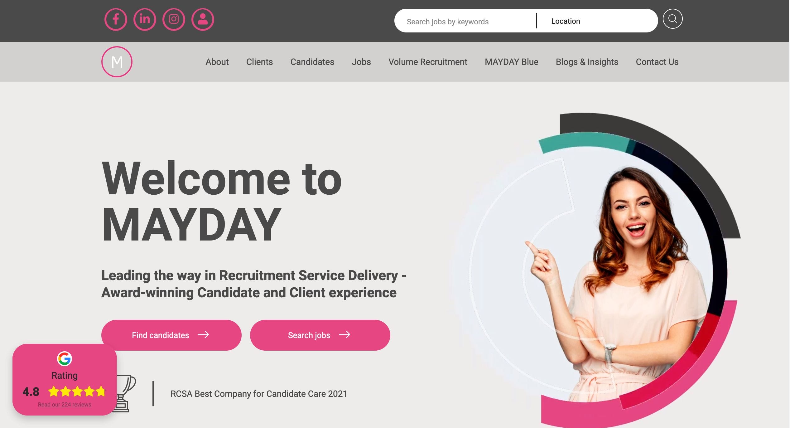
You know a professional web design example when you see one, and Mayday is certainly skillfully designed. User experience, visual stimulation, and a treasure-cove of content are all available on this rich website. The welcome page contains pertinent information – their social media links, a search bar, and a menu tab. These are all tied together through structured sections, eye-catching photos, and an altogether one-of-a-kind web design.
- website: https://www.maydayrecruitment.com/
-
Clarity Recruiting
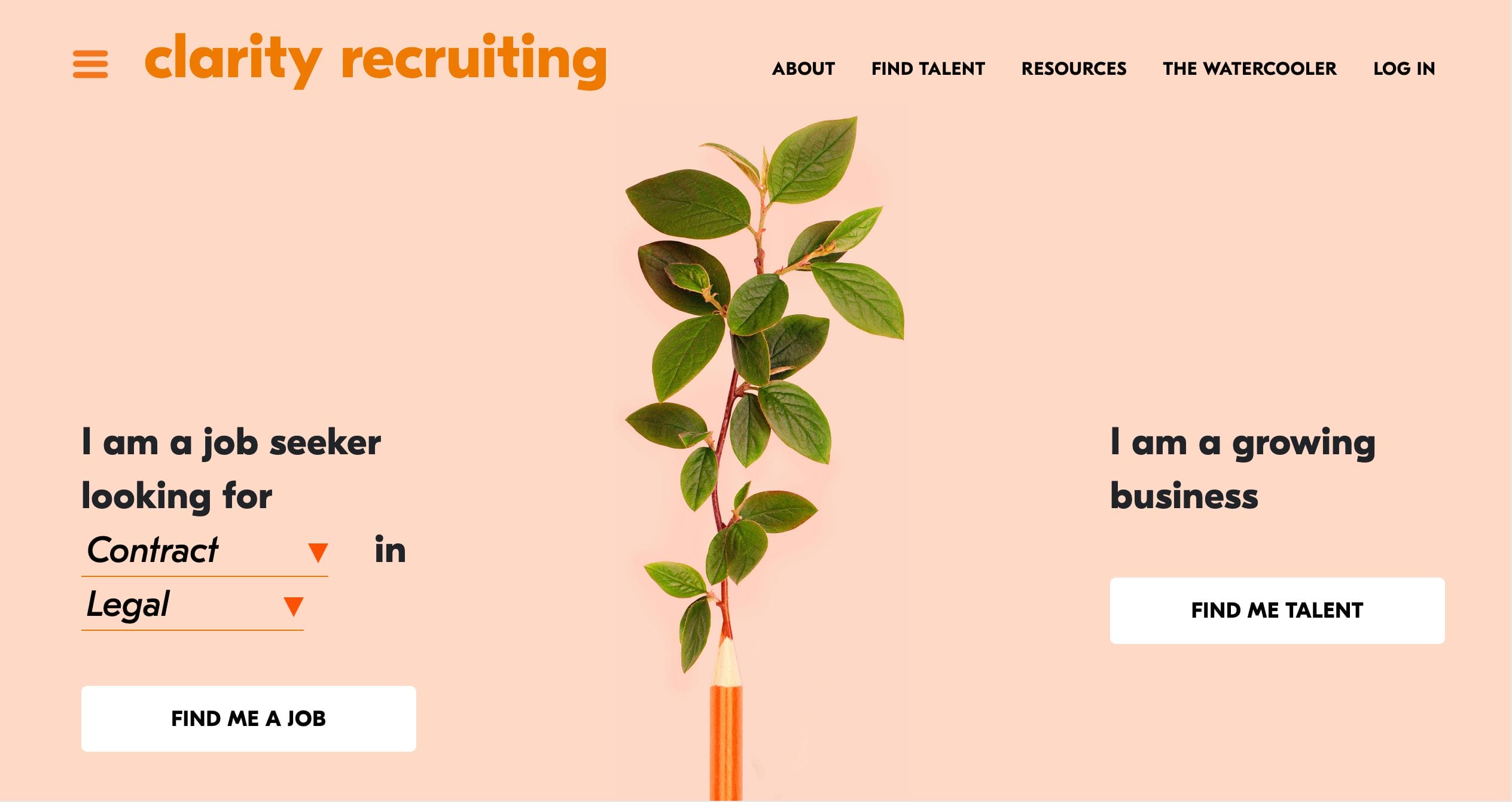
Growth and progress are the focal points of the Clarity Recruiting website. The whole layout is made dynamic through its quirky color scheme, select graphics, and images, as well as a play on typography. It features a good combination of testimonials, an uncomplicated interface, and an abundance of resources for its users.
- website: https://clarityrecruiting.com/
-
Yoh

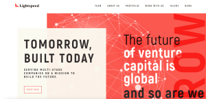
A sleek web design inspiration, Yoh’s page is a take on how the “future is now.” The dark tones are very well contrasted with the red and white space. It features a menu tab that includes all you need from the website as well as a search bar and very well-placed call-to-action buttons. The site is well divided into different categories and ends on a strong note with resources and guides.
- website: https://www.yoh.com/
-
Artisan Talent
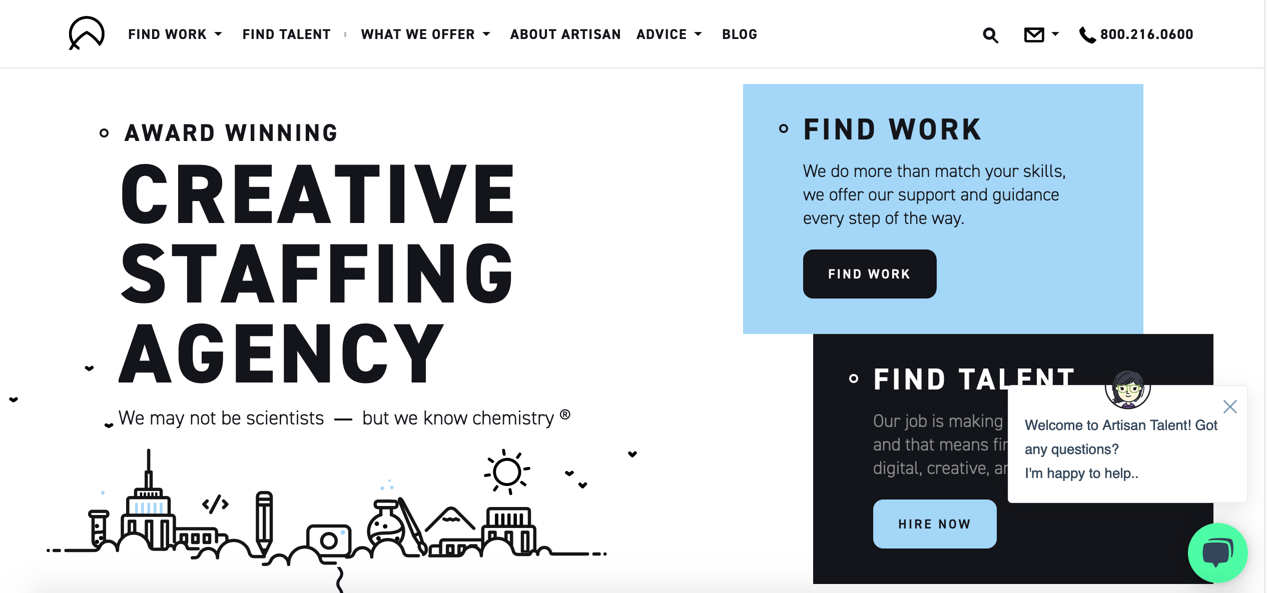
Endearing and truly a gem in the web space, the Artisan Talent website is a sight for sore eyes. From its simple layout to its charming animations and graphics, this is a standout example among other recruitment pages on the internet today. Color blocking, minimalistic, but very complete in content and execution, this is a stellar web design example to get inspiration from.
- website: https://artisantalent.com/
-
Freshminds
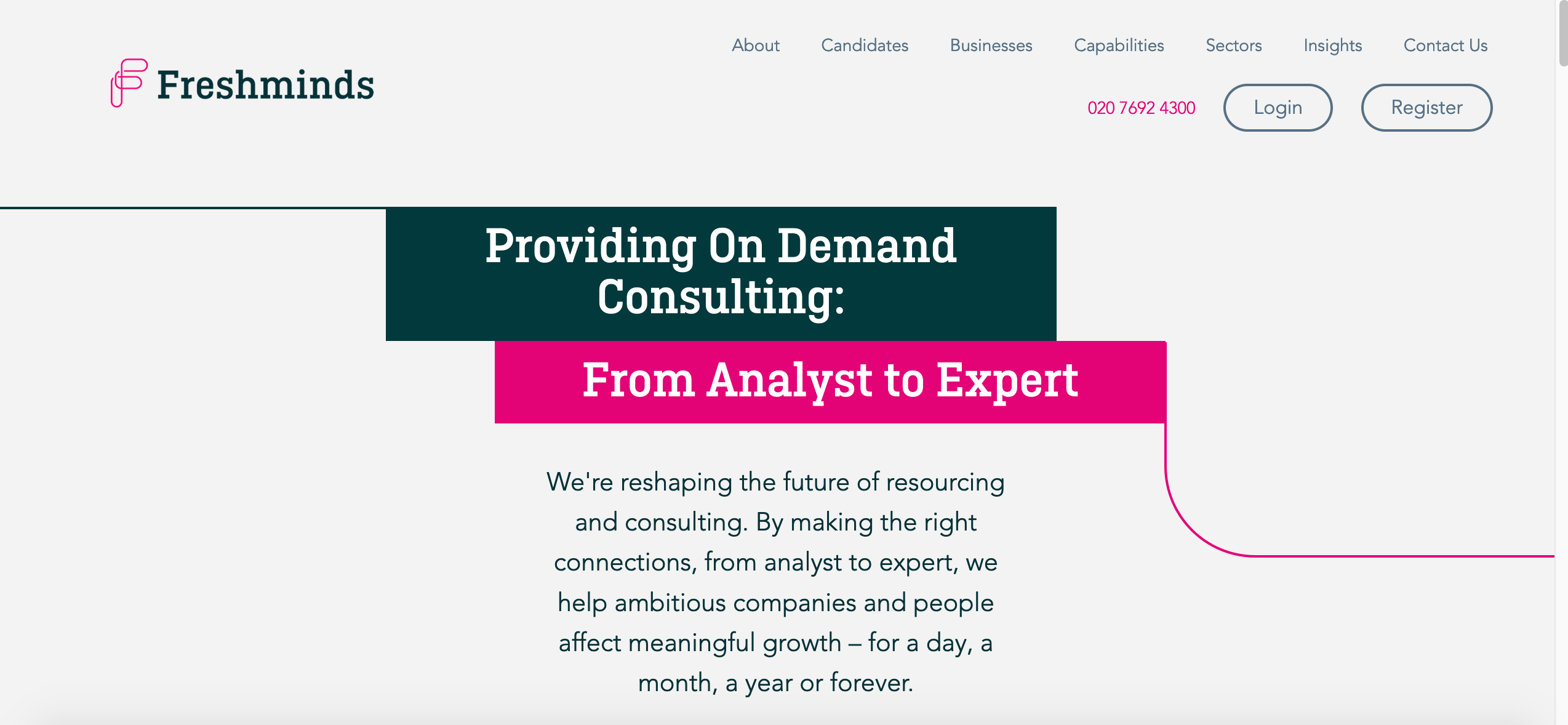
Using their logo as the framework of their web design, Freshminds has a smooth almost continuous effect as you scroll through the page. Using lines, boxes, and distinctive colors, they direct users to different site areas in an organized way.
- website: https://www.freshminds.co.uk/
-
Ford Agency
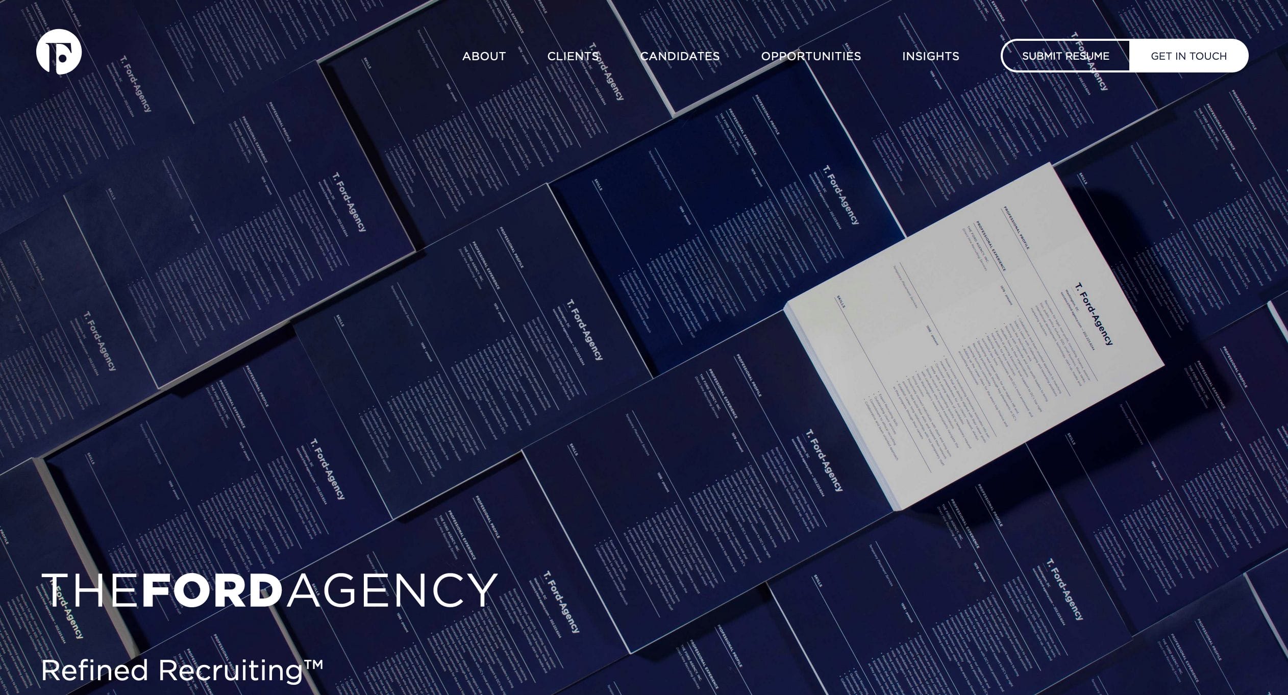
Formal and succinct, Ford Agency is a web design example that less is more. They let their expertise speak for themselves. A sleek menu tab and clear call-to-action buttons are available on the site. They show their proficiency through their clients and services without being too loud. Using muted colors and clean fonts and buttons, they can drive the point of their business effectively.
- website: https://www.ford-agency.com/
