10+ Best Tech Company Website Examples & Inspirations
With the rise of tech companies over the years, it’s not surprising how they now invest in a stunning website that prioritizes bridging technology and how these can highlight benefits to their customer’s life. We rounded up 10+ Best Tech Company Websites that you can take as examples and inspiration to improve your own tech websites.
10+ Best Tech Company Website Examples & Inspirations
1. Sonos
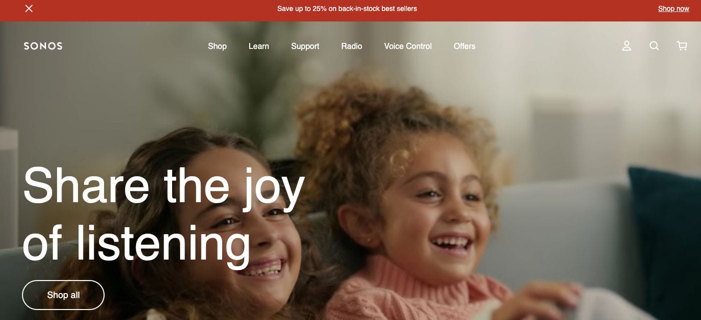
Upon landing on their home page, we are welcomed by an interactive preview of people having the time of their lives together with Sonos in the background. This helps establish how their devices help their customers have a better quality of life and build relationships further with loved ones. Emphasized by adding their headline in white font over the warm video preset — they truly understand how to leave an impact on site visitors.
- website: https://www.sonos.com/en-us/home
2. Apple
With a minimalist and luxurious website, Apple stays true to its brand and focuses on introducing its revolutionary products to site visitors. Since the reputation of their devices proceeds the name, it’s not surprising that they focused on crafting short but impactful copy without adding too much information just to sell. Each category was listed down on their home page and one can simply click and be redirected to the desired product page.
- website: https://www.apple.com/
3. Tesla
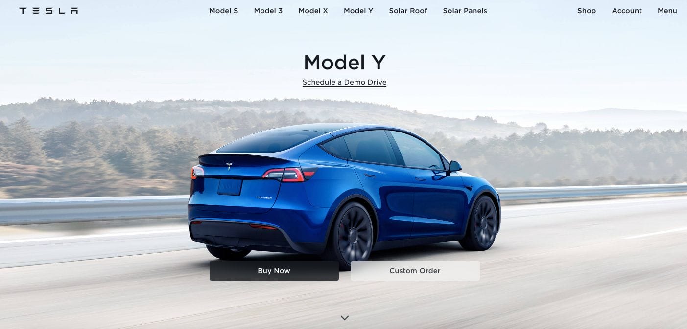
A stunning website highlighting their hero products at the moment, Tesla perfected the execution by keeping their home page as minimal as possible with a small menu on the top, and a well-lit outdoor shot that lets their iconic Tesla models stand out. There are also call-to-action buttons that allow customers to customize their orders or simply opt for a contactless delivery. Scrolling further, we get to look at several of their new releases. Moreover, they also added sections for solar panels and accessories in case the site visitor is interested.
- website: https://www.tesla.com/
4. Netflix
Keeping it straightforward, Netflix prepared a montage that features its wide collection of movies and TV series. This directly showcases what the platform is for — a streaming platform service where customers can stream and watch their favourite films from the comfort of their homes. Furthermore, the website features a form where customers can add an email with a call-to-action button to start the membership process. Scrolling further allows customers to see what platforms they support along with FAQs to answer potential questions of customers.
- website: https://www.netflix.com/ph-en/
5. Paypal
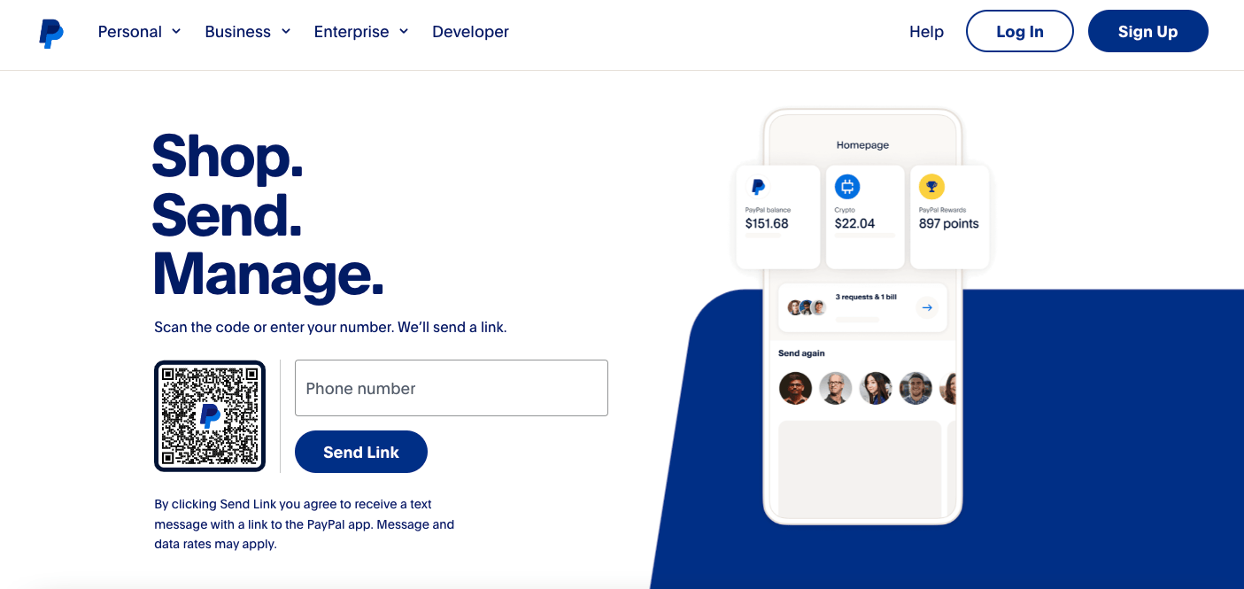
Paypal wows us with a neat website with an impactful headline that’s written to communicate the service they offer in just a few words. Followed by a subheading to further elaborate the service, they also added a call-to-action button that allows clients to join the platform or if they need more convincing, there is also a learn more button.
- website: https://www.paypal.com/us/home
6. BMW
A premium brand with an iconic luxurious website, BMW showcase their best products through a stunning photo carousel. Furthermore, they added a blue tone that aligns with the brand which added a moody feel to each shot. Because of this, the headline overlay in white stands out best from the moody shots. Scrolling further allows you to see an overview catalogue of their hero products with a call-to-action button that’s sales driven.
- website: https://www.bmwusa.com/
7. Fitbit
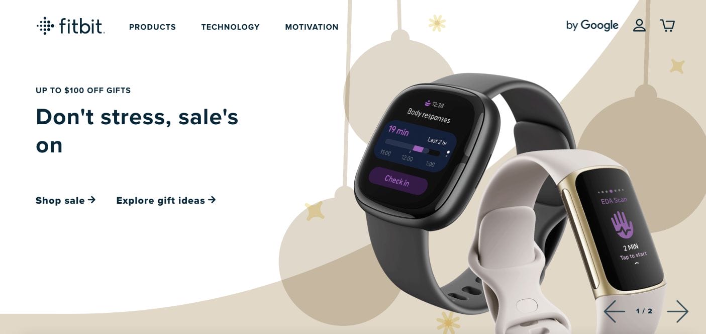
Fitbit is another best tech company website example that has a simple minimalist website which allows its colourful products to stand out in the banner. They have a navigational bar on top that can help you learn more about the brand. Below are other sections that highlight the features and benefits directed to communicate what’s in-store for the audience. They added a pop of colours to direct attention to important things and also implemented real-life customer photos that allow the audience to resonate with the brand more.
8. Asana
Highlighting the platform benefits, Asana kept it easy to absorb for potential corporate clients. They focused on elaborating on each feature and added a snippet from the platform. Furthermore, they added a list of plug-ins and partner productivity tools they partnered in too. With a call-to-action button inviting the audience to take action, it’s not surprising that anyone would proceed with the purchase.
- website: https://asana.com/
9. Skullcandy
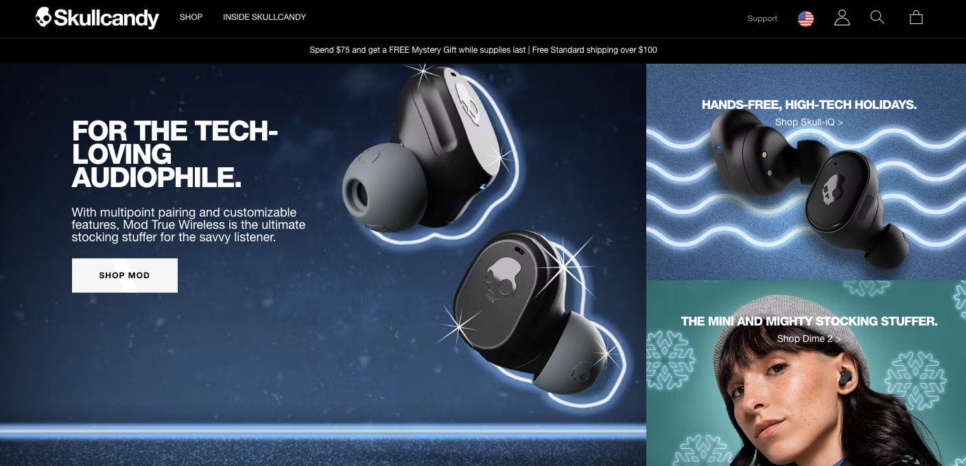
Skullcandy wows us with its colourful products through a product collage with copy overlay. Each can direct the audience to the product page for more information, further closing the sales. Besides this, they also play around with different youthful elements that attract millennials and gen z customers and encourage them to purchase. With a navigational bar, they also have an option that allows customers to select a specific region and see a localized website version that resonates with them specifically.
- website: https://www.skullcandy.com/
10. Native Union
Keeping it simple, Native Union has a navigational bar limited to product categories. This simplifies the customer journey along with a slideshow that features the hero products of the company. Scrolling further also allows you to see their bestselling products and reviews from select publications in the past. There is also a customer testimonial section included.
- website: https://www.nativeunion.com/