18 Spectacular Textured Websites To Give You New Ideas
The fact is that every surface comes with a texture. Whether it’s water, sand, or a wall, it has a texture. And yes, the Internet, too, has a texture or appears to have one. When creating a website, adding textures to it can offer beautiful effects. But their main goal is to provide aesthetics to the web page.
Unfortunately, it’s not easy to find the right texture. You, as a designer, must know your target audience first so you can choose the texture based on the site’s visitors. Keep in mind that this effect can support the character/s of the page. You can opt for rustic colors but you must aim for a minimalist overall design.
The ability to use this type of design is a very powerful way to attract more visitors. It can make a dull design to a more colorful site. It can add personality to your design, refine visual experience and even produce a more intuitive environment.
This post will showcase the most beautiful textured sites that you can use as an inspiration to help you start your own textured site.
1. Olly Sorsby
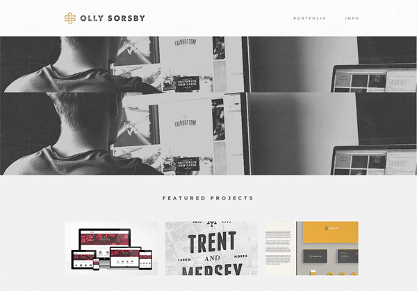
It’s a site of a graphic designer, Olly Sorsby. In here, you can see that the texture is very subtle. It is mixed with scattering of splatters. The overall design is very clean. It gives the site a delicate retro feel. The visitors will be given an impression of authority and, of course, age.
2. Jib
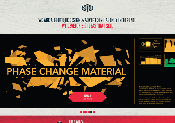
Jib is a boutique and advertising agency based in Toronto. Its homepage uses a slight wood grain texture that spread across the entire theme. If you’re planning to have this type of design to your own site, you’ll have to consider the color of the background as well. In here, the style and the color choice work well. Thus, you’ll have to pay attention to the other elements too when designing your site.
3. We Grow Cherries
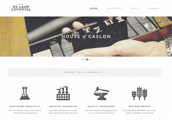
It’s a website of the students from Visual Communication at Birmingham Institute of Art and Design. The texture is used not as a background but as an accent for the whole page. This is a perfect example of why you should consider the context of the site when picking this style.
4. In Tacto
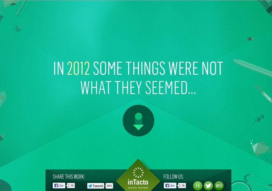
This site uses subtle textures that combine with the green-colored background giving you a feeling of living somewhere. The texture fits perfectly with the overall theme.
5. Scott McCarthy
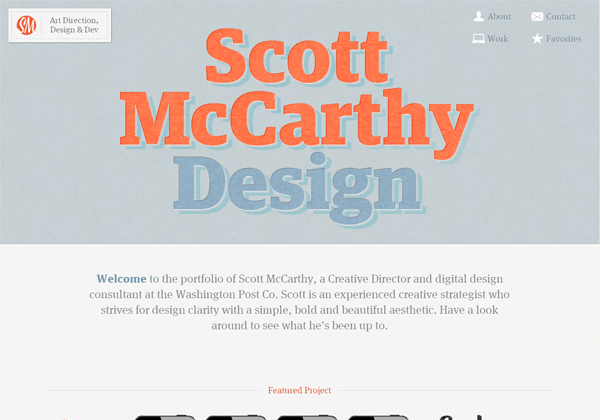
This is a perfect example of how you can use textures as the main point of your design. It doesn’t have to be a tool that you can use to subtly modify the look and feel of your page. Overall, it’s the texture that makes the site more attractive.
6. Inspireconf
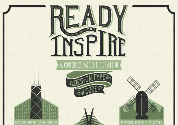
This site uses grainy paper texture, which fits the topic of the site. The design is enhanced by the font and the texture giving the site an “old-school” feel. It simply shows that you can use textured element to accentuate a very simple design.
7. IXI Store
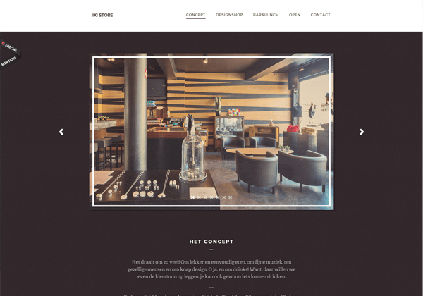
The texture here is used for visual decoration. Even so, it transforms the entire site into something that will surely be admired. Without it, the entire site would be sitting there on a plain, dull background.
8. Praline
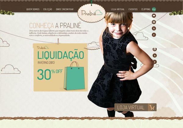
In here, the texture is used in the entire site. But it’s being applied in a way that it doesn’t overpower the main content of the page.
9. Postable
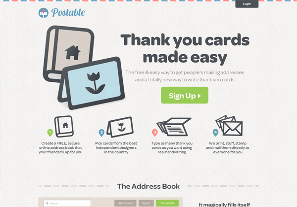
The texture offers the feeling of a letter, which perfectly fits the site’s goal, i.e. to make beautiful thank you cards.
10. Zindustry
Subtlety technique is often overused. But, in here, it works well.
11. Italio
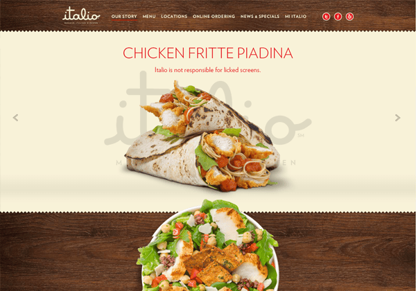
In here, the designer wasn’t afraid to try things that are out of the box. In here, the use of noise transformed the entire site into something else making it more to enticing to eat those Italian foods.
13. Harry’s
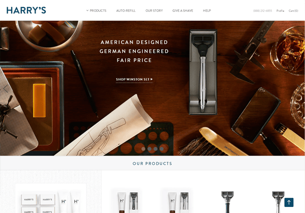
Here, you’ll notice that it implements multiple textures. But they all complement one another to make a beautiful mixture.
14. Mixpanel
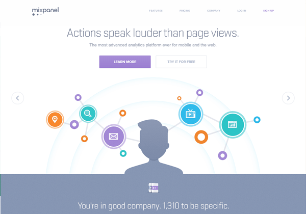
Just like in any other sites featured here, this one uses subtle texture and attractive colors and fonts.
15. Andreas Fretz
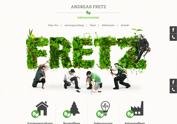
It’s a German-language site that showcases the works that the company does. The texture is embedded in such a way that you won’t notice it, but it’s there.
16. MailChimp
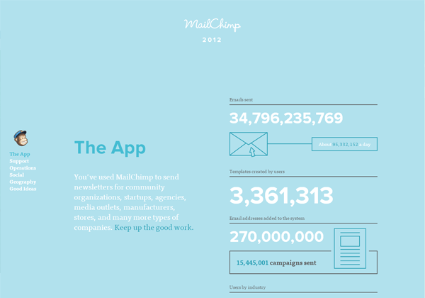
Adding grain in this design gives you the overall theme a touch of realism. It perfectly fits the entire theme.
17. Big Daddy Weave
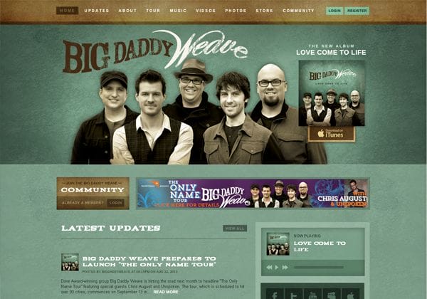
The mix of textures throughout the page and coupled with clever shading effects provide a beautiful design.
18. Tabspresso
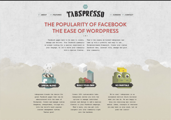
The paper grain used here relate to the theme of the design. Without the texture, the site wouldn’t be as attractive as it is now.
Looking at those designs, you’ll realize that adding little texture to it can make the entire page a lot more appealing to the eyes. Hopefully, these examples have provided you new ideas that you can use and incorporate them to your own design.