The 5 Most Important Aspects of Ecommerce Homepage Design
The average ecommerce website’s bounce rate is a staggering 45.7%.
That’s right – almost half of the traffic that you work so hard to generate for your online store will leave before you have a chance to sell something to them. Keep in mind that online shoppers are used to getting what they want almost instantly. If your homepage doesn’t cater to this need, your business is losing money.
In this article, we’ll take a look at five steps you can take to make your ecommerce site’s homepage more effective at engaging visitors and converting them into customers.
Make Your Value Proposition Very Clear
People need a reason to be interested in your store. Simply telling them what you’re selling isn’t always going to be enough.
Your homepage needs to give visitors compelling reasons to browse around. And with the number of competitors clamoring for their attention, you better give them these reasons quickly and unambiguously.
Let’s think for a minute about value propositions. What exactly are they? This is a really important question.
A value proposition is the reason a customer should do business with you. It’s the measurable benefits they will enjoy when they use your products. It’s not “what you’re selling” as much as it’s the reward they get for buying it.
Let’s take a look at this example from Somnifix. The sleep-aid retailer sells a product that promotes nasal breathing. Their value proposition isn’t “breathe through your nose.” That’s what their product enables, but it’s not the benefit customers will enjoy.
What you get when you use these strips is clearly stated in the homepage header: Reduced snoring and better sleep quality.
These are the real reasons people will invest in their product – the tangible benefits they get from using it.

Image source: Somnifix.com
Enable Easy, Logical Navigation
Navigating to your site’s various product categories has to be an easy, pleasant, and logical experience. If people can’t get where they want to go on your site, they’ll go somewhere else.
To reduce bounce rates and urge users to delve into your store’s product category pages, it’s essential to use these three navigation practices:
- Parent product categories need to be super prominent. Obviously, they should be featured in the primary navigation bar, but it also helps to dedicate a nice, big portion of homepage real estate to promoting these pages’ links.
- Don’t hold back on navigational granularity. In your navigation element, use as many links as necessary to cover all your product categories and sub-categories. A smart UX designer will find a way to lay out a large selection of links in a way that doesn’t damage the page’s readability.
- Allow customers to search for product pages. Web users may not want to navigate through all your categories looking for a specific item. Make sure you give them a search bar that searches for all the relevant keywords in your inventory.
Mannequin Mall does a genuinely terrific job of implementing these three rules on their homepage.
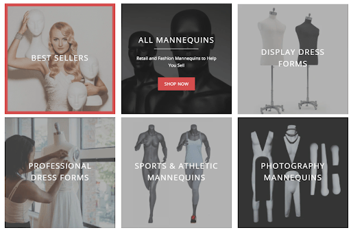
Image source: Mannequinmall.com
Make Your Credibility Obvious
Social proof is a really, really big deal in ecommerce.
“How big a deal?” you ask.
Well, according to Vendasta, a whopping 92% of online shoppers actively read customer reviews before making a purchase. Furthermore, 80% of consumers trust online reviews as much as a personal recommendation.
Clearly, for online retailers looking to quell the concerns of potential first-time customers, reviews are critical. So why only display them on product pages? How many sales are you missing because you’re not flaunting your excellent social proof on your homepage?
Take a leaf from Future Kind’s book and get as many tasteful references to your brand and product’s credibility on your homepage.
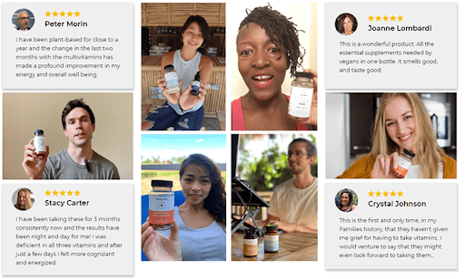
Image source: Futurekind.com
Not only does the vegan supplement company include a visible reference to their overall star rating inside their header graphic, but they also dedicate an entire section to quotes from verified customers.
Don’t Hide Behind a Digital Wall
Potential customers who land on your homepage want to know that you’re available to them. This is especially true if they’ve never bought anything from you before.
The era of hiding your customer support behind an email address and dealing with queries and complaints when it suits you is over.
Online shoppers have become used to a certain level of “contactability” from e-commerce brands who staff call centres and live chat features with helpful, knowledgeable staff.
If your homepage makes it crystal clear that you’re easy to get hold of, they’ll go into the shopping experience full of confidence and trust – a mindset that you, as the shopkeeper, want.
This is why so many online retailers place their phone number in a highly visible spot on their homepages. In the case of sporting goods retailer, Anytime Baseball Supply, they even go so far as letting customers know what times they’ll be available for them.
The enthusiastic tone of the copy surrounding the phone number also makes it seem like the store’s salespeople are eagerly awaiting the customer’s call. This goes a long way towards making shoppers feel like they’re going to be doing business with flesh and blood human beings, rather than a website.
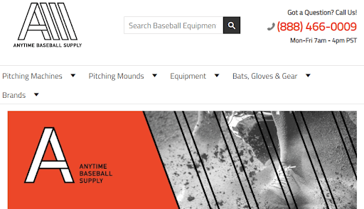
Image source: Anytimebaseballsupply.com
Shine a Spotlight on Discounts
According to Oberlo, 41% of people who shop online do so because they’re looking for sales, discounts, and coupons.
Bear this statistic in mind when designing your homepage. Give your prospective customers a very good reason to stick around by offering them a clear view of all your discounted items.
There are many ways to do this, but one of the most effective is to actually show the products that are on sale, rather than forcing your users to click on a “Sale” link first.
This approach kills two birds with one stone:
- you’re displaying your inventory – showing first-time visitors what it is that you sell, and
- you’re giving discount-hunters a nice, detailed view of what they can save on
Homestead Supplier does this beautifully, dedicating a sizable portion of their homepage to a product carousel labeled under the heading: “What’s Hot.”
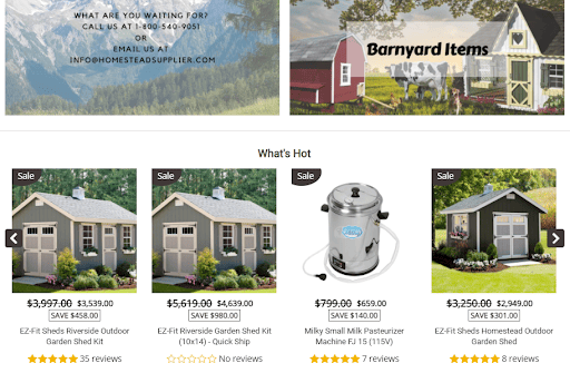
Image source: Homesteadsupplier.com
Here’s what makes this UI element stand out:
- It contains a very wide variety of items.
- Images are large and showcase the products beautifully.
- The previous price, current price, and savings amount are displayed.
- Star ratings speak to each discounted item’s quality.
BONUS TIP: Choose the Right Platform
Your choice of ecommerce platform drives two aspects of homepage design. These two aspects are easy to overlook but absolutely critical to success in this cutthroat industry.
The first is “choice of templates.” Unless you’re a seasoned graphic and web designer, you’re unlikely to nail your homepage’s design with your Photoshop and HTML skills.
A great ecommerce platform will give you access to a wide selection of homepage templates to choose from. In most cases, these templates have been designed by professional designers who understand how to keep users engaged.
The second benefit to choosing the right platform is “ease of customization.” Most reputable tools will include a super-accessible drag and drop editor that makes tweaking the front-end and inserting smart, engaging functions incredibly easy.
Don’t gloss over this part of the process when setting up your ecommerce site. This decision is an important one. Choose a platform that offers you a great selection of templates that are easy to customize.
Some Closing Thoughts
Your homepage needs to do the same thing that a brick-and-mortar storefront does: seize the attention of people passing by.
Every on-screen element needs to communicate something that convinces a visitor not to move on to one of the other tabs they have open in their browser.
Think about your homepage from the perspective of a shopper. Analyze it as if you are someone who’s just “popping in.” Ask yourself if the page’s design and messaging compels you to navigate deeper.
This is the starting point for every website design decision you make. And this is doubly important for your homepage, which is the first encounter with your brand for most of your prospective customers.
