Typographic Logos: 6 Eye-catching Examples
Designing a logo can be fun and yet daunting task. A logo must be able to convey a message effectively and represent something that will surely stick to people’s mind.
The effective logos out there are memorable and drive a point immediately. While there are many ways to design a logo, typographic logos are now getting attention from different people, be it business entities or for personal use. Typographic logos are words and image at the same time. Thus, you can virtually speak to people while leaving visual image for them to remember. It is like hitting two birds with one stone.
Typographic logos are logos which makes use of letters and words instead of purely images or drawings. When used in a business, logos can be an effective way to create a brand and increase people’s awareness about your product. Creating a logo may sound easy for some people and yet many logo designers either overdo things or fall short of the design.
If you want to get some inspiration for your next typographic logo design, I have gathered 6 eye-catching examples. Here is a quick run down of these typographic logos.
1. FedEx
FedEx or Federal Express is a logistic company that specializes in delivering different types of item from one place to another. They have a big network that extends from local to international market. There logo is almost always recognizable. Colored with purple and orange, FedEx is able to introduce itself without speaking a word.
2. Coca-Cola
Who would never know the world famous and most popular beverage? Coca-Cola has transformed itself to be an international icon. I believe everyone will recognize the mostly red and sometimes white typography against a red background logo of Coca-Cola. It is eye-catching and elicits a thirst effect to people.
3. Ebay
Ebay is has long been a popular buy-and-sell online platform. Everyone knows eBay as a place where you can buy great products in an affordable price. Another good thing about eBay is that you can find hard-to-find items here that you simply given up to look for in other places. The logo of eBay has different color for each letter; red, blue, orange, and green for the letters E, B, A, and Y respectively.
4. Microsoft
Microsoft is widely known as a multinational corporation that specializes in computer products and services. It is one of the most valuable and important companies in the world today. It leads the innovative technological development and becomes the leading software developer. Microsoft is simply Microsoft. You can see this in their logo with simplicity and direct to the point. In addition to the typography logo, beside it is the one big square divided equally into four squares with different colors to represent its popular Windows Operation System. It is worth noting too that Microsoft made a major face lift on their logo after 25 years last late August of 2012. Nevertheless, their logo continues to stick in people’s mind.
5. WWF
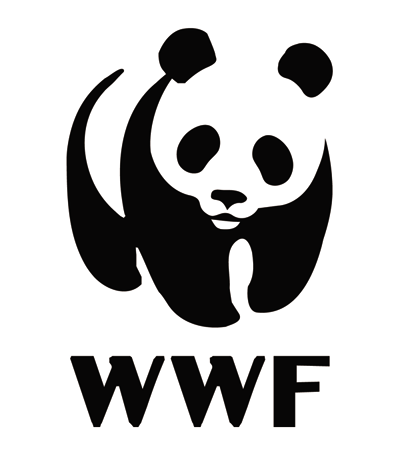
WWF or World Wide Fund for Nature is one of the biggest international organizations that work by protecting Mother Nature. They certainly made a positive impact as their logo is popular and very well-known in many places. The logo of WWF consists of black bold letters of “WWF” located below a panda image. In China, panda is considered as their national treasure and now in danger of extinction. It is the ideal epitome to represent the cause of WWF.
6. IBM
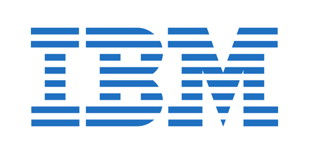
IBM or International Business Machines is the biggest computer producer in the United States and even in the rest of the world. IBM is represented by its simple and yet elegant typographic logo. Dominantly blue and stripe logo, IBM has made its campaign in convincing people that their product is superior and reliable.
These are just some of the logos that are popular and had made a big impression of people’s mind. Of course, they are already a big brand and that is given. But the point here is that these typographic logos had made it to the top because of its simplicity, compact, and to-the-point elements in representing an entity.
When a typographic logo or any type of logo is backed up with positive reinforcement, people perceive a brand to be helpful and something to be desired. These elements are possessed by not just eye-catching but powerful typographic logos.