how-to: view your site in multiple screen resolutions with screenfly
With the many new gadgets in different shapes and sizes being utilized today by millions of web users all across the globe, it’s certainly important to design your site so that it looks attractive, clean, and user-friendly on all electronic devices.
This allows you to maximize the reach of your website.
There’s certainly no point in having a professionally-designed, appealing website with so many grand features if mobile browsers are not able to view it and navigate properly on their phones.
With Screenfly, you can check how your own website looks on an electronic tablet, a smart phone, a flat screen TV, or a regular PC.
This way, you can redesign or modify your site accordingly and provide a greater experience for more people.
HOW-TO: View Your Site In Various Devices
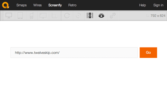
- Go to ScreenFly and type in your URL:

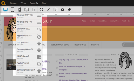
- Hover over the devices on the top left menu to view how your site design appears to users on various devices. Here’s an example: