15+ Website Design Inspiration for Insurance Agents
Starting something can always be daunting. There’s a lot of overthinking involved in this stage — worrying about regrets and starting over again when the best idea came in too late. Though of course, with the abundance of resources online, you can get accustomed first to how established insurance agents do it. Here, we rounded up 15+ Website Design Inspiration for Insurance Agents you can check vibe with.
15+ Website Design Inspiration for Insurance Agents
1. National General Insurance
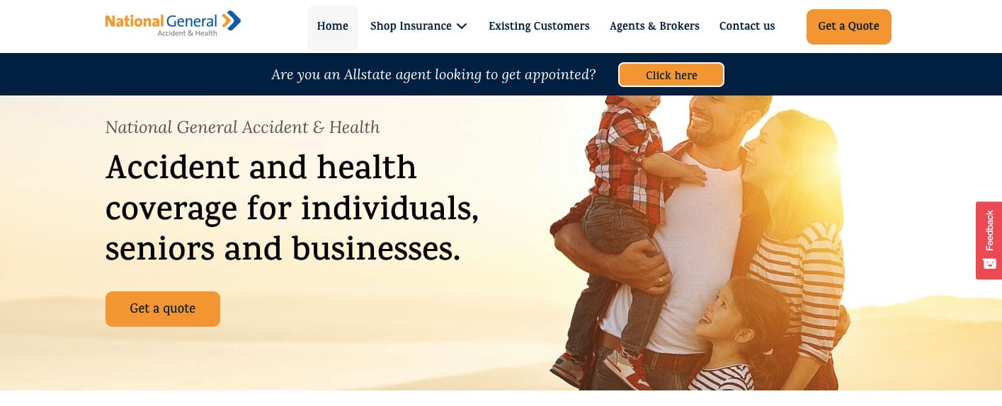
Straight to the point, professional, and modern, National General Insurance has a website that’s balanced and credible. They put together images of families (their target audience) to invoke a more personal connection to their audience. Not only that, but the content is also easy to absorb through the bright and light colours and the use of bullets and shorter sentences.
- website: https://natgenhealth.com/
2. Haven Life
With a well-done web copy that’s attention-grabbing, Haven Life sure has more up in its sleeves. There are all-to-actions in place to maximize the exploration of the aemphasize to know the insurance company more. Moreover, they also put emphasis on the future by tapping on parents who intend to ensure the security of their children through photos in each section.
- website: https://havenlife.com/
3. Stone Insurance Agency
Professional and with a timeless charm, Stone Insurance Agency puts a spotlight on their seasoned team who you can rely on. With this in mind, they establish their credibility and what you can expect when working with them. Surely, complemented with really good customer service also contributes to an overall good impression.
- website: https://stoneinsagency.com/
4. Wefox
Wefox has consistent branding throughout its website. The use of their brand colour is emphasized through the use of white as the base background. Furthermore, they ensured that their messaging is direct with a call-to-action promoting audience to take action already. There is also an option to change the language too.
- website: https://www.wefox.com/en-ch
5. Liberty Mutual
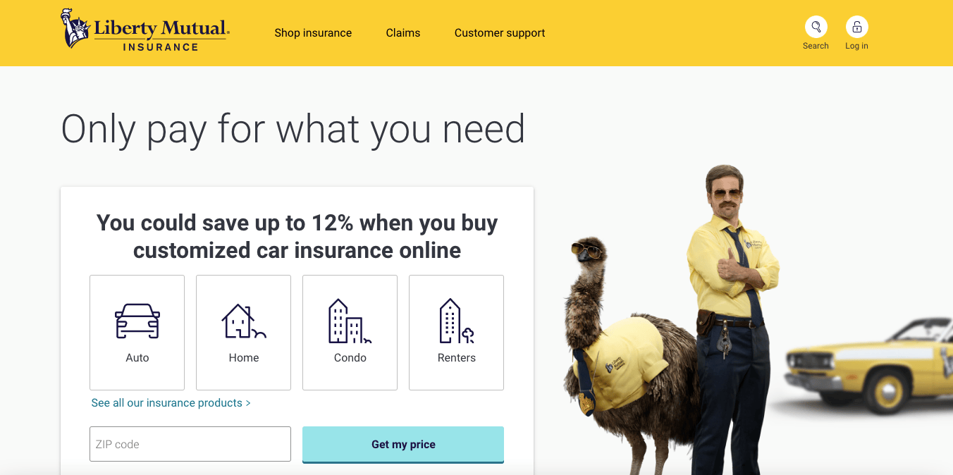
Using yellow as their primary colour calls the attention of their audience to colour psychology. The first section of Liberty Mutual‘s website, they have interactive buttons to explore depending on what the visitor might need insurance for. Even with these simple icons, it communicates what they offer with just one look.
- website: https://www.libertymutual.com/
6. Prudential
A professionally-designed website, Prudential understands how to flaunt their years in the business. They have a navigational bar on top — to help segregate audiences depending on what offers and content are directed towards them. On the left, there is also a quick menu to explore what they offer. Their use of people as well communicates how community-driven they are.
- website: https://www.prudential.com/
7. Ladder
Approaching website design that’s a bit minimalist but also warm. Ladder‘s choice of colours and use of a happy image sure help give the website a more welcoming feel. Moreover, they also showcased statistics which can communicate quantified clients who put their trust in them.
- website: https://www.ladderlife.com/
8. Hi Oscar
Hi Oscar is another of the best website inspiration for insurance agents that you can check. They have a bright blue Pantone that means security and trustworthiness in colour psychology. They also used graphic design to represent their clients and how they accommodate diverse groups of people.
- website: https://www.hioscar.com/
9. Progressive
Professional and happy, Progressive played around grey and yellow tones along with white to exude a feeling of happiness and confidence. Moreover, the landing page has a quick navigational menu on top and a quick preview of the services they offer. Straightforward and easy to navigate.
- website: https://www.progressive.com/
10. Brown & Brown
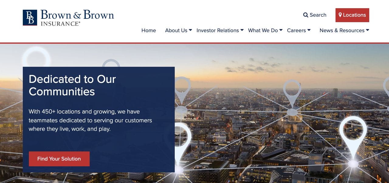
Brown & Brown has a professional and modern website that exudes wisdom and credibility in what service they extend. They put emphasis on their geographical location and how many lives they’ve touched. Furthermore, their call-to-action button also communicates “Find Your Solution” — which shows how they are committed to delivering personalized service.
- website: https://www.bbinsurance.com/
11. New York Life
Putting emphasis on numbers and quantifiable data, New York Life‘s user interface is organized. The navigational bar enumerates the services they offer and whatever stage in life their clients are. Truly, this website shows how much they care about their clients.
- website: https://www.newyorklife.com/
12. Aetna
Aetna has a section designed to segregate the web traffic depending on their intent. This allows them to maximize the opportunity and convert them into clients. Moreover, they also cut the website short and added a few links to encourage them to click and read more about the services offered.
- website: https://www.aetna.com/
13. Titan Insurance
Titan Insurance keeps it simple by using black and white as their website colours. Professional and modern, they also added a form to encourage the customer to get in touch with them. On the side, there are also buttons with icons to help potential clients get to explore what they need.
- website: https://titaninsured.com/
14. Health Care Gov
Starting with a question, Health Care Gov kept it simple but also impactful. They added call-to-actions to encourage the audience to take action towards answering the question they asked when they first landed on the website.
- website: https://www.healthcare.gov/
15. Many Pets
Many Pets has a modern and creative website design. Their choice of deep pink and green colours communicates youthfulness and at the same time, credibility. Furthermore, their web copy is also written in a knowing tone that sure exudes confidence and their commitment to delivering exemplary service. They also added a testimonial section with a photo of a happy owner with their pet — perfect for projecting a better outcome in life by availing of their service.
- website: https://manypets.com/uk/