10+ Best Wedding Florist Websites to Inspire You (2023)
Starting a career as a wedding florist is one of the most dreamy and creative careers you can explore. With this in mind, having a website is a great way to maximize your potential. You can immediately build credibility while also showcasing your stunning pieces. If you’re unsure where to start, here are the 10 Best Wedding Florist Websites to inspire you!
10 Best Wedding Florist Website Inspirations
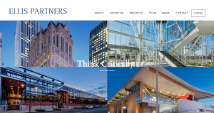
1. Vintage Bash
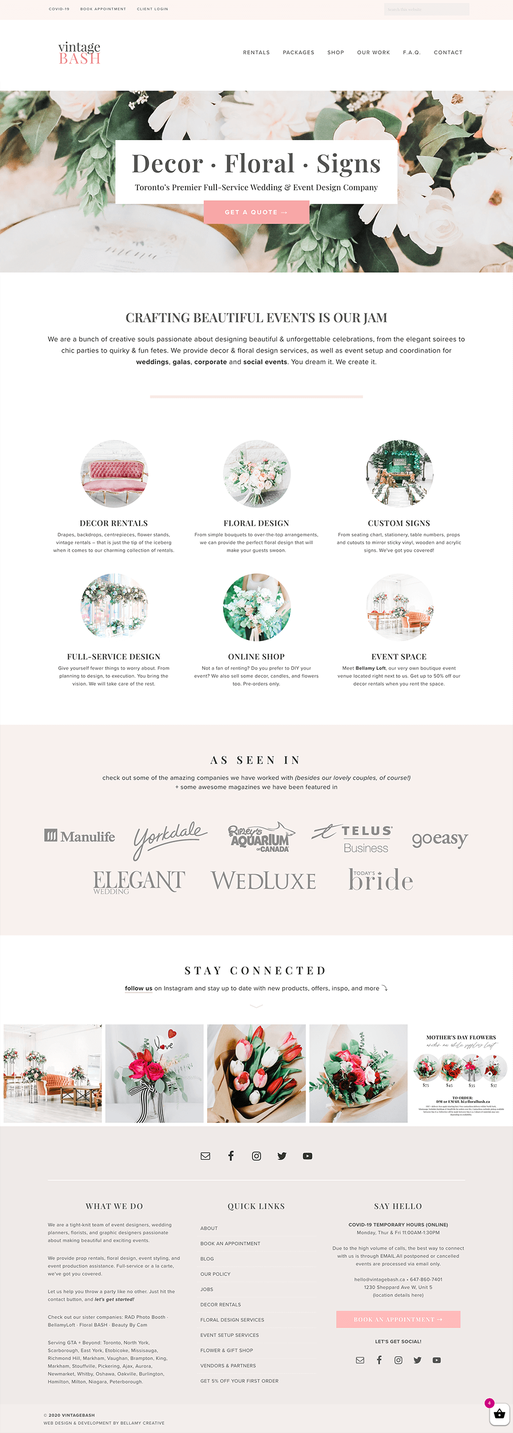
One of the go-to wedding decor and florists in Toronto, Vintage Bash stuns us with its fantastic website that communicates elegance and timelessness. Their website is minimalist but you can see how they paid so much attention to the layout. Moreover, they kept it consistent with their choice of chic and soft brand colours that are balanced with the white background. There is also a play of different layouts depending on each section. Since this website has a shop as well, they focused on customer experience — maintaining ease of use and navigation.
- website: https://www.vintagebash.ca/
2. Quill + Oak
Quill + Oak is another fantastic website that played around with using the floral motif on each section. In a high fashion sense, they played around with the use of negative space and neatness through the use of sans serif fonts. Furthermore, they also incorporated photos of previous clients as you scroll down. This bridges a connection with the audience without being too pushy and without the need for a longer copy.
- website: https://www.quillandoak.ca/
3. Tumble Weed Floral Design
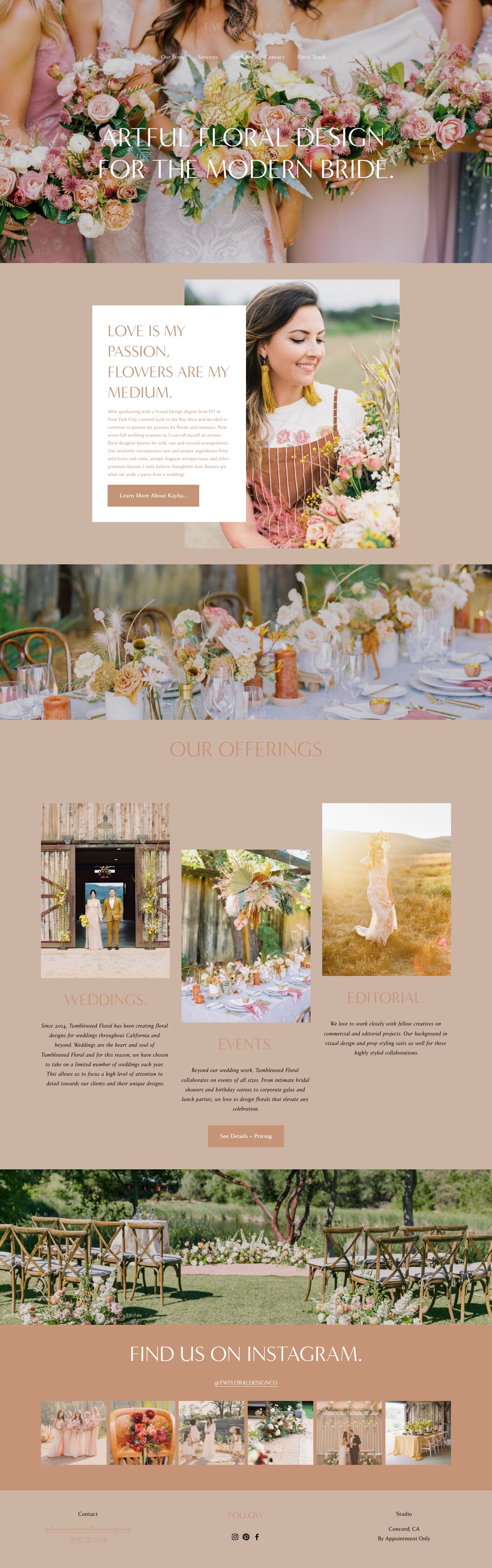
Tumble Weed Floral Design went big with a full-screen photo highlighting floral arrangements in a wedding. They managed to do this without going overboard because of their palette choice and use of elegant fonts. Moreover, there is a sense of consistency with each scroll since the colour is adapted in a subtle way throughout the page. Not only that, but they also added a section for their services and portfolio gallery that can be scrolled through the Instagram section too.
4. Threads and Blooms
One of the classic fairytale-ish wedding florist websites to get inspiration from, Thread and Blooms aces this. Their website has a light and sweet vibe into it that was highlighted through their choice of colours and the Lightroom filter on their photos. Furthermore, they also divided each segment with a full-screen photo and a minimalist white block to let the audience know that there’s something new to see. Doing this also encourages them to focus on the important details.
- website: https://threadsandblooms.com/
5. Willow Flower Company
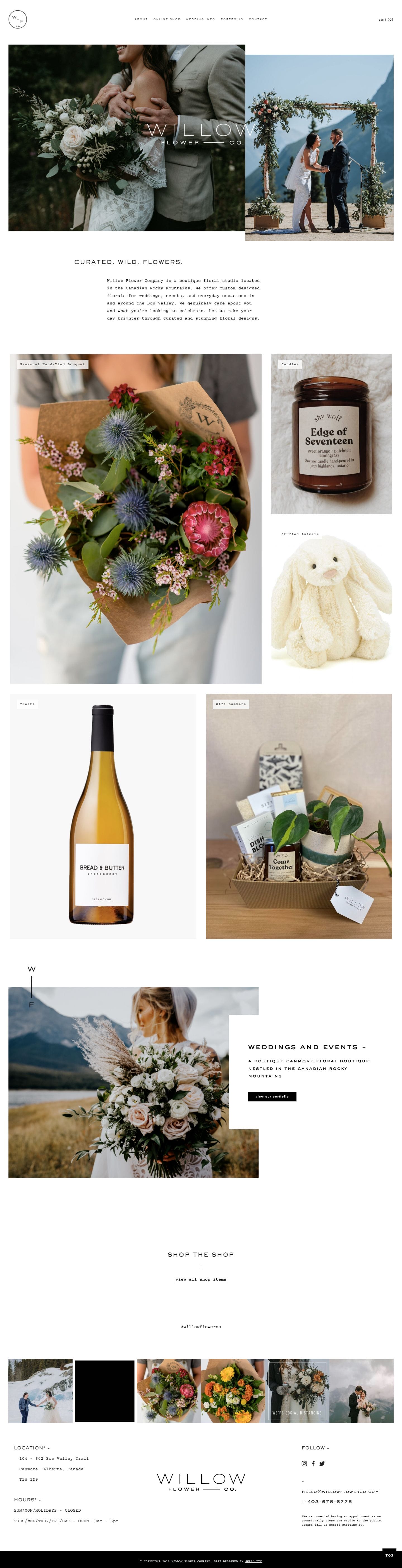
Willow Flower Company kept it strikingly simple with minimalist design and just playing around with content blocks in a stylish way. On their homepage, they have a full-screen photo collage with an overlay of their logo in white. The choice of font on the logo is clean and impactful. Besides this, they have a full gallery below that showcases what they offer and what you can expect from them too. They made the website as visual as possible with less text.
- website: https://www.willowflowercompany.ca/
6. The Flower Crown
Another wedding florist website to check out, The Flower Crown has a navigational bar on top that the audience can click and navigate the site for more details. They also used photos from different projects and added behind the scene shots to bring life to what they deliver. This also adds dimension and more depth to their core values — hopefully something to resonate with the audience too.
- website: https://theflowercrownca.com/
7. Kate Hill
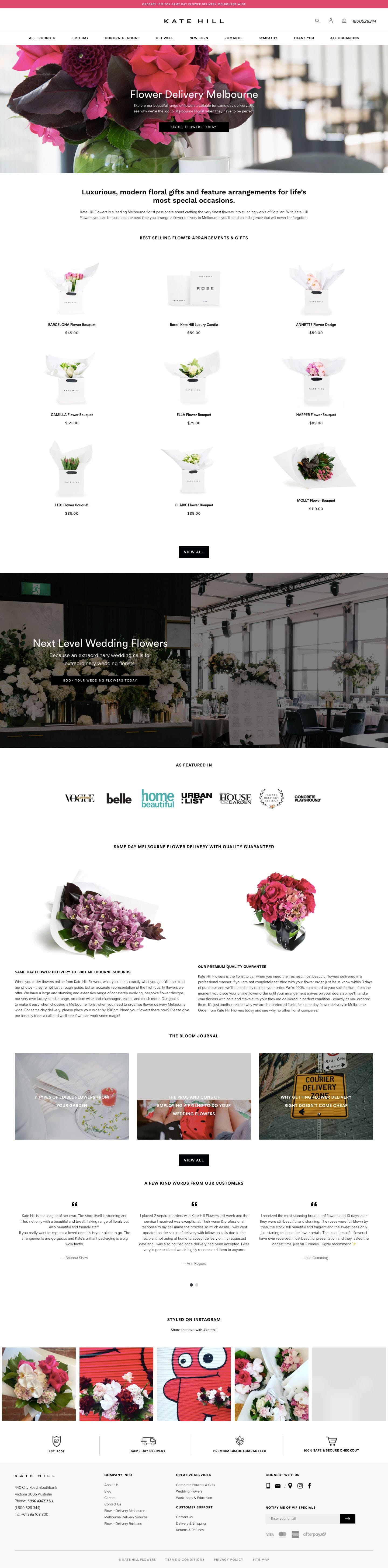
Chic and high-fashion, Kate Hill knows its brand and it transcends to the customer’s end. They have a certain command with a luxurious flair that can appeal to women. This helps them close more high-value transactions and build a certain aspirational concept surrounding them. Moreover, their website played around with balance and added a pop of colour through photos in between.
- website: https://katehillflowers.com.au/
8. Lux Wedding Florist
Lux Wedding Florist‘s website is charming on its own. There is a fairytale and rustic vibe that sure appeals to those who intend to have a classic grand wedding. Quite direct to the point, there are a couple of call-to-action buttons around to encourage potential clients to get more information about what they need. This encourages action which minimizes loss of potential.
- website: https://luxweddingflorist.com/
9. Emma Norton
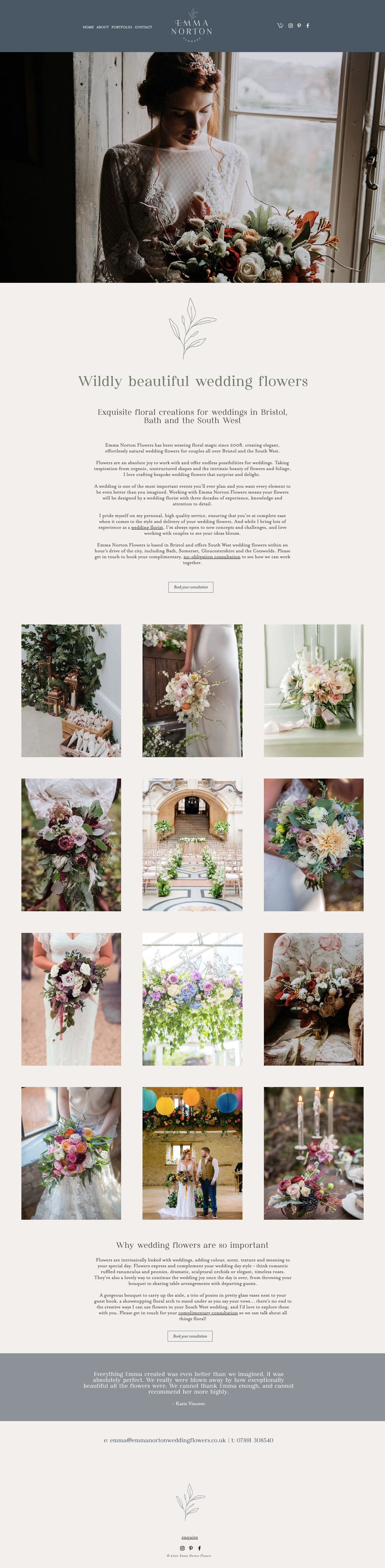
Though with the use of darker woody colours, Emma Norton still maintains a classic but elegance in their website. There is a soft yet dark blue section with navigation on top that makes their logo in white pop out. Moreover, this is complemented by the dramatic photo spread and minimalist web copy after introducing the brand. There is a sense of mystery the brand exude that makes the audience scroll and read for more.
- website: https://www.emmanortonflowers.co.uk/
10. Willow and Thyme
True to their branding, Willow and Thyme deliver fresh and simply stunning bouquets that brides would sure love. They maintained a minimalist website with few photos to add a sense of narration with each scroll. In between, they also added short and striking quotes and web copy to invoke a feeling and connect with the audience.
- website: https://www.willowandthyme.co.uk/
https://we.curate.co/blog/tips/4-great-examples-of-wedding-florists-websites