10 Best Weight Loss Coaching Websites to Inspire You (2023)
Establishing credibility is important for any aspiring coach to grow their clientele. To do so, starting a website is one of the best ways to maximize online presence and organically generate leads to nurture. You can achieve this by coming up with a fantastic and well-structured website that the target audience can relate to and find to trust. Here, we compiled the 10 best weight loss coaching websites that you can check out for inspiration.
10 Best Weight Loss Coaching Websites to Inspire You (2022)
1. MODA Weight Loss
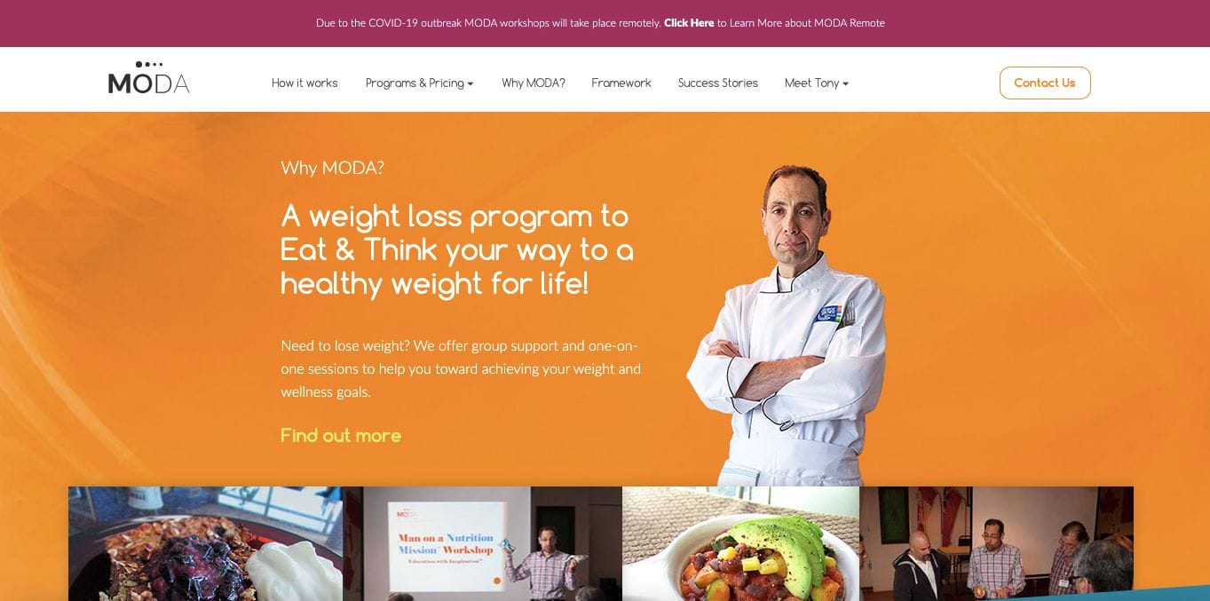
Intended to help people lose weight in Toronto, MODA Coaching encourages you to take a step further with their fun website. They kept it straightforward through the choice of bright colours that pop out. There are also select graphics in between their long-form copy. Furthermore, they also added video materials for a more lively and personal touch with their audience. Below, they also ensured to add a directory for easier navigation and social pages.
- website: https://modaweightloss.ca/
2. Roseli Greco
Roseli Greco has an impressively neat and professional website. Her choice of colours revolved around tones of soothing and serene blues that can surely bring a sense of calmness into the mix. Paired with white, this adds a minimalist yet structured website that directs its readers to absorb content. She kept it also straightforward by introducing herself then directing the flow to what she offered to the audience along with the call to action buttons.
- website: https://roseligrecolifecoach.com/
3. Michelle De Wolf
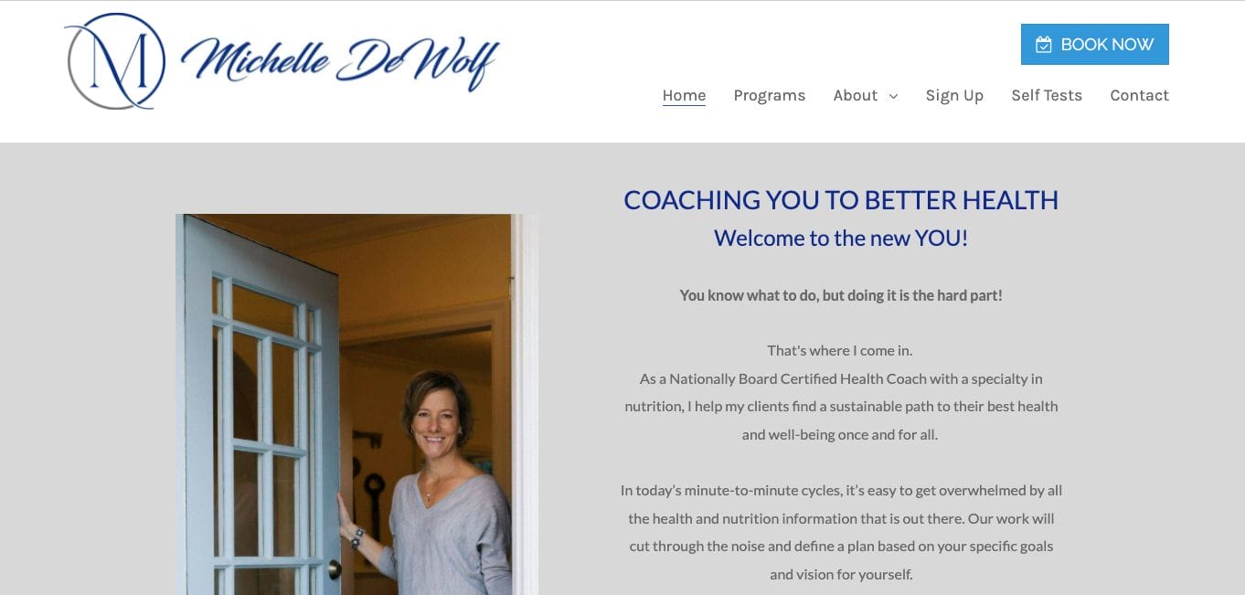
With one look, Michelle De Wolf’s weight loss website is professionally made with a commitment to the service. She kept her colour choices muted and minimal which allows her landing page to have more space and divide content into bite-size pieces. Moreover, there are also photos in between content to bring a human touch and add warmth every now and then. She also ensured to have a navigation area on top to explore the website and added a call to action at the top as well.
- website: https://michelledewolf.com/
4. Julie nutrition
One of the best weight loss coaching websites to check out, we admire Julie Nutrition for their application of strategic funnel marketing. In each scroll, they introduce the service and how onboarding with them can make a positive change to the lives of the audience. Not only that, but they also added a call to action in between, encouraging them to take action and willingly build a relationship that can be nurtured in the long run.
- website: https://www.julienutrition.com/
5. Chris Fernandez Training
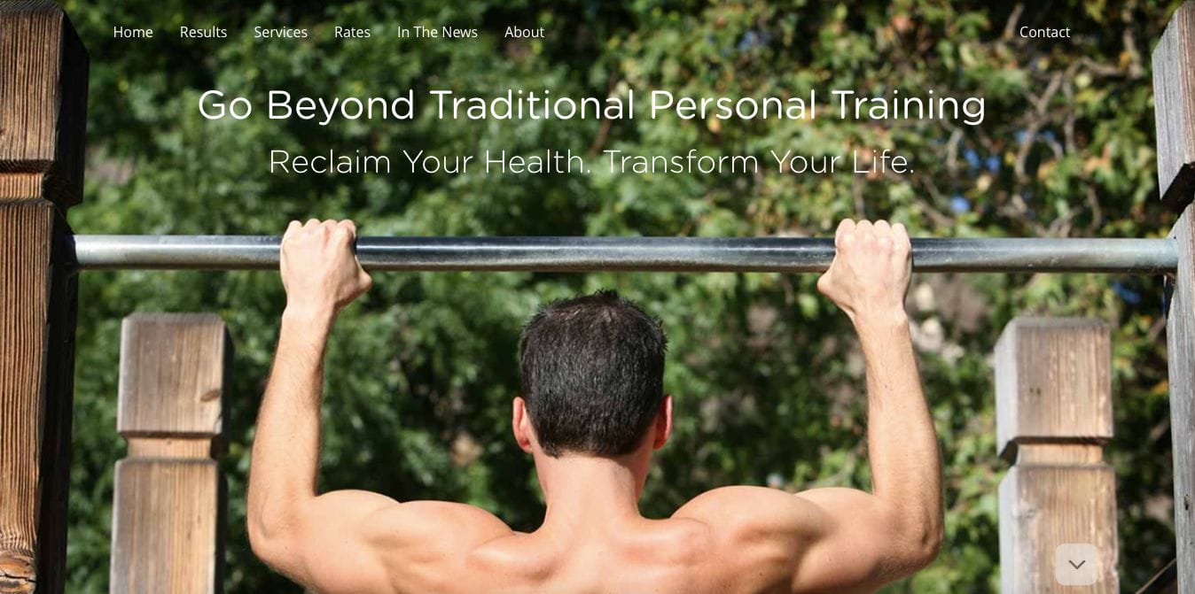
Taking the road less travelled, Chris Fernandez stayed away from minimalist and straightforward websites. They owned up their branding and came up with a well-structured website that benefits the brand in the long run. Their choice of colours inspired by nature such as greens and brown add gentleness and a comfortable vibe that the audience can resonate with. Moreover, their use of this also expresses their mission in helping their clients go back to basics and take charge of their lives.
6. Cali Fit
Cali Fit understood how to design their website through the use of dark and light elements without going overboard. They understood how doing so can add more depth to the layout, giving them a chance to express the brand personality more. Furthermore, they picked bold yet simple fonts to deliver a cleaner layout that is also easy to skim. They also used bright cyan for the headings to attract attention and have them focus on the important things.
7. The Food Coach
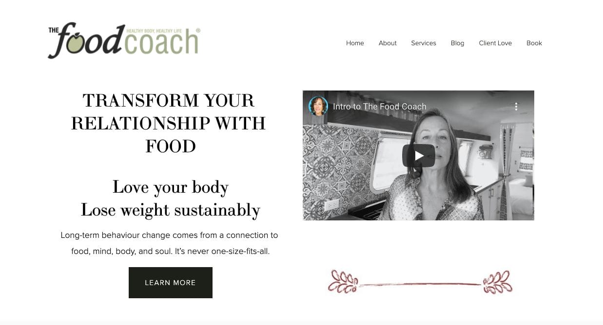
Subtle and straightforward, The Food Coach‘s website looks simple yet neat. They focused on delivering their intent without fuss and tapping into the mind and hearts of the ones who take the time to read. Furthermore, there is also play around formats in each section that keeps them separated from each other. With subtle pop of colours for icons as dividers, it’s quite a worthwhile experience for those who have time to focus with no rush.
- website: https://www.foodcoach.ca/
8. CanfitPro
Can Fit Pro encourages you to put on your running shoes and get ready to move. Their choice of bright and bold colours subconsciously motivates the audience to take action and be on top of their games. With few scrolls, their services are emphasised with graphic images that can help those who are new to understand. Furthermore, they added black and dark elements to divide sections and signal the reader that there’s more further the page.
- website: https://www.canfitpro.com/
9. Jill Bunny
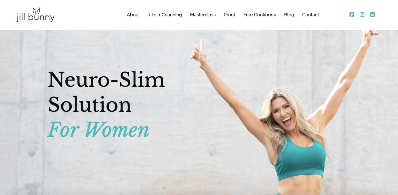
Knowing your brand personality can benefit you and Jill Bunny knows that. She embraced her mission without compromising her brand expression. With one look, you would know who her target market is and what she does through her headings, images, and web copy. Also, there is also a section where she highlights her achievements that helped her establish credibility.
- website: https://www.jillbunny.com/
10. Thrive Nutrition Coaching
Thriving for a healthy lifestyle is promoted by Thrive Nutrition Coaching. They are one of the best minimalist weight loss coaching websites to get inspiration from. Moreover, there are related graphics used as well as short but direct copies that are easier to absorb. They also used bullets to make their services easier to scan and explored the use of links on images to help the audience navigate to other pages for more details.
- website: https://www.thrivenutrition.ca/

